Bespoke’s Quick-View Chart Book — 1/19/18
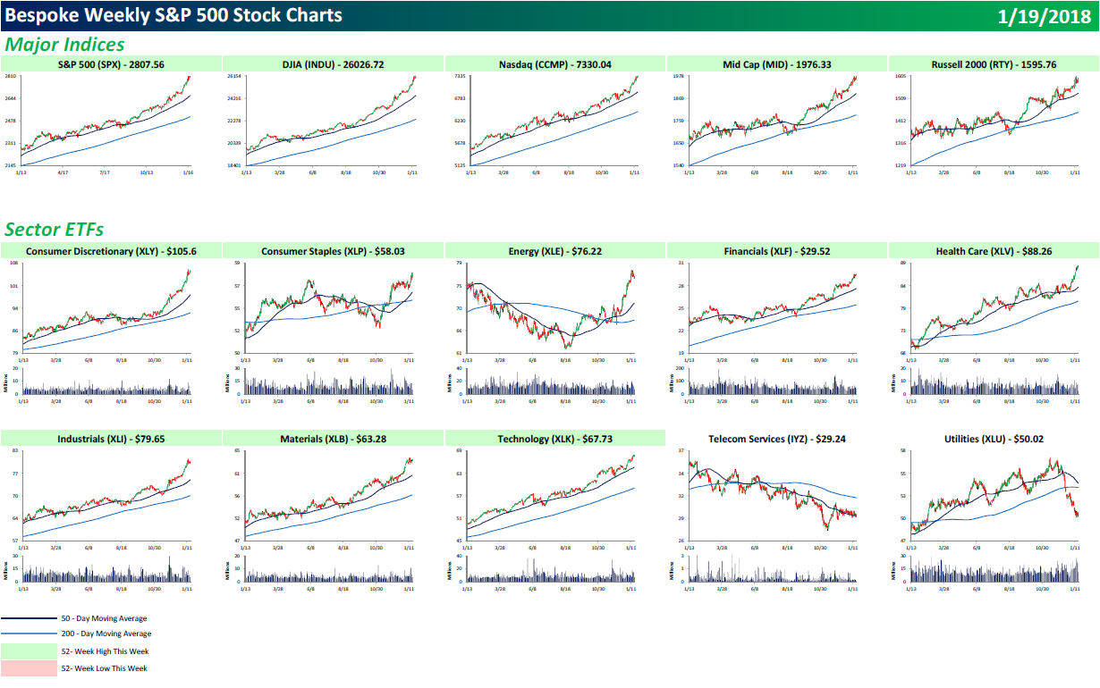
Each weekend as part of our Bespoke Premium and Institutional research service, clients receive our S&P 500 Quick-View Chart Book, which includes one-year price charts of every stock in the S&P 500. You can literally scan through this report in a matter of minutes or hours, but either way, you will come out ahead knowing which stocks, or groups of stocks, are leading and lagging the market. The report is a great resource for both traders and investors alike. Below we show the front page of this week’s report which contains price charts of the major averages and ten major sectors.
In our Chart Book, a green headline means the chart hit a new 52-week high this week. As you can see below, this week all five major US indices hit a new high, while every sector but Utilities and Telecom (two defensives) hit a new high. That’s a lot of green. Folks, take a snapshot of this one, because it doesn’t get much better than this.
You can view our entire S&P 500 Chart Book by signing up for a 14-day free trial to our Bespoke Premium research service.
B.I.G. Tips – When Are High Yields a Problem?
For anyone who was concerned about the flattening of the yield curve in recent months, you can breathe a little easier now that long-term Treasury yields are moving steadily higher. As of Thursday afternoon, the yield on the 10-year US treasury ‘spiked’ to 2.62%, putting it right near its 52-week high of 2.63% from last March. If that level is taken out in the next few days, that would take the yield to the highest levels since 2014.
When looking at the current levels of longer-term Treasury yields, a bit of perspective is in order. The chart below shows the change in the yield on the 10-year US Treasury since the start of the bull market in March 2009. During this span, the 10-year has traded in a range from 1.36% on the downside to 3.99% to the upside. Taking the mid-point of those two extremes gives us a mid-point of 2.68%. With the yield on the 10-year currently right at 2.62%, yields are still in the lower half of their bull market range!

So what can we expect from the market with longer-term Treasury yields on the move higher? To answer this question, we just published a B.I.G. Tips report which looks at how equities have reacted to prior increases in rates throughout the current bull market. Included in this report is an analysis of which sectors have typically reacted the best and worst to moves in yield.
For anyone interested in the trends we uncovered, check out the report by signing up for a Bespoke Premium membership now!
The Closer — Housing & Crude — 1/18/18
Log-in here if you’re a member with access to the Closer.
Looking for deeper insight on markets? In tonight’s Closer sent to Bespoke Institutional clients, we update our summary of residential construction activity, as well as EIA petroleum market tracking.

See today’s post-market Closer and everything else Bespoke publishes by starting a 14-day free trial to Bespoke Institutional today!
Bespoke’s Sector Snapshot — 1/18/18
We’ve just released our weekly Sector Snapshot report (see a sample here) for Bespoke Premium and Bespoke Institutional members. Please log-in here to view the report if you’re already a member. If you’re not yet a subscriber and would like to see the report, please start a two-week free trial to Bespoke Premium now.
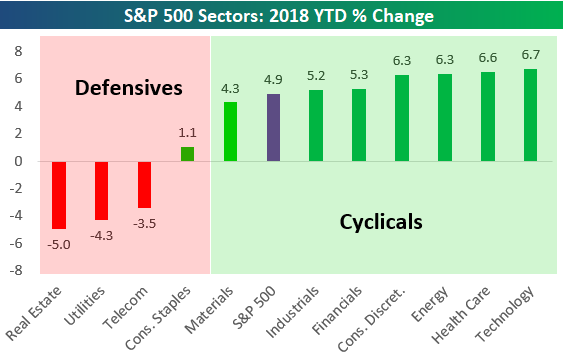
Below is one of the many charts included in this week’s Sector Snapshot, which highlights the year-to-date percentage change for the S&P 500 and its eleven sectors. As you can see, defensive sectors are underperforming while cyclicals have been very strong. That’s the type of underlying action investors want to see.
To see our full Sector Snapshot with additional commentary plus six pages of charts that include analysis of valuations, breadth, technicals, and relative strength, start a two-week free trial to our Bespoke Premium package now. Here’s a breakdown of the products you’ll receive.
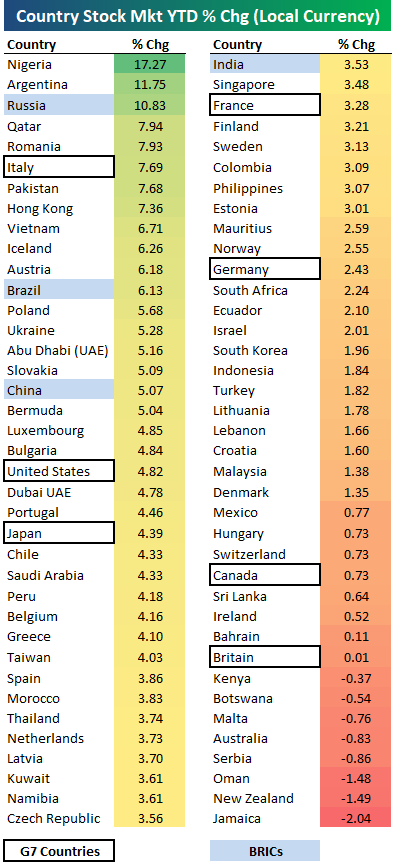
2018 Stock Market Performance of 76 Countries
We’re just 18 days into 2018, but the average country’s stock market (in local currency) is already up 3.51% year-to-date based on the 76 indices highlighted in the table below. Sixty-eight of the 76 countries are “in the black” for the year while just 8 are down.
As shown, Nigeria is off to the best start with a gain of 17.27%, followed by Argentina (+11.75%) and Russia (+10.83%). Italy has been the best G7 country so far, followed by the US and then Japan. Canada and the UK have been the weakest of the G7 with gains of less than 1%.
In terms of declines, Jamaica is down the most, but the drop has been just 2%.
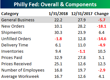
Unlike the Eagles, the Philly Fed Disappoints
Although it was still solid, the January report on Manufacturing from the Philadelphia Fed came in slightly weaker than expected. Think about it like the current Eagles without Carson Wentz; not quite as strong but respectable nonetheless. While economists were forecasting the headline reading in this month’s report to come in at a level of 25.0 versus last month’s reading of 27.9, the actual print came in at 22.2. This may not sound like an important level, but keep in mind that it is the 14th straight monthly reading above +20. That has only happened one other time in the history of the survey dating back to 1980!
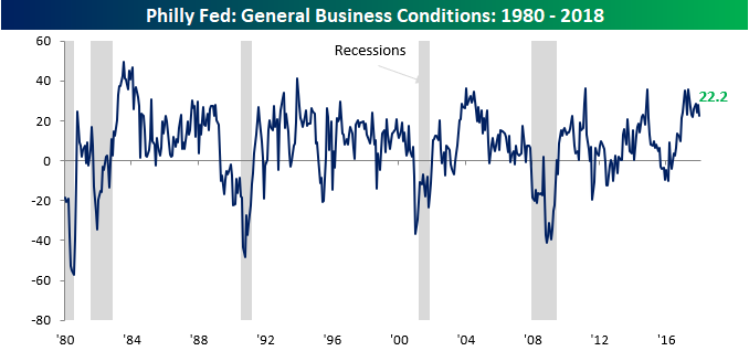
As far as the internals of this month’s report were concerned, there wasn’t a whole lot of strength to mention. Of the report’s nine sub-indices, just five saw m/m gains. Of those, the biggest increases were Prices Received and Inventories. To the downside, the weakness was centered in Orders as both the indices of New and Unfilled Orders saw double-digit declines.

Jobless Claims Back in “Amazing” Mode
After a disappointing report last week, jobless claims plunged this week, falling from 261K down to 220K compared to expectations for a level of 249K. Relative to expectations, this week’s report was the strongest since September 2017. It was also only the 8th weekly print that came in lower than expected by 29K or more since 2001. Even more amazing is the fact that the 220K print is the lowest reading we have seen since February 1973. That’s 45 years ago, folks! And remember, these stats don’t adjust for massive population growth since the 70s either.
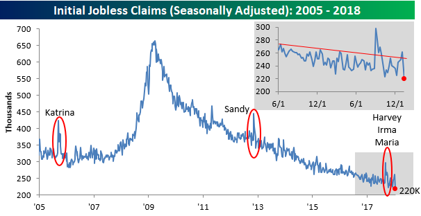
The four-week moving average also saw a pretty big decline this week, falling from 250.75K down to 244.5K. That’s still more than 13K above the cycle low of 231.25K back in early November, but it does break a streak of four straight weeks where the reading increased.

On a non-seasonally adjusted (NSA) basis, jobless claims fell from 403.6K down to 360K. While NSA claims were actually slightly lower at the same time this year, they are still more than 188.1K below the average of 548.1K for the current week of the year dating back to 2000. All in all, it was a very strong report.
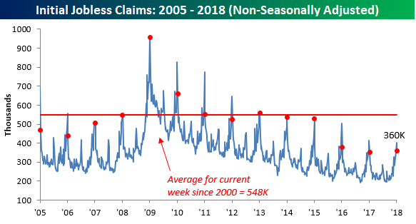
Chart of the Day: Senior Living Stabilizes
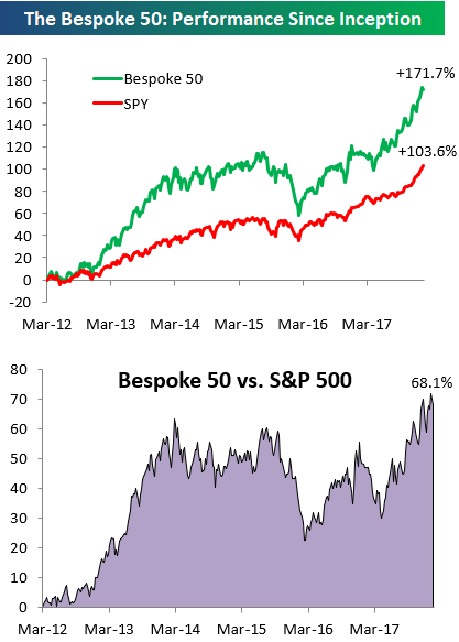
the Bespoke 50 — 1/18/18
Every Thursday, Bespoke publishes its “Bespoke 50” list of top growth stocks in the Russell 3,000. Our “Bespoke 50” portfolio is made up of the 50 stocks that fit a proprietary growth screen that we created a number of years ago. Since inception in early 2012, the “Bespoke 50” has beaten the S&P 500 by 68.1 percentage points. Through today, the “Bespoke 50” is up 171.7% since inception versus the S&P 500’s gain of 103.6%. Always remember, though, that past performance is no guarantee of future returns.
To view our “Bespoke 50” list of top growth stocks, click the button below and start a trial to either Bespoke Premium or Bespoke Institutional.
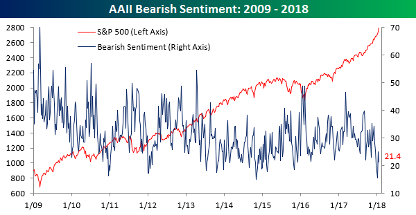
Bulls Back in the Majority
After a one-week dip back below 50%, bulls are back in the majority in the weekly survey of individual investors from AAII. In this week’s survey, bullish sentiment increased from 48.7% up to 54.1%. Outside of the 59.8% print two weeks ago, this week’s level of bullish sentiment is the highest since November 2014.
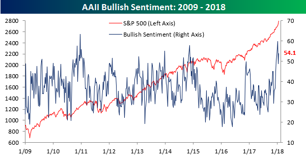
As bullish sentiment ticked back above 50%, bearish sentiment declined but still held above 20%, falling from 25.1% down to 21.4%.