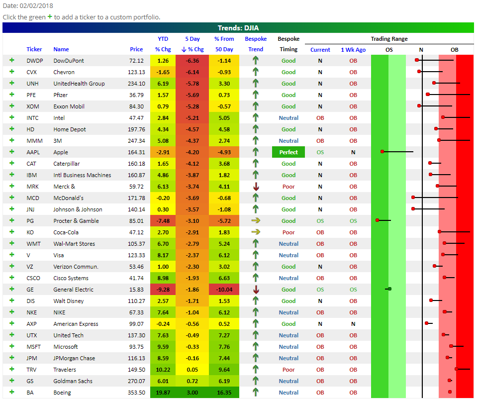
Stocks Finally Experiencing Mean Reversion
Our popular Trend Analyzer tool comes in handy when market volatility picks up. Below is a snapshot of the 30 Dow stocks taken directly from our Trend Analyzer tool. In the “Trading Range” section, the dot represents where the stock is currently trading, while the tail end represents where it was trading one week ago. The black vertical “N” line represents each stock’s 50-day moving average, and moves into the red and green zones are considered overbought or oversold.
After trading in overbought territory for what seemed like an eternity, we’ve finally seen some mean reversion for equities. This is evidenced by the large move lower within trading ranges that you can see in the snapshot below. Apple (AAPL), Procter & Gamble (PG), and General Electric (GE) are now the most oversold Dow stocks, while DowDuPont (DWDP), Chevron (CVX), and UnitedHealth Group (UNH) are the Dow stocks that are down the most over the past week. Boeing (BA), Goldman Sachs (GS), and Travelers (TRV) are the only Dow stocks that are up over the past week.
Learn more about our Trend Analyzer and sign up for a two-week free Premium trial to unlock its full capabilities.
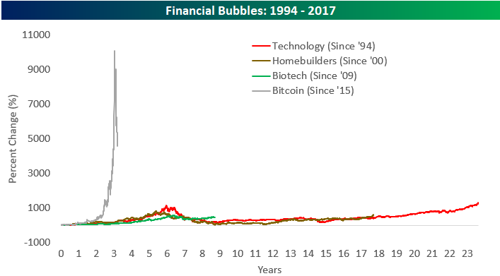
Financial Bubbles and Bursts — Dot Com, Housing, Biotech, and Bitcoin
Towards the end of 2017, way back when the price of Bitcoin was going higher, our chart below comparing Bitcoin’s rally since 2015 to prior bubbles made its way across the financial world. We’ve updated the chart today to account for the 50%+ drawdown that Bitcoin has experienced from its peak.
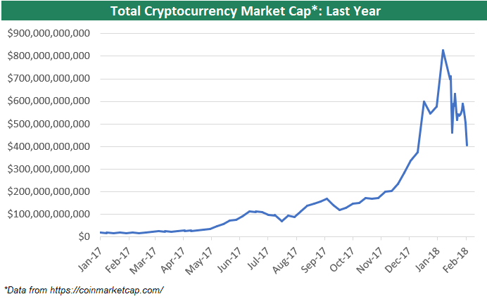
We’ve also updated our chart of total cryptocurrency market cap going back to the start of 2017. After peaking above $800 billion in early January, cryptocurrencies have lost more than half of their value and now combine for just $400 billion. Even still, $400 billion is nothing to sneeze at. Should this asset class really burst, you’ll likely see total market cap dip down below $100 billion — which was the level the space was trading as recently as late July 2017.
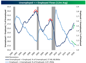
Flows Feeling It
One positive development we’ve seen throughout this economic expansion is a rising share of unemployed workers finding employment and a falling share of workers moving out of employment and into unemployment. As shown in the chart below, a record low share of those employed became unemployed over the last 12 months. Conversely, the share of unemployed workers who moved into the ranks of the employed has risen steadily higher over the last several years. With these two series continuing to trend in the right direction, recession risk as evidenced by labor market flows remains very low.
For more of Bespoke’s economic/macro analysis, start a 14-day free Bespoke Institutional trial today.
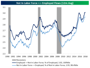
There’s also a secular story in labor market flows. As shown in the chart below, over the last 12 months a record share of the labor force has moved directly from employment to reporting they are no longer in the labor force. This is a decent proxy for retirement; workers who want to remain employed would go from holding a job to unemployed. To be fair, flows of those not in the labor force to employment (a measure of both young people entering the jobs market and cyclical strength) as a share of those not in the labor force have also been very strong. That’s one reason job growth has held up despite large outflows from the labor force.
Less Educated Workers, Less Labor Market Slack?
Over the last 25 years, labor force participation has dropped pretty consistently. Post-crisis, there was a thesis that less participation meant some workers didn’t have the skills required by employers to be productively employed. That doesn’t seem consistent with the first chart below. As shown, the best-educated workers have seen their participation in the labor force fall by the largest amount. While it’s a mistake to assume “education level” and “skill” are synonymous, they should be reasonably correlated. As shown in the chart, the least educated workers have the highest LFPR relatively to their own history. It’s still much lower than among better-educated workers, but hasn’t been falling, unlike for those with more education. Over the last couple of years, as LFPRs have bottomed for workers with a high school education and some college, college graduates have seen their LFPRs making a new low for the history of their series.
For more of Bespoke’s economic/macro analysis, start a 14-day free Bespoke Institutional trial today.
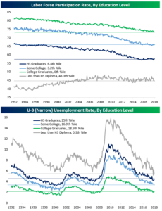
We should also note that while workers with at least a high school education have unemployment rates well above pre-crisis lows, those with less than a high school diploma have an unemployment rate below its minimums from the late 1990s and the prior economic expansion. Again, if there was a skills gap, we wouldn’t expect the unemployment rate for those with the least formal education to be at historically low levels.
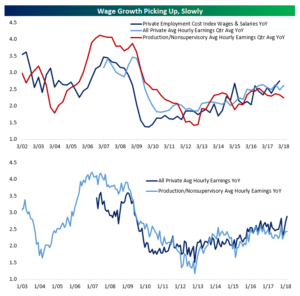
Wages Picking Up
Today we’ll have three quick blog posts discussing some data from this month’s nonfarm payrolls report. In this first post, we’ll focus on wages. As shown in the chart below, YoY growth of average hourly earnings for all private employees is at its strongest pace since the aftermath of the recession. YoY growth for last month was also revised up to +2.7%. As shown below, though, production and non-supervisory average hourly earnings growth (pay for non-managerial earners) is not accelerating as dramatically. We should also note that earlier this week the employment cost index for Q4 showed the strongest YoY wage and salary growth in the post-recession period. The ECI adjusts for the composition of the labor force, so if anything the relatively strong pace of growth we’ve seen in wages recently could be understated.
For more of Bespoke’s economic/macro analysis, start a 14-day free Bespoke Institutional trial today.
January 2018 Headlines
The Closer — Productivity, Auto Sales, 60/40 — 2/1/18
Log-in here if you’re a member with access to the Closer.
Looking for deeper insight on markets? In tonight’s Closer sent to Bespoke Institutional clients, we take a look at US productivity, grim US auto sales (including some brutal numbers from Ford and Fiat-Chrysler), and update our tracking of the pain this week’s price action has wrecked on balanced stock/bond portfolios.

See today’s post-market Closer and everything else Bespoke publishes by starting a 14-day free trial to Bespoke Institutional today!
Bespoke’s Sector Snapshot — 2/1/18
We’ve just released our weekly Sector Snapshot report (see a sample here) for Bespoke Premium and Bespoke Institutional members. Please log-in here to view the report if you’re already a member. If you’re not yet a subscriber and would like to see the report, please start a two-week free trial to Bespoke Premium now.
Below is one of the many charts included in this week’s Sector Snapshot, which highlights the 10-day advance/decline line for the S&P 500. Even though the S&P’s price level is still overbought, the index’s 10-day advance/decline line (an important breadth measure) has moved back into neutral territory.

To learn more about the 10-day A/D line and see our full Sector Snapshot with additional commentary plus six pages of charts that include analysis of valuations, breadth, technicals, and relative strength, start a two-week free trial to our Bespoke Premium package now. Here’s a breakdown of the products you’ll receive.
Bespoke Consumer Pulse Report — February 2018
Bespoke’s Consumer Pulse Report is an analysis of a huge consumer survey that we run each month. Our goal with this survey is to track trends across the economic and financial landscape in the US. Using the results from our proprietary monthly survey, we dissect and analyze all of the data and publish the Consumer Pulse Report, which we sell access to on a subscription basis. Sign up for a 30-day free trial to our Bespoke Consumer Pulse subscription service. With a trial, you’ll get coverage of consumer electronics, social media, streaming media, retail, autos, and much more. The report also has numerous proprietary US economic data points that are extremely timely and useful for investors.
We’ve just released our most recent monthly report to Pulse subscribers, and the results from this month’s survey were certainly enlightening. Along with a few under-the-radar shifts in consumer sentiment towards the economy that we found, we also continue to see extremely high levels of bullish investor sentiment. Start a 30-day free trial to see just how extreme the investor sentiment numbers have gotten.