Amazon and Everybody Else
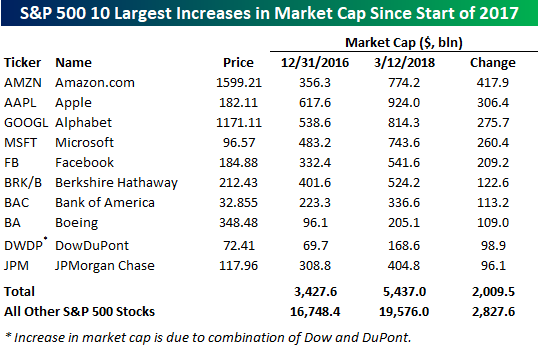
Since the start of 2017, shares of Amazon (AMZN) have more than doubled. That’s impressive enough in its own right, but for mega-cap companies, that kind of move is almost unheard of. Heading into 2017, AMZN had the sixth largest market cap in the S&P 500 at $356.3 billion. Today, the company’s market cap has swollen to $774.2 billion for an increase of just under $418 billion. AMZN is now the third largest company in the S&P behind Alphabet (GOOGL) at $814 billion and Apple (AAPL) at $924 billion. Additionally, there are only six companies in the S&P 500 that currently have a market cap that is greater than the market cap that AMZN has added since just the start of 2017! That’s a lot of rockets for Jeff Bezos to fly to space.

The table below lists the ten stocks in the S&P 500 that have seen the greatest increase in market cap since the start of 2017. AMZN is the clear leader on the list with a lead of more than $100 billion over AAPL, which has gained an impressive $306.4 billion over the same time period. Outside of these two companies, another six stocks have seen their market cap increase by more than $100 billion. In total, the ten companies listed below that have seen the largest increase in market cap since the start of 2017 have added just over $2 trillion to their combined market cap, which works out to more than 40% of the total increase in market cap for all the stocks in the S&P 500 during that same span. On a final note, it is a striking coincidence that the first letter of the four tickers that have seen the greatest increase in market cap since the start of 2017 make up the acronym MAGA!
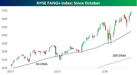
Stock Seasonality – 3/12/18
February 2018 Headlines
Best and Worst S&P 500 Stocks of the Bull Market
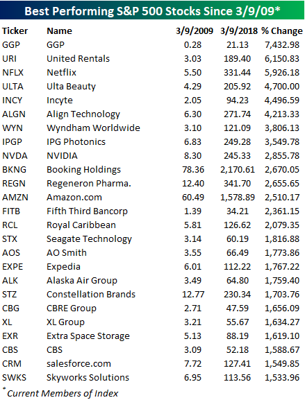
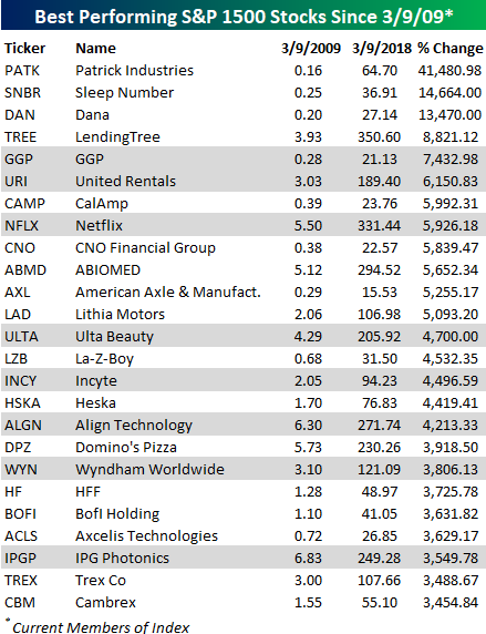
To commemorate the nine-year anniversary of the bull market, in an earlier post, we highlighted the best and worst performing stocks of the bull market that began on 3/9/09. The first list below highlights the 25 top performing current members of the S&P 500 since the bear market low in March 2009. The best performer of them all has been GGP. On 3/9/09, the stock closed at $0.28 and was for intents and purposes, on its way to zero. This past Friday, the stock closed at $21.13. Not a very high dollar price, but still enough for a gain of over 7,400%! Bill Ackman has been criticized for a number of high profile bets that didn’t go his way, but GGP was one where he literally made billions! Other stocks on the list of biggest winners are probably familiar to a lot of readers as Netflix (NFLX), Ulta Beauty (ULTA), Align Technology (ALGN), NVIDIA (NVDA), Booking (BKNG), and Amazon.com (AMZN) have all rallied more than 2,000%.
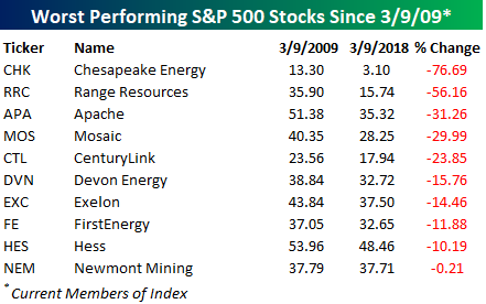
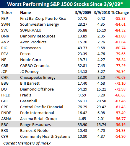
On the downside, just ten current members of the S&P 500 have lower share prices now than they did on 3/9/09, and a number of them are from the Energy sector. Chesapeake (CHK) has lost over 75% of its value, while Range Resources (RRC) is down by more than half. Newmont Mining (NEM) is just barely down since the bear market low, but when you consider that the S&P 500 has more than tripled, that’s still pretty pathetic. Ten years from now, a number of these companies will likely be out of business, but who knows, maybe one or two of them will end up on the list of biggest winners.
Bespoke Brunch Reads: 3/11/18
Welcome to Bespoke Brunch Reads — a linkfest of the favorite things we read over the past week. The links are mostly market related, but there are some other interesting subjects covered as well. We hope you enjoy the food for thought as a supplement to the research we provide you during the week.
Research
A Not-So-Great Recovery in Consumption: What is holding back household spending? by Aditya Aladangady Laura Feivseson (FEDS Notes)
Why hasn’t consumer spending been very strong to bounce back in this recovery? A quantitative investigation of the breakdown in the relationship between income, net worth, and government transfers with consumer spending. [Link]
The Moral Hazard of Lifesaving Innovations: Naloxone Access, Opioid Abuse, and Crime by Jennifer L. Doleac and Anita Mukherjee (SSRN)
We present this paper with the following cautionary notes: while the study’s design and data set are of good quality, they have not yet been peer-reviewed and they are contradictory to prior findings, meaning they should be handled carefully while not being dismissed, in our view. That said, if the findings hold up they are important. To summarize, the authors find that increasing availability of Naloxone leads to moral hazard (more risk-seeking behavior) and therefore the benefits of the drug’s availability is cancelled out. [Link]
Study: When CEOs’ Equity Is About to Vest, They Cut Investment to Boost the Stock Price by Alex Edmans (HBR)
This study finds that equity grants’ vesting period creates an incentive for short-termism around investment versus quarterly profitability. [Link; soft paywall]
Trumponomics
Men of Steel, unburdened by experience by Jamie Powell (FTAV)
A summary of what steel tariffs may mean, viewed through the lens of the last abortive effort at similar tariffs attempted during the Bush Administration. [Link; soft paywall]
Trump says American workers are hurt by immigration. But after ICE raided this Texas town, they never showed up. by Nick Miroff (WaPo)
This fascinating article gives an overview of the local economy of the Texas Panhandle. While some of that narrative deals with the Trump Administration’s anti-immigration policies, the scope of the story is much larger and worth reading regardless of the currency policy context. [Link; soft paywall]
How Trump’s Hudson Tunnel Feud Threatens the National Economy by Elise Young and Demetrios Pogaks (Bloomberg)
While this story is a tad dramatic, it does underscore some of the risks to changes in federal policy facing one of the biggest engines of wealth and output in the country. [Link]
Stock Bulls in Trump Country Are Freaking Out Their Brokers by Michelle Davis (Bloomberg)
A frankly terrifying review of market enthusiasm based on Presidential tweets. With the current bull market celebrating its 9th birthday today, relatively elevated valuations, and lots of priced-in optimism about tax benefits and global growth, the extreme sentiment described in this article is concerning to say the least. [Link]
Rigged Games
How Do Pundits Never Get It Wrong? Call a 40% Chance by Rolfe Winkler and Justin Lahart (WSJ)
A rundown of the popular prognostication play which pegs every significant shift at a 40% chance, inflating odds of a major change while carefully hedging towards the baseline outcome. [Link; paywall]
Under Armour Boss’s Alma Mater Wins Shady Hoops Game, Has Folks Wondering If Money Buys Free Throws by Dave McKenna (Deadspin)
The favored charity of Under Armour CEO Kevin Planck received what can only be described as an absurd series of favorable calls during their effort to beat another school’s squad. [Link]
Yale’s Swensen (Mostly) Apologizes for Harsh Words to Students by Janet Lorin (Bloomberg)
In a rather embarrassing turn of events for one of the most revered asset allocators in the world, Yale’s endowment manager got into a very public spat with the school’s newspaper this week. [Link; auto-playing video]
Education
You probably won’t remember this, but the “forgetting curve” theory explains why learning is hard by Nikhil Sonnad (Quartz)
In practice, the challenge of learning isn’t the intake of information, but its retention. This is such a persistent phenomenon, it’s even got a mathematical formula. [Link]
Startup Weekly
12 questions about the future of HQ trivia and its $15M fundraise by Josh Constine (TechCrunch)
All you need to know about HQ, the live trivia game which has driven rabid enthusiasm and huge numbers of persistent trivia players. [Link]
Wall Street Tech Spree: With Kensho Acquisition S&P Global Makes Largest A.I. Deal In History by Steven Bertoni and Antoine Gara (Forbes)
Prayer beads, cast iron tea pots, and Buddhas as decoration: Kensho is ramping up its algorithmic offerings after being purchased by S&P. [Link]
Long Reads
State of the Wine Industry 2018 by Rob McMillan (Silicon Valley Bank)
Chock full of charts and data, this rich, smooth report offers a wealth of tannic observations for the casual drinker and serious oenophile alike. [Link; 45 page PDF]
Jerry and Marge Go Large by Jason Fagone (HuffPo)
The story of a retired couple from Michigan and the numerical assault on the jackpots of lotteries in two different states. [Link]
National “Security”
Geek Squad staff ‘paid by FBI’ to flag illegal imagery (BBC)
A secret deal between Best Buy’s repair division and the FBI led to reporting of imagery related to child abuse; while the goal is laudable, such an arrangement very likely violates 4th Amendment rights and was found by a federal court to be insufficient evidence for a search warrant. [Link]
The Women Who Lived at CIA (CIA News & Information)
The story of a Quaker’s property that became enclosed in the campus of the CIA during the expansion of the new agency. [Link]
Fake News
It’s True: False News Spreads Faster and Wider. And Humans Are to Blame. by Steve Lohr (NYT)
In news that won’t surprise anyone that spends a lot of time on social media, fake stories are spread much more rapidly than real ones. [Link; soft paywall]
Meanwhile, In Canada
Over 500 Canadian doctors protest raises, say they’re being paid too much (yes, too much) by Catherine Clifford (CNBC)
“Who would want to cut their own pay?” is a fun hypothetical, and one which can now be answered: Canadian (specifically, Quebecois) doctors. [Link]
Maps
The Literal Translation of Country Names (Open Sea Dragon)
This amazing map presents the name of almost all countries with their original meaning. Spoiler: America’s is by far the least interesting. [Link]
Read Bespoke’s most actionable market research by starting a two-week free trial today! Get started here.
Have a great Sunday!
Best and Worst Performing S&P 1500 Stocks Of the Bull Market
In commemoration of the bull market’s 9th anniversary, we wanted to take a brief moment to highlight some of the equity market’s biggest winners and losers over the last nine years. We’ll start with the losers. Within the current universe of S&P 1500 stocks, a total of 60 names have share prices that are lower now than they were on the day the market bottomed. That’s a pretty amazing forgettable accomplishment when you think about it, and suggests that these companies — whether through their own fault or the fault of a larger macro trend — have had some major issues to contend with. The table below lists the 21 current members of the S&P 1500 that have seen their share prices decline 50% or more during the bull market. Most of these names are either small or mid-cap names that you may have never heard of, but a lot of companies formerly considered high-quality, like JC Penney (JCP) and Barnes and Noble (BKS), are also listed. The only two stocks listed that are in the S&P 500 (highlighted in grey) are Chesapeake Energy (CHK) and Range Resources (RRC).
Now to the winners. Since the bull market began, 206 current members of the S&P 1500 have been ten-baggers, meaning that investors who held them the entire time have made over ten times their money. Below we list the 25 best-performing stocks of the group. All 25 of the names listed have gained more than 3,000% (thirty times your money), and 12 are up by over 5,000%. The biggest winner, though, has been Patrick Industries (PATK). On March 9, 2009, PATK closed at 16 cents. Nine years later, its share price is $64.70 for a gain of 41,480.98%!!! Most people have never heard of PATK, but looking at the list there are a number of well-known S&P 500 companies as well. As shown, GGP, United Rentals (URI), and Netflix (NFLX) are all 50-baggers.
The Bespoke Report — 3/9/18
Nine years ago today, the US stock market bottomed after a crash of more than 50% from its 2007 highs. In hindsight, it’s quite easy to think of a 50%+ decline as a great buying opportunity, because that’s the name of the game, right? “Buy low, sell high.” In reality, though, emotions run highest when financial pain is at its greatest, and that’s why instead of going out and buying when there’s “blood in the streets,” most investors were still in liquidation mode at the lows, giving up on their holdings because they just couldn’t take it any more.
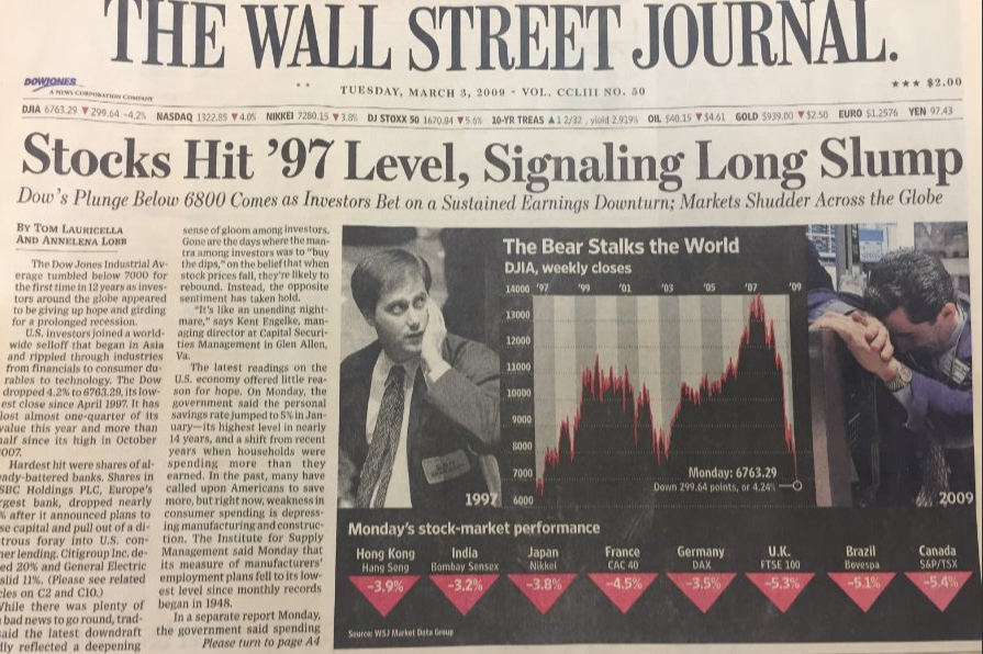
The headlines certainly weren’t helping. Below is the cover of the WSJ on March 3rd, 2009, less than a week from the ultimate lows. It certainly didn’t paint an optimistic picture. In reality, stepping in and buying at this point would have given investors the best entry points they’ll probably ever see in their lives.
We’ve been writing our weekly Bespoke Report newsletter for the last ten years, and for a trip down memory lane, today we want to share with you our Bespoke Report from March 9th, 2009 (the day of the Financial Crisis low). CLICK HERE TO VIEW. While we wouldn’t give ourselves full credit for “calling the bottom,” we did carefully make note of a few different indicators that were starting to turn bullish at the time.
Times are of course quite different nine years removed from one of the worst bear markets on record. But that doesn’t mean investors should get complacent. Remember, every new all-time high could end up being the start of a new bear market.
We continue to publish our weekly Bespoke Report newsletter, and it has grown into one of the most popular pieces of research on the street. If you’d like to read this week’s Bespoke Report, simply click the button below to start a two-week free trial to any one of our three premium membership levels. Have a great weekend!
The Closer: End of Week Charts — 3/9/18
Looking for deeper insight on global markets and economics? In tonight’s Closer sent to Bespoke clients, we recap weekly price action in major asset classes, update economic surprise index data for major economies, chart the weekly Commitment of Traders report from the CFTC, and provide our normal nightly update on ETF performance, volume and price movers, and the Bespoke Market Timing Model. This week, we’ve added a section that helps break down momentum in developed market foreign exchange crosses.

The Closer is one of our most popular reports, and you can sign up for a free trial below to see it!
See tonight’s Closer by starting a two-week free trial to Bespoke Institutional now!
S&P 500 Quick-View Chart Book
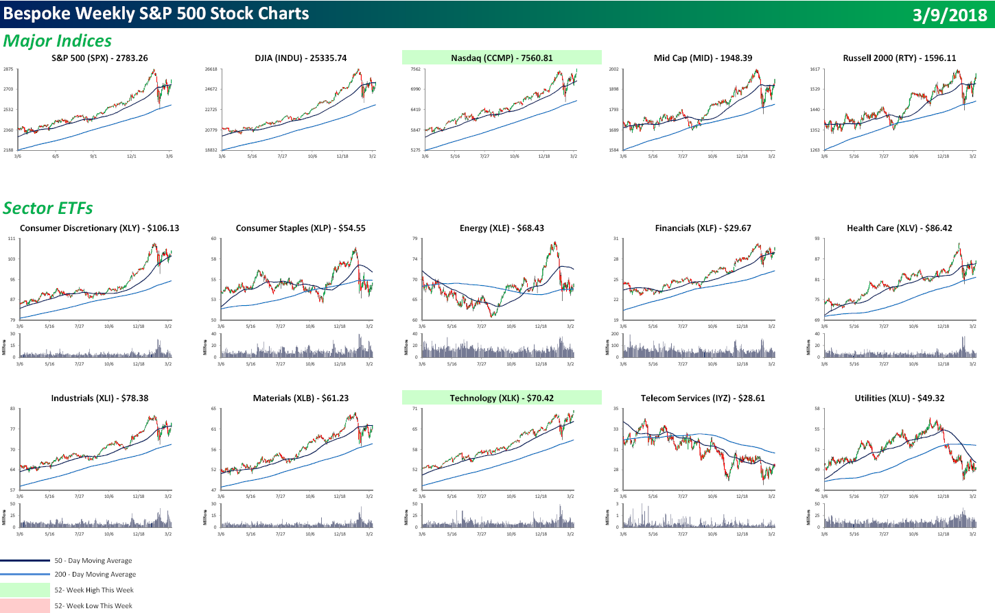
Each weekend as part of our Bespoke Premium and Institutional research service, clients receive our S&P 500 Quick-View Chart Book, which includes one-year price charts of every stock in the S&P 500. You can literally scan through this report in a matter of minutes or hours, but either way, you will come out ahead knowing which stocks, or groups of stocks, are leading and lagging the market. The report is a great resource for both traders and investors alike. Below we show the front page of this week’s report which contains price charts of the major averages and ten major sectors.
It was a strong finish to the week for US equities as all of the major averages finished at their highs of the day. The S&P 500 marginally took out its late February high, and believe it or not, the Nasdaq made a new all-time high. Of the ten major sectors shown, only Technology made a new high. Hmmm. The Nasdaq and Technology making new highs all by themselves? Sounds like the late 1990s. To view our entire S&P 500 Chart Book, sign up for a 14-day free trial to our Bespoke Premium research service.
This Time Is Different, Manufacturing Payrolls Edition
The monthly Employment Situation Report will always be one of our favorite releases not just because it’s so economically relevant, but because of how many interesting details there are in the data. This month, the BLS reported a very strong 31,000 net new jobs created in the manufacturing sector, with upward revisions bringing January’s total to 25,000. Over the last three months, 96,000 manufacturing jobs have been added, a far cry from the sector’s small job losses in 2016. The current ramp up in manufacturing jobs suggests that something is very different about this economic cycle.
Below we show the cumulative change in manufacturing jobs over the course of each economic expansion and contraction since the 1948 recession. Prior to the 1980s, there was a familiar pattern of huge additions to manufacturing payrolls in expansions, with big job losses in recessions. At the end of the 1970s, total payroll employment peaked out at 19.55mm. But cycles since have been different. While the mid-1990s expansion saw reasonably robust payrolls additions to US manufacturing, they were relatively small versus prior expansions. Then, in the 1990s cycle, cumulative manufacturing payrolls declined over the course of the full expansion, a result without precedent post-WW2. That was just a prelude, though. Over the full course of the 2000s expansion (6 years, from November 2001 to November 2007), manufacturing payrolls fell by more than 13% or more than 2 million jobs. That was in spite of robust expansions in aggregate employment, GDP, and stronger inflation. In fact more manufacturing jobs were lost in the 2000s expansion than any post-WW2 recession including 2007-2009! So why is this expansion different? Almost one million net new manufacturing jobs have been created, with a bit more than a quarter of those coming in the last 12 months. Manufacturing payrolls’ secular decline from 1990-2010 now appears to be over.
To see this, in the chart below we show the cumulative change in manufacturing payrolls in recessions (dark blue lines) and expansions (light blue lines). While total manufacturing payrolls are still a shadow of their 1970s self (35% below the record level from 1979), their solid gains this expansion is a big change from the last few cycles. The irony, of course, is that return to normal cyclical behavior comes just as US policymakers have shifted towards a policy that was more applicable in the last few cycles but no longer looks as necessary. We should note, of course, that US manufacturing output using monthly Fed data on real output is only 2.5% below 2008 record highs. In other words, while manufacturing payrolls went into secular decline, manufacturing output never did, as factories became much more productive.