Two-Day Bounce
With the S&P 500 now up more than 3% since the close on Thursday, we thought it was a good time to update our asset class performance matrix to see what else has been moving the most over the past two trading days. The matrix below highlights the total return of each ETF over the last two days, since the close on 1/26 (which was the date of the S&P’s last all-time high), and year-to-date.
As shown, the Nasdaq 100 (QQQ) is up the most of the US index ETFs with a gain of 3.48%, while the small-caps (IWM, IJH) are up less than 2%. Looking at US sectors, Tech (XLK), Financials (XLF), and Materials (XLB) are up the most, while Consumer Staples (XLP), Energy (XLE), and Telecom (IYZ) are up the least.
Outside of the US, India (PIN), Brazil (EWZ), and Russia (RSX) are up the most over the last two days, while China (ASHR) is actually down and Hong Kong (EWH) is only up 4 basis points. The emerging markets ETF (EEM) has also posted a nice gain of 3.5%.
Commodities (DBC) are down by 0.70% over this period, with oil (USO) and natural gas (UNG) leading the way lower. Treasury ETFs are down slightly as well during this two-day equity rally.
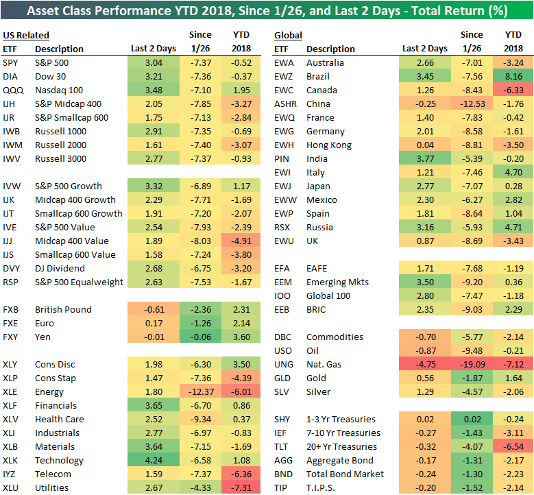
Chart of the Day: Fiscal Stimulus Arrives
S&P 500 Stock Seasonality: 2/12/18
While we don’t ever suggest that investors should base their trading solely on the calendar, there is evidence that the market and many stocks do indeed follow seasonal patterns. This makes our S&P 500 Stock Seasonality report a useful addition to every investor’s toolbox. Using the last ten years worth of price data, our Stock Seasonality report looks at the average returns for the S&P 500, its eleven sectors, and its 500 individual stocks. In the report, we highlight the five stocks in each sector that have historically been the best and worst performers over the next two weeks. For each stock, we also include information such as average returns, the percent of time each stock or sector is positive/outperforms the S&P 500, and its historical performance over the next two weeks for each of the last ten years. The Stock Seasonality report is published on a weekly basis on Mondays, and it is available to all Bespoke Premium and Bespoke Institutional subscribers.
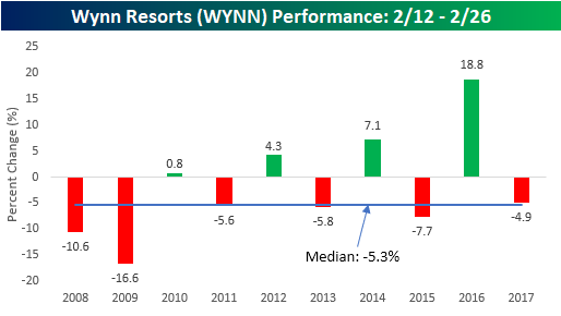
One stock that we wanted to highlight this week is Wynn Resorts (WYNN). As if things weren’t bad enough for the company given the controversies surrounding Steve Wynn, the stock is also now entering what has historically been one of the weakest times of the year for the stock. As shown in the chart below, WYNN has traded lower during the upcoming two-week period in six of the last ten years for a median decline of 5.3%. That makes it the worst performing stock for the upcoming two-week period in the S&P 500.
For active traders, our Stock Seasonality report is an excellent tool to help keep track of the best and worst times of year for the overall market, sectors, and individual stocks. To see the report and which two stocks have performed even better than EA in the upcoming two-week period, sign up for a monthly Bespoke Premium membership now!
Bespoke Brunch Reads: 2/11/18
Welcome to Bespoke Brunch Reads — a linkfest of the favorite things we read over the past week. The links are mostly market related, but there are some other interesting subjects covered as well. We hope you enjoy the food for thought as a supplement to the research we provide you during the week.
Investing
Fidelity Reports Web Issues After Robo-Adviser Sites Crash by Brandon Kochkodin, Suzanne Woolley, and Ben Steverman (Bloomberg)
As equity markets plunged, technology platforms that have sought to create a new, more passive approach to investing saw crashes during the equity market decline Monday. [Link; auto-playing video]
Banks Cheer Return of Wild Markets by Max Colchester, Jenny Strasburg and Liz Hoffman (WSJ)
Low volatility meant low trading volumes for banks’ fixed income, currency, and commodities desks. But equity market declines this week have analysts anticipating good things for those parts of the financial system. [Link; paywall]
I somehow made $110k this morning and I’m still not totally sure how by flopsie123 (r/wallstreetbets)
A Reddit user was short a put spread, had 863 of 1000 puts on one leg exercised against him. Despite a $50,000 account the broker allowed $23mm worth of SPY shares to end up in his long account. That’s quite a margin loan! Remarkably, the investor managed to come out well ahead. [Link]
Crypto
As Bitcoin Bubble Loses Air, Frauds and Flaws Rise to Surface by Nathaniel Popper (NYT)
An accounting of recent frauds, schemes, and hacks related to the retreat in crypto prices and the poor practices they have revealed. [Link; soft paywall]
China to stamp out cryptocurrency trading completely with ban on foreign platforms by Xie Yu (SCMP)
After taking earlier steps to curtail access to cryptocurrency access by closing domestic exchanges among other measures, China has now moved to block all websites related to crypto trading. [Link]
Tech
No telecommuting allowed: Why is Google investing billions of dollars in office buildings? by Tom Foremski (ZDnet)
Despite a suite of products and a culture that would seem to support remote work, Google has an absolutely voracious appetite for physical real estate and office space. [Link]
Twitter Made a Small Change to How It Shows Retweets. That’s Bad News for Bots. by April Glaser (Slate)
Embedded tweets that are shown on websites outside of the social network will now refer to how many people are discussing a tweet, rather than including retweet counts. [Link]
Space Cowboys
Falcon Heavy, in a Roar of Thunder, Carries SpaceX’s Ambition Into Orbit by Kenneth Chang (NYT)
A glowing review of the first test flight of SpaceX’s Falcon Heavy launch system, the new and powerful multistage rocket designed to lift much larger satellites than the current Falcon 9 workhorse. [Link; soft paywall/auto-playing video]
This Mutant Crayfish Clones Itself, and It’s Taking Over Europe by Carl Zimmer (NYT)
A single mutation in a crayfish in Europe about 20 years ago let the creature clone itself, creating vast waves of progeny which have spread across the entire world. [Link; soft paywall]
EHang’s driverless MEGADRONE carries passengers around China at 80mph in its first ever test flights by Phoebe West (Daily Mail)
A Chinese company has run thousands of tests flights with a two passenger aerial vehicle, which can fly to, pick up, and drop off passengers all without a human driver. [Link]
Bonds
Someone on the internet was wrong, $1tn of Treasuries edition by Alexandra Scaggs (FTAV)
Scaggs does some excellent mythbusting about US federal debt dynamics and mechanics as well as critiquing reports of forecasts portrayed as facts. [Link; registration required]
Trade
China to Probe U.S. Sorghum Subsidies (Bloomberg)
Following new Trump administration tariffs on solar panels and washing machines, China has announced a probe of subsidies paid to US sorghum exporters; describing this dust-up as a trade war is premature, but it’s got some similarities. [Link]
Economic Research
New Perspectives on the Decline of U.S. Manufacturing Employment by Teresa Fort, Justin Pierce, and Peter Schott (NBER/Fed Working Papers Preliminary Draft)
Using data from the Census, the authors introduce new dynamics relating to US manufacturing employment and import substitution. They find non-manufacturing workers hired by manufacturing firms largely offset the manufacturing employment decline until 2000; plant closures were offset in large part by new establishments containing high skill professional workers and other non-manufacturing jobs. [Link; 29 page PDF]
Have a great Sunday!
The Bespoke Report — 2/9/18
The Closer: End of Week Charts — 2/9/18
Looking for deeper insight on global markets and economics? In tonight’s Closer sent to Bespoke clients, we recap weekly price action in major asset classes, update economic surprise index data for major economies, chart the weekly Commitment of Traders report from the CFTC, and provide our normal nightly update on ETF performance, volume and price movers, and the Bespoke Market Timing Model. This week, we’ve added a section that helps break down momentum in developed market foreign exchange crosses.

The Closer is one of our most popular reports, and you can sign up for a free trial below to see it!
See tonight’s Closer by starting a two-week free trial to Bespoke Institutional now!
S&P 500 Quick-View Chart Book: 2/9/18
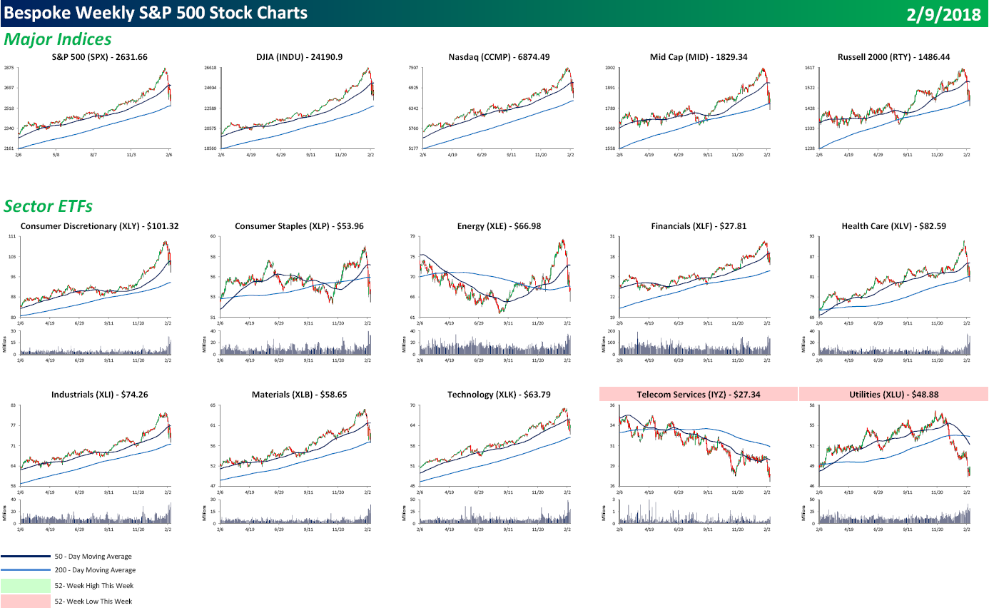
Each weekend as part of our Bespoke Premium and Institutional research service, clients receive our S&P 500 Quick-View Chart Book, which includes one-year price charts of every stock in the S&P 500. You can literally scan through this report in a matter of minutes or hours, but either way, you will come out ahead knowing which stocks, or groups of stocks, are leading and lagging the market. The report is a great resource for both traders and investors alike. Below we show the front page of this week’s report which contains price charts of the major averages and ten major sectors.
Looking through the Chart Book this week, there are a number of broken looking charts, as all the major averages and sectors are below their 50-DMA. Utilities have been especially weak as the sector hit a 52-week low. In terms of individual stocks, 62 members of the S&P 500 hit 52-week lows this week, and they were spread out across just about every sector. In fact, the only two sectors where not a single stock hit a 52-week low were Technology and Telecom Services (which has just three stocks in it). Real Estate was one of the weakest sectors with 19 different components of that sector hitting new lows. It just hasn’t been a good year for interest rate sensitive stocks.
To view our entire S&P 500 Chart Book, sign up for a 14-day free trial to our Bespoke Premium research service.
B.I.G. Tips – You Don’t See This Very Often
The chart below comes from the second page of our Morning Lineup report, and it shows the S&P 500’s price relative to its 50-day moving average (DMA) expressed in standard deviations. When the line is in the white areas, the S&P 500 is trading at neutral levels. Readings in the light red (or light green) areas are considered overbought (or oversold), while readings in the dark red (or dark green) are considered extremely overbought (or oversold). Yesterday, we tweeted the chart out calling it El Capitan after the rock formation in Yosemite National Park, but a more apt Yosemite analogy after today may be Yosemite Falls.

The types of move that we have seen over the last two weeks in the S&P 500’s trading range aren’t seen too often. In the span of two weeks, the S&P 500 has gone from an extreme overbought reading to an extreme oversold reading (as of Friday afternoon). While that could change depending on where the S&P 500 settles at the end of the day, at the very least, we have seen the S&P 500 shift from extremely overbought as of 1/26 to an oversold level as of yesterday.
What makes the move that we have seen over the last two weeks even more dramatic is the fact that leading up to it there had been only two other trading days over the last year where the S&P 500 even traded at oversold levels in the past year! Whether you want to call it a slap in the face, a reality check, or something else, investors have been quickly reminded of the fact that equities move in both directions.
Following this move where the rubber band has gone from being stretched in one direction to another, we wondered whether it tends to snap back again or just snap. To that end, we just published a report looking at prior periods in the S&P 500’s history where the index has gone from trading at extreme overbought levels to oversold or extreme oversold levels in the span of two weeks or less.
If you’re interested in the report, you can read it by signing up for a Bespoke Premium membership now!
S&P 500 Corrections
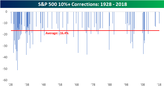
After nearly two years without one, the S&P 500 officially entered correction territory yesterday, falling 10.2% from its 1/26/18 all-time closing high. The current correction represents the 96th decline of 10%+ from a closing high that followed a gain of at least 10%. The chart below shows the magnitude of every prior correction for the S&P 500 since 1928. Not including the current period, the median decline for the S&P 500 in the 95 prior corrections was a decline of 16.4% over the course of 64 days. Keep in mind, though, that these are median levels. There have been a number of corrections (13) that saw declines of less than 11%, while several saw deeper declines of more than 20%. In terms of length, prior corrections have also been all over the map. Some have lasted as little as three days, while others have stretched on for well over a year.
Unfortunately, there is no hard and fast rule when it comes to corrections, and that’s what can make them so terrifying when you go through one. You never know when it will end. Throughout history, market corrections have ‘typically’ occurred a little more than once per year. As mentioned above, there have been 96 corrections since 1928, but if you look at their distribution over time, a good deal of them were clustered around the Great Depression. If we look just at the post-WWII period, there have been 55 corrections in the span of 73 years, reducing their frequency to once about every 16-17 months. In any event, the market was still overdue for a correction heading into the current one, but maybe not by as much as it seemed on the surface.
The Closer — A Correction Comes — 2/8/18
Log-in here if you’re a member with access to the Closer.
Looking for deeper insight on markets? In tonight’s Closer sent to Bespoke Institutional clients, we make the case that downside for equities is limited from current levels, based on technicals, the economic back drop, and historical precedent, with each reviewed in turn.

See today’s post-market Closer and everything else Bespoke publishes by starting a 14-day free trial to Bespoke Institutional today!