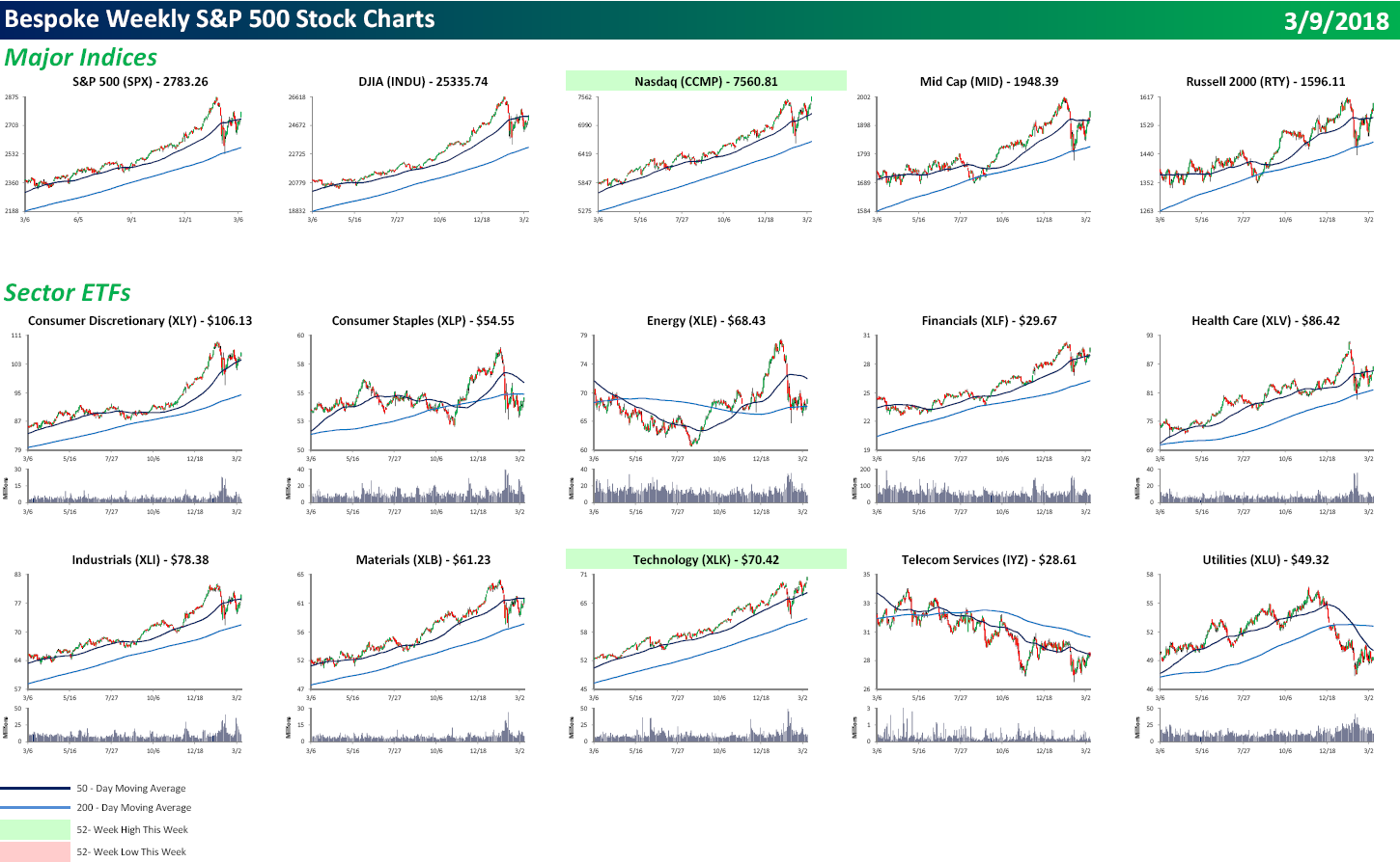
S&P 500 Quick-View Chart Book
Each weekend as part of our Bespoke Premium and Institutional research service, clients receive our S&P 500 Quick-View Chart Book, which includes one-year price charts of every stock in the S&P 500. You can literally scan through this report in a matter of minutes or hours, but either way, you will come out ahead knowing which stocks, or groups of stocks, are leading and lagging the market. The report is a great resource for both traders and investors alike. Below we show the front page of this week’s report which contains price charts of the major averages and ten major sectors.
It was a strong finish to the week for US equities as all of the major averages finished at their highs of the day. The S&P 500 marginally took out its late February high, and believe it or not, the Nasdaq made a new all-time high. Of the ten major sectors shown, only Technology made a new high. Hmmm. The Nasdaq and Technology making new highs all by themselves? Sounds like the late 1990s. To view our entire S&P 500 Chart Book, sign up for a 14-day free trial to our Bespoke Premium research service.
This Time Is Different, Manufacturing Payrolls Edition
The monthly Employment Situation Report will always be one of our favorite releases not just because it’s so economically relevant, but because of how many interesting details there are in the data. This month, the BLS reported a very strong 31,000 net new jobs created in the manufacturing sector, with upward revisions bringing January’s total to 25,000. Over the last three months, 96,000 manufacturing jobs have been added, a far cry from the sector’s small job losses in 2016. The current ramp up in manufacturing jobs suggests that something is very different about this economic cycle.
Below we show the cumulative change in manufacturing jobs over the course of each economic expansion and contraction since the 1948 recession. Prior to the 1980s, there was a familiar pattern of huge additions to manufacturing payrolls in expansions, with big job losses in recessions. At the end of the 1970s, total payroll employment peaked out at 19.55mm. But cycles since have been different. While the mid-1990s expansion saw reasonably robust payrolls additions to US manufacturing, they were relatively small versus prior expansions. Then, in the 1990s cycle, cumulative manufacturing payrolls declined over the course of the full expansion, a result without precedent post-WW2. That was just a prelude, though. Over the full course of the 2000s expansion (6 years, from November 2001 to November 2007), manufacturing payrolls fell by more than 13% or more than 2 million jobs. That was in spite of robust expansions in aggregate employment, GDP, and stronger inflation. In fact more manufacturing jobs were lost in the 2000s expansion than any post-WW2 recession including 2007-2009! So why is this expansion different? Almost one million net new manufacturing jobs have been created, with a bit more than a quarter of those coming in the last 12 months. Manufacturing payrolls’ secular decline from 1990-2010 now appears to be over.
To see this, in the chart below we show the cumulative change in manufacturing payrolls in recessions (dark blue lines) and expansions (light blue lines). While total manufacturing payrolls are still a shadow of their 1970s self (35% below the record level from 1979), their solid gains this expansion is a big change from the last few cycles. The irony, of course, is that return to normal cyclical behavior comes just as US policymakers have shifted towards a policy that was more applicable in the last few cycles but no longer looks as necessary. We should note, of course, that US manufacturing output using monthly Fed data on real output is only 2.5% below 2008 record highs. In other words, while manufacturing payrolls went into secular decline, manufacturing output never did, as factories became much more productive.
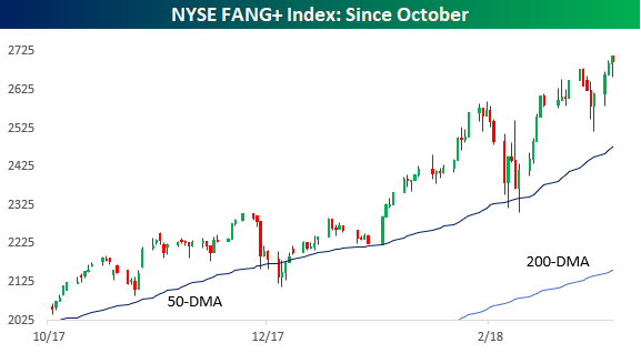
Chart of the Day: Big Beat in Non-Farm Payrolls
The Closer — County Employment, National Debt — 3/8/18
Log-in here if you’re a member with access to the Closer.
Looking for deeper insight on markets? In tonight’s Closer sent to Bespoke Institutional clients, we review the Fed’s Flow of Funds report and quarterly data on county business establishments, employment, and wages.

See today’s post-market Closer and everything else Bespoke publishes by starting a 14-day free trial to Bespoke Institutional today!
Bespoke’s Sector Snapshot — 3/8/18
We’ve just released our weekly Sector Snapshot report (see a sample here) for Bespoke Premium and Bespoke Institutional members. Please log-in here to view the report if you’re already a member. If you’re not yet a subscriber and would like to see the report, please start a two-week free trial to Bespoke Premium now.
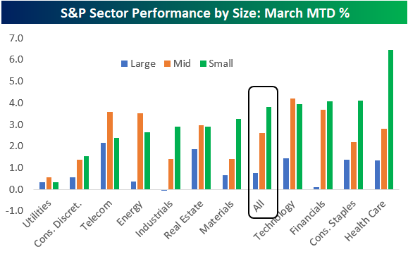
Below is one of the many charts included in this week’s Sector Snapshot, which highlights the month-to-date percentage change of S&P sectors based on market cap. As you can see, small caps have significantly outperformed large caps so far this month.
To see our full Sector Snapshot with additional commentary plus six pages of charts that include analysis of valuations, breadth, technicals, and relative strength, start a two-week free trial to our Bespoke Premium package now. Here’s a breakdown of the products you’ll receive.
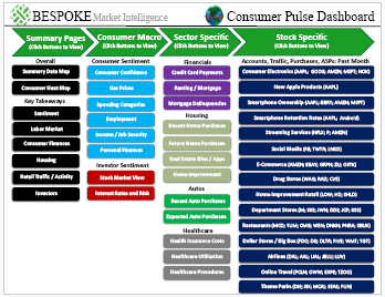
Bespoke’s Consumer Pulse Report — March 2018
Bespoke’s Consumer Pulse Report is an analysis of a huge consumer survey that we run each month. Our goal with this survey is to track trends across the economic and financial landscape in the US. Using the results from our proprietary monthly survey, we dissect and analyze all of the data and publish the Consumer Pulse Report, which we sell access to on a subscription basis. Sign up for a 30-day free trial to our Bespoke Consumer Pulse subscription service. With a trial, you’ll get coverage of consumer electronics, social media, streaming media, retail, autos, and much more. The report also has numerous proprietary US economic data points that are extremely timely and useful for investors.
We’ve just released our most recent monthly report to Pulse subscribers, and the results from this month’s survey showed noticeable weakness on both a month-over-month and year-over-year basis. Investor sentiment towards the stock market also took a big dip, which is unsurprising given that the S&P experienced its first 10% correction in two years in February. Start a 30-day free trial for a full breakdown of all of our proprietary Pulse economic indicators.
B.I.G. Tips – February Employment Report Preview
Heading into Friday’s Non Farm Payrolls (NFP) report for February, economists are expecting an increase in payrolls of 205K, which would be a slight increase from January’s reading of 200K. In the private sector, economists are also expecting the same increase of 205K. With these increases, the unemployment rate is expected to fall to 4.0%. The big area of focus, however, will come from average hourly earnings. You may recall that in last month’s report, we saw a larger than expected increase, and that helped to exacerbate what was at the time a modest sell-off in equity prices. With that in mind, look for any signs of strength in wages to have an adverse impact on stock prices.

Ahead of the report, we just published our eleven-page monthly preview of the February jobs report. This report contains a ton of analysis related to how the equity market has historically reacted to the monthly jobs report, as well as how secondary employment-related indicators we track looked in February. We also include a breakdown of how the initial reading for February typically comes in relative to expectations and how that ranks versus other months.
One topic we cover in each month’s report is the S&P 500 stocks that do best and worst from the open to close on the day of the employment report based on whether or not the report comes in stronger or weaker than expected. In other words, which stocks should you buy, and which should you avoid? The table below highlights the best-performing stocks in the S&P 500 from the open to close on days when the Non-Farm Payrolls report has been weaker than expected over the last two years.
When the NFP report is weaker than expected, all of the 25 best-performing stocks in the S&P 500 have seen average open-close gains of more than 1%. NRG Energy (NRG) is the best performing stock in the S&P 500 with an average gain of 1.9% and gains 85% of the time. In terms of consistency, it doesn’t get any better than Sysco (SYY) which has been up from the open to close every time the NFP report has been weaker than expected.
For anyone with more than a passing interest in how equities are impacted by economic data, this report is a must-read. To see the report, sign up for a monthly Bespoke Premium membership now!

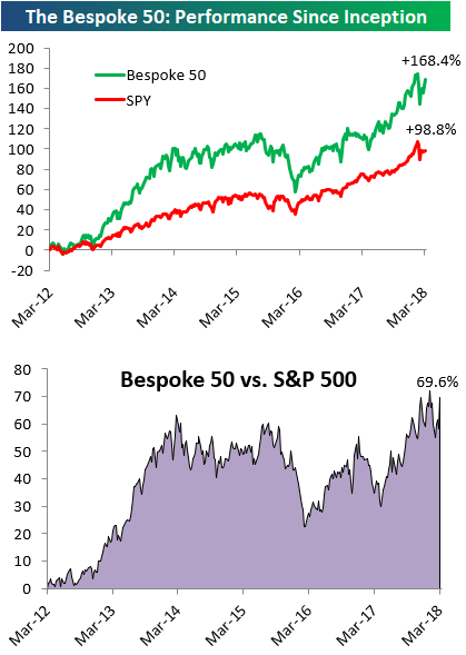
the Bespoke 50 — 3/8/18
Every Thursday, Bespoke publishes its “Bespoke 50” list of top growth stocks in the Russell 3,000. Our “Bespoke 50” portfolio is made up of the 50 stocks that fit a proprietary growth screen that we created a number of years ago. Since inception in early 2012, the “Bespoke 50” has beaten the S&P 500 by 69.6 percentage points. Through today, the “Bespoke 50” is up 168.4% since inception versus the S&P 500’s gain of 98.8%. Always remember, though, that past performance is no guarantee of future returns.
To view our “Bespoke 50” list of top growth stocks, click the button below and start a trial to either Bespoke Premium or Bespoke Institutional.
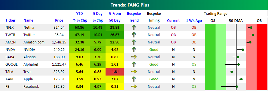
FANG+
One of the first lessons of any marketing class is that adding a “+” next to any product automatically infers that the new version is a better version of the old one. So, while FANG was an adequate group of stocks for investors looking to get their fix of the most turbo-charged growth stocks, like every trend or fad, eventually the idea gets stale and consumers need more. So what was a financial marketer to do? Why not take FANG and ad a plus sign!
Enter FANG+. While FANG was simply a combination of Facebook (FB), Amazon (AMZN), Netflix (NFLX), and Alphabet (GOOGL), FANG+ takes those four names and adds in other favorites of the action-seeking trading community like Apple (AAPL), Alibaba (BABA), Baidu (BIDU), NVIDIA (NVDA), Tesla (TSLA), and Twitter (TWTR). Talk about a hyper-growth investor’s dream! Taking a look at the performance of FANG+ since its inception late last year, the index has been on quite a tear with a gain of over 34% since late October.
We ran the members of FANG+ through our Trend Analyzer tool– which is available to Premium and Institutional members — in order to see how these names stack up and how they’ve performed so far this year. Needless to say, it’s been quite a run. In spite of the fact that the broader market is up just slightly on the year, every stock in the FANG+ index is outperforming the S&P 500, and four of the stocks are outperforming by a magnitude of more than 10 times! Leading the way, Netflix (NFLX) is up 64%, Twitter (TWTR) is up 47%, and Amazon.com (AMZN) is up over 30%. Given these moves, it should come as no surprise that all three stocks are overbought. The remaining stocks in the index are all in neutral territory, and only one (TSLA) is below its 50-day moving average (DMA). NVDA, GOOGL, and AAPL even have good timing scores. Shares of Facebook (FB) and Apple (AAPL) are both up less than 5%, though, so these two better get their act together!