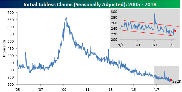
Jobless Claims Little Changed
Jobless claims dropped a “whopping” 1K in the latest week and missed expectations by a margin of just 2K. In other words, little changed in the overall trend of claims. For the week, first-time claims came in at 232K. This is the 28th straight week that claims have been at or below 250K, and extends the record of consecutive weeks below 300K to 163.
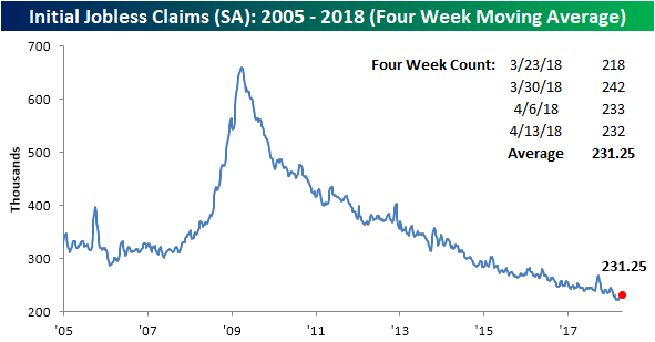
The four-week average for claims rose by just over 1K this week to 231.25K, and remains within 10K of the multi-decade low of 222.75K from early March.
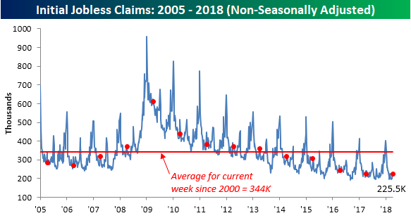
At 225.5K, non-seasonally adjusted claims haven’t been this low in the current week of the calendar since 1973. Going back to 2000, the average for the current week of the year has been 344.3K, so this week’s level is nearly 120K below that.
A Slight Beat for the Philly Fed
The Philadelphia Fed’s monthly report on manufacturing came in slightly better than expected for April. While economists were expecting a slight decline to 21.0 from last month’s reading of 22.3, the actual reading showed a slight increase to 23.2. From a bigger picture perspective, the headline report has been positive for 23 straight months now, which is the longest streak since August 2015. Even more impressive, though, is the fact that the last 17 of those monthly reading have been above 20, and that’s tied with the period ending in June 1984 for the longest streak in the history of the survey.

Looking at the individual components of this month’s report, there were some sizable declines in New Orders, Shipments, Unfilled Orders, and Inventories.
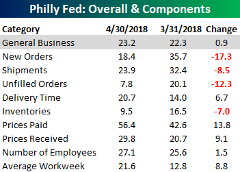
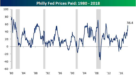
On the upside, Prices Paid had its largest one month increase since November 2016 and rose to its highest level since March 2011.
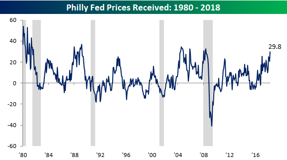
Prices Received also had a relatively large increase and is now at its highest level since early 2008!
But it wasn’t just the increases in these two components pointing to inflationary implications. Delivery Times also hit a record high, which suggests demand is outstripping supply.

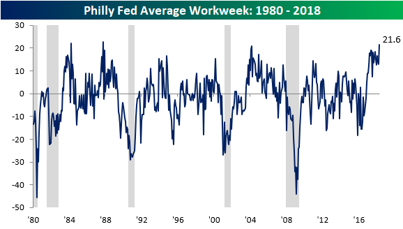
Also, Average Workweek increased to 21.6, which is the highest level since October 1987! While extending workweeks can work temporarily, eventually, that should lead to more hiring and higher costs.
Individual Investor Whiplash
With all the volatility in the equity market lately, it is only natural that investors are having a hard time figuring out what to do. That confusion is clearly starting to show up in surveys of sentiment like the weekly AAII poll. In last week’s update on sentiment, we noted that the percentage of bullish investors had dropped all the way down to 26%, which was the lowest level since last August. Well, in this week’s survey sentiment spiked back up to 37.8%, for an increase of 11.7 percentage points. That’s the largest one week increase since last September. Isn’t it amazing what a few up days for equities can do to sentiment? That said, we would note that these sort of sentiment shifts based solely on the day to day moves of the market isn’t particularly healthy.
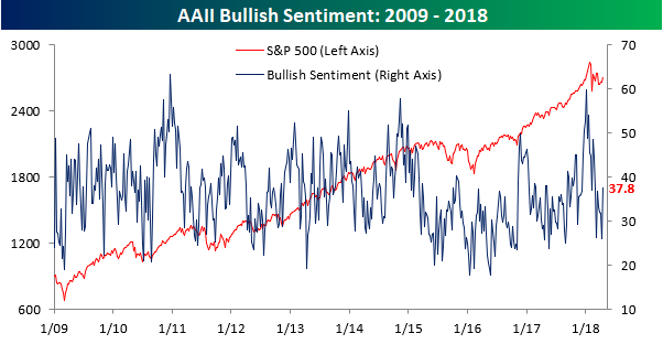
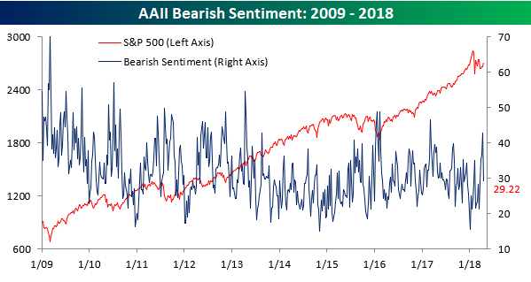
With the big spike higher in bullish sentiment, bearish sentiment tanked, falling from 42.75% down to 29.22%. Besides a similar one week decline following the initial bounce in sentiment in February, the last time we saw a larger one-week decline in bullish sentiment was back in the first week of 2012!
the Bespoke 50 — 4/19/18
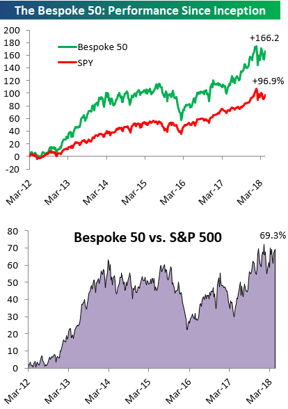
Every Thursday, Bespoke publishes its “Bespoke 50” list of top growth stocks in the Russell 3,000. Our “Bespoke 50” portfolio is made up of the 50 stocks that fit a proprietary growth screen that we created a number of years ago. Since inception in early 2012, the “Bespoke 50” has beaten the S&P 500 by 69.3 percentage points. Through today, the “Bespoke 50” is up 166.2% since inception versus the S&P 500’s gain of 96.9%. Always remember, though, that past performance is no guarantee of future returns.
To view our “Bespoke 50” list of top growth stocks, click the button below and start a trial to either Bespoke Premium or Bespoke Institutional.
The Closer — BoC, 10s Cheap, Sector Vol & Spread, Energy Update — 4/18/18
Log-in here if you’re a member with access to the Closer.
Looking for deeper insight on markets? In tonight’s Closer sent to Bespoke Institutional clients, we recap the BoC decision today, review why ten year yields are excessively high, and recap this week’s EIA data and energy price action.

See today’s post-market Closer and everything else Bespoke publishes by starting a 14-day free trial to Bespoke Institutional today!
Who Said Words Can’t Hurt?
What if we told you that just when the Housing Bubble was beginning to unravel over a decade ago and the majority of Wall Street brokerage firms would face insolvency as a result of the all the toxic debt they had on their books, that there was one firm that had the foresight to not only avoid the bad debts but to take the other side of Wall Street’s bets? Clearly, one would assume that the stock of this company would not only have been a good investment relative to its peers but to the broader market as well. Well, that hasn’t exactly been the case. The stock we are talking about is Goldman Sachs (GS).
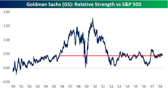
While Goldman was celebrated for years for having avoided the Housing Bubble and claiming that they didn’t even want to be part of the government bailout of the financial sector, the long-run performance of its stock has not been nearly as good as one would expect. The first chart below shows the relative strength of the stock versus the S&P 500 Financial sector going back to the start of 2000. When the line is rising, it indicates that GS is outperforming, while a falling line indicates that the stock is underperforming. From the time of its IPO in late 1999 through the middle part of the following decade, shares of Goldman performed pretty much in line with the Financial sector and even lagged modestly. Beginning in 2005, though, the stock’s fortunes turned, and Goldman became one of the sector’s leaders. There was a period of volatility in its relative strength in late 2008, but then the stock really pulled ahead in late 2008 through early 2009 as the market recognized the company’s adeptness in avoiding the subprime crisis. Goldman was now considered “the smartest firm on the street.”
Ever since the middle of 2009, though, Goldman has generally been a market laggard, erasing much of its outperformance from the Financial Crisis. In fact, going all the way back to December 2007, the price of Goldman and the Financial sector as a whole have had nearly identical returns in terms of price. While Goldman is down 10.1% since the start of December 2007, the S&P 500 Financial sector is down 9.8%. In addition, of the current members of the S&P 500 Financial sector, 41 stocks have outperformed Goldman since the start of December 2007 compared to just 18 that have underperformed. Granted, there’s a bit of survivorship bias here as companies like Lehman and others went under, but it does illustrate how Goldman has not been a leader of the sector over the last decade.
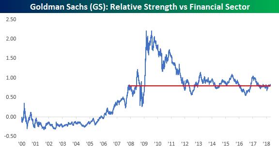
Relative to the S&P 500, it’s a similar story. Outside of a brief period right after Lehman went under, Goldman outperformed the S&P 500 by a wide margin during and through the Financial Crisis. That outperformance peaked in the late Summer of 2009, and ever since then, the stock has given up most of its outperformance. Going back to the Summer of 2005, nearly 13 years ago, Goldman and the S&P 500 are both up 123% in terms of price. In other words, the stock hasn’t generated any alpha during that span.
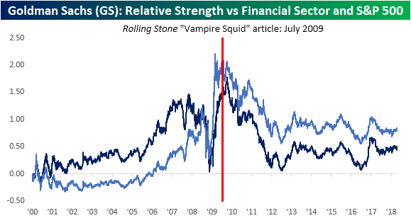
So what happened? There are a number of factors behind the decline in Goldman, but one worth noting here can be summed up in two words – Matt Taibbi. Just about everyone remembers back in July 2009, when Taibbi wrote a scathing article for Rolling Stone that referred to Goldman as the “great vampire squid.” The article went on to accuse Goldman and its alumni of feeding all of the major bubbles throughout US history only to profit with taxpayer money once the bubbles burst. Whether you agree with the article or not, it was a public relations nightmare for the company. The media and the general public were looking for a scapegoat, and who better to blame than the company that actually profited from the crisis?
Looking again at the relative strength chart of Goldman Sachs versus the Financial sector and the S&P 500, it’s hard not to argue that the “Vampire Squid” article didn’t have an impact on the public’s perception of Goldman and ultimately its stock price. While the Rolling Stone story wasn’t published exactly when Goldman’s relative strength peaked versus the Financial sector and the S&P 500, it preceded the peak, not by a matter of months, but more like a matter of weeks.
Getting back to the present, can you think of another super successful company that has recently become a scapegoat for the public’s uneasiness over privacy? We’ll give you a hint: booster seats.
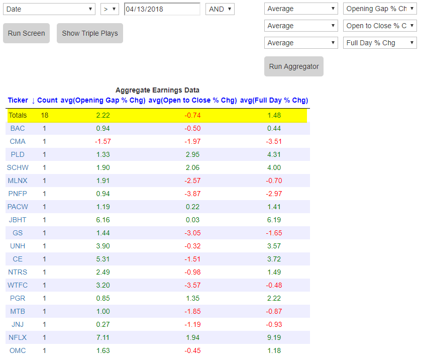
Earnings Reports See Initial Buying, Then Some Selling
Heading into today, stocks that have reported earnings this week have seen their share prices initially react positively to the news. Using our Earnings Screener, below we show the 18 stocks that had reported earnings this week through yesterday morning. The first column next to the stock ticker shows the amount that the stock gapped up or down at the first open of trading following its earnings report. As you can see, 17 of 18 stocks have gapped up in reaction to their earnings reports. On average, the gap up for these 18 stocks has been +2.22%.
Things look a little different from the open to close of trading, though. In fact, 12 of the 18 stocks that have reported earnings have traded lower from the open to the close on their earnings reaction days, for an average open to close decline of 0.74%.
The trend is clear (although the sample size is relatively small). So far, we’re seeing a very positive initial stock price reaction to earnings, but then selling has dominated the trading day.
Start a two-week free trial to Bespoke Institutional to use our Earnings Screener now.
Fixed Income Weekly – 4/18/18
Searching for ways to better understand the fixed income space or looking for actionable ideals in this asset class? Bespoke’s Fixed Income Weekly provides an update on rates and credit every Wednesday. We start off with a fresh piece of analysis driven by what’s in the headlines or driving the market in a given week. We then provide charts of how US Treasury futures and rates are trading, before moving on to a summary of recent fixed income ETF performance, short-term interest rates including money market funds, and a trade idea. We summarize changes and recent developments for a variety of yield curves (UST, bund, Eurodollar, US breakeven inflation and Bespoke’s Global Yield Curve) before finishing with a review of recent UST yield curve changes, spread changes for major credit products and international bonds, and 1 year return profiles for a cross section of the fixed income world.
In this week’s note we focus on the rental yield implied by US Census estimates of county-level median home value and rental outlays.

Our Fixed Income Weekly helps investors stay on top of fixed income markets and gain new perspective on the developments in interest rates. You can sign up for a Bespoke research trial below to see this week’s report and everything else Bespoke publishes free for the next two weeks!
Click here and start a 14-day free trial to Bespoke Institutional to see our newest Fixed Income Weekly now!
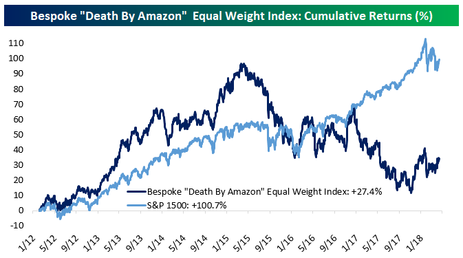
Bespoke’s Death By Amazon Index Continues To Slide
Yesterday we published an update to our Death By Amazon index, which captures the performance of stocks which we judge as exposed to the rise of Amazon: traditional retailers, without their own brands, or without a focus on e-commerce or a dedication to specialty products that Amazon does not focus on. We’ve maintained these indices since 2014, and they haven’t always lagged badly. As shown in the chart below, the equal-weight version of the index actually outperformed the S&P 1500 dramatically until early 2015. Since then, the stocks have really lagged. Late in 2017 the index was flat versus where it stood almost 5 years earlier! While it has rebounded a bit over the last few months, the performance gap versus the broad S&P 1500 is still huge.
More recently, we’ve also introduced an Amazon Survivors index. These stocks are retail still, but they have attributes which might help them resist the competition of the e-commerce giant: strong brand names they control, e-commerce focus, or a specialty product line where Amazon doesn’t compete (for instance, auto parts). Since inception, this index has outperformed our Death By Amazon index quite dramatically.
To see our most recent Death By Amazon report, which includes a list of the stocks that make up both the Death By Amazon and Amazon Survivors indices, you have to be a Bespoke Premium member or higher. You can see the report now with a two-week free trial to Bespoke Premium.