Empire Manufacturing Breaks Four-Month Losing Streak
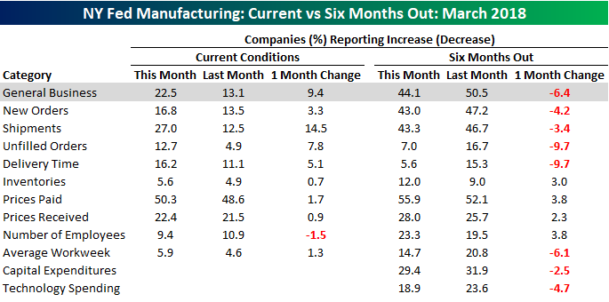
After four straight months of declines, the General Business Conditions for the Empire Manufacturing report came in better than expected this month. While economists were forecasting a slight increase to 15.0 from last month’s level of 13.1, the actual reading came in at 22.5, which is the highest since last October. Over the last few months, even as the General Business index declined, the index for expectations six months out continued to improve. In this month’s report, we saw a bit of a reset as the current conditions index bounced, and the expectations index pulled back.

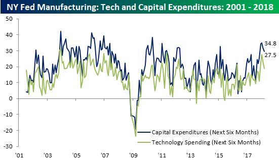
Plans for Technology Spending and Capital Expenditures both pulled back for the second straight month after a torrid run to multi-year highs.
Looking at the internals of the report, the trend we mentioned above where current conditions improved and expectations declined is also evident. As far as Current Conditions are concerned, “Number of Employees” was the only category that declined, while most of the indices regarding expectations declined. A couple of other highlights worth pointing out in the internals of the report are that the index of current Shipments rose to its highest level since October 2009 and Delivery Times hit the highest level in the history of the survey (dating back to 2001). Finally, current levels of Prices Paid and Prices Received were the highest since early 2012.
Jobless Claims Continue Their Downtrend
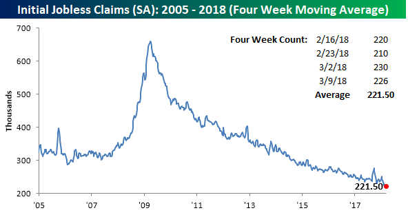
Whenever you’re talking markets and charts, the last thing a bull wants to hear is the word downtrend. That is unless it relates to weekly Jobless Claims, and in the case of this indicator, they remain stuck in one of the most prolonged downtrends any of us will ever see. In this week’s report, first-time claims came in at 226K compared to expectations for 228K and last week’s level of 230K. This is the 9th straight week that claims have been below 250K, which is the longest streak since 1973. More importantly, though, it is the 158th straight week where claims have come in below 300K. Three years ago, it was considered an extraordinary accomplishment for the economy that claims dropped below 300K. Now, we’re just three weeks away from tying the longest streak of sub 300K readings ever!

The four-week moving average also saw a slight decline this week, falling to 221.5K from 222.25K. That’s just 1K above the multi-decade low of 220.5K that we dropped to in the last week of February.
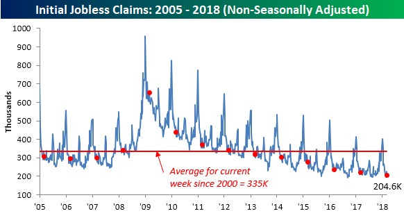
On a non-seasonally adjusted basis (NSA), claims almost dropped below 200K, falling from 225.5K down to 204.6K. For the current week of the year, this is the lowest weekly print since 1969, and it is also more than 130K below the average of 335K for the current week of the year dating back to 2000.
The Closer — Wednesday Round Up — 3/14/18
Log-in here if you’re a member with access to the Closer.
Looking for deeper insight on markets? In tonight’s Closer sent to Bespoke Institutional clients, we run down a big selection of economic data including producer price inflation, Canadian home price data, EIA petroleum market data, and Eurozone economic surprises (which have come in to the downside). We also discuss Energy price action and some relative equity valuations.

See today’s post-market Closer and everything else Bespoke publishes by starting a 14-day free trial to Bespoke Institutional today!
Chart of the Day: Memories of the Late 1990s
Strong Period for PBJ, IHI…Malaysia and the Philippines
Our new Stock Seasonality Tool lets you see how any asset class, index, sector, stock, or ETF typically performs over any time period throughout the year. Below we wanted to highlight a few interesting tidbits from a screen we just ran using the tool this afternoon.
First up is a snapshot of our S&P 500 Seasonality gauges, which always show how the index has historically performed over the next week, month, and three months from today’s date. As shown below, the S&P has done very well in the near term over the last 10 years. Over the next week, the index has posted a median gain of 1.12%. Over the next month, it has gained 1.77%, and over the next 3 months, it has gained 2.93%.

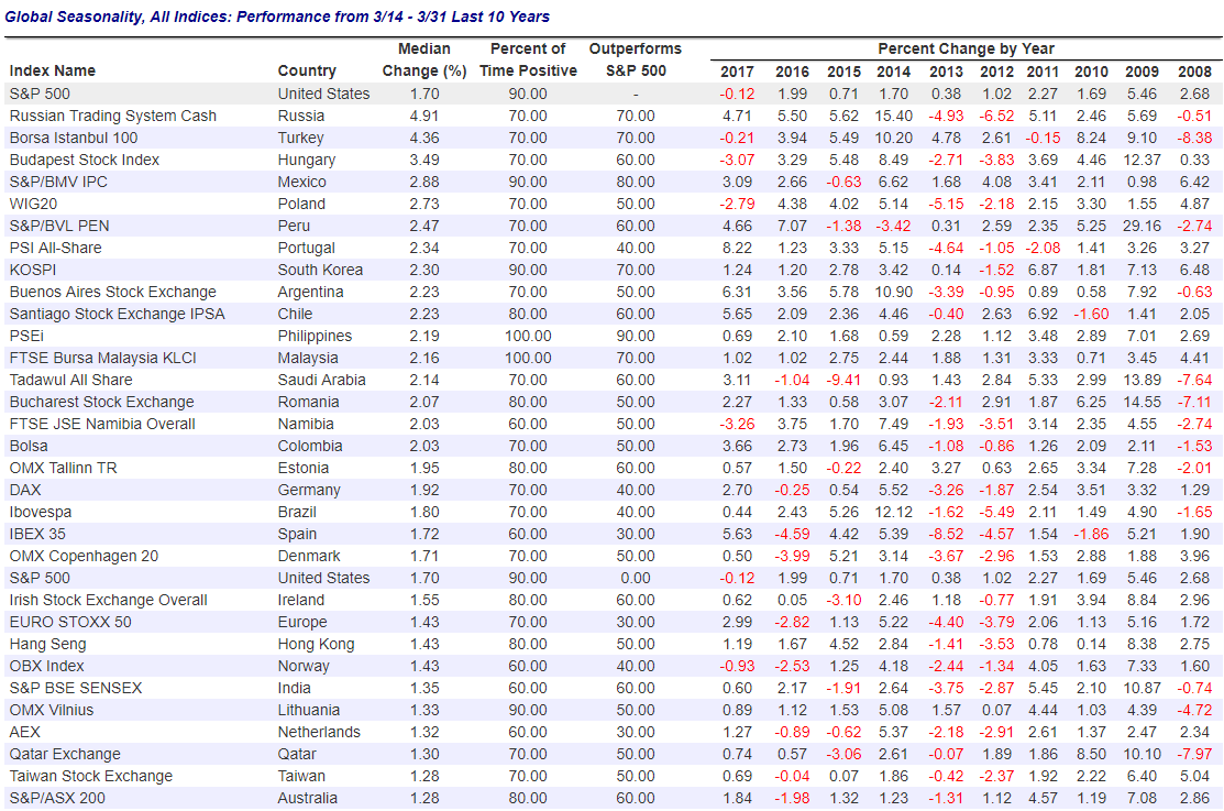
Drilling down a bit, we wanted to see how different country stock markets have historically done in the second half of March. Below we show the countries with the best median returns from March 14th through March 31st over the last 10 years.
Note that the US (S&P 500) has been one of the most consistently positive countries during this period with gains in 9 of the last 10 years. 2017 was the only year in the last 10 where the S&P fell from 3/14 through 3/31, and it only fell 0.12%.
While Russia, Turkey, and Hungary have the strongest median gains for the remainder of March, the Philippines and Malaysia’s stock market have gained during this period for 10 consecutive years!
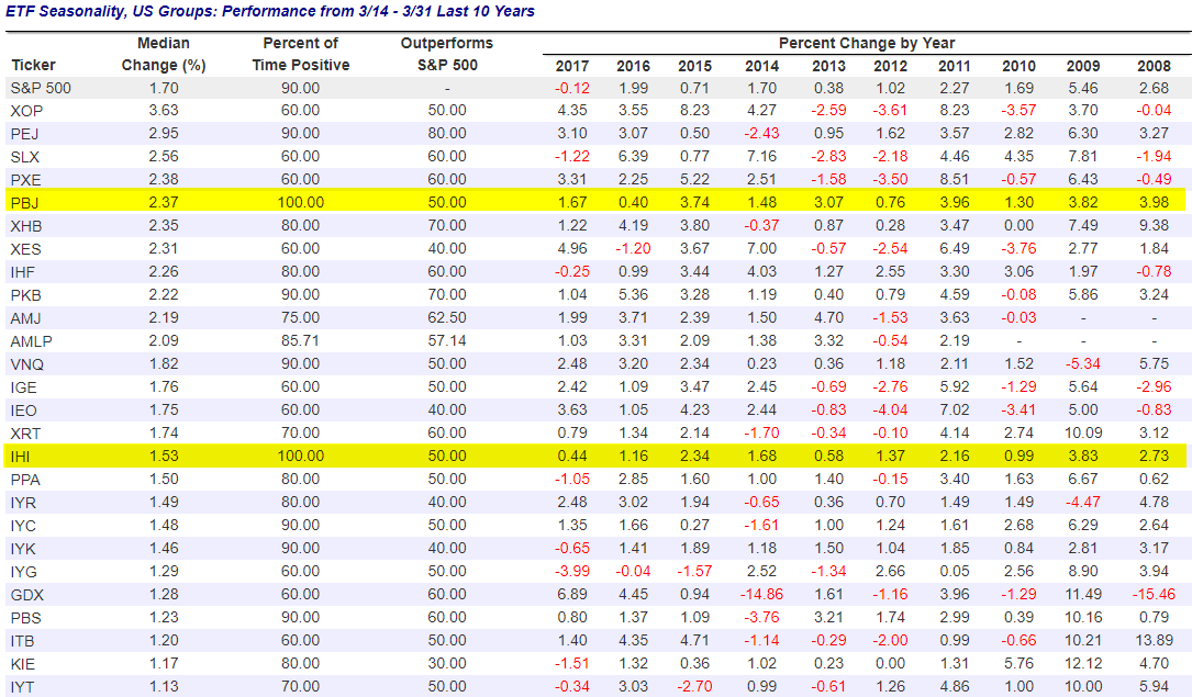
You can also see how different ETFs typically perform for the remainder of March. Looking at US Group ETFs, we see that PBJ and IHI are the two that have gained 100% of the time from March 14th through March 31st over the last 10 years. PBJ is a food & beverage stock ETF, while IHI is a medical device company ETF. (If you hover over the ticker in our Stock Seasonality Tool, a description of the ETF shows up.)
Start a free trial to Bespoke Premium to start using our Stock Seasonality Tool now!
Sell in May, and Go Away — Bespoke’s Stock Seasonality Tool in Action
Our new interactive Stock Seasonality Tool (available to Bespoke Premium and Bespoke Institutional members) allows investors to test seasonal tendencies for any asset class with a couple clicks of the mouse. It’s truly an amazing new feature that we’ve added for members.
In a recent Chart of the Day, we wanted to highlight the power of the Stock Seasonality Tool by testing out the popular “Sell in May, and Go Away” hypothesis for the stock market. With our Stock Seasonality Tool, you can not only easily pull up this analysis for the S&P 500 in a couple of seconds, but you can also pull it up for every major country stock market around the world to see if it holds true outside of the US as well.
The old “Sell in May, and Go Away” adage suggests that stock market returns are typically poor during the summer months, so it’s best to just forget about stocks and set sail during this period. Let’s see how true the adage really is.
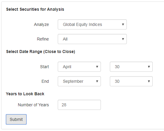
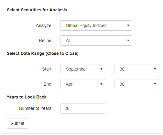
Once you’re at the Stock Seasonality page, click the button at the top of the page that says “Custom Seasonality Analysis.” The box below will show up on your screen. Click the “Analyze” drop-down menu and select “Global Equity Indices.” Leave the “Refine” drop-down menu the same, and for the “Select Date Range” option, select April 30th as the Start date and September 30th as the End date. Our database uses closing prices for the dates shown, so using April 30th as the start date and September 30th as the end date will show you historical performance for all global equity indices from May 1st through September 30th of every year.
The “Years to Look Back” option tells the database how many years you want to go back when running the analysis. For global equity indices, the database can look back 28 years starting in 1990. (While the S&P 500 goes back to 1928, most price data for other country indices only goes back to the 1980s or 1990s.) For this analysis, we’ll go back as far as possible to 1990, so increase the “Number of Years” option to “28.”
Click the “Submit” button when you’re done.
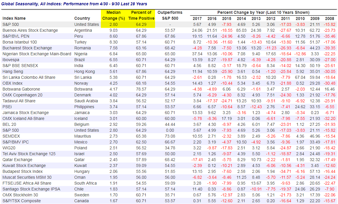
Along with a chart highlighting the 5 best and 5 worst performing country stock markets from the May to September period, clicking the “Submit” button will also return the table below. To be included in the table, the index or country has to have data going back at least 19 years (2/3 of the 28 year total). (Note that all performance numbers are in local currencies as well.)
So what do the results show? At the top of the table, you can see that over the last 28 years, the S&P 500 has experienced a median change of +2.80% from May through September with positive returns 64.29% of the time. You can also see results for a number of other countries, but we’ll get to that later.
Now that we’ve shown that the S&P 500 has historically posted a median gain of 2.80% during the May through September period (the “Sell in May, and Go Away” period), let’s run a screen that shows the S&P’s performance during the remaining months of the year to see how the two compare. All you have to do to run this screen is reverse the Start and End dates. At the Stock Seasonality page, change the Start date to September 30th and the End date to April 30th. Keep the number of years to look back at 28 so we get a true comparison.
Click the Submit button once you’ve changed the dates.
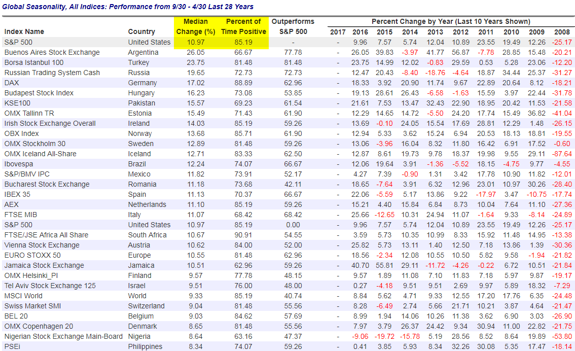
Below is a snapshot of the table that appears when running the screen above. Here you can see that over the last 28 years, the S&P 500 has posted a median gain of 10.97% during the October through April period with positive returns 85.19% of the time.
Remember, the ‘Sell in May, and Go Away” strategy showed a median change of just 2.8% from May through September with positive returns 64.29% of the time. That’s very weak compared to the 10.97% median change from October through April, suggesting that the “Sell in May, and Go Away” adage is somewhat true. While “Sell in May” performance is not outright negative, it has clearly been a much weaker period of the year.
So how does the “Sell in May, and Go Away” strategy look for other country stock markets? The results from our screens above provide some very insightful information. For some countries, the differences in performance are extremely one-sided, while for a few other countries, the May through September period is actually stronger than the October through April period.
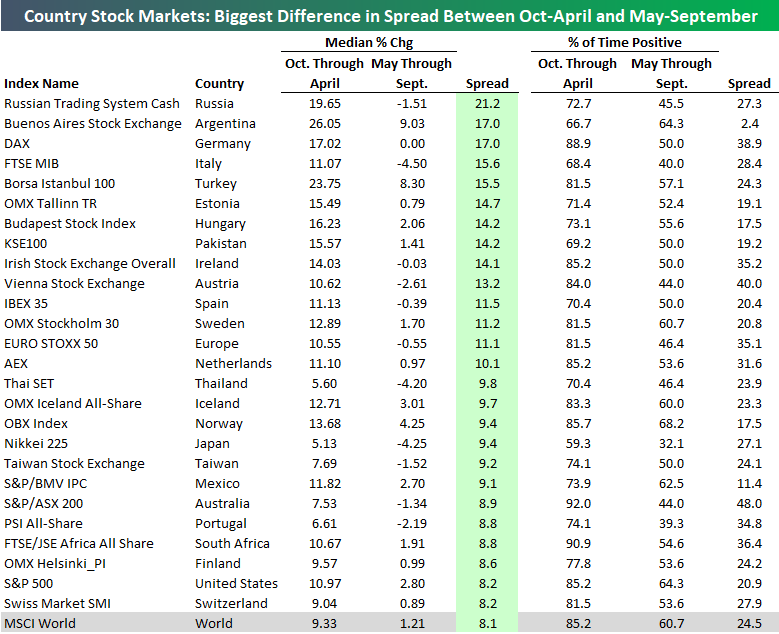
Below is a table showing the countries that have the biggest spread in performance between the October through April and May through September periods. The countries where “Sell in May, and Go Away” works best include Russia, Germany, Italy, and Turkey. As shown, the median change for Russia’s stock market from October through April has historically been +19.65%, while its median change during the May through September period has actually been negative at -1.51%. For Germany, the DAX has historically seen a median gain of 17.02% from October through April, while May through September has been totally flat.
For the MSCI World index, October through April has historically gained 9.33%, while May through September has gained just 1.21%. The October through April period has seen positive returns 85.2% of the time, while the May through September period has been positive just 60.7% of the time.
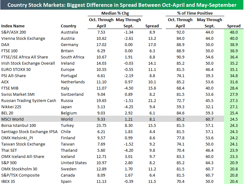
The table below is another version of the one above, with this one sorted by the spread between the “% of Time Positive” numbers. Here we see that Australia’s stock market is on top, with positive returns 92% of the time from October through April, and positive returns only 44% of the time from May through September. Ironically, Australia’s summer comes during our winter (and vice versa), so you might have expected the opposite of the “Sell in May” strategy to work best. Clearly that’s not the case, though!
In the UK, the median numbers for the “Sell in May” strategy aren’t that extreme, but the theory still holds true. Since 1990, the October through April period has seen the FTSE 100 post a median change of +6.29%, while the May through September period has seen a median change of 0%. The October through April period has been positive 88.9% of the time, while the May through September period has only been positive 50% of the time. That’s a significant difference.
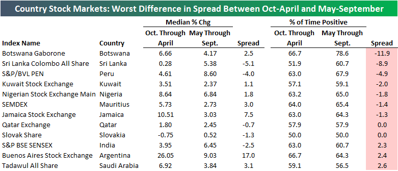
There are only five countries that typically experience better performance during the May through September period, and they’re shown below. India is the most notable country on the list. The SENSEX has historically seen a median gain of just 3.95% from October through April, while May through September has seen a median gain of +6.45%.
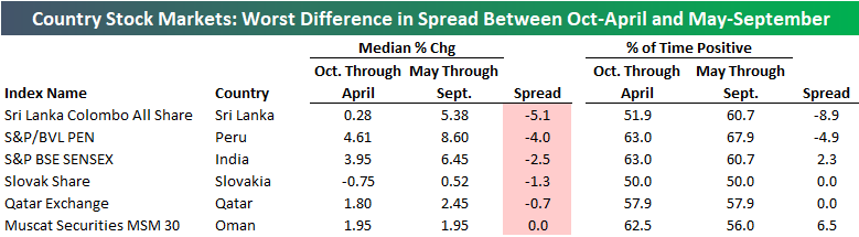
In terms of “% of time positive,” Botswana’s stock market is on top, with positive returns from May through September 78.6% of the time, and positive returns from October through April 66.7% of the time.
All of the tables above were either direct screenshots from our Stock Seasonality Tool in action, or they were built in Excel after copying and pasting the data. Hopefully this analysis has given you a good example of what our Stock Seasonality Tool can do. Along with the ability to track seasonality for any country stock market, remember that you can also run screens on all US stocks and ETFs, and you can even run it specifically on the stocks in your Custom Portfolios that you’ve built in our Trend Analyzer tool. To pull up your Custom Portfolio stocks, simply select “Custom Portfolios” using the “Analyze” drop-down menu.
If you have any questions about how to use our new Stock Seasonality Tool, feel free to email or call us at 914-315-1248.
March Madness Eve
With the heart of college basketball’s biggest tournament set to kick-off tomorrow, you can bet that a lot of traders will be looking to make sure they have access to the games at their desks (or via their phones). Before the age of mobile devices and streaming, it used to be that if you wanted to watch the afternoon games in the first two days of the NCAA Tournament, you had to sneak away from the desk and head out to a bar that had the games on. It was also a simpler time when the games were only on one-channel, and people didn’t have to frantically search for what channel TruTv was on their cable provider.
Because a lot of the first round’s games take place during the day, there have been all sorts of studies done estimating the loss in worker productivity that takes place as a result of people shifting their attention from work to the games. According to one estimate, the aggregate amount of worker productivity lost because of the games amounts to $6.3 billion for the entire month of March. In the stock market, we wondered whether volumes are impacted by people taking time out of the trading day to watch the games. To check that, we looked at US equity market volumes on the Wednesday, Thursday, and Friday of the week when the first round of the NCAA Tournament is played and calculated how those levels compared to average volume over the prior 50 trading days.
Looking at the results, there doesn’t seem to be a whole lot of evidence that Wall Street shuts down during the NCAA Tournament. In fact, quite the contrary. Going back to 2004, volumes on day one and two of the tournament are above average more often than they are below average. Overall, average volume the day before the tournament starts is 3.5% above average (median: +1.9%). On the first day of the tournament, volumes are typically 5% above average (median: 2.7%), and then on day two of the tournament, average volume is 20.6% above average (median: 17.7%). One reason for the Friday spike in volume, however, is due to the fact that it also tends to be an options expiration day. Whatever the reasons, the idea that Wall Street shuts down during the first two days of the tournament is not borne out in fact.

There are several possible explanations for the pickup in volume during the first two days of the tournament. The first is that the games may actually give salespeople an excuse to call a particular client and talk about how the team of their customer’s school is doing and then get a trade done in the process. The second, and sadly, probably more likely reason is that all the trading these days is done by computer anyways, so what do they care if there are games going on?
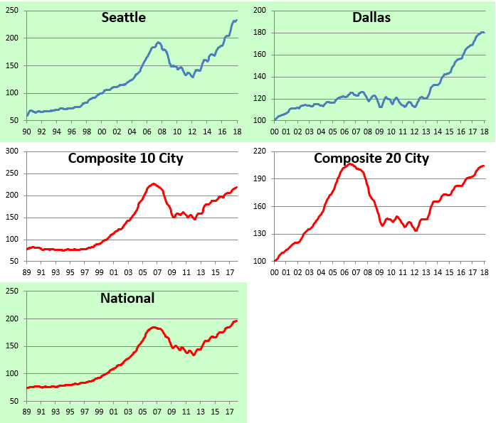
US City-By-City Home Price Levels — Gains from Crisis Lows, Distance from Bubble Highs
We like to provide an update on trends in US home prices every few months based on the monthly release of the S&P/Case-Shiller home price indices. While the data has a 2-month lag, it’s still helpful for tracking longer-term trends in real estate prices from city to city across the US.
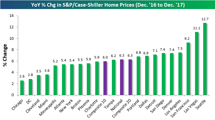
The first chart below shows the year-over-year change in home prices from December 2016 to December 2017 (remember, the data has a 2-month lag). As shown, the composite 10 and 20-city indices and the national index are all up roughly 6% y/y.
Seattle has seen the biggest y/y gains at +12.7% (can you take a guess why?), followed by Las Vegas and then San Francisco. On the lower end of the spectrum, Chicago, DC, Cleveland and Miami have seen the smallest year-over-year gains in home prices.
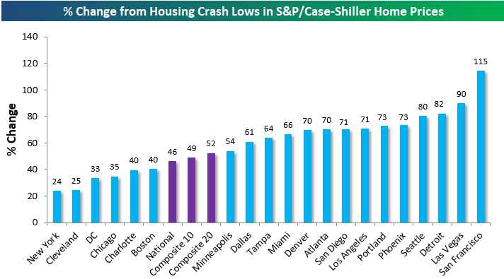
Another interesting way to look at the data is to see how much home prices are up from their post-housing bubble lows (most lows weren’t made until early 2012). The National index is now up 46% from its lows, but most cities are up well over 50% from their lows at this point. San Francisco is up by far the most at +115%, followed by Las Vegas (+90%), Detroit (+82%), and Seattle (+80%).
On the weaker side of things, New York and Cleveland have gained the least off their lows at roughly +25%. With the recent tax law changes, it’s going to be hard for New York to bring itself up from the rear.
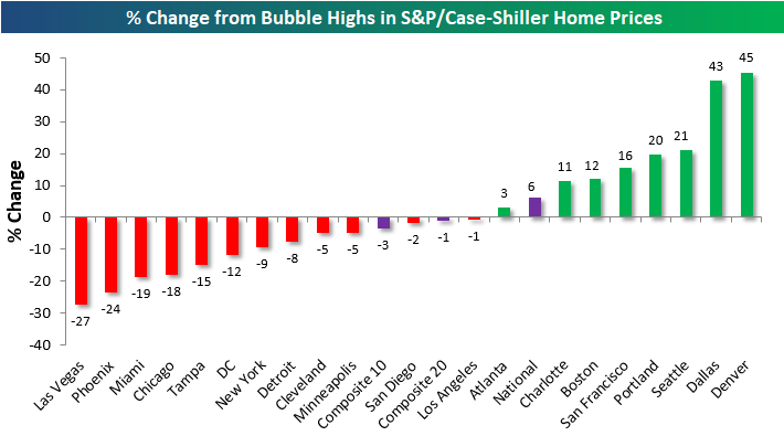
Finally, let’s take a look at how prices now compare to their prior housing bubble highs (mostly made back in 2005 and 2006). Quite a few cities now have home prices that are well above their prior highs from the mid-2000s bubble. Denver and Dallas are up the most at more than 40%+ from their prior bubble highs, while Seattle and Portland are both roughly 20% above mid-2000s peak levels.
At the national level, home prices have now eclipsed their housing bubble highs by 6%, but both the composite 10-city and composite 20-city indices are still just a hair below their highs.
Los Angeles and San Diego are the two closest cities to making new all-time highs, while Las Vegas, Phoenix, Miami, and Chicago have the furthest to go.
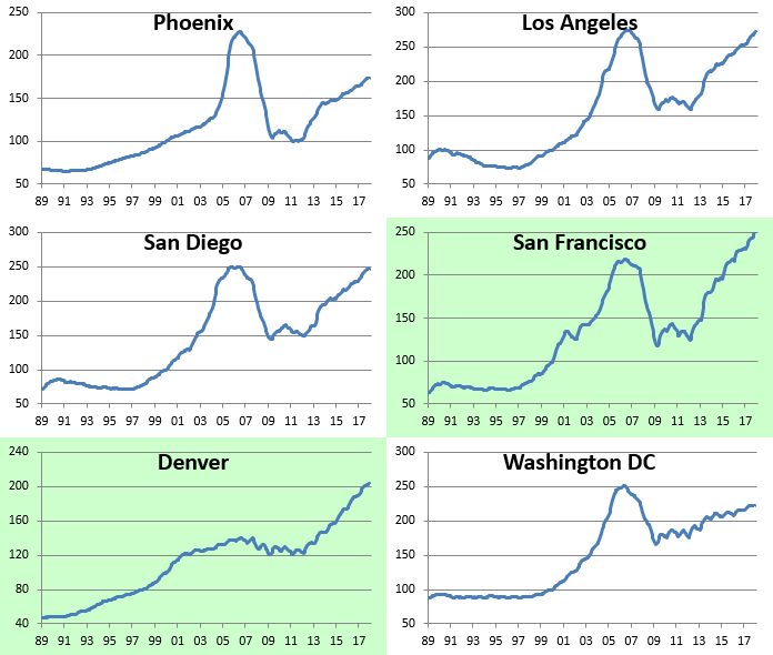
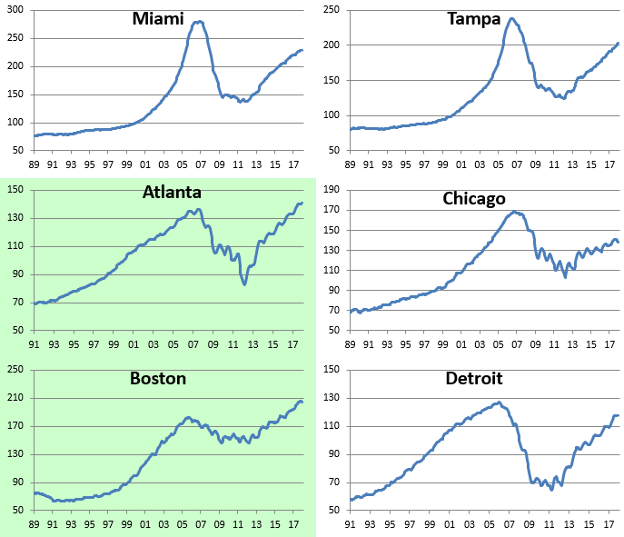
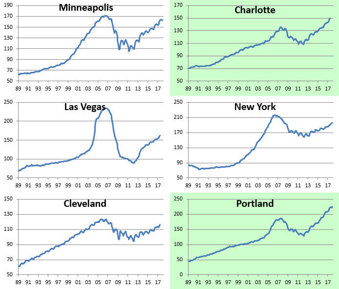
Below we provide historical home price charts for each of the cities tracked by S&P/Case-Shiller. Cities highlighted in green have all traded to new all-time highs during the current expansion.
B.I.G. Tips – Retail Sales Miss Again
Fixed Income Weekly – 3/14/18
Searching for ways to better understand the fixed income space or looking for actionable ideals in this asset class? Bespoke’s Fixed Income Weekly provides an update on rates and credit every Wednesday. We start off with a fresh piece of analysis driven by what’s in the headlines or driving the market in a given week. We then provide charts of how US Treasury futures and rates are trading, before moving on to a summary of recent fixed income ETF performance, short-term interest rates including money market funds, and a trade idea. We summarize changes and recent developments for a variety of yield curves (UST, bund, Eurodollar, US breakeven inflation and Bespoke’s Global Yield Curve) before finishing with a review of recent UST yield curve changes, spread changes for major credit products and international bonds, and 1 year return profiles for a cross section of the fixed income world.
In this week’s note, we review the leading effect other global bond markets are having on the UST market.

Our Fixed Income Weekly helps investors stay on top of fixed income markets and gain new perspective on the developments in interest rates. You can sign up for a Bespoke research trial below to see this week’s report and everything else Bespoke publishes free for the next two weeks!
Click here and start a 14-day free trial to Bespoke Institutional to see our newest Fixed Income Weekly now!