Jobless Claims Doing the Limbo
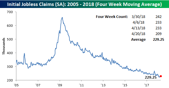
Just when you think jobless claims can’t go any lower, they do. In this week’s report, first-time claims came in at a level of 209K compared to forecasts for a reading of 230K. Not only was this week’s print a big beat relative to expectations, but it was also the lowest reading since 1969! With jobless claims posting impressive numbers week in and week out, it’s easy to forget how impressive these weekly reports are, so let us remind you. The current streak of 164 straight weeks of sub-300K prints is the longest such streak on record. Also, it has now been 24 weeks since weekly claims even came in above 250K, and that’s the longest such streak of sub-250K readings since 1973.
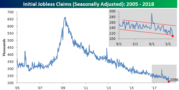
Even with the weekly reading coming in at the lowest level since 1969, the four-week average for jobless claims didn’t quite take out its multi-decade lows from early March. In order for this reading to make a new low next week, we’ll have to see a print of 215k or less.
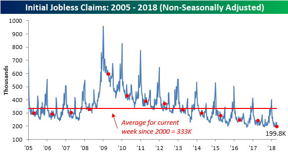
On a non-seasonally adjusted basis, jobless claims were also impressive with a sub-200K reading. For the current week of the year, that is the lowest level since 1969, and it’s more than 133K below the average for the current week of the year dating back to 2000.
The Closer — LatAm Update, EIA Recap — 4/25/18
Log-in here if you’re a member with access to the Closer.
Looking for deeper insight on markets? In tonight’s Closer sent to Bespoke Institutional clients, we take a look at recent data releases from Brazil and Mexico. We also recap weekly petroleum market data from the US and energy markets price action.

See today’s post-market Closer and everything else Bespoke publishes by starting a 14-day free trial to Bespoke Institutional today!
Half of Case Shiller Home Price Cities Now at All-Time Highs
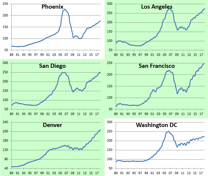
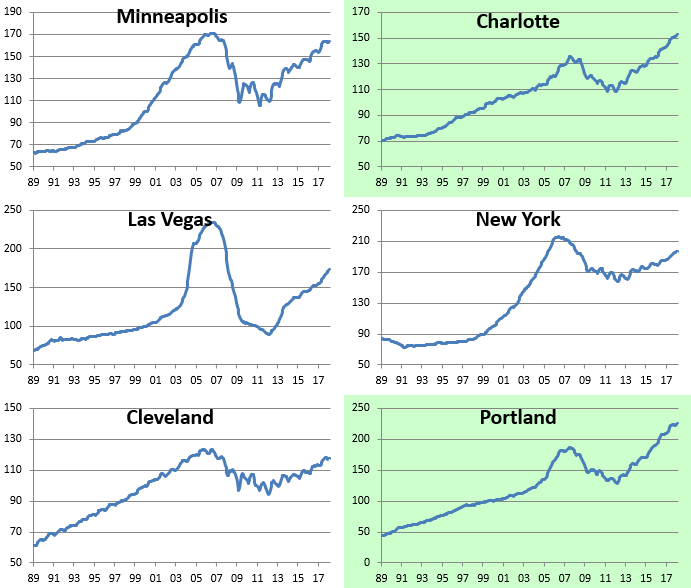
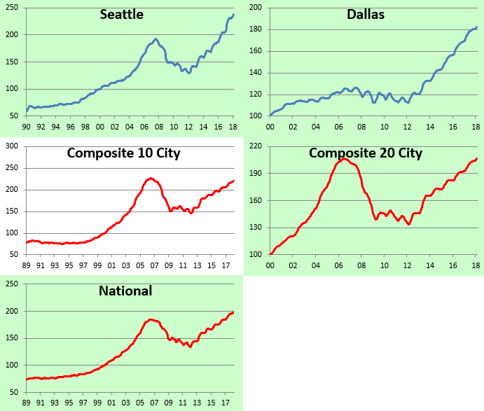
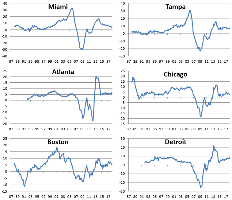
The monthly S&P/Case-Shiller home price indices were released earlier this week, and below we provide a look at the results so you can see how real estate prices are doing in your area of the country. (If you’re outside of the US, we’re sorry!)
In the first chart below, we show how much each of the cities tracked gained (or lost) on a month-over-month and year-over-year basis. Keep in mind that these indices are on a two-month lag, so this month we’re looking at February results.
As shown, every city tracked posted MoM and YoY gains in February, with Seattle up the most over both time frames. Thank you Amazon.com!
Chicago was up the least on a month-over-month basis (+0.05%), while the DC area was up the least on a year-over-year basis (+2.43%).

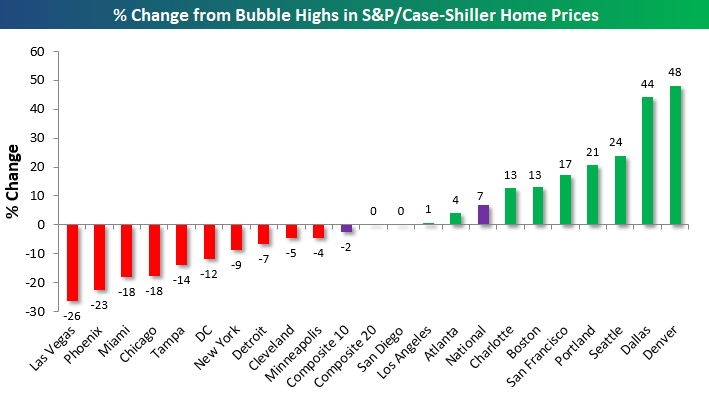
In the chart below, we show how much each city is up or down versus its highest point during the Housing Bubble of the mid-2000s. This month we saw both San Diego and Los Angeles eclipse their prior all-time highs, which means exactly half of the cities tracked are now at new all-time highs, while half are still below their bubble highs.
Denver and Dallas are by far up the most from their mid-2000s highs, while Las Vegas, Phoenix, Miami, and Chicago are the farthest below their prior highs.
Our next chart shows how much home prices have gained off of their low points following the bursting of the Housing Bubble. Most of these lows weren’t made until 2011/2012, which was 2-3 years after the low for the stock market in March 2009. As shown, the three composite indices are now up around 50% off of their lows. San Francisco home prices are up the most at +118%, followed by Las Vegas (+93%), Seattle (+85%), and Detroit (+84%).
On the weak side, Cleveland and New York have seen home prices bounce the least off of their housing crash lows at just +25%. Other cities that have posted relatively weak home price gains over the last few years include the DC area and Chicago.

Below we provide raw price charts for the S&P/Case Shiller home price indices going back as far as their data goes. Cities that are highlighted in green have eclipsed their prior Housing Bubble highs, while those not highlighted in green are still below their prior highs. As mentioned earlier, Los Angeles and San Diego are the two cities that just made new highs this month.

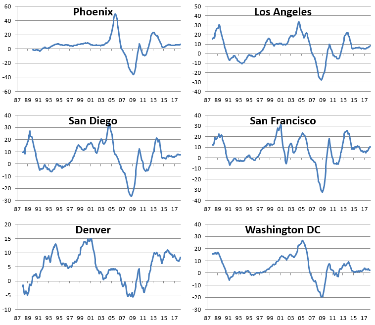
We’ve also made charts that highlight the year-over-year percentage change in the S&P/Case-Shiller home price indices. These are included below. When looking through the charts, you’ll mostly notice a big spike in YoY gains during the Housing Bubble, then a crash to extremely negative levels during the bust, and then a two-stage recovery since then. The last period of rapid YoY home price growth for most cities came to an end in 2013/2014, and since then, we’ve seen slow and steady gains. No city has seen a year-over-year decline in home prices for a number of years now.
Start a two-week free trial to Bespoke Institutional for more in-depth coverage of US housing.

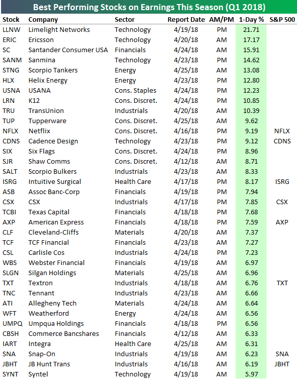
Earnings Season’s Biggest Winners and Losers…So Far
The average stock that has reported earnings this season (since 4/10) has fallen in price on its earnings reaction day (the first trading day following a stock’s earnings report).
Below is a list of the stocks that have posted the biggest one-day gains in reaction to their earnings reports. For stocks that report after the close, we use the next day’s price change. For stocks that report before the open, we use that day’s price change.
As shown, Limelight Networks (LLNW) has seen the best response of any stock on earnings this season with a one-day gain of 21.71%. Just two other stocks have seen gains of more than 15% on their earnings reaction days — Ericsson (ERIC) and Santander (SC).
Six other stocks have posted gains of more than 10% — SANM, STNG, HLX, USNA, LRN, and TRU. Other notables on the list of biggest earnings season winners include Netflix (NFLX), Six Flags (SIX), Intuitive Surgical (ISRG), American Express (AXP), and CSX.
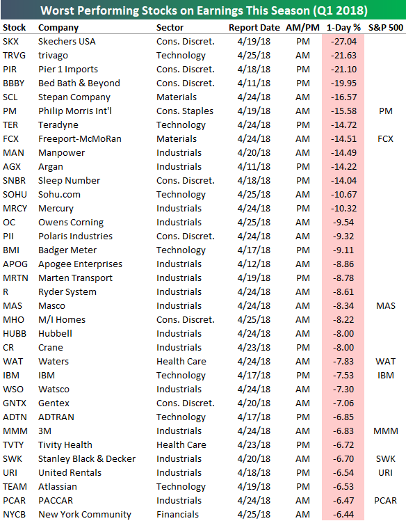
While 9 stocks have gained more than 10% on their earnings reaction days so far this quarter, 13 have fallen more than 10%. The three worst performers in reaction to earnings have been Skechers (SKX), trivago (TRVG), and Pier 1 Imports (PIR). All three of these stocks fell more than 20% in response to earnings. Bed Bath & Beyond (BBBY) just missed falling 20% with a one-day decline of 19.95%.
Other notables on the list of biggest earnings season losers include Philip Morris International (PM), Freeport-McMoRan (FCX), IBM, 3M (MMM), and United Rentals (URI).
Sign up for a Bespoke Premium free trial for more in-depth earnings season analysis.
Bespoke Short Interest Report – 4/25/18
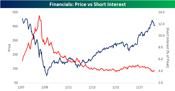
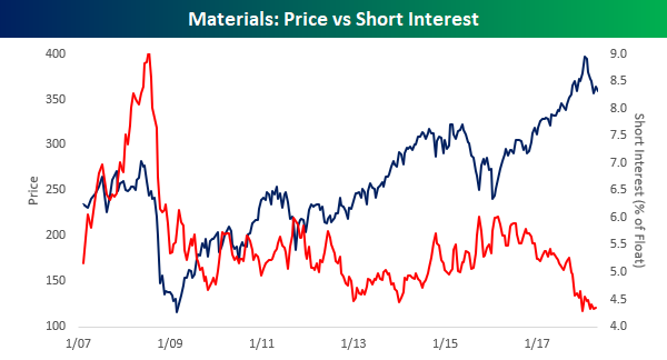
Short interest figures for the middle of April were released after the close on Tuesday, so we have just updated our regular report on short interest trends for the market, sectors, and individual stocks for clients. Below we wanted to quickly highlight two charts that caught our eye. With the S&P 500 trading at or close to correction levels, it shouldn’t come as a surprise that we have seen short interest levels pick up a bit, but two sectors where investors appear to have little concern is in the Financials and Materials sectors. The charts below are pulled from our regular update on trends in short interest, and they compare the average short interest level (as a percentage of float) of stocks in the sector to its price going back to 2007.
For both sectors, not only are average short interest levels right near their lowest levels of the last year, but they are also right near their lowest levels in over a decade. For these sectors, at least, investors don’t seem all that concerned. While there are valid reasons to be positive on the prospects for either sector, one would think investors would be showing a little bit more concern.
For a more detailed look at short interest data on a regular basis, sign up for a monthly Bespoke Premium membership now!
Fixed Income Weekly – 4/25/18
Searching for ways to better understand the fixed income space or looking for actionable ideals in this asset class? Bespoke’s Fixed Income Weekly provides an update on rates and credit every Wednesday. We start off with a fresh piece of analysis driven by what’s in the headlines or driving the market in a given week. We then provide charts of how US Treasury futures and rates are trading, before moving on to a summary of recent fixed income ETF performance, short-term interest rates including money market funds, and a trade idea. We summarize changes and recent developments for a variety of yield curves (UST, bund, Eurodollar, US breakeven inflation and Bespoke’s Global Yield Curve) before finishing with a review of recent UST yield curve changes, spread changes for major credit products and international bonds, and 1 year return profiles for a cross section of the fixed income world.
In this week’s note we discuss the current issuance tempo and quality of new bonds being sold in the high yield market.

Our Fixed Income Weekly helps investors stay on top of fixed income markets and gain new perspective on the developments in interest rates. You can sign up for a Bespoke research trial below to see this week’s report and everything else Bespoke publishes free for the next two weeks!
Click here and start a 14-day free trial to Bespoke Institutional to see our newest Fixed Income Weekly now!
Ten-Year Yield Momentum
One of the problems with the market we have been highlighting over the last several weeks has been the equity market’s inability to hang on to early gains. Whether or not stocks trade higher at the open, the trend throughout the trading day has been lower. In the Treasury market, we have seen a similar trend as investors take any opportunity they can get to dump long-term paper. Since the direction of treasury prices has the opposite impact on yields, this has resulted in some strong upward momentum for treasury yields.
Take the last week or so, for example. If today’s increase in yields holds, the yield on the 10-year US Treasury will have finished the day higher than it opened for six straight days. This helped to push the yield above the ‘dreaded’ 3% threshold. Similar runs of strong intraday increases in the 10-year yield have been relatively uncommon over the last twenty years with the current streak being the 19th such streak of six or more days. The longest streak of consecutive open to close increases in the 10-year yield lasted nine trading days in the period ending in June 2006, and the most recent streak of six or more days was exactly two years ago today!

Bespoke’s Global Macro Dashboard — 4/25/18
Bespoke’s Global Macro Dashboard is a high-level summary of 22 major economies from around the world. For each country, we provide charts of local equity market prices, relative performance versus global equities, price to earnings ratios, dividend yields, economic growth, unemployment, retail sales and industrial production growth, inflation, money supply, spot FX performance versus the dollar, policy rate, and ten year local government bond yield interest rates. The report is intended as a tool for both reference and idea generation. It’s clients’ first stop for basic background info on how a given economy is performing, and what issues are driving the narrative for that economy. The dashboard helps you get up to speed on and keep track of the basics for the most important economies around the world, informing starting points for further research and risk management. It’s published weekly every Wednesday at the Bespoke Institutional membership level.
You can access our Global Macro Dashboard by starting a 14-day free trial to Bespoke Institutional now!

Chart of the Day: Earnings Pump Fake — Don’t Bite!
The Closer — Equity Index Technicals & US Data Deluge Charted — 4/24/18
Log-in here if you’re a member with access to the Closer.
Looking for deeper insight on markets? In tonight’s Closer sent to Bespoke Institutional clients, we review price action for US equity indices, discuss some misconceptions related to changing bank assets, and recap a number of economic data points released today: new home sales, the regional Richmond Fed survey of manufacturing and services, Case-Shiller home price data, and Conference Board consumer confidence data.
See today’s post-market Closer and everything else Bespoke publishes by starting a 14-day free trial to Bespoke Institutional today!