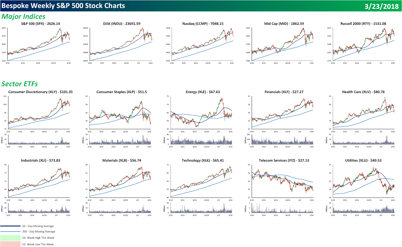
S&P 500 Weekly Chart Book — 3/23/18
Each weekend as part of our Bespoke Premium and Institutional research service, clients receive our S&P 500 Quick-View Chart Book, which includes one-year price charts of every stock in the S&P 500. You can literally scan through this report in a matter of minutes or hours, but either way, you will come out ahead knowing which stocks, or groups of stocks, are leading and lagging the market. The report is a great resource for both traders and investors alike. Below we show the front page of this week’s report which contains price charts of the major averages and ten major sectors.
It was an extremely poor finish to an already poor week for US equities. While none of the major indices or sectors traded to 52-week lows, if you thumb through our chart book, the number of new lows is starting to add up with 22 this week, and 200-DMAs are being breached to the downside left and right. Consumer Discretionary Amazon, Financials, and Technology had been the stalwarts, but even they started to crack this week. To view our entire S&P 500 Chart Book, sign up for a 14-day free trial to our Bespoke Premium research service.
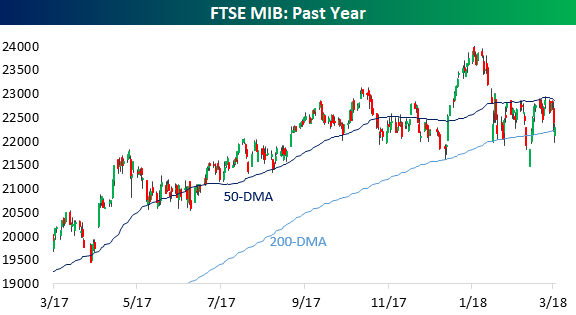
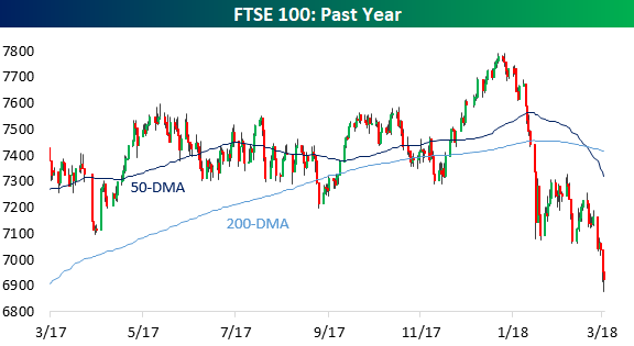
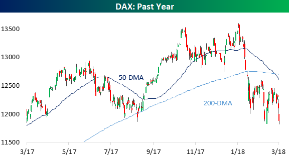
Global Indices Below 200-DMAs With Death Crosses To Boot
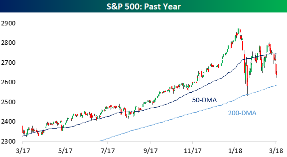
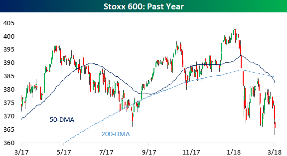
It’s been a week to forget for global equity indices. In the charts below we chart local currency prices for indices in the US (S&P 500), Europe (Stoxx 600), Italy (FTSE MIB), Spain (IBEX 35), the UK (FTSE 100), Germany (DAX), Japan (Nikkei 225), and Australia (ASX 200). All are now below their 50-DMAs and the US is the only index hanging on to its 200-DMA. Adding to that technical damage are a number of death crosses. This bearish technical indicator is triggered when the 50-DMA passes below the 200-DMA when both are downward sloping. The Stoxx 600, FTSE 100, and DAX all fit this bill.
As if death crosses and moves below long-term averages weren’t enough, the Stoxx 600, IBEX 35, FTSE 100, and DAX are all at 52-week lows on a closing basis. The Nikkei closed the week with its second-largest decline since the 2016 US Presidential election, and US equities have dropped on 4 of 5 trading days in 3 of the past 4 weeks. The weakness of the price action across global equities is consistent and broad-based.
Start a free trial to one of our three membership levels for full coverage and analysis of the market.


The Closer — Thursday Thoughts: Economic Cycle, Confidence, & Credit Cost — 3/22/18
Log-in here if you’re a member with access to the Closer.
Looking for deeper insight on markets? In tonight’s Closer sent to Bespoke Institutional clients, we review a variety of minor economic data releases in the US today. We also discuss the outlook for EUR, the rising cost of capital for corporations, and discuss today’s equity market selloff.

See today’s post-market Closer and everything else Bespoke publishes by starting a 14-day free trial to Bespoke Institutional today!
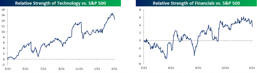
Leaders Lag and Laggers Lead
It has been a pretty nutty week for the equity market over the last four days as sectors which had been holding things up have sold off sharply, while sectors that had been left for dead have been picking up a little bit of late. The charts below show the relative strength of the S&P 500 Technology and Financial sectors. As usual, rising lines indicate that the sector is outperforming the S&P 500 and vice versa. For much of 2018, these two sectors have been outperforming the rest of the market. With the two sectors accounting for just about 40% of the entire S&P 500, their strength was enough to hold the rest of the market up. This week, that has all changed, though, as both sectors are down around 4%. For Technology, it hasn’t seen a downturn relative to the broader market that was this steep since late November, while the last decline of this magnitude for the Financial sector was in December.

So which sectors have been picking up the slack? Well, of course, it’s the ones that everyone left for dead a few weeks ago. The charts below show the relative strength of the Energy and Utilities sectors, and in both cases, the sectors sold off sharply to start the year, but with the broader market weakness, both sectors have gotten a lift – relatively speaking. While the two have outperformed this week, they are still marginally lower.

One area of the market that has seen a big boost with all the tariff talk is small caps. Despite Trump’s “America First” policies and rhetoric, the Russell 2000 has underperformed the S&P 500 over the course of President Trump’s time in office. Ever since the President brought up the issue of tariffs, though, the Russell has rallied and is now up 3% in March compared to a 2% decline in the S&P 500.

Volatility in Sentiment on the Rise Too
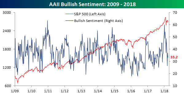
With the S&P 500 swinging between positive and negative moves lately, sentiment on the part of individual investors has also been seeing its fair share of ups and downs. According to the weekly survey from the American Association of Individual Investors (AAII), bullish sentiment declined from 36.8% down to 33.2%. That’s not much of a move, but it is below average and comes after a two-week stretch where it dropped close to 11 percentage points only to rise more than 10 percentage points the following week. Basically, investors can’t make up their minds.
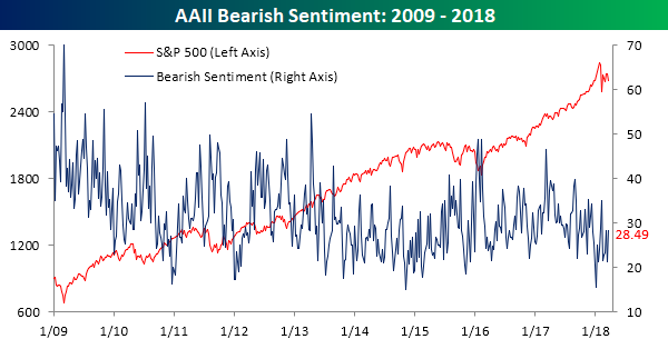
Bearish sentiment has been just as volatile. Last week, bearish sentiment declined 7 percentage points to 21.33%. This week it rose by 7 percentage points right back up to 28.5%.
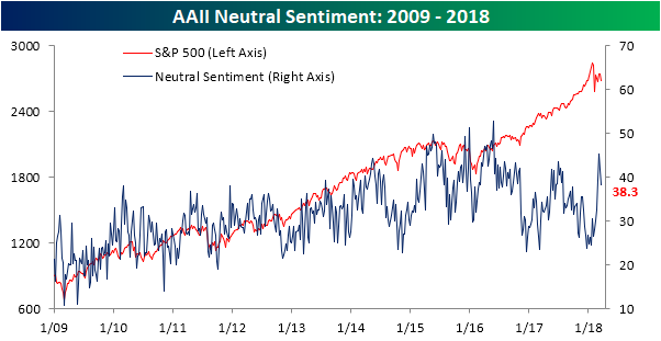
Finally, neutral sentiment spiked back over 40% in the last two weeks, only to fall nearly 4 points this week to a still high 38.2%.
Bespoke’s Sector Snapshot — 3/22/18
We’ve just released our weekly Sector Snapshot report (see a sample here) for Bespoke Premium and Bespoke Institutional members. Please log-in here to view the report if you’re already a member. If you’re not yet a subscriber and would like to see the report, please start a two-week free trial to Bespoke Premium now.
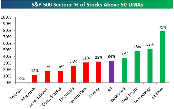
Below is one of the many charts included in this week’s Sector Snapshot, which highlights the percentage of stocks in S&P 500 sectors currently trading above their 50-day moving averages. As shown, breadth has weakened significantly with just 34% of S&P 500 stocks above their 50-DMAs. Only two sectors — Utilities and Technology — have breadth readings above 50%, while four have readings below 20%.
To find out what this means and see our full Sector Snapshot with additional commentary plus six pages of charts that include analysis of valuations, breadth, technicals, and relative strength, start a two-week free trial to our Bespoke Premium package now. Here’s a breakdown of the products you’ll receive.
Chart of the Day: Tencent’s Monster Weight
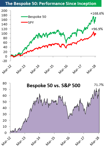
the Bespoke 50 — 3/22/18
Every Thursday, Bespoke publishes its “Bespoke 50” list of top growth stocks in the Russell 3,000. Our “Bespoke 50” portfolio is made up of the 50 stocks that fit a proprietary growth screen that we created a number of years ago. Since inception in early 2012, the “Bespoke 50” has beaten the S&P 500 by 71.7 percentage points. Through today, the “Bespoke 50” is up 168.6% since inception versus the S&P 500’s gain of 96.9%. Always remember, though, that past performance is no guarantee of future returns.
To view our “Bespoke 50” list of top growth stocks, click the button below and start a trial to either Bespoke Premium or Bespoke Institutional.
The Closer — Powell On Stage, WTI Winning, Current Account — 3/21/18
Log-in here if you’re a member with access to the Closer.
Looking for deeper insight on markets? In tonight’s Closer sent to Bespoke Institutional clients, we summarize the Fed policy decision today, weekly EIA data, and quarterly current account data from the BEA.
See today’s post-market Closer and everything else Bespoke publishes by starting a 14-day free trial to Bespoke Institutional today!
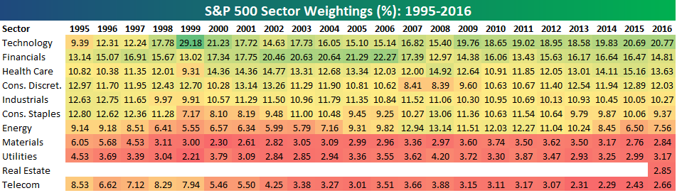
Bespoke’s S&P 500 Sector Weightings Report — March 2018
S&P 500 sector weightings are important to monitor. Over the years when weightings have gotten extremely lopsided for one or two sectors, it hasn’t ended well. Below is a table showing S&P 500 sector weightings from the mid-1990s through 2016. In the early 1990s before the Dot Com bubble, the US economy was much more evenly weighted between manufacturing sectors and service sectors. Sector weightings were bunched together between 6% and 14% across the board. In 1990, Tech was tied for the smallest sector of the market at 6.3%, while Industrials was the largest at 14.7%. The spread between the largest and smallest sectors back then was just over 8 percentage points.
The Dot Com bubble completely blew up the balanced economy, and looking back you can clearly see how lopsided things had become. Once the Tech bubble burst, it was the Financial sector that began its charge towards dominance. The Financial sector’s sole purpose is to service the economy, so in our view you never want to see the Financial sector make up the largest portion of the economy. That was the case from 2002 to 2007, though, and we all know how that ended.
Unfortunately we’ve begun to see sector weightings get extremely out of whack once again.
If you would like to see the most up-to-date numbers for S&P 500 sector weightings, simply start a two-week free trial to our Bespoke Premium or Bespoke Institutional service. Click back to this post once you’re signed up to see the numbers.