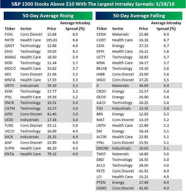
Looking For Action? S&P 1500 Most Volatile Stocks
For traders with a short-term time horizon looking for big moves, we have updated our list of the S&P 1500 stocks trading above $10 that have the largest intraday high-low ranges (based on the average percent spread between the intraday high and low over the last 50 days). The stocks are grouped based on whether they have a rising or falling 50-day moving average (DMA), and names highlighted in gray are new to the list this month.
With volatility in the market surging, the most volatile stocks are also becoming even more volatile. In our last update back on 2/14, just 26 of the 50 most volatile stocks had average daily ranges of 5% or more. As of yesterday’s close that number had increased to 41. Also, the percentage of stocks with rising moving averages has diminished. On 2/14, the 50 most volatile stocks were evenly split between stocks with rising and falling 50-DMAs. In this month’s update, though, the percentage of stocks in downtrends (falling 50-DMAs) outnumbers uptrends (rising 50-DMAs) 28 to 22.
Of the 50 stocks listed below, Fossil is the most volatile with an average daily range of 8.0%. However, because it trades at just over $12 per share, that 8% daily range doesn’t really translate into much in terms of dollars. Right below FOSL, though, is Nektar Therapeutics (NKTR). With a share price of around $106 and an average daily range of 6.6%, NKTR sees a typical high/low spread of over $7 each trading day.
In terms of sector representation, stocks from just six of the eleven sectors are on this month’s list. Leading the way with 13 stocks is Health Care, which is followed by Technology (12) and Consumer Discretionary (11). The five sectors with no stocks making the list are Consumer Staples, Financials, Real Estate, Telecom Services, and Utilities.
B.I.G. Tips – Fear the Day
Berkshire Overtakes Facebook; $2.34 Trillion in S&P 500 Market Cap is Erased
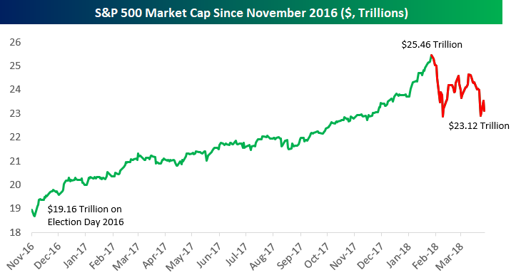
From Election Day 2016 through the S&P 500’s last all-time high on January 26th, the index added $6.3 trillion in market cap to take its total market cap up to $25.46 trillion. Since the high on 1/26, the index has now lost $2.34 trillion in market cap, bringing the total down to $23.12 trillion. This means that 37% of the post-Trump gains in market cap have been erased during the current market pullback.
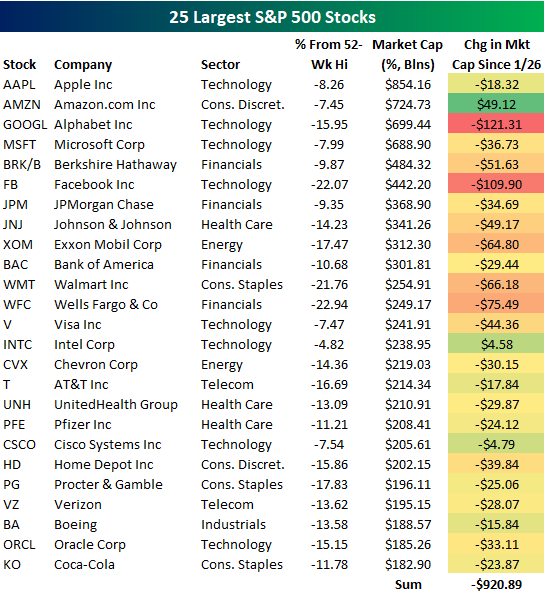
Below is a list of the 25 largest companies in the S&P 500. For each stock, we include its current market cap, its distance from its 52-week high, and its change in market cap since the S&P 500’s peak on 1/26.
Apple (AAPL) remains on top with a market cap of $854 billion. Amazon.com (AMZN) has moved into the #2 slot with a market cap of $724.7 billion, moving past both Alphabet (GOOGL) and Microsoft (MSFT) in recent days. While most stocks have lost market cap since the market’s peak, AMZN has added $49 billion!
Another big development at the top of the list is that Berkshire Hathaway (BRK/B) has unseated Facebook (FB) in the top five. While both Berkshire and Facebook have lost tens of billions in market cap over the last two months, Facebook (FB) has lost more than double what Berkshire has lost. At the moment, Berkshire is worth $42 billion more than Facebook ($484 billion vs. $442 billion). As shown, Facebook has now lost $109.9 billion in market cap since January 26th.
While the S&P 500 as a whole has lost $2.34 trillion in market cap since January 26th, the 25 largest stocks have lost nearly a trillion. This means the 25 largest stocks have accounted for roughly 40% of the losses.
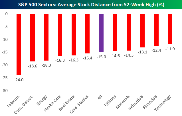
Below is a chart that shows the average S&P 500 stock’s distance from its 52-week high by sector. As shown, the average S&P 500 stock is now 15% below its 52-week high. Telecom is the only sector with a reading below -20%, but Consumer Discretionary and Energy are getting close to the -20% mark.
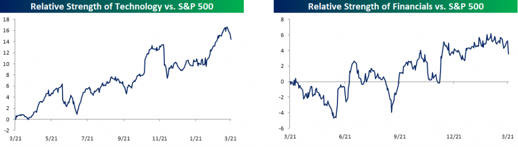
Note that the two largest sectors of the market — Financials and Technology — still have the strongest readings, but these two sectors have been getting crushed over the last couple of weeks.
Start a free trial to one of our three membership levels for full coverage and analysis of the market.
The Closer — Relative Performance, Equity Economy, Outside Days, Confidence — 3/27/18
Log-in here if you’re a member with access to the Closer.
Looking for deeper insight on markets? In tonight’s Closer sent to Bespoke Institutional clients, we recap the huge breakdown in tech relative to energy, driven by Facebook’s decline. We also look at the global economic cycle, US equity price action, and US consumer confidence from the Conference Board.

See today’s post-market Closer and everything else Bespoke publishes by starting a 14-day free trial to Bespoke Institutional today!
“The Younger I Get, the More Jaded I Become”
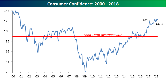
Tuesday’s Consumer Confidence report for the month of March showed a moderately larger than expected decline from February’s multi-year high. While economists were forecasting the headline index to rise to 131.0 from last month’s initially reported reading of 130.8, the actual reading came in a little more than three points weaker at 127.7. While the index declined, besides last month’s multi-year high, there has only been one other month during the current cycle where the headline index was higher.
Start a free trial to one of our three membership levels for full coverage and analysis of the market.
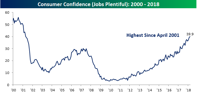
One of the key reasons why confidence is still right near multi-year highs is because a large percentage of consumers think getting a job is like shooting fish in a barrel. As shown in the chart below, just under 40% of those surveyed think jobs are plentiful.
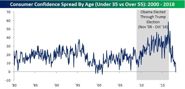
One of the fascinating aspects of the monthly Consumer Confidence report lately has been the breakdown in confidence by age. The chart below shows the historical levels of Consumer Confidence among consumers under the age of 35 and those above the age of 55. While the two series tend to move in the same direction, one pretty much constant over time has been that younger consumers (blue line) are more confident than older consumers. That was especially the case coming out of the financial crisis when confidence among younger consumers was much quicker to recover.
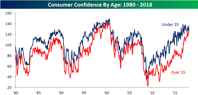
While younger consumers have generally been more confident than older more ‘jaded’ consumers, ever since late 2016 confidence among older consumers has surged. The surge has been so strong in fact, that in this month’s report, confidence among older consumers (>55) exceeded confidence among younger consumers for only the fourth time since 1980. The only three other months where this occurred were in 1999 (April and October) and 2000 (November). The chart below shows the spread between confidence levels among both age groups cited above going back to 1980. What’s really interesting about this chart is that from the time when President Obama was first elected through the election of Donald Trump, the spread in confidence reached record highs. Right after President Trump was elected, though, the spread narrowed as older Americans increasingly became more optimistic.
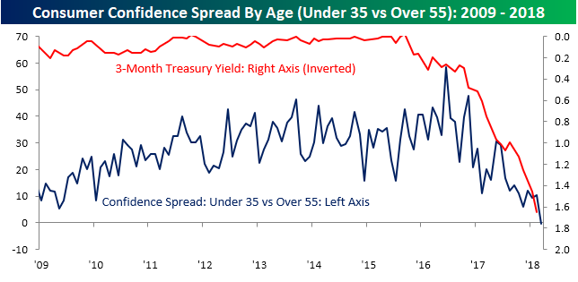
The above example would seem to suggest that politics has played a role in confidence among consumers as older Americans tended to support President Trump, while younger Americans were supporters of President Obama and subsequently Hillary Clinton. Besides politics, though, another factor contributing to the shift in sentiment among these two age groups comes down to interest rates. The chart below compares the spread shown above (going back to 2009) to the yield on the three-month US Treasury plotted on the right axis on an inverted scale. Older Americans tend to be more reliant on fixed income securities than other asset classes, so when rates are low, they feel it the most. Therefore, it makes sense that from 2009 through late 2015 when interest rates were at historically low levels, the spread between the two age groups really widened. Within a few months of interest rates bottoming, though, confidence among younger Americans relative to older Americans peaked.
Oil Stocks and Oil Diverge
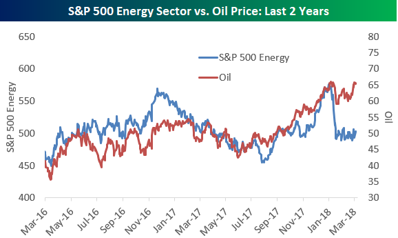
If you haven’t noticed, the price of oil has been rising over the last year, and at $65/barrel for crude, it’s right near a 52-week high.
Interestingly, the S&P 500 Energy sector has diverged from the price of oil recently. Below is a chart that highlights price trends for the Energy sector (oil stocks) versus oil. Up until the stock market correction started at the end of January, the two were tracking relatively closely. Since the correction, though, oil stock prices have sold off hard and haven’t recovered, while the price of oil has bounced back to the very top end of its 52-week range.
Start a free trial to one of our three membership levels for full coverage and analysis of the market.
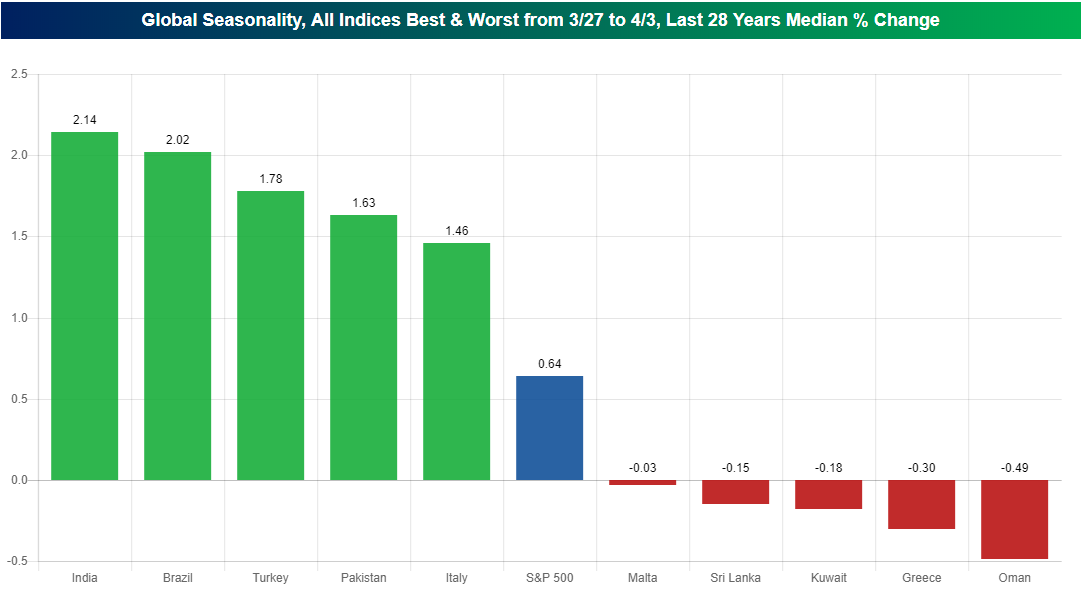
India and Brazil Have Big Seasonal Tailwinds
Using our interactive Stock Seasonality tool (start a free premium trial now to use it if you’re not yet a member), we wanted to see which countries had the best stock market performance around the turn of the month from March to April.
It’s super easy to pull this info up with our interactive tool. Simply click the Custom Seasonality Analysis button and select these options.
The chart below shows the five best and five worst performing country stock markets from March 27th through April 3rd of each year. (Here we use median % change and we go back 28 years.)
As shown, India and Brazil have been the best performing stock markets during this period with median gains of more than 2%. On the downside, Oman and Greece have seen the largest declines with median drops of -0.49% and -0.30%, respectively. The S&P 500 has posted a median change of +0.64% during this period over the last 28 years.
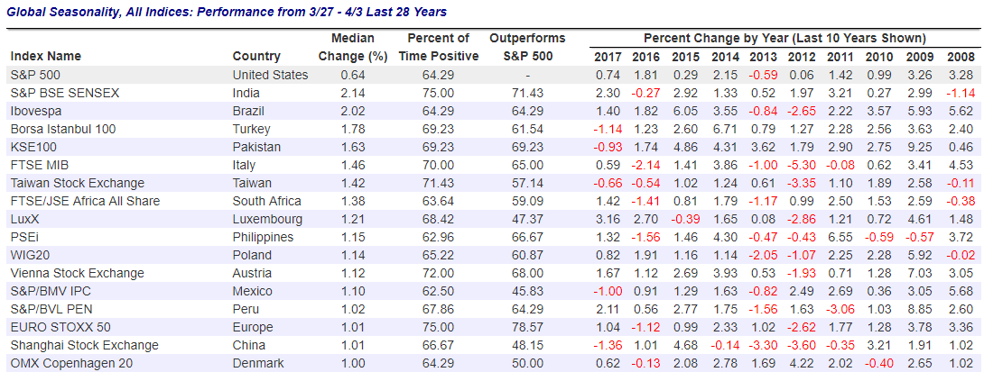
Both the chart above and the table below are snapshots from the seasonality screen we ran using our Stock Seasonality tool. The table below shows the best-performing country stock markets from 3/27 to 4/3. For each country, we show its median % change during this period along with the percentage of the time it has been positive, the percentage of time it has outperformed the S&P 500, and then how it has performed during this period in each of the last ten years.
India has been the clear leader among countries with positive returns 75% of the time between 3/27 and 4/3. The Euro STOXX 50 index is the only other country in the table that has posted gains 75% of the time.
Start a free trial to Bespoke Premium to access our Stock Seasonality Tool now!
B.I.G. Tips – The Shortest Romance Ever
Two months ago, when the January Consumer Confidence report was released, we noted in a Chart of the Day report how bullish sentiment towards US equities had hit a record high. In that report, we noted how “Similar examples of periods where sentiment was tilted to the bullish side are few and far between, but overall, forward returns were mixed and volatility picked up.”
While consumers finally fell in love with equities again in January, the romance has soured quickly. In this month’s Consumer Conference report for the month of March, the percentage of consumers looking for higher stock prices dropped to 35.4%, for a two-month decline of over 15 percentage points! Meanwhile, the percentage of consumers looking for lower stock prices has ticked up from a ten-year low of less than 20% in November to 29.4% now. It has only been two months, but the shift in sentiment towards equities by US consumers has been swift.
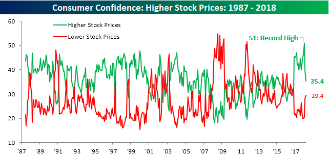
In a B.I.G. Tips report sent to clients today, we looked at prior periods where consumers soured so quickly on the stock market. In the report, we highlight how the market typically does following these rare bearish swings. If you’re interested in the report, you can read it by signing up for a Bespoke Premium membership now!
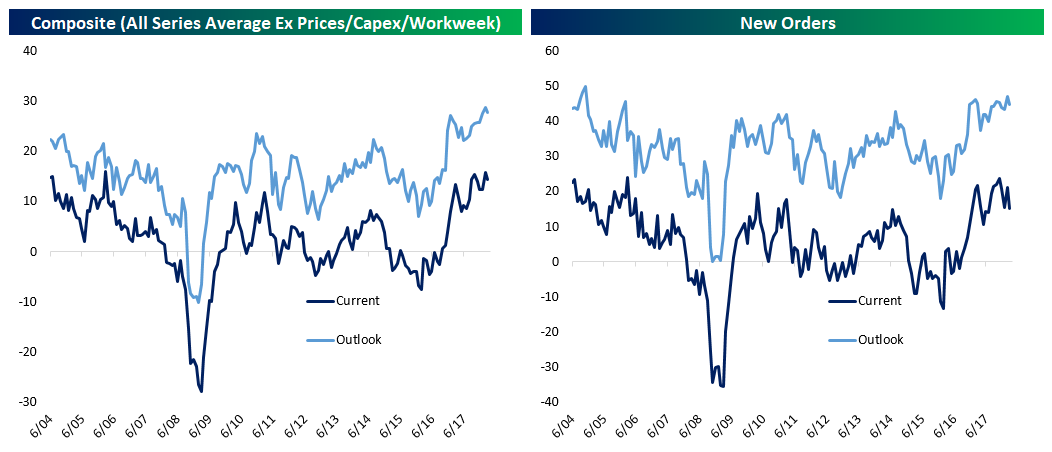
Aggregate National Manufacturing Indicator Using the 5 Regional Fed Surveys
Last night in The Closer we introduced a new way to track the aggregate national manufacturing sector using common elements of the New York, Philadelphia, Kansas City, Dallas and Richmond Fed manufacturing surveys. Join Bespoke Institutional now to track this indicator on a monthly basis.
The data dates back to 2004, when the Dallas Fed data was introduced. Today, with the release of the Richmond Fed’s manufacturing data, we now have all five March releases. There are some interesting trends. For instance, the current composite (a simple average of all categories except for prices, workweek, and capex) declined on the month, driven by lower employment, shipments, and new orders in February. The outlook composite (asking manufacturers what they think is in store 6 months ahead) declined due to lower inventory, new orders, shipments, and unfilled orders.
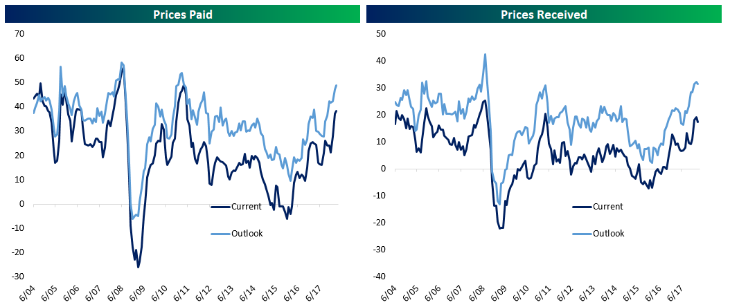
Prices paid continue to accelerate, while prices received have started to decline on both a current and forward basis. Capex expectations also may have peaked. We summarize the readings in the table below, showing from left to right the current reading, its percentile versus the historical range, the reading from last month, sequential change, the reading from 3 months ago, 3m change, the reading from a year ago, and YoY change. All components are seasonally-adjusted, with readings above 0 indicating expansion and readings below 0 indicating contraction.
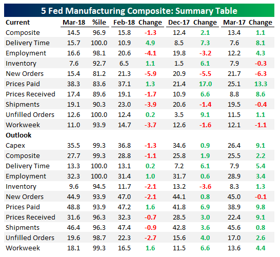
We can also chart the data to show its evolution over time. As shown in the first chart at left below, our composite is just off record levels established last month on an outlook basis and near-record levels on a current basis. The New Orders readings look much less impressive. While the outlook for new orders is right near a record from last month, current readings have pulled back materially.
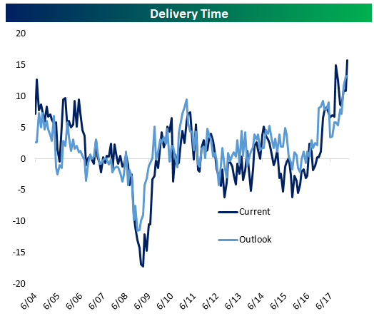
While some indices are retreating, one series that is still at a record on both a current and expected basis is the delivery time series. As shown below, manufacturers are seeing rapidly rising wait times for supplier deliveries, an indication of capacity constraints.
Prices are also indicating capacity constraints as they’ve accelerated rapidly from early 2016 lows through today. We do note prices received edged slightly lower in March but are still very high relative to history.
Finally, expected outlays on capital expenditures took a breather after posting a record for several consecutive months.
Join Bespoke Institutional now to track our national aggregate manufacturing readings! Monthly updates are included in our post-market macro note — The Closer.