Fixed Income Weekly – 5/9/18
Searching for ways to better understand the fixed income space or looking for actionable ideals in this asset class? Bespoke’s Fixed Income Weekly provides an update on rates and credit every Wednesday. We start off with a fresh piece of analysis driven by what’s in the headlines or driving the market in a given week. We then provide charts of how US Treasury futures and rates are trading, before moving on to a summary of recent fixed income ETF performance, short-term interest rates including money market funds, and a trade idea. We summarize changes and recent developments for a variety of yield curves (UST, bund, Eurodollar, US breakeven inflation and Bespoke’s Global Yield Curve) before finishing with a review of recent UST yield curve changes, spread changes for major credit products and international bonds, and 1 year return profiles for a cross section of the fixed income world.
This week we discuss where things stand in the current credit cycle. We also discuss the net asset value discount on EDD as a sentiment gauge and as a way to gauge future returns.

Our Fixed Income Weekly helps investors stay on top of fixed income markets and gain new perspective on the developments in interest rates. You can sign up for a Bespoke research trial below to see this week’s report and everything else Bespoke publishes free for the next two weeks!
Click here and start a 14-day free trial to Bespoke Institutional to see our newest Fixed Income Weekly now!
The Closer — Iran Away, Jaunty JOLTs, Beige Not Boring — 5/8/18
Log-in here if you’re a member with access to the Closer.
Looking for deeper insight on markets? In tonight’s Closer sent to Bespoke Institutional clients, we review the decision from President Trump to cancel the Iran deal, updated March JOLTS data, and a new index of economic activity based on the Fed’s Beige Book.

See today’s post-market Closer and everything else Bespoke publishes by starting a 14-day free trial to Bespoke Institutional today!
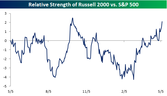
Small Caps Shine in Dollar’s Rise
As we highlighted in a prior post, when the dollar rallies, companies with domestic exposure tend to outperform their multi-national peers. Since small-cap stocks tend to have little in the way of international exposure, they tend to be a big beneficiary of dollar strength. Look no further than the relative strength chart of the Russell 2000 versus the S&P 500 over the last year. When the line is rising, it indicates that small caps are outperforming and vice versa for a falling line. While small caps were underperforming by a pretty sizable margin back in mid-February, they have completely reversed in the last three months and are now outperforming large caps by nearly their widest margin of the last twelve months. Quite a turnaround!
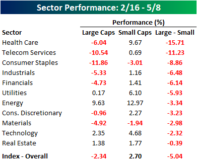
In terms of the recent outperformance in the small-cap space since the US Dollar Index’s low in February, it couldn’t possibly be more broad-based. Since 2/16, the S&P 500 is down 2.3% while the S&P 600 small-cap Index has actually rallied 2.7%. What’s really amazing, though, is that all 11 sectors in the small-cap space have outperformed their large-cap peers since 2/16. While the performance spread is widest in the Health Care sector at more than 15 percentage points, even small-cap Technology and REITs have managed to outperform their larger peers.
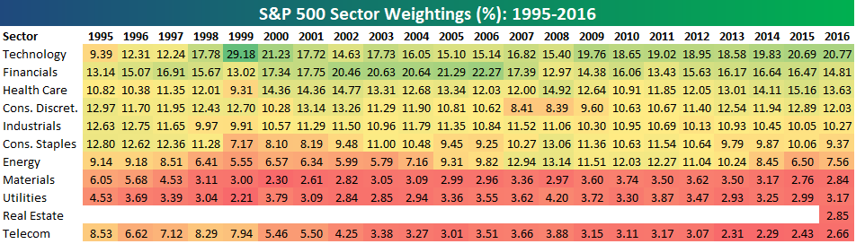
Bespoke’s Sector Weightings Report — May 2018
S&P 500 sector weightings are important to monitor. Over the years when weightings have gotten extremely lopsided for one or two sectors, it hasn’t ended well. Below is a table showing S&P 500 sector weightings from the mid-1990s through 2016. In the early 1990s before the Dot Com bubble, the US economy was much more evenly weighted between manufacturing sectors and service sectors. Sector weightings were bunched together between 6% and 14% across the board. In 1990, Tech was tied for the smallest sector of the market at 6.3%, while Industrials was the largest at 14.7%. The spread between the largest and smallest sectors back then was just over 8 percentage points.
The Dot Com bubble completely blew up the balanced economy, and looking back you can clearly see how lopsided things had become. Once the Tech bubble burst, it was the Financial sector that began its charge towards dominance. The Financial sector’s sole purpose is to service the economy, so in our view you never want to see the Financial sector make up the largest portion of the economy. That was the case from 2002 to 2007, though, and we all know how that ended.
Unfortunately we’ve begun to see sector weightings get extremely out of whack once again.
If you would like to see the most up-to-date numbers for S&P 500 sector weightings, simply start a two-week free trial to our Bespoke Premium or Bespoke Institutional services. Click back to this post to see the numbers once you’re signed up!
Domestics Shining As Dollar Rallies
As shown in the chart below, the US Dollar index is up 4% since it took off on April 16th.
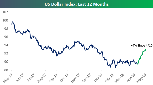
Dollar strength hurts US companies that generate significant revenues outside of the country, and it benefits companies that generate the bulk of their revenues domestically.
Since April 16th when the Dollar began its current rally, we’ve seen “domestic” stocks outperform “internationals” by a wide margin. Using our International Revenue Database that’s available to Bespoke Premium and Bespoke Institutional members, below we show that Russell 1,000 stocks that generate 50%+ of their revenues outside of the US are down an average of 1.21% since 4/16. On the flip side, Russell 1,000 stocks that generate all of their revenues domestically are up an average of 1.67% over the same time period.
This is clear evidence that the Dollar’s movements are impacting stock prices.
To find the geographic revenue exposure of stocks you’re most interested in, start a two-week free trial to Bespoke Premium and access our International Revenues Database now.
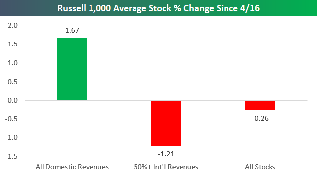
Chart of the Day – Small Business Sentiment Little Changed
S&P 500 Average Performance by Weekday
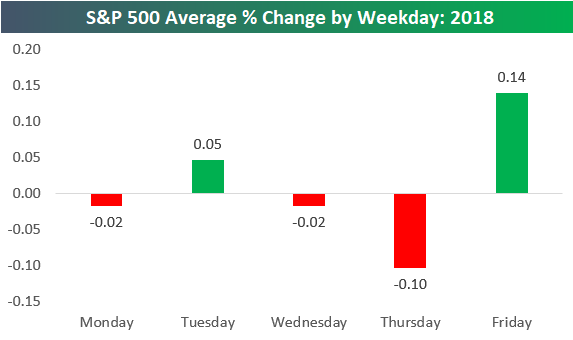
The S&P 500 has averaged a daily change of 0.01% so far in 2018. That’s about as close to zero as it can get, but at least it’s positive!
Below is a chart showing the S&P 500’s average daily change by weekday so far in 2018. As shown, Monday, Wednesday, and Thursday have averaged declines, while Tuesday and Friday have averaged gains. Thursdays have been the worst day of the week, while Fridays have been the strongest.
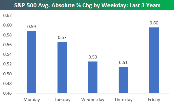
In terms of volatility, the S&P has averaged an absolute change of +/-0.86% on all trading days so far in 2018. In 2017, which was one of the least volatile years in the history of the stock market, the S&P averaged an absolute daily change of just +/-0.30%.
Below we show how volatile each trading day of the week has been in 2018. As shown, the week has started and ended with a bang, while the middle days have been less volatile. On Mondays, the S&P has averaged a move of +/-1.15%. Tuesdays and Thursdays have averaged smaller moves of just over +/-0.80%, while Wednesdays have been the least volatile with an average change of +/-0.51%. Finally, Fridays have ended the week with an average absolute change of +/-1.03%.

The trend of volatile starts and ends to weeks and a calmer tone during the middle of the week has been in place for more than just 2018. Looking back over the last three years, a similar pattern has been in place. Mondays and Fridays have been the most volatile days of the week, and then things have gotten progressively less volatile from Tuesday through Thursday.
Bespoke Stock Scores — 5/8/18
The Closer — Last Hour, Next 6 Months — 5/7/18
Log-in here if you’re a member with access to the Closer.
Looking for deeper insight on markets? In tonight’s Closer sent to Bespoke Institutional clients, we take a look at the last hour of trading versus the first hour, and what it means for forward returns. We also take a look at a couple solid data releases from Mexico today and the recession signal in the UST yield curve.
See today’s post-market Closer and everything else Bespoke publishes by starting a 14-day free trial to Bespoke Institutional today!
A Bipartisan Rally: Crude Oil and the Dollar
WTI crude oil prices crossed a major milestone when they traded above $70 per barrel for the first time since late 2014, when prices were crashing from over $100 to ultimately under $30. With the recent gains, crude oil prices are up over 16% YTD now and 52% over the last 12 months.
The most surprising aspect of the rally in crude oil prices is that the most recent leg higher has come as the dollar has rallied along with it. Historically, crude oil prices have had an inverse correlation to the dollar and looking at the chart below, it’s pretty easy to see that the rally in crude oil prices over the last year has mostly coincided with a decline in the dollar. Over the last four weeks, though, the US Dollar Index has seen a pretty sizable bounce of over 3%, but rather than stop the rally in its tracks, crude oil has been unfazed, gaining an additional 10%+.

We just published a report for clients looking at how equities have reacted following prior periods where crude oil and the dollar have rallied by similar magnitudes on a simultaneous basis. After going through this must-read report, you may be surprised to see just how uncommon a scenario like this is. To see the report, sign up for a monthly Bespoke Premium membership now!