Q1 GDP Slows, But Beats Expectations
Analysts were forecasting a significant weakening of GDP in Q1 versus a solid pace in Q4, and they got it, but not to the degree they expected. Real gross domestic product rose 2.32% annualized in the first three months of 2018, the slowest pace since Q1 of 2017. That was still stronger than the 2.0% forecast by economists. Notably, that was the first beat for a Q1 GDP print in almost a decade…the last time analysts undershot the start of the year was Q1 2008.

As shown in the chart above, the deceleration in output was mostly a function of consumption. As shown in the chart, consumer spending rose over 4% in real terms in Q4 at an annual pace. That was the strongest pace since Q4 2014, when consumer outlays rose at a 5% annual rate. Nonresidential fixed investment (business capital expenditures) continues to run at a robust pace over 6% annualized. While that pace is strong, it’s interesting to note that 3 of the prior 4 quarters were stronger.
Given typical weakness in Q1 and the lumpy consumer spending numbers, this GDP report ended up pretty well all things considered. We should also emphasize that the first reading of GDP is always the least accurate, so revisions are worth keeping an eye on.
The Closer — US Data Discussion, EM Getting Cheap — 4/26/18
Log-in here if you’re a member with access to the Closer.
Looking for deeper insight on markets? In tonight’s Closer sent to Bespoke Institutional clients, we review US data released today: homeownership & vacancy, advance goods trade data, preliminary durable goods manufacturing data, Mexican labor markets, and Brazilian loan growth. We also review high carry EM currrencies with brutal charts.

See today’s post-market Closer and everything else Bespoke publishes by starting a 14-day free trial to Bespoke Institutional today!
Bespoke’s Sector Snapshot — 4/26/18
We’ve just released our weekly Sector Snapshot report (see a sample here) for Bespoke Premium and Bespoke Institutional members. Please log-in here to view the report if you’re already a member. If you’re not yet a subscriber and would like to see the report, please start a two-week free trial to Bespoke Premium now.
Below is one of the many charts included in this week’s Sector Snapshot, which highlights the percentage of stocks in each S&P 500 sector that are trading above their 50-day moving averages. As shown, breadth for the S&P 500 remains below 50% with 45% of stocks in the index currently above their 50-DMAs. Unfortunately, the key cyclical sectors of the market like Industrials, Consumer Discretionary, Technology, and Financials all have readings below 45%.
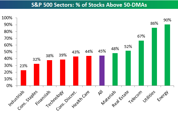
To find out what this means and to see our full Sector Snapshot with additional commentary plus six pages of charts that include analysis of valuations, breadth, technicals, and relative strength, start a two-week free trial to our Bespoke Premium package now. Here’s a breakdown of the products you’ll receive.
B.I.G. Tips – Most “Dismally” Forecast Economic Report Ever?
the Bespoke 50 — 4/26/18
Every Thursday, Bespoke publishes its “Bespoke 50” list of top growth stocks in the Russell 3,000. Our “Bespoke 50” portfolio is made up of the 50 stocks that fit a proprietary growth screen that we created a number of years ago. Since inception in early 2012, the “Bespoke 50” has beaten the S&P 500 by 64.4 percentage points. Through today, the “Bespoke 50” is up 157.6% since inception versus the S&P 500’s gain of 93.2%. Always remember, though, that past performance is no guarantee of future returns.
To view our “Bespoke 50” list of top growth stocks, click the button below and start a trial to either Bespoke Premium or Bespoke Institutional.
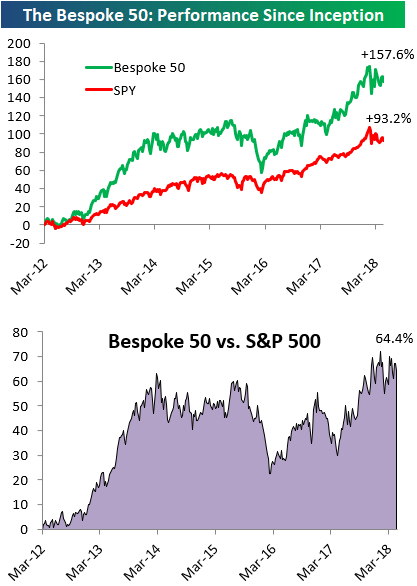
Chart of the Day: Capex Activity Likely Peaked
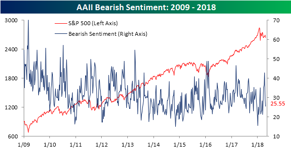
Bearish Sentiment Drops Again
Despite the weak performance for equities over the last week, individual investor sentiment didn’t show any spike in negative sentiment this week. According to the weekly sentiment survey from AAII, bullish sentiment dropped less than one percentage point falling from 37.78% down to 36.91%.
While bullish sentiment barely budged, bearish sentiment saw a relatively large decline, falling from 29.22% down to 25.55%. That decline of nearly four percentage points follows a drop of nearly 14 percentage points last week, making it the largest two-week decline in bearish sentiment since last September.
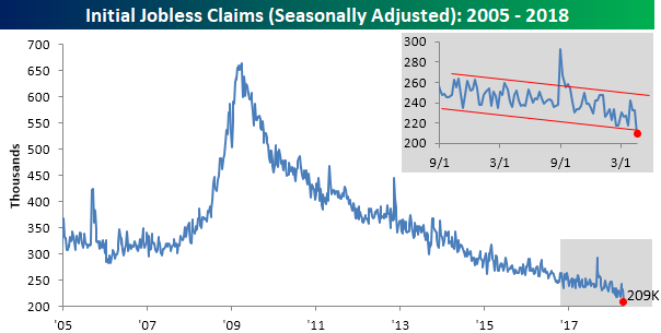
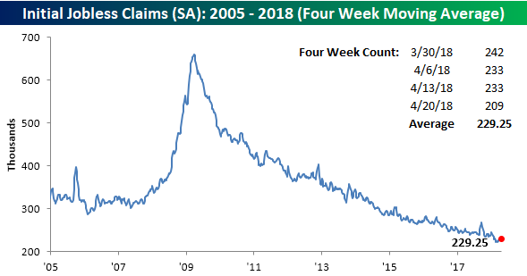
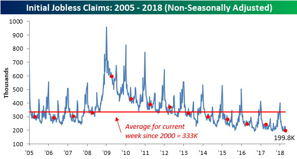
Jobless Claims Doing the Limbo
Just when you think jobless claims can’t go any lower, they do. In this week’s report, first-time claims came in at a level of 209K compared to forecasts for a reading of 230K. Not only was this week’s print a big beat relative to expectations, but it was also the lowest reading since 1969! With jobless claims posting impressive numbers week in and week out, it’s easy to forget how impressive these weekly reports are, so let us remind you. The current streak of 164 straight weeks of sub-300K prints is the longest such streak on record. Also, it has now been 24 weeks since weekly claims even came in above 250K, and that’s the longest such streak of sub-250K readings since 1973.
Even with the weekly reading coming in at the lowest level since 1969, the four-week average for jobless claims didn’t quite take out its multi-decade lows from early March. In order for this reading to make a new low next week, we’ll have to see a print of 215k or less.
On a non-seasonally adjusted basis, jobless claims were also impressive with a sub-200K reading. For the current week of the year, that is the lowest level since 1969, and it’s more than 133K below the average for the current week of the year dating back to 2000.
The Closer — LatAm Update, EIA Recap — 4/25/18
Log-in here if you’re a member with access to the Closer.
Looking for deeper insight on markets? In tonight’s Closer sent to Bespoke Institutional clients, we take a look at recent data releases from Brazil and Mexico. We also recap weekly petroleum market data from the US and energy markets price action.
See today’s post-market Closer and everything else Bespoke publishes by starting a 14-day free trial to Bespoke Institutional today!
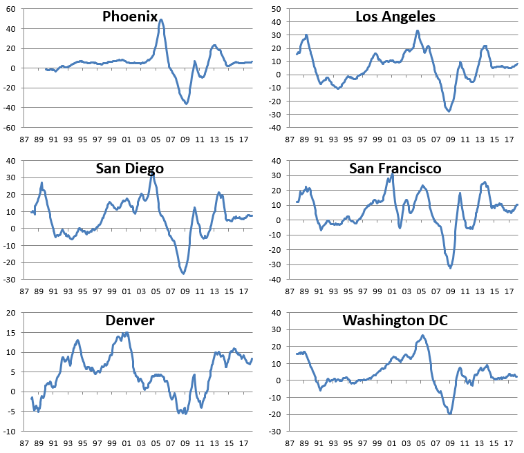
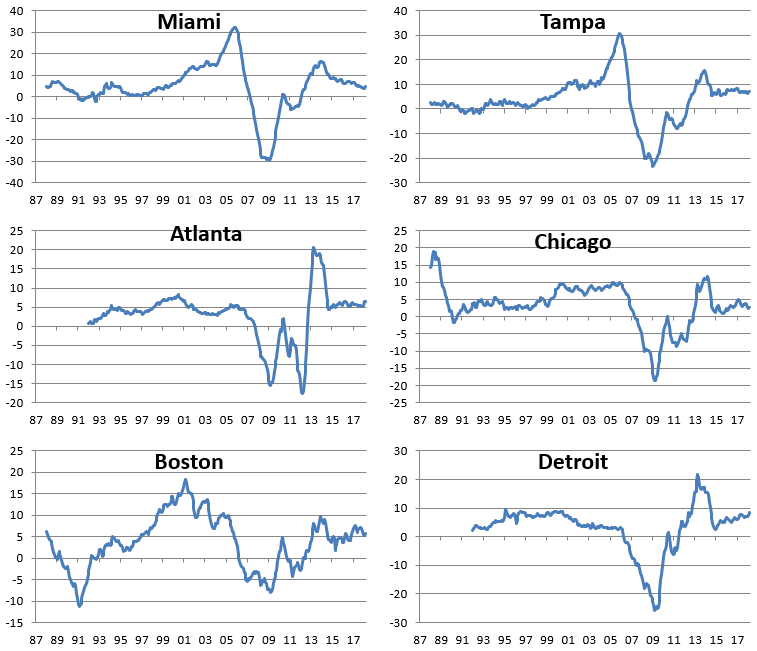
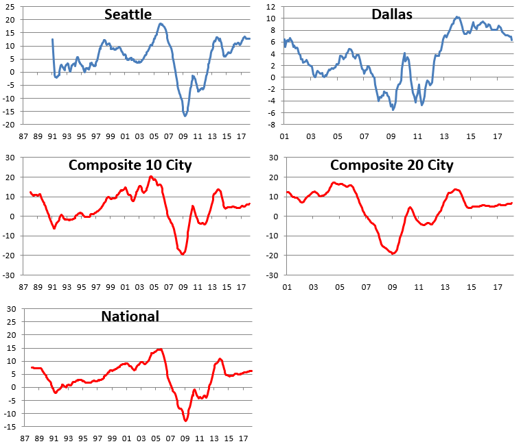
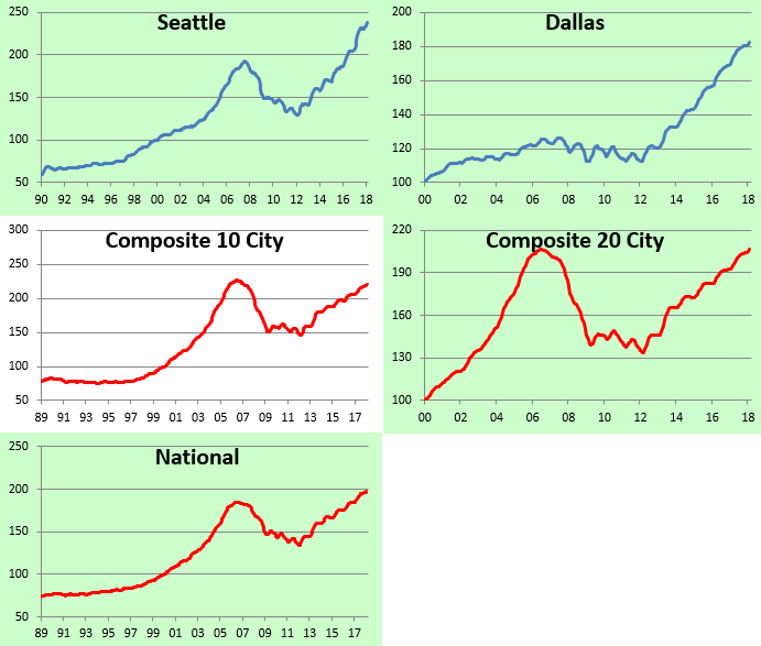
Half of Case Shiller Home Price Cities Now at All-Time Highs
The monthly S&P/Case-Shiller home price indices were released earlier this week, and below we provide a look at the results so you can see how real estate prices are doing in your area of the country. (If you’re outside of the US, we’re sorry!)
In the first chart below, we show how much each of the cities tracked gained (or lost) on a month-over-month and year-over-year basis. Keep in mind that these indices are on a two-month lag, so this month we’re looking at February results.
As shown, every city tracked posted MoM and YoY gains in February, with Seattle up the most over both time frames. Thank you Amazon.com!
Chicago was up the least on a month-over-month basis (+0.05%), while the DC area was up the least on a year-over-year basis (+2.43%).

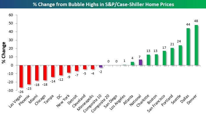
In the chart below, we show how much each city is up or down versus its highest point during the Housing Bubble of the mid-2000s. This month we saw both San Diego and Los Angeles eclipse their prior all-time highs, which means exactly half of the cities tracked are now at new all-time highs, while half are still below their bubble highs.
Denver and Dallas are by far up the most from their mid-2000s highs, while Las Vegas, Phoenix, Miami, and Chicago are the farthest below their prior highs.
Our next chart shows how much home prices have gained off of their low points following the bursting of the Housing Bubble. Most of these lows weren’t made until 2011/2012, which was 2-3 years after the low for the stock market in March 2009. As shown, the three composite indices are now up around 50% off of their lows. San Francisco home prices are up the most at +118%, followed by Las Vegas (+93%), Seattle (+85%), and Detroit (+84%).
On the weak side, Cleveland and New York have seen home prices bounce the least off of their housing crash lows at just +25%. Other cities that have posted relatively weak home price gains over the last few years include the DC area and Chicago.

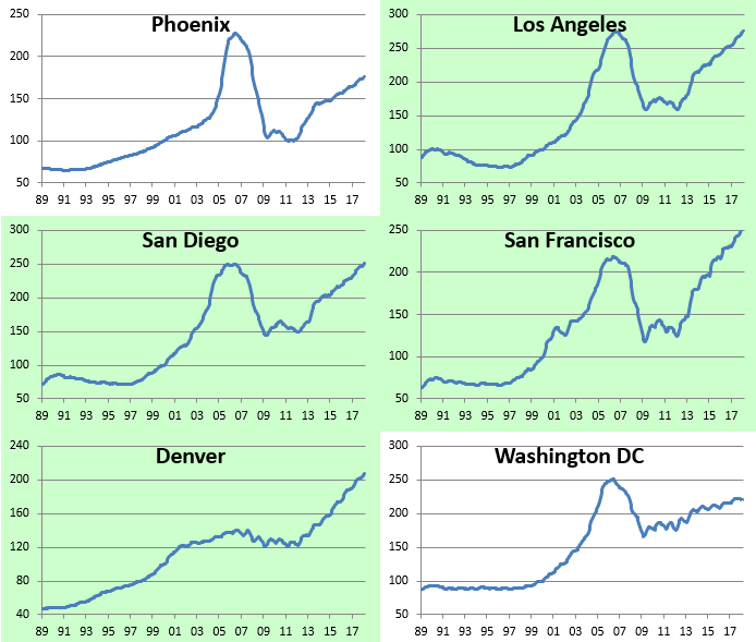
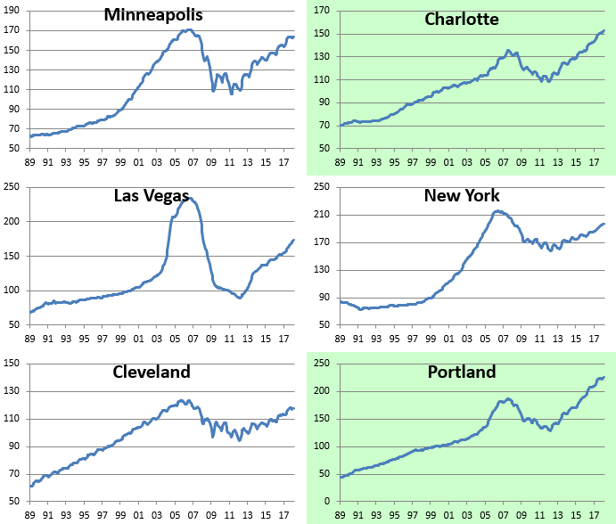
Below we provide raw price charts for the S&P/Case Shiller home price indices going back as far as their data goes. Cities that are highlighted in green have eclipsed their prior Housing Bubble highs, while those not highlighted in green are still below their prior highs. As mentioned earlier, Los Angeles and San Diego are the two cities that just made new highs this month.

We’ve also made charts that highlight the year-over-year percentage change in the S&P/Case-Shiller home price indices. These are included below. When looking through the charts, you’ll mostly notice a big spike in YoY gains during the Housing Bubble, then a crash to extremely negative levels during the bust, and then a two-stage recovery since then. The last period of rapid YoY home price growth for most cities came to an end in 2013/2014, and since then, we’ve seen slow and steady gains. No city has seen a year-over-year decline in home prices for a number of years now.
Start a two-week free trial to Bespoke Institutional for more in-depth coverage of US housing.