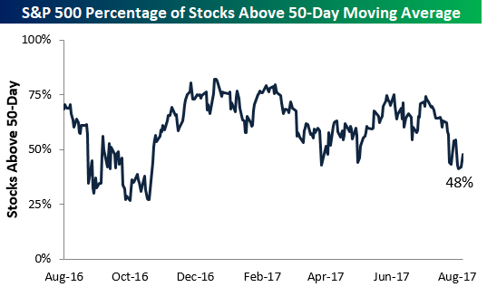
Breadth Still Not Great
The S&P 500 re-took its 50-day moving average yesterday, but unfortunately it did so without more than half of its index members closing above their 50-days as well. As shown below, only 48% of stocks in the S&P are currently above their 50-day moving averages. Bulls would like to see a much stronger reading than that based on where the S&P is currently trading.
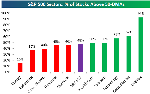
Below is a look at the percentage of stocks above their 50-day moving averages by sector. As shown, five cyclical sectors have breadth readings that are weaker than the 48% reading for the broad S&P 500. Energy is all the way down at 16%, while Industrials and Consumer Discretionary are at 40% or less. The two sectors with the strongest breadth levels are both defensive in nature — Utilities and Consumer Staples. We’d prefer to see the script flipped with cyclicals leading and defensives lagging.
The Closer — Large Cap Technicals, Mexican Growth, and Canadian Retail — 8/22/17
Log-in here if you’re a member with access to the Closer.
Looking for deeper insight on global markets and economics? In tonight’s Closer sent to Bespoke Institutional clients, we review the technical picture for the S&P 500, recap major North American data releases today, and preview tomorrow’s data schedule.

The Closer is one of our most popular reports, and you can sign up for a free trial below to see it!
See today’s post-market Closer and everything else Bespoke publishes by starting a no-obligation 14-day free trial to our research platform!
Chart of the Day: Introducing The “Amazon Survivors” Index
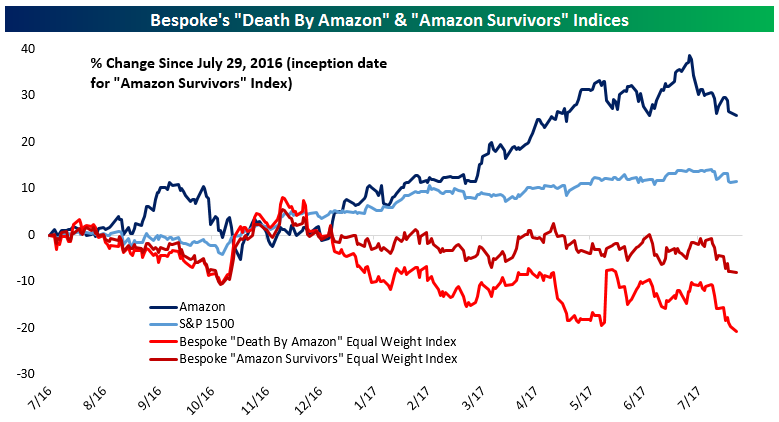
Back in February of 2014, we introduced the Bespoke “Death By Amazon” Index (DBA), a portfolio of companies culled from retailer indices that we judged as being extremely exposed to Amazon’s assault on the traditional retailing business model. The “Death By Amazon” Index has become pretty well-known over the past few years — especially over the last year since it has underperformed the rest of the stock market quite dramatically.
While the “Death By Amazon” Index is made up of retail stocks that are most threatened by Amazon.com, what about the rest of the retail sector? We wanted to know how the retailers that aren’t in the “Death By Amazon” Index are doing compared to the DBA, AMZN, and the broad market. In this regards, we’ve created the Bespoke “Amazon Survivors” Index (ASI), which is composed of companies not included in the “Death By Amazon” Index but still included in the retailing indices we use as our source list for companies. Below, we chart the performance of Amazon, the S&P 1500, and our two indices. All charts of our indices in this post are the equal weight versions.
Subscribe to one of our three membership levels to continue reading today’s Chart of the Day. We provide additional performance metrics as well a list of index members of our “Death By Amazon” and “Amazon Survivors” indices.
Bespoke Stock Scores: 8/22/17
ETF Trends: Fixed Income, Currencies, and Commodities – 8/22/17
S&P 500 Breadth Streak Could End
At one point during the day yesterday, the percentage of stocks in the S&P 500 trading above their 50-day moving averages dipped down to 39%. Had this breadth measure closed at 39%, it would have been the first time the reading closed below 40% in 198 trading days dating back to November 4th, 2016. A small late-day rally into the close saved the streak yesterday, but entering today the reading is sitting right at 40%. The streak will most likely end with a decline of any magnitude for the S&P today.
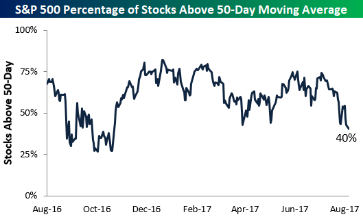
Below is a chart showing historical streaks of trading days with 40%+ of S&P 500 stocks closing above their 50-day moving averages. The length of the streak is just another data point showing just how long it has been since we’ve had any kind of market pullback.
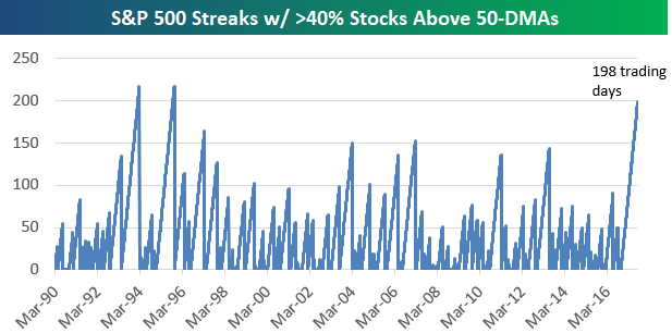
There have only been two longer streaks in the S&P’s history dating back to 1990 when this breadth data begins. In 1994 there was a 216-trading day streak of consecutive 40%+ breadth readings, and in 1995 there was a 217-trading day streak.
Once these long streaks of positive breadth come to an end, there’s a question of what it means. Does the breakdown in breadth finally signal that a more prolonged market pullback has begun, or is it actually a good time to buy?
The table below shows all streaks of 100+ trading days where 40%+ of stocks in the S&P 500 closed above their 50-day moving averages. The date shown is the day the streak came to an end, and next to each date we show how the S&P 500 performed over the next week, month, and three months.
As shown at the bottom of the table, when these streaks have come to an end, the market has performed very well in the near term the large majority of the time. Over the next week, the S&P has averaged a gain of 1.10% with gains 9 out of 13 times (69%). Over the next month, the S&P has averaged a gain of 2.45% with positive returns 10 out of 13 times (77%). And over the next three months, the S&P has averaged a big gain of 4.65% with positive returns 11 out of 13 times (85%). The biggest three-month drawdown seen after these streaks have ended was just -2.67% following the 101-trading day streak that ended on January 13th, 2005.

Gold: Third Time the Charm or Third Strike?
It was less than two weeks ago that we were watching one of the cable news networks, and the panel was discussing what viewers should expect in a war with North Korea since so many of them considered it a sure thing. The next week, the same panel had moved on from North Korea and was discussing the process by which President Trump will leave office. For all this reported chaos in the world right now, one would think that the price of gold would be seeing at least a little action, but over the last four months or so, it has merely been bouncing around between $1,200 and $1,300, or a range of less than 8%. In the most recent leg higher, gold has once again tested the top end of its range and for now, at least, it has been stopped in its tracks. Will the third time be the charm for gold or are we in for just more of the range?

The Closer — Chicago Potpourri — 8/21/17
Log-in here if you’re a member with access to the Closer.
Looking for deeper insight on global markets and economics? In tonight’s Closer sent to Bespoke Institutional clients, we update our tracking of GDP growth based on the Chicago Fed National Activity Index, review the impact of FX on trade for two large economies, and note the implications of a series of daily declines in USDJPY.
The Closer is one of our most popular reports, and you can sign up for a free trial below to see it!
See today’s post-market Closer and everything else Bespoke publishes by starting a no-obligation 14-day free trial to our research platform!
S&P 500 vs. Russell 2,000: Year To Date Relative Performance
While it made an attempt to close the day in the green, the Russell 2,000 small-cap index finished down 7 basis points on Monday. This is notable because it left the index in the red on a year-to-date basis.
As shown below, the Russell 2,000 is lagging the large-cap S&P 500 badly in 2017. Through today’s close, the S&P is outperforming the Russell by roughly 8.3 percentage points YTD.
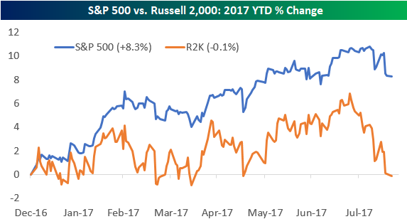
Below is a table showing the year-to-date performance of both the S&P 500 and Russell 2,000 at this point in each year since 1979 (the Russell 2,000’s inception point). For each year, we also show how the two indices performed for the remainder of the year.
At this point in the year (160 trading days), 2017 is only the third year in which the S&P 500 was up while the Russell 2,000 was down. It’s also been the third worst year ever for the Russell 2,000 on a relative basis versus the S&P 500 at this point in the year.
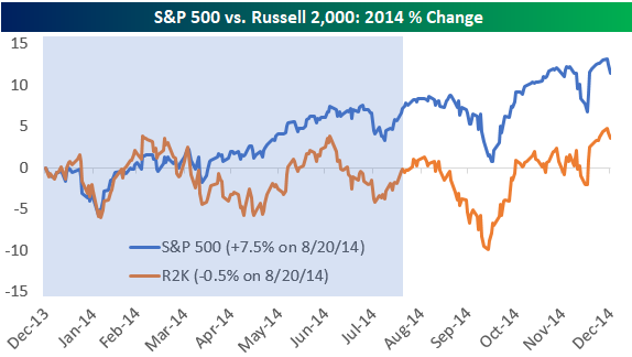
Interestingly, we saw a very similar underperformance scenario for the Russell 2,000 just 3 years ago in 2014. Through 160 trading days in 2014, the S&P 500 was up 7.47% compared to the Russell 2,000’s decline of 0.53%. In that year, both indices gained from August 21st through year-end, with the Russell slightly out-gaining the S&P (+4.08% vs. +3.64%).
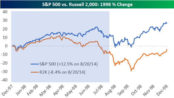
The other year where the S&P 500 was up at this point while the Russell was down was in 1998. In that year the Russell underperformance was more than 2x as bad, though. While the S&P 500 was up 12.49% on August 20th, 1998, the Russell 2,000 was down 8.38%! In that year, the S&P 500 went on to gain another 12.61% for the remainder of the year, while the Russell only gained another 4.96%.

Below we provide chart patterns of the S&P 500 vs. Russell 2,000 in both 2014 and 1998, with the blue shading representing the first 160 trading days of each year.
Energy’s Lost Decade
You know you’re getting old when you can’t remember the last time Energy stocks were a market leader. The chart below shows the relative strength of the S&P 500 Energy sector versus the S&P 500 going back to August 1989. When the line is rising, it indicates periods where Energy is outperforming the S&P 500, while periods of Energy sector underperformance are indicated by falling lines. The period from September 1990 through January 1999 was one where the sector was out of favor, and it was towards the end of it when Exxon merged with Mobil and then Chevron merged with Texaco. At the time those mergers were announced, the sector was right in the midst of putting in a multi-year bottom that sparked a nine-year period of major outperformance by the sector.
Like all good parties, though, the music eventually stopped for the Energy sector in July 2008 just as the Financial Crisis was unfolding. From that peak up until now, Energy has been a major underperformer versus the S&P 500 and given up nearly all of its prior outperformance. Even more noteworthy, though, is the fact that the current period of underperformance has now lasted longer (9 years, 1 month) than the 8 years and 4-month stretch that spanned the majority of the 1990s. We have noted in the past that overcapacity looms as one of the major impediments to a sustainable rally in the Energy sector, and one way to remedy that is through consolidation. That’s exactly what happened in the late 1990s, but this time around we have yet to see any really big headline-grabbing mergers in the space.
Start a 30-day free trial to Bespoke’s Premium service for our most actionable ideas.
