Not All Golden Crosses Are Golden
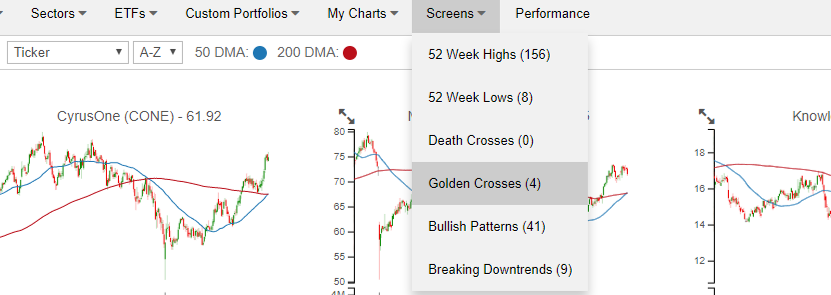
Our recently launched Chart Scanner has become an incredibly popular and useful tool for clients as it gives a user the ability to quickly scan through hundreds of charts in order to find the most attractive (or unattractive) patterns. Included with the tool are a number of pre-defined screens that allow users to see stocks that hit 52-week highs or lows in the previous session, experienced “death” or “golden” crosses, as well as charts which we view as having bullish or bearish patterns. Each of these screens can be found using the drop-down box at the top of the page (as illustrated in the image below). To unlock our Chart Scanner tool, simply sign up for a two-week free trial to Bespoke Premium. You won’t be disappointed!
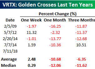
In a follow-up to yesterday’s post regarding Exxon Mobil’s (XOM) historical performance following Golden Crosses, today we wanted to highlight another example that showed up in our Chart Scanner. Yesterday, Vertex Pharmaceuticals (VRTX) had its fifth Golden Cross in the last ten years with the most recent occurring back in July 2014. A Golden Cross occurs when a stock’s upwardly sloping 50-day moving average (DMA) crosses above its 200-DMA, which also has to be rising. Conversely, a Death Cross occurs when a downwardly sloping 50-DMA crosses below the 200-DMA, which also has to be moving lower. Technicians consider Golden Cross formations to be a positive signal, while a Death Cross is considered to be negative.

Unlike XOM, which has historically seen modestly positive returns following these patterns, Golden Crosses for VRTX have been outright bearish. The table below lists the one week, one month, and three month returns for the stock following each prior Golden Cross. After just one week, VRTX had positive returns only half the time, yet still managed to average a gain of 2.48% (median: 0.29%). However, one month later in all four prior occurrences, the stock saw big declines, averaging a drop of 10.68% (median: -12.06%). The three-month return did not do much better, averaging a decline of 6.35% (median: -11.62%) with losses three out of four times. It just goes to show that even something that technicians consider to be a positive signal is not always a guarantee.
Yield Curves Update
Below we reproduce one section of our Fixed Income Weekly — a report we update every Wednesday to Bespoke Institutional subscribers covering domestic and international interest rate, credit, and other fixed income-related subjects. Each week we include commentary on a variety of yield curves, including USTs, German bunds, Eurodollars, inflation, and the Bespoke Global Yield Curve, a composite nominal interest rate measure of the 15 largest global economies.
Curve flattening continues, with swaps curve starting to invert in some cases. We discussed that phenomenon in The Closer on Tuesday (link). 10s30s is the most likely to invert, but 5s10s is also very close to inverting as well. The front end of the curve is relatively stable (15 bps range since the start of June).
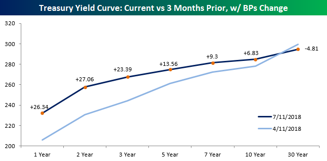
The persistent decline in German yields over the past 5 months (from over 75 bps at the start of February to sub-30 bps earlier this week) has helped dramatically flatten the Euro curve, which hit 52-week lows this week in lock-step with the US yield curve. Sovereign bonds have been better behaved of late.

As discussed in The Closer last night (link), the Eurodollar curve has flattened. That said, it’s a kink in the curve as opposed to an overall flattening with lower yields in out years. Still, that inversion is not a good sign as a reflection of market expectations for the future of the Fed hiking cycle or the economic expansion.

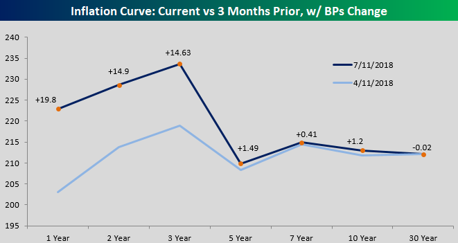
Yesterday’s PPI report came in pretty hot, with PPI Final Demand, Ex Food & Energy, and Ex Food, Energy, & Trade Services all beating expectations. Ex Food & Energy hit the highest level since 2011 on a YoY basis. That bodes well for the overall trend in inflation, and is also a reflection of both tightening labor markets and the impacts of tariffs on intermediate and final goods.
With both US and Euro curves flattening dramatically, the Bespoke Global Yield Curve has made new flats over the last few weeks. That’s despite a topping out of the short end of the curve, which had been rising inexorably thanks to the combination of Fed tightening and emerging market central bank hikes in response to currency weakness across the space.
For more analysis like this on a weekly basis, start a two-week free trial to Bespoke Institutional and gain access to our Fixed Income Weekly.

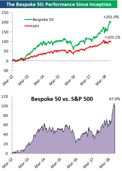
the Bespoke 50 — 7/12/18
Every Thursday, Bespoke publishes its “Bespoke 50” list of top growth stocks in the Russell 3,000. Our “Bespoke 50” portfolio is made up of the 50 stocks that fit a proprietary growth screen that we created a number of years ago. Since inception in early 2012, the “Bespoke 50” has beaten the S&P 500 by 97.9 percentage points. Through today, the “Bespoke 50” is up 201.0% since inception versus the S&P 500’s gain of 103.1%. Always remember, though, that past performance is no guarantee of future returns.
To view our “Bespoke 50” list of top growth stocks, click the button below and start a trial to either Bespoke Premium or Bespoke Institutional.
Friday the 13th Markets
With tomorrow being Friday the 13th, we looked at how the S&P 500 has performed on this day over time. Historically, the “cursed” day has not had much of an impact on the market. In fact, going all the way back to 1928, the S&P has actually performed slightly better when the 13th falls on a Friday (+0.01%) than it has when the 13th falls on all other weekdays (-0.02%). Relative to all other Fridays, though, market returns on Friday the 13th are weaker as the S&P 500’s average Friday performance over time has been a gain of 0.05% (table below).

The chart below shows the S&P 500’s return on all Friday the 13ths since 2009. Judging by the results, it would appear as though investors have become more superstitious as the S&P 500 has averaged a decline of 0.14% with gains just 44% if the time. The worst Friday the 13th during this period came in April 2012 when the S&P 500 declined 1.25%, while the biggest gain was exactly three months later on 7/13/2012 (1.65%). While the overall returns of the S&P 500 on Friday the 13th since 2009 have been a bit weaker than average, we would be more concerned with seeing a black cat or walking under a ladder than seeing any catastrophic market change on this historically unlucky day.

Chart of the Day: New 9 Year Lows For Turkey
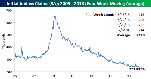
Jobless Claims Back Near Historic Lows
After two weeks of increases, jobless claims saw their largest one-week decline since April this week, falling from 232K down to 214K. At 214K, initial claims are just 5K above their cycle low of 209K back on 4/20, but more importantly, claims have now been below 300K for a record 175 straight weeks and at or below 250K for 40 weeks. If that’s not impressive, what is?
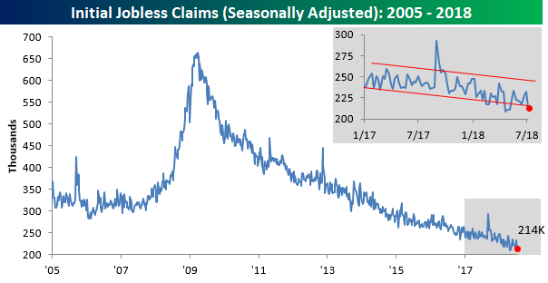
Even with this week’s decline, though, the four-week moving average barely budged lower, falling from 224.75K down to 223K. That’s 9.5K above the cycle low of 213.5K on 5/11. With a print of 218K falling off the count next week, it’s going to be hard to make much downside headway in this reading.
The most impressive aspect of the report this week was the non-seasonally adjusted numbers. At a level of 264.5K, NSA claims were more than 130K below the average for the current week of the year dating back to 2000, and going all the way back to the late 1960s when the series starts, there has never been a lower reading for the current week of the year.
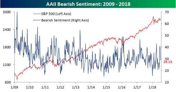
Biggest Increase In Bullish Sentiment Since 2016 Election
Bulls are not only running on the streets of Pamplona this week, but they’re on Wall St. as well. Even with yesterday’s trade-induced decline, individual investors seized on the S&P 500’s four-day win streak and turned considerably more optimistic on equities. According to the weekly sentiment survey from AAII, bullish sentiment surged from 27.9% up to 43.1%. That 15.2 percentage point increase represents the largest one week increase in optimism since the week after the November 2016 election of President Trump.
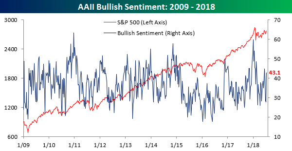
Not surprisingly, most of the increase in bullish sentiment came from the bearish camp, where the percentage dropped from 39.3% down to 29.2%.
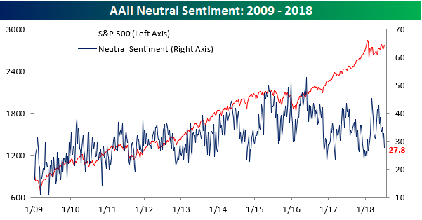
Neutral sentiment also saw a sizable decline this week as investors became a little bit more decisive in their views. This week’s reading of 27.8% is the lowest level of neutral sentiment since the start of February.
The Closer — Quits Surge, Curves Flatten — 7/11/18
Log-in here if you’re a member with access to the Closer.
Looking for deeper insight on markets? In tonight’s Closer sent to Bespoke Institutional clients, we take a look at the very strong PPI numbers today from the BLS. Despite the huge decline in crude today, EIA data showed strong demand with large inventory draws continuing. We also take a look at a few different market indicators in fixed income and FX.

See today’s post-market Closer and everything else Bespoke publishes by starting a 14-day free trial to Bespoke Institutional today!
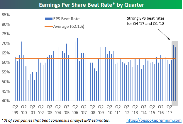
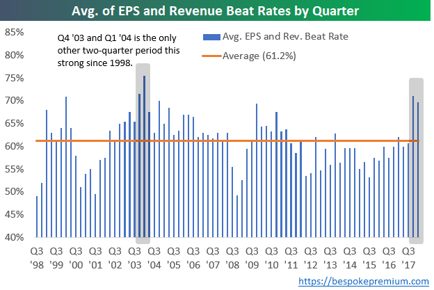
Can Companies Keep Up Strong Beat Rates in Q2 Earnings Season?
One thing we’ll be watching closely this earnings season is whether companies can keep up the extraordinarily high beat rates seen over the past two quarters.
Over the past two earnings seasons, even though analysts had to up their estimates quite a bit due to the Trump corporate tax cuts, companies were easily able to beat expectations. Since 1999, 62.1% of earnings reports have reported EPS that were greater than consensus expectations. As shown below, though, the last two quarters saw much higher than average beat rates.
Not only have bottom line EPS beat rates been strong, but top-line revenue beat rates have been strong as well. Revenue beat rates over the last two earnings seasons were higher than any quarter since Q4 2004.
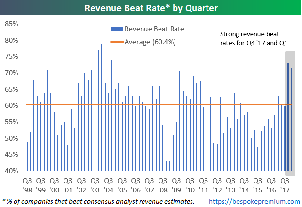
The chart below takes the average of each quarter’s earnings and revenue beat rate. When looking at the strength of both the top and bottom line beat rate each earnings season, the only other two-quarter period that showed stronger beat rates than the last two quarters was back in Q4 2003 and Q1 2004.
Needless to say, investors have gotten used to stronger than expected earnings reports over the last six months. If companies aren’t able to keep up the pace this season, we think the market will struggle.
Years Like 2018 – Not Many!
Calling a specific period of time “unique” is often used as a cop-out by commentators and investors, so we usually try not use the term lightly. But if a certain period of time is so unique that it has no historical precedent, you can’t fault someone for saying it. In comparing the S&P 500’s performance in 2018 to prior years, we found that there really are very few years where the market has seen a similar pattern. In other words, 2018 really is unique!
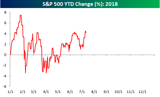
To illustrate this, we ran the correlation of the closing prices of the S&P 500 so far this year to the closing prices for every other year through 7/11. We have done this type of analysis many times over the years, and usually, when we run it, the years that have the most similarity to the year in question have correlation coefficients of +0.85 or even greater than 0.90. In the analysis we ran for 2018, however, there were only two years with a correlation coefficient of more than +0.50, and five of the top ten years have correlation coefficients of less than +0.40!
In a just-published report for Premium and Institutional clients, we ran an analysis of the years that were the most positively and negatively correlated to 2018 to see what trends the market showed for the remainder of these years. To unlock this report, sign up for a Bespoke Premium trial membership now!