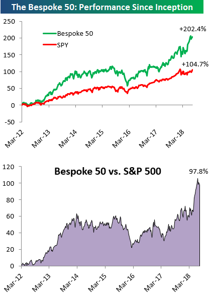
the Bespoke 50 — 7/19/18
Every Thursday, Bespoke publishes its “Bespoke 50” list of top growth stocks in the Russell 3,000. Our “Bespoke 50” portfolio is made up of the 50 stocks that fit a proprietary growth screen that we created a number of years ago. Since inception in early 2012, the “Bespoke 50” has beaten the S&P 500 by 97.8 percentage points. Through today, the “Bespoke 50” is up 202.4% since inception versus the S&P 500’s gain of 104.7%. Always remember, though, that past performance is no guarantee of future returns.
To view our “Bespoke 50” list of top growth stocks, click the button below and start a trial to either Bespoke Premium or Bespoke Institutional.
The Closer — Midweek Chart Bonanza — 7/18/18
Log-in here if you’re a member with access to the Closer.
Looking for deeper insight on markets? In tonight’s Closer sent to Bespoke Institutional clients, we wade through a huge deluge of charts covering everything from the Beige Book released today to commodities’ growth signal, EIA petroleum market data, and a huge wack of charts focused on the disappointing June residential construction report from the US Census.

See today’s post-market Closer and everything else Bespoke publishes by starting a 14-day free trial to Bespoke Institutional today!
China and US Drifting Apart
In an interview with CNBC today, President Trump’s top economic advisor Larry Kudlow highlighted the Administration’s growing frustration with China’s seeming lack of interest to reach any deal in the ongoing trade dispute. As the US and China continue to drift apart in terms of reaching a potential trade deal, so too have the stock markets of both countries. Below we highlight the YTD return of the S&P 500 versus China’s benchmark Shanghai Composite Index. While the two indices started off the year tracking each other relatively closely, the gap between the two has steadily widened and even picked up the pace ever since the President announced the first round of tariffs against China in early March. Through Wednesday, the YTD gap between the two indices is over 20 percentage points in favor of the US, and that’s before even taking the decline in the value of the yuan into account.
With the President’s intent focus on the performance of the stock market under his tenure, you can bet that as long as this trend continues, there will be no urgency on the part of the US to make much in the way of concessions, especially after relaxing restrictions on the ZTE ban and seemingly getting nothing in return.

Equity Relative Strength vs Bonds Testing Resistance
The chart below is updated on a daily basis in our Morning Lineup report and shows the relative strength of the S&P 500 versus the price of the Treasury Long Bond Future over the last 12 months. In the chart, a rising line indicates that equities are outperforming long-term Treasuries and vice versa. As you can see in the chart, the final four months of 2017 saw a steady trend of equity outperformance right up until the January highs. You may recall that back in late January, sentiment towards equities was at multi-year highs while the overriding consensus was that Treasury yields were going to the moon, which would put bonds in a swoon.
Well, with the benefit of hindsight, we all know that stocks didn’t keep rallying and long-term Treasury yields fell (meaning bonds are up in price). In the last couple of weeks, though, equity performance has picked up steam and while the S&P 500 just cleared frustrating resistance at the 2,800 level in the last few days, equity relative strength is also making a move to test a resistance level that has been problematic over the last few months. Technicians often say that the more often a support or resistance level is tested, the weaker it becomes. That ultimately proved to be the case with 2,800 for the S&P 500 last week, and given all the tests in the relative strength chart below, we think resistance will eventually give way to a breakout here as well.
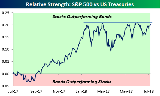
Chart of the Day: Miserable Housing Starts
Fixed Income Weekly – 7/18/18
Searching for ways to better understand the fixed income space or looking for actionable ideals in this asset class? Bespoke’s Fixed Income Weekly provides an update on rates and credit every Wednesday. We start off with a fresh piece of analysis driven by what’s in the headlines or driving the market in a given week. We then provide charts of how US Treasury futures and rates are trading, before moving on to a summary of recent fixed income ETF performance, short-term interest rates including money market funds, and a trade idea. We summarize changes and recent developments for a variety of yield curves (UST, bund, Eurodollar, US breakeven inflation and Bespoke’s Global Yield Curve) before finishing with a review of recent UST yield curve changes, spread changes for major credit products and international bonds, and 1 year return profiles for a cross section of the fixed income world.
Today we look further into the flattening of the yield curve.

Our Fixed Income Weekly helps investors stay on top of fixed income markets and gain new perspective on the developments in interest rates. You can sign up for a Bespoke research trial below to see this week’s report and everything else Bespoke publishes free for the next two weeks!
Click here and start a 14-day free trial to Bespoke Institutional to see our newest Fixed Income Weekly now!
Bespoke’s Global Macro Dashboard — 7/18/18
Bespoke’s Global Macro Dashboard is a high-level summary of 22 major economies from around the world. For each country, we provide charts of local equity market prices, relative performance versus global equities, price to earnings ratios, dividend yields, economic growth, unemployment, retail sales and industrial production growth, inflation, money supply, spot FX performance versus the dollar, policy rate, and ten year local government bond yield interest rates. The report is intended as a tool for both reference and idea generation. It’s clients’ first stop for basic background info on how a given economy is performing, and what issues are driving the narrative for that economy. The dashboard helps you get up to speed on and keep track of the basics for the most important economies around the world, informing starting points for further research and risk management. It’s published weekly every Wednesday at the Bespoke Institutional membership level.
You can access our Global Macro Dashboard by starting a 14-day free trial to Bespoke Institutional now!

The Closer — Small Caps, Netflix, IP, API — 7/17/18
Log-in here if you’re a member with access to the Closer.
Looking for deeper insight on markets? In tonight’s Closer sent to Bespoke Institutional clients, review the downturn in small cap relative performance, recent credit performance and fundamentals for tech high flyer Netflix, monthly industrial production numbers from the Federal Reserve, and a few miscellaneous data points.
See today’s post-market Closer and everything else Bespoke publishes by starting a 14-day free trial to Bespoke Institutional today!
Nasdaq Equal Weight Index on Pace for a Record High Close
OK, everyone knows that the big mega-cap stocks have been doing most of the heavy lifting with respect to stock market returns of late, but one thing we continue to stress is that just because the big stocks are doing really well doesn’t mean that the rest of the market is in the tank. The most recent example? Just today, the Nasdaq 100 Equal Weight index is poised to close at an all-time high after rallying more than 1% off its early lows. While the index still hasn’t taken out its intraday all-time high, it’s basically right there.
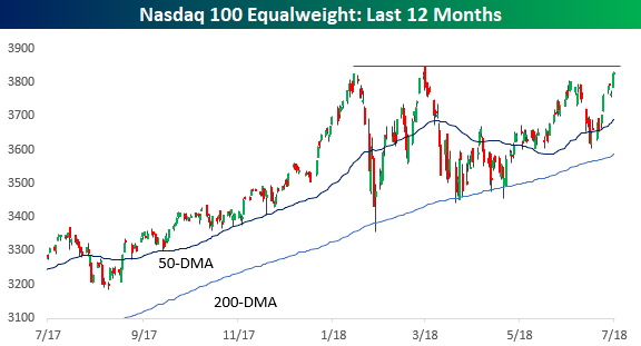
Again, we aren’t denying the fact that the cap-weighted Nasdaq 100, which has been driven by the FANG and other large-cap tech stocks has been outperforming. In the six-month window that the Nasdaq 100 Equal Weight index has been range-bound, the cap-weighted index has been making a routine out of hitting new highs.
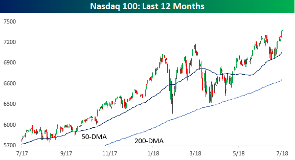
Comparing the performance of the two indices, the Nasdaq 100 is up just over 30% over the last year, but the Nasdaq 100 Equal Weight has been no slouch either, rallying almost 19%, which is better than the Dow, S&P 500, or even Russell 2000.
