Chart of the Day: Consumer Confidence – Mind the Gap
Bespoke Summary of Economic Indicators: 7/31/18
Bespoke Stock Scores — 7/31/18
Month End Rotation or Something Else?
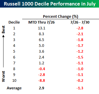
After a second straight day where growth stocks and July’s biggest winners up until late last week (in many cases one in the same) sold off sharply, bulls could use the proverbial ‘Turnaround Tuesday’ right about now. When looking at the performance of individual stocks within the Russell 1000 over the last two trading days, it’s hard not to see what looks an awful lot like month-end rotation and rebalancing out of winners. The table below groups the Russell 1000 components into deciles based on how they performed leading up to last Thursday (7/26). The stocks in the decile of top performers (decile one) were up an average 13.1% heading into last Friday, while the stocks in the decile of worst performers (decile ten) declined an average of 8.8%. Looking at how these stocks have performed since last Thursday’s close shows a clear trend where the top stocks have declined the most, while the stocks that were down the most have gotten by mostly unscathed.
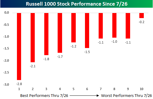
The chart below further illustrates the trend as the deciles of top performers MTD through 7/26 are down the most, while the worst performers have held up much better.
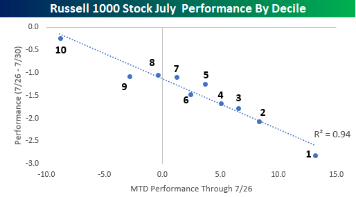
Looking at the performance of each decile on a scatter chart, where the horizontal axis represents MTD performance through 7/26 while the y-axis shows performance since the close last Thursday, further illustrates the trend. As shown, each dot is practically right on the trendline! Clearly, these charts suggest that there is a good deal of rotation and re-balancing going on in portfolios as we approach month-end. That doesn’t mean it has to stop when August begins, but it is a trend we have seen to varying degrees towards the end of prior months in 2018.
With July winding down, we’ve been covering market seasonality for the month of August and how market internals stack up heading into the final full month of summer. To read all about it, you can start a two-week free trial to Bespoke Premium today!
The Closer — Rejection In Place Or Turnaround Tuesday? — 7/30/18
Log-in here if you’re a member with access to the Closer.
Looking for deeper insight on markets? In tonight’s Closer sent to Bespoke Institutional clients, we review the prospects for a “Turnaround Tuesday” after three straight days of losses for the Nasdaq 100. We also review pending home sales, our composite index of Fed manufacturing activity, Brazilian deficit and inflation data, and the prospects for the Fed taking rates above neutral.

See today’s post-market Closer and everything else Bespoke publishes by starting a 14-day free trial to Bespoke Institutional today!
Chart of the Day – The Sun Even Shines on Value Stocks Some Days
B.I.G. Tips – CAT Nipped
Dividend Investing Going The Way Of The Dodo
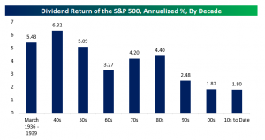
In the middle of the 20th century, it was possible to see a respectable nominal return from equity dividends, as measured by the aggregate market total return from dividends. In the chart below, we show the annual dividend-only return for the S&P 500 by decade. Our data starts in March of 1936 and ends last week, so the first and last segments are snapshots as opposed to a full decade. As shown in the chart, prior to the 1990s, dividend returns were regularly above 4%, with the 1960s the only decade with a 3% return from dividends. Since the 1990s, though, dividend returns have been much lower: 2.48%, 1.82%, and 1.80%. Of course, interest rates overall have fallen dramatically since the 1980s, and that’s a factor here, but more broadly return of capital has become much more common via buybacks than dividends. Share buybacks are a much tax friendlier return of cash to shareholders than dividends, which is a big reason for their increased popularity in recent decades. It’s also worth keeping the much lower dividend disbursal picture in mind when considering the sustainability of market buybacks as it mostly reflects a shift in how companies return capital to shareholders.
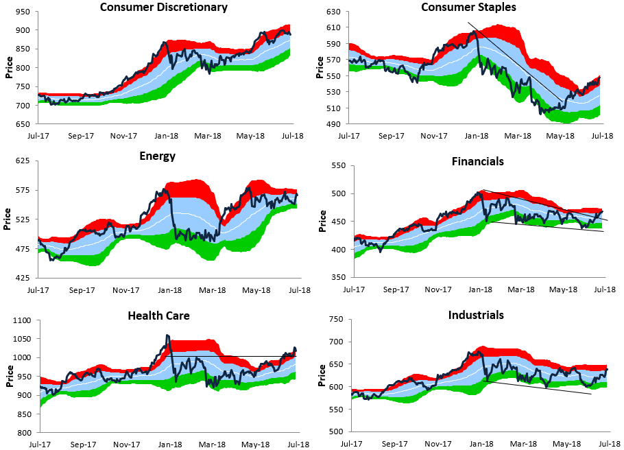
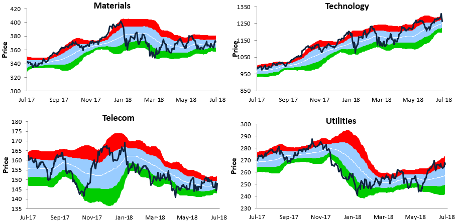
Bespoke Sector Trading Range Charts
As shown below, the S&P 500 recently ticked into extreme overbought territory, which also bumped it up against the top of its uptrend channel. After hitting these levels, the index promptly pulled back last Friday, and it’s lower yet again this morning.
For now, the sell-off seems to be end-of-month re-positioning ahead of what is historically a weaker time of year for stocks (August and September). As long as the bottom of the uptrend channel can hold, bulls will be okay, although it may not feel that way as it happens.

Below is a look at our trading range charts for the major S&P 500 sectors (Real Estate is not included). Over the last week, the major rotation that we’ve seen has been out of sectors that had been leading (Tech, Consumer Discretionary) and into sectors that had been lagging (Industrials, Financials). Overall, most sectors have built up a pretty solid cushion over the last few months that would allow for a drop of a few percentage points without doing much technical damage.
Bespoke Brunch Reads: 7/29/18
Welcome to Bespoke Brunch Reads — a linkfest of the favorite things we read over the past week. The links are mostly market related, but there are some other interesting subjects covered as well. We hope you enjoy the food for thought as a supplement to the research we provide you during the week.
Policing
Sombra the drug-sniffing police dog is famous in Colombia. Now, smugglers have put a bounty on her head. by Kyle Swenson (WaPo)
A single drug-sniffing dog in Colombia has done such a good job finding cocaine (200+ arrests have been credited to her) that a group of drug smugglers have put a price on her head. Stay safe Sombra! [Link; soft paywall]
Abject Failure
Amazon’s Facial Recognition Tech Falsely Matched 28 Members Of Congress With Arrest Mugshots by Davey Alba (BuzzFeed News)
We mentioned some of the pitfalls of Amazon’s Rekognition technology in Bespoke Brunch Reads on May 27th (NYT link; soft paywall). This week the ACLU released a report which showed the platform matching 28 members of Congress to mugshots in its database, a spectacularly high error rate given the high quality input. More disturbingly, the error rate was biased against people of color: they are 20% of Congress but 40% of false matches. [Link]
Darts Are Beating the Ira Sohn Investing Pros by Spencer Jakab (WSJ)
Over the three months since the famed Sohn Conference, a series of stock picks chosen quite literally with darts thrown at the wall are beating the favored picks of presenters. [Link; paywall]
Politics
How The Hell Do You Run An Election When Your Country’s Been Ruled By A Dictator For 37 Years? by Tamerra Griffin (BuzzFeed News)
The first open and free elections in Zimbabwe since its independence are about to take place. This is an on-the-ground look at how candidates are approaching the challenge of introducing themselves to voters. [Link]
Chinese sentences of the day another view of Trump by Tyler Cowen (Marginal Revolution)
A different (and perhaps deceptive?) perspective on the Trump Presidency’s foreign policy, as recounted to Mark Leonhard of the Financial Times. [Link]
A Booming Economy Hasn’t Given House GOP Candidates an Election Edge by Arit John, Laura Litvan, and Katia Dmitrieva (Bloomberg)
Historically low unemployment and accelerating growth have benefited the party in power but ahead of midterms this year the GOP faces a significant deficit in the generic ballot, fundraising, and primary turnout. Explanations include inequality, regional divides, and the intense cultural/values dispute over the President. [Link; soft paywall]
Horror Stories
When a Stranger Decides to Destroy Your Life by Kashmir Hill (Gizmodo)
The awful story of an Alabama woman who was libeled after a debate on Facebook. Despite a desire to remove her lies on the part of the perpetrator, numerous websites still feature the invented slander and refuse to take down the content. [Link]
Hospitals know how to protect mothers. They just aren’t doing it. by Alison Young (USA Today)
Back in December, Bespoke Brunch Reads included a ProPublica investigation of drastically higher mortality related to pregnancy among black women (link). This piece from USA Today looks even more broadly at the issue, which isn’t driven by a single factor but includes failures by hospitals, economic incentives to perform more C-sections, high blood pressure’s prevalence, and more. The result? A staggering and tragic 26.4 maternal deaths per 100,000, drastically higher than in 1990 and standing in sharp contrast to other countries where maternal death rates have consistently fallen. [Link]
Big Projects
The New Rockets Racing to Make Space Affordable by Andre Tartar and Yue Qiu (Bloomberg)
A graphics-intensive look at the race to cut costs for orbital lift capacity. Per kilogram costs have plunged in recent years thanks to increased competition and new entrants, making especially small and generic payloads like mini communications satellites downright affordable to fling into low earth orbit. [Link; soft paywall]
The $3 Billion Plan to Turn Hoover Dam Into a Giant Battery by Ivan Penn (NYT)
One of the problems with some forms of renewable power (especially solar and wind) is that its supply is uneven relative to more predictably harnessed alternatives like natural gas or nuclear plants. One idea: use bursts of electrical power availability to push water upstream of the Hoover Dam, effectively turning the reservoir into a battery. [Link; soft paywall]
History
Book Review: The Rise and Fall of the British Nation: A Twentieth-Century History by David Edgerton by Left Outside (Medium)
A re-casting of British economic history to revise the 20th century narrative of economic and geopolitical development. The details are too extensive to discuss here but this is good food for thought. [Link]
Real Estate
Luxury Homeowners Retreat With Sensory-Deprivation Tanks by Alina Dizik (WSJ)
Tanks of salty water for floating in a state of total sensory deprivation are the latest in a long line of luxury goods added to the homes of the wealthy. [Link; paywall]
Southern California home sales crash, a warning sign to the nation by Diana Olick (CNBC)
CoreLogic data shows a 12% YoY drop in new and existing home/condo sales in Southern California even as prices hit a record, fueling speculation that the national housing market is poised to collapse. [Link]
Economic Policy
Is the Fed Partly to Blame for Wage Stagnation? by Matthew C. Klein (Barron’s)
Klein argues that the Fed has effectively been running monetary policy far too restrictively for a very long time, including but not limited to the post-crisis era. [Link]
Vehicular Assault: Proposed Auto Tariffs Will Hit American Car Buyers’ Wallets by Mary E. Lovely, Jérémie Cohen-Setton, and Euijin Jung (Peterson Institute for International Economics)
A very good teardown of how import taxes on autos would impact the price of cars, on top of existing steel import taxes. The total cost increase estimate ranges from 8% (for compact cars, assuming a 66% pass-through of costs) to 20% (for luxury compact SUVs/crossovers, assuming 100% pass-through of costs), along with a 1.5% decline in auto production and a 1.9% decline in the auto labor force. [Link; 8 page PDF]
The missing profits of nations by Thomas Tørsløv, Ludvig Wier, and Gabriel Zucman (Voxeu)
Global average statutory tax rates on corporations have fallen by more than half in the last three decades, driven in very large part by tax avoidance by multinational companies. [Link]
Hedge Funds
Leon Cooperman’s Omega Hedge Fund Converts to Family Office by Katherine Burton and Katia Porzecanski (Yahoo!/Bloomberg)
Part of a broader industry trend, Cooperman is returning outside capital and reducing his regulatory footprint by converting to a family office, a much less restrictive form of management. [Link]
Investing
Millennials Are Making a Costly Investment Mistake by Riley Griffin (Bloomberg)
In addition to risk aversion that favors cash or cash-like investments to riskier, long-term approaches like the equity market, young adults aren’t earning as much interest as they could be. [Link]
Best. Day. EVER! Survey Finds Average Person Has Only 15 ‘Perfect’ Days A Year by Ben Renner (StudyFinds)
The type of day the average person considers “perfect” is vanishingly uncommon. [Link]
Read Bespoke’s most actionable market research by starting a two-week free trial today! Get started here.
Have a great Sunday!