No Congestion for Gas Prices
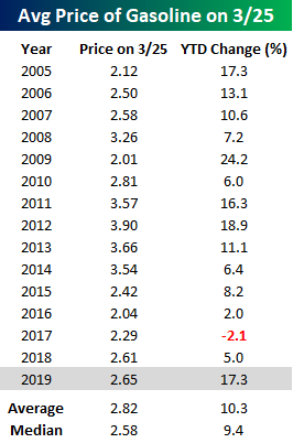
The road higher for gas prices has been as clear as can be of late as prices have been on a tear. According to AAA, the national average price of a gallon of gas has risen 17.3% YTD through 3/25. That’s a full seven percentage points above the average YTD gain for this time of year and the largest YTD increase through 3/25 since 2012. Even after the gains, though, the average price is only four cents higher now than it was a year ago. What’s ironic about this year’s gains in prices is that they are coming at a time when inflation is just about the last worry on anyone’s mind.
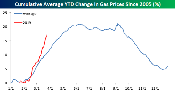
The chart below compares the change in gas prices this year to an annual composite chart of prices going back to 2005. While prices are higher this year, and the move has been much larger than normal, we would note that prices typically rise at this time of year. They also typically continue to rise right up until Memorial Day when the summer driving season kicks off. For most of the summer, prices then plateau and then start to rapidly decline heading into year-end.
One reason behind the much larger than average increase in gas prices this year is that lately, prices have barely gone down- not even for a day here and there. Check out the chart below. Over the last 42 calendar days, the national average price of gasoline hasn’t declined once. Going back to 2004, there have only been two other streaks that are longer (2009 and 2011), and if prices don’t decline today or tomorrow, the current streak will move into a tie for second.

Maximum Frustration
Make up your mind already! That’s the way traders are feeling towards the market these days. Whether you are a bull or bear, it’s hard not to be frustrated with how the equity market trades lately with its complete lack of decisiveness. After repeated attempts at breaking through 2,800 in the fourth quarter, the S&P 500 attempted to break through that level once again in late February but stalled right at resistance. Then, in the first full week of March, it seemed as though another roll-over was in store as the S&P 500 saw five straight days of declines taking the index back below its 200-DMA (light red shaded box in chart). Negative sentiment peaked on Friday, March 8th when the much weaker than expected Non-Farm Payrolls report set the stage for a negative open to close out the week.
The weak open on 3/8 proved to be the low point of that sell-off, and in the following week the S&P 500 regained all of its prior losses and traded right back up to the former resistance line. At the close the following Friday (3/15), the S&P 500 even marginally eclipsed that resistance line (provided you had a magnifying glass to see it). The strength from that week followed right through to the next week as the S&P 500 looked to have finally and convincingly broken through that pesky resistance level of 2,816 (green shaded box), confirming that the ‘breakdown’ from the first week of March was a fakeout.
Or was it the rally that was the fakeout? Ever since last Wednesday’s FOMC meeting where the central bank took on a surprisingly dovish tone, equities have once again had trouble. Whether it was last Friday’s sell-off that took the S&P 500 back below the former resistance line or Tuesday’s rally which has now seen its early gains more than halved, it seems as though the market can’t make up its mind one way or the other as the S&P 500 sits right on the resistance line at 2,816 as we type! In the span of less than a month, we have seen two moves (one up and one down) that technicals suggested was the start of a move, and both proved to be false alarms.

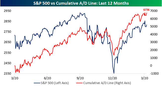
Unfortunately, we aren’t getting much in the way of direction from market internals either. The S&P 500’s cumulative A/D line remains strong, but after hitting new highs earlier today, as equities have sold off, so too has the A/D line putting it back below last week’s highs. The fact that the S&P 500 A/D line continues to hold up right near its record highs is definitely more positive than negative, but we’d much more prefer something a little bit more decisive.
S&P 500 Sector Weightings — Tech Treks Higher
Below is a table we published last September showing the S&P 500 stocks that were impacted by the S&P GICS sector re-classifications. Twenty stocks in the index switched sectors at the time, while the three Telecom stocks remained in what became the new Communication Services sector.
Since a number of the stocks involved in the sector re-classifications were mega-caps, the switch ended up altering sector weightings in the S&P 500 quite a bit. Both Alphabet (GOOGL) and Facebook (FB) came out of the Technology sector and went into the Communication Services sector, which lowered the Tech sector’s market cap by $1.3 billion at the time. Other stocks like Disney (DIS), Netflix (NFLX), and Comcast (CMCSA) moved nearly $500 billion in market cap from the Consumer Discretionary sector to the Communication Services sector.

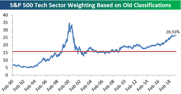
The sector re-classifications last September came at a time when the Tech sector’s weighting in the S&P 500 had ballooned up to 26% of the index. Not since the Dot Com bubble of the late 90s had Tech’s weighting been that high, so the timing of last year’s sector moves was very convenient. The re-classifications basically clipped 5 percentage points off of Tech’s weighting in the S&P, which made things look a lot less lopsided.
So what would the Tech sector’s weighting look like now if the sector re-classifications had not taken place last September? We answer that question in the chart below. Had the re-classifications not taken place, Tech would currently make up 26.53% of the S&P 500. That would be a new high for the current expansion. And the only time Tech’s weighting has been higher than this level was during a 10-month window between December 1999 and October 2000. That turned out to be quite a disastrous time to be long Tech.
Below is a chart showing current S&P 500 sector weightings based on both the old and new sector classifications. As shown, instead of 26.53% based on the old classifications, Tech has a much more digestible, but still high, 21.14% weighting in the S&P.
Health Care ranks second with a weighting of 14.56%, followed by Financials at 12.64%. Communication Services ranks 4th at 10.24%, and then Consumer Discretionary, Industrials, and Consumer Staples rank 5th through 7th. Energy, Utilities, Real Estate, and Materials combine for a weighting of about 14.5%, which is the same size as the Health Care sector on its own.
These numbers really give you a good sense of which sectors impact movements in the S&P the most, and which ones have basically no impact at all anymore.

Chart of the Day: Recessionary Data From The Conference Board
Bespoke Stock Scores — 3/26/19
Trend Analyzer – 3/26/19 – Only the Nasdaq (QQQ)
Declines over the past week have pushed all but one index ETF back to neutral from overbought territory. Currently, only the Nasdaq (QQQ) is overbought. QQQ has been a strong performer lately and while other indices have seen declines exceeding 3% over the last week, QQQ is only down 0.13% headed into today’s trading. It is also up the most YTD at 15.74%. On the other hand, the other index ETFs are all neutral with some having collapsed below the 50-DMA. There are now five ETFs below their 50-DMAs with the Core S&P Small Cap ETF (IJR) the furthest below. As IJR edges increasingly closer to oversold, it is now over 2% below its 50-DMA. Along with the Dow (DIA), it is also only seeing single digit returns YTD. While IJR has been exceptionally bad, the other small caps like the Micro Cap ETF (IWC) and Russell 2000 (IWM) have not been much better, as these three are now all down over 3.25%.

Bespoke CNBC Appearance (3/26)
Bespoke co-founder Paul Hickey sat down with Brian Sullivan earlier on Tuesday to discuss markets, the yield curve, and semiconductors. To view the segment, please click on the image below.
Morning Lineup – A Global Sigh of Relief
We’ve just published today’s Morning Lineup featuring all the news and market indicators you need to know ahead of the trading day. To view the full Morning Lineup, start a two-week free trial to Bespoke Premium.
Equity investors around the world are breathing a global sigh of relief this morning as most equity markets have at least partially rebounded from Friday and Monday’s weakness. There’s a healthy dose of economic data coming up 8:30 with Housing Starts and Building Permits and then Consumer Confidence at 10 AM. Keep an eye on semis today as yesterday, they underperformed the broader market by a pretty wide margin, and then last night Samsung issued a profit warning. Semis have been the market’s leadership group for some time now, so bulls don’t want to see that group falter.
Please click the link below to read today’s Bespoke Morning Lineup.
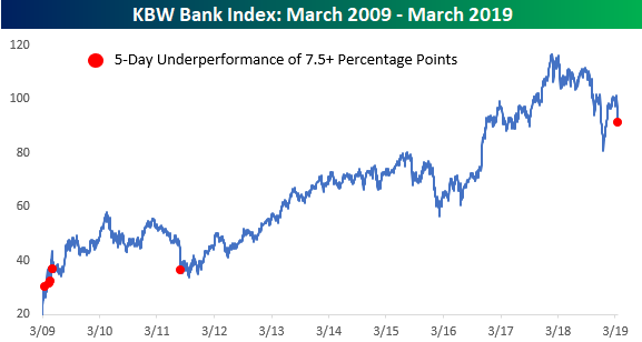
Things are looking up a bit today, but the last five trading days have been hell for bank stocks. After the KBW Bank Index briefly peaked above its 200-DMA last week for the first time since late September, it has been nothing but declines for the group ever since. During the last five trading days, the KBW Bank Index has seen daily declines of 1.32%, 3.02%, 1.53%, 3.92%, and 0.42%. In total, those declines work out to a five-day decline of just under 10% (9.83%) compared to a drop of just 1.22% for the S&P 500.
With bank stocks underperforming by more than 8 percentage points during this stretch, it goes down as the worst relative performance for the group since August 2011. Since the lows of the Financial Crisis, there have only been five other five day periods that saw similar underperformance, and all but the 2011 period occurred during the very early stages of the rally. You don’t see relative underperformance like this in the bank stocks very often.
Start a two-week free trial to Bespoke Premium to see today’s full Morning Lineup report. You’ll receive it in your inbox each morning an hour before the open to get your trading day started.

The Closer — Relative Underperformance, Yield Curve Diverges, Global Weakness — 3/25/19
Log-in here if you’re a member with access to the Closer.
Looking for deeper insight on markets? In tonight’s Closer sent to Bespoke Institutional clients, in spite of equities’ strong performance so far this year, we highlight the asset’s underperformance relative to commodities and fixed income. Staying on the topic of fixed income, we take a look at the divergence between the long end and the front end of the yield curve, and what kinds of recessionary signals it is sending. Further, we provide an update on the market’s expectations for rate hikes and cuts based on the OIS market. Turning to macro data, we show another weak month of CPB data on global trade and industrial production, though it’s not all bad, as Germany trade and auto industry data is at least supportive.

See today’s post-market Closer and everything else Bespoke publishes by starting a 14-day free trial to Bespoke Institutional today!