Small Caps: Make Up Your Mind Already
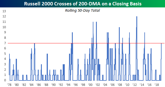
As noted in an earlier post, the Russell 2000 closed back above its 200-DMA yesterday for the 7th cross of that trendline on a closing basis in the last 50 trading days. As shown in the chart below, the last time we saw this many crosses of the 200-DMA in a 50-trading day span was back in 2014. Back then, the number of crosses reached as high as nine and the most ever in a 50-trading day span was 12 back in 2012.
So what, if anything, does the indecisiveness on the part of the Russell 2000 mean for future returns? Is it a sign that eventually the bulls won’t be able to hang on and lower prices are in store, or does it mean that the bears will finally capitulate, and prices will soar?
The chart below shows the Russell 2000 going back to 1978, and in it we have included red dots to show every other time where the Russell 2000 saw seven or more crosses of its 200-DMA in a 50-day span. As you can see, there doesn’t seem to be any clear trend in either direction. The mid-2000s are a perfect case in point. From late 2004 right up through late 2008, we saw multiple occurrences both on the way up and on the way down. As far as market indicators go, this one hasn’t been all that helpful. Start a two-week free trial to Bespoke Premium to access Bespoke’s unbeatable research.

Morning Lineup – 7-Up
We’ve just published today’s Morning Lineup featuring all the news and market indicators you need to know ahead of the trading day. To view the full Morning Lineup, start a two-week free trial to Bespoke Premium.

Here’s a snippet from today’s report:
Newsflow is on the quiet side this morning. Futures, though, are trading higher on the heels of positive price action in Europe. On the economic front, PPI and Jobless Claims will be released at 8:30.
The S&P 500 may be trading in a steady uptrend with higher highs and higher lows all year, but the small-cap Russell 2000 just can’t make up its mind. For the last two months now, small caps have been stuck in a range as Banks and Biotechs, the two largest industries in the index, have been a drag.
The 200-day moving average is generally considered a dividing line between whether an index or stock is in a long-term uptrend or downtrend. In the Russell’s case, it has been oscillating above and below that level for some time now. With yesterday’s close back above the 200-DMA, that now makes it seven times that the index has crossed above or below its 200-DMA on a closing basis in the last 50 trading days. That’s the most number of crosses in that short of a span in more than four years! In order for this trend to break one of those two “Big Bs” in the index (Banks and Biotechs) is going to have to make a move.

Start a two-week free trial to Bespoke Premium to see today’s full Morning Lineup report. You’ll receive it in your inbox each morning an hour before the open to get your trading day started.
The Closer — EMFX Ticks Up, Crack Spreads Wider, Inflation Solid, GSS Sampling — 4/10/19
Log-in here if you’re a member with access to the Closer.
Looking for deeper insight on markets? In tonight’s Closer sent to Bespoke Institutional clients, we begin with a look at EM currencies which are setting up to break out above their recent range. We then show how crack spreads surged on high gasoline demand as per the EIA data released today. We go further into this release to show how petroleum stockpiles have held up this week. More in economic data, we recap today’s CPI release which missed expectations due to autos and new apparel price methodology. We then turn to inflation indicators which have yet to show a peak in inflation. Stepping out of the ordinary, we move onto the University of Chicago’s General Social Survey for 2018 in which media consumption and government confidence showed some interesting points. We finish with our weekly look at fund flows.

See today’s post-market Closer and everything else Bespoke publishes by starting a 14-day free trial to Bespoke Institutional today!
Gas Surge Continues
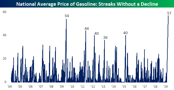
If you regularly fill up your car with gas, you have no doubt noticed that prices have been going up lately. Two weeks ago, we highlighted the fact that gas prices were in the midst of one of their longest streaks without a decline. Since that post in late March, that streak of days where prices have been flat or higher has continued. At a length of 57 days, the current streak now ranks as the longest on record (since at least 2004)!
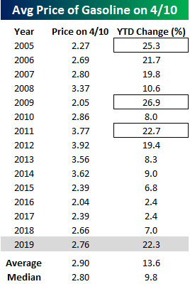
With gas prices moving non-stop to the upside, prices are up much more than average for this time of year. The chart below compares the move in gas prices this year to a composite of prices in every prior year since 2004. With a gain of 22.33% already this year, prices are already higher now than they are at the average peak YTD reading since 2004. Looking at the chart, the pattern of prices so far this year has been similar to the pattern for prior years, but the magnitude of the move has been much stronger. If this pattern continues to hold, we would expect to see gas prices continue to rise right on through the end of May before leveling off for the summer and heading back lower after Labor Day.

Not only have gas prices increased more than average so far this year, but there haven’t been many other years where they were up as much YTD as they are now. Going back to 2004, there have only been three prior years where gas prices were up more YTD as of 4/10 than they are now (2005, 2009, and 2011). The one silver lining is that despite the move higher, the average national price of $2.76 per gallon is still lower than the average ($2.90) and median ($2.80) for this time of year. Start a two-week free trial to Bespoke Premium to access Bespoke’s unbeatable research.
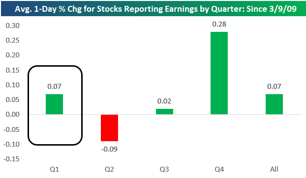
B.I.G. Tips – The Best Performing Stocks on Q1 Earnings
Below is a chart showing the average performance of stocks on their earnings reaction days by earnings season since the start of the bull market back on March 9th, 2009. By far the best period of the year for stocks to report earnings has been the Q4 reporting period, which runs from early January through late February. During this reporting period, stocks have averaged a one-day gain of 0.28% on their earnings reaction days over the last 10 years.
The second best period has been the Q1 reporting period (which is upcoming and runs from early April through late May). During the Q1 earnings season, the average stock has gained 0.07% on its earnings reaction day. (Remember, for stocks that report before the open, their earnings reaction day is that trading day. For stocks that report after the close, their earnings reaction day is the following trading day.)
The Q3 reporting period (early October through late November) sees stocks trade basically flat, while the Q2 earnings season (early July through late August) has actually seen stocks average a decline of 0.09% on their earnings reaction days since the bull market began.
One of the ways we use our Earnings Explorer tool as an idea generator is to look for stocks that typically perform very positively or negatively in certain quarters of the year. With the Q1 reporting period starting up this week, now is a good time to highlight the stocks that have historically performed the best following their Q1 reports. Below is a list of stocks with market caps above $5 billion that have historically performed the best in reaction to their Q1 earnings reports. To make the list, the stock had to have at least 8 years of Q1 reports, so these stocks have been consistently positive during Q1 for a long time.
Please log-in or start a free membership trial to continue reading this report…
Large and Small Caps: Different Groups in the Driver’s Seat
Fixed Income Weekly – 4/10/19
Searching for ways to better understand the fixed income space or looking for actionable ideals in this asset class? Bespoke’s Fixed Income Weekly provides an update on rates and credit every Wednesday. We start off with a fresh piece of analysis driven by what’s in the headlines or driving the market in a given week. We then provide charts of how US Treasury futures and rates are trading, before moving on to a summary of recent fixed income ETF performance, short-term interest rates including money market funds, and a trade idea. We summarize changes and recent developments for a variety of yield curves (UST, bund, Eurodollar, US breakeven inflation and Bespoke’s Global Yield Curve) before finishing with a review of recent UST yield curve changes, spread changes for major credit products and international bonds, and 1 year return profiles for a cross section of the fixed income world.
In this week’s report we take a look at how the markets have been reacting to ECB decisions recently.

Our Fixed Income Weekly helps investors stay on top of fixed income markets and gain new perspective on the developments in interest rates. You can sign up for a Bespoke research trial below to see this week’s report and everything else Bespoke publishes free for the next two weeks!
Click here and start a 14-day free trial to Bespoke Institutional to see our newest Fixed Income Weekly now!
Bespoke CNBC Appearance (4/9/19)
Bespoke co-founder Paul Hickey appeared on CNBC’s Squawk Box on Tuesday (4/9) to discuss markets heading into earnings season. To view the segment, click on the image below.

Start a two-week free trial to Bespoke Premium to access our individual stock research and much more.
Bespoke’s Global Macro Dashboard — 4/10/19
Bespoke’s Global Macro Dashboard is a high-level summary of 22 major economies from around the world. For each country, we provide charts of local equity market prices, relative performance versus global equities, price to earnings ratios, dividend yields, economic growth, unemployment, retail sales and industrial production growth, inflation, money supply, spot FX performance versus the dollar, policy rate, and ten year local government bond yield interest rates. The report is intended as a tool for both reference and idea generation. It’s clients’ first stop for basic background info on how a given economy is performing, and what issues are driving the narrative for that economy. The dashboard helps you get up to speed on and keep track of the basics for the most important economies around the world, informing starting points for further research and risk management. It’s published weekly every Wednesday at the Bespoke Institutional membership level.
You can access our Global Macro Dashboard by starting a 14-day free trial to Bespoke Institutional now!

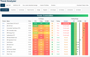
Trend Analyzer – 4/10/19 – Overbought Oil
Given yesterday’s declines, the Dow (DIA) has now turned negative on the week. It is also now underperforming on a YTD basis versus all the other major index ETFs. Fortunately, it is the only ETF to have moved into negative territory for the last five trading days. Granted, the others’ returns are nothing stellar as there is no ETF to have edged out a gain of more than 1%.
Turning to overbought and oversold levels as seen in our Trend Analyzer, yesterday’s declines only led to a single ETF, the Russell 2000 (IWM) which we discussed in last night’s Closer, falling back into neutral from overbought. There are still eleven others that are still overbought and fairly close to being 2 standard deviations or more above their 50-DMA. From its strong run, the Nasdaq is the most overbought as it currently sits the most extended above the 50-DMA.
Start a two-week free trial to Bespoke Premium to access our Trend Analyzer tool in addition to other interactive features.
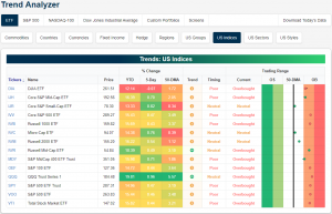
Turning to commodities, Crude Oil (USO) has been the only one to see any sort of substantial move in the past week. Even with a decline yesterday, USO is up 2.46% in the past week and a substantial 37.99% YTD! This huge rally comes with the caveat that the asset has become extended above its 50-DMA. At yesterday’s close, USO settled 11.21% above the 50-DMA and remaining in extreme overbought levels.