The Closer — The Debt Is Fine, Global Trade & IP, Canada Update, And An SPV — 9/25/18
Log-in here if you’re a member with access to the Closer.
Looking for deeper insight on markets? In tonight’s Closer sent to Bespoke Institutional clients, we argue that US corporate debt is less worrisome than it’s been made out to be. We also take a look at July global trade and industrial production data updated today before reviewing Canadian macro and a development from the UN today that signals a much larger trend in the world of global macro.

See today’s post-market Closer and everything else Bespoke publishes by starting a 14-day free trial to Bespoke Institutional today!
FHFA & Case-Shiller Home Price Indices: What’s The Difference?
Two home price indices were released today: S&P CoreLogic Case-Shiller and FHFA House Price Index (sometimes referred to as HPI). These indicators both measure moves in home prices, but subtle differences in the methodologies with which each are calculated can result in variations between the two.
Both indices track the value of homes across the US using a repeat sales methodology. This essentially looks only at the prices of only existing single-family homes (multi-family homes and new constructions are excluded) that have been bought/sold at least twice. This way of indexing home prices helps to control for a property’s qualities—such as the size or style of house—that could affect the price.
While both CoreLogic’s Case-Shiller and FHFA use this type of Case-Shiller methodology, FHFA uses a slightly modified version. FHFA’s version of the house price index weights homes with long periods of time between sales differently than those with shorter time spans between sales. Both indices give less weight to a sale after ten years, but FHFA penalize them more than Case-Shiller. Additionally, FHFA weights all homes equally. Case-Shiller is value-weighted, meaning price trends for higher valued homes tend to have more of an impact on the index.
The way in which data is collected and organized are the other major differentiating factors. S&P CoreLogic uses local government assessor and records offices to get the valuation of homes. FHFA, on the other hand, uses the value of mortgages bought by either Fannie Mae or Freddie Mac. This removes refinancing appraisals that are picked up in the Case-Shiller data. Unfortunately, it fails to include a variety of mortgages such as subprime and VA loans. The FHFA breaks out state and regional prices with a lot more granularity; unlike Case-Shiller, it offers versions for census regions and states, while the Case-Shiller version only offers 20 metros and a national composite.
As you can see in the charts below, both indices closely follow each other. The most recent release has once again reaffirmed weakness in the housing market. The Case-Shiller Index for August has fallen to its lowest level since March 2010, sitting at 0.16% MoM SA. While mean home values are still appreciating, this trend downwards is the closest to depreciating home values that we have been seen in several years. Evident in the chart below, the Case-Shiller Index has been falling on a MoM SA basis for almost a year now. Despite a short uptick, the FHFA has pretty much been in the same boat.

This picture is only slightly rosier when looking at year-over-year seasonally adjusted data. We are nowhere close to home values depreciating, but it does appear that both indices are beginning to change their slight uptrend. Once again, this is nothing new for housing data, which has been on a rough run of late. Existing home sales missed estimates last week, while mortgage applications, new home sales, and pending home sales are all on the calendar this week. Perhaps, that will offer a brighter picture.

Chart of the Day: Confidence in Jobs
No Fears From Florence
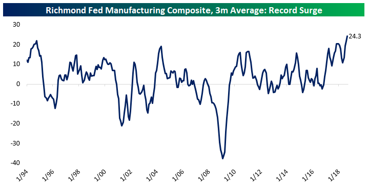
With Hurricane Florence crashing into the North Carolina coast earlier this month and the subsequent flooding that followed, a natural question among investors is how would the hurricane the regional economy. North Carolina is part of the Richmond Fed district, so a quick way to asses the damage would be to look at the most recent data from the Richmond Fed Manufacturing report. Below we show the three month average of the Richmond Fed’s manufacturing composite index. This index tends to be very volatile so we’ve smoothed it out a bit, but the September reading was a record at 29. For the states covered by the Richmond Fed (Maryland, Virginia, West Virginia, and the Carolinas), this was the best manufacturing backdrop in the history of the index’s data.
One thing to keep in mind with the most recent data is that while it covers the month of September, most of the survey responses were gathered before Hurricane Florence made landfall, so the full impact of the hurricane won’t be borne out until next month’s report. That being said, with the index at an all-time high, there doesn’t seem to be much of a negative impact even from survey responses that came in after the hurricane made landfall.
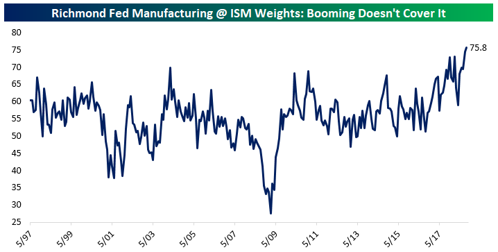
We would argue that re-weighting the Richmond data to be consistent with the ISM Manufacturing index delivers an even more impressive result. In the chart below, we show that re-weighted version of the index. Similar to the aggregate index, this re-weighted version is at a record, with a reading equivalent to an ISM Manufacturing print over 75! Simply put, the South Atlantic economy is cooking despite the challenge posed by Hurricane Florence.
The strong performance of the regional economy is also visible in home prices. The South Atlantic Region (which includes Delaware, Maryland, District of Columbia, Virginia, West Virginia, North Carolina, South Carolina, Georgia, and Florida) has seen its home price performance come in much stronger than the national since relative strength bottomed back in 2011. July data, updated this morning by the FHFA, showed new highs for the region’s prices versus the broader national index. Of course, this data does not include the impact of Florence, but it still shows a very positive backdrop for the regional economy heading into the storm.

B.I.G. Tips – Fed Days September 2018
Bespoke Stock Scores — 9/25/18
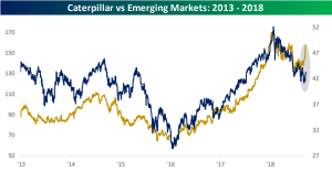
CAT vs Emerging Market
Shares of Caterpillar (CAT) have been an underperformer for most of 2018 due to slower sales growth outside of the United States. In recent weeks, this has not been the case. We have witnessed a big rotation into CAT as well as other Industrials as investors are looking to jump on laggards eyeing a rally.
CAT has resembled the performance of emerging markets over the past five years. Logically, this should not come as any surprise seeing as most emerging markets are reliant on natural resources, which is just the right market for CAT’s earth moving equipment. But in recent weeks, we have seen CAT far outpacing the MSCI Emerging Market ETF.
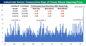
Again, CAT is not the only one of the Industrials that investors have rotated into in September. The sector as a whole has been stronger of late. As we discussed in our Morning Lineup today, the sector just went 15 trading days closing at a level higher than it opened. Back to when our data begins in 2002, that streak is by far the longest. April 2004, September 2009, and January 2018 were the only ones that come close — each at 9 days. In each of these periods, in the month following the last day of each streak, the Industrials sector was down for an average decline of 2.5%.
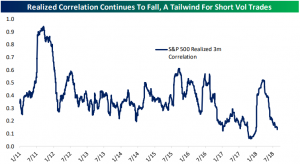
Lower Volatility on Lower Correlation
As equities have rallied this year, volatility has fallen as seen through the VIX. Currently sitting just under 12, the VIX is nowhere near the extreme single-digit lows from earlier in the year, but it is still far lower than a level of over 16 back in June.
A factor behind the lower level of volatility in the market is that stocks have become less correlated with one another. In other words, in general, the performance of one stock is not necessarily indicative of that of another. In the chart below, we show the realized correlation over time. While the current level is nowhere near new lows, it has been a steep drop off to get to where we are. Further declines in correlation will help to lower volatility more as individual stocks move in opposite directions, canceling each other out.
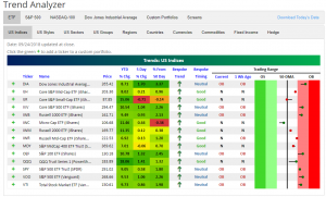
Trend Analyzer – 9/25/18 – Better and Worse
Markets were down on political news at the close yesterday with the Dow falling 0.68% and the S&P 500 down 0.35%. These price movements are making our Trend Analyzer resemble how it looked most of last week. Half of the major US Index ETFs are trading in neutral territory. The other half is overbought. Fortunately, with the exception of Core S&P Small-Cap (IJR) and S&P MidCap 400 (MDY), every ETF is above where it was one week prior. This is giving every neutral ETF a good timing rating.
Bespoke Morning Lineup – 9/25/18
Yesterday marked the end of an impressive streak for the S&P 500 Industrials sector where it had previously closed higher than it opened for 15 consecutive trading days! As shown in the chart below, before the current streak, the prior record for the longest stretch of daily closes above the open was nine trading days. That happened three prior times (April 2004, September 2009, and January 2018). Following those three periods, the sector’s performance was mixed to poor. One month after the day when the streak was broken, the sector was down all three times for an average decline of 2.5%. Not a major decline, but not positive either.

Start a two-week free trial to Bespoke Premium to see today’s full Morning Lineup report. You’ll receive it in your inbox each morning an hour before the open to get your trading day started.
