Fixed Income Weekly – 10/10/18
Searching for ways to better understand the fixed income space or looking for actionable ideals in this asset class? Bespoke’s Fixed Income Weekly provides an update on rates and credit every Wednesday. We start off with a fresh piece of analysis driven by what’s in the headlines or driving the market in a given week. We then provide charts of how US Treasury futures and rates are trading, before moving on to a summary of recent fixed income ETF performance, short-term interest rates including money market funds, and a trade idea. We summarize changes and recent developments for a variety of yield curves (UST, bund, Eurodollar, US breakeven inflation and Bespoke’s Global Yield Curve) before finishing with a review of recent UST yield curve changes, spread changes for major credit products and international bonds, and 1 year return profiles for a cross section of the fixed income world.
This week we look at where real yields are sitting around the world.

Our Fixed Income Weekly helps investors stay on top of fixed income markets and gain new perspective on the developments in interest rates. You can sign up for a Bespoke research trial below to see this week’s report and everything else Bespoke publishes free for the next two weeks!
Click here and start a 14-day free trial to Bespoke Institutional to see our newest Fixed Income Weekly now!
Small Cap Stocks Getting Crushed Across Sectors
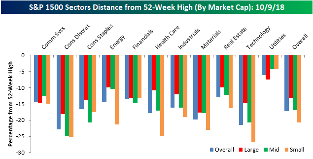
In a post yesterday, we highlighted the fact that while large-cap stocks in the S&P 500 were down an average of 13.2% from their 52-week highs, small-cap stocks were faring much worse, with stocks in the S&P 600 Small Cap index down an average of over 20% from their respective highs. Today, we wanted to go into a little more detail on these market cap divergences by looking at how far stocks are down from their 52-week highs within individual sectors.
While small-cap stocks are down an average of 20.7% from their 52-week highs, small-cap Technology, Consumer Discretionary, and Health Care stocks are down an average of much more. In the Technology sector, for example, the average spread between where individual small cap tech stocks are trading relative to their 52-week highs is 26.7%, while in the Consumer Discretionary sector that same spread is just over 25%. While stocks in these sectors have sold off sharply from their 52-week highs, stocks in the Utilities sector are down less than 5% on average from their 52-week highs. Utilities is also the only sector where the average small-cap stock is down less from its 52-week high than the average large-cap stock in the sector.
Speaking of large caps, stocks in the Consumer Discretionary and Materials sector are trading down the furthest from their 52-week highs (~18%), while Utilities (-7.4%), Energy (-9.9%), and Real Estate (-9.95%) are the only three sectors where stocks are down less than 10%, on average, from their 52-week highs.

Bespoke’s Global Macro Dashboard — 10/10/18
Bespoke’s Global Macro Dashboard is a high-level summary of 22 major economies from around the world. For each country, we provide charts of local equity market prices, relative performance versus global equities, price to earnings ratios, dividend yields, economic growth, unemployment, retail sales and industrial production growth, inflation, money supply, spot FX performance versus the dollar, policy rate, and ten year local government bond yield interest rates. The report is intended as a tool for both reference and idea generation. It’s clients’ first stop for basic background info on how a given economy is performing, and what issues are driving the narrative for that economy. The dashboard helps you get up to speed on and keep track of the basics for the most important economies around the world, informing starting points for further research and risk management. It’s published weekly every Wednesday at the Bespoke Institutional membership level.
You can access our Global Macro Dashboard by starting a 14-day free trial to Bespoke Institutional now!

Morning Lineup – Sector Divergences
Futures may be trading pretty flattish ahead of the open, and the S&P 500 may be right at its 50-day moving average, but don’t let the sense of calm fool you. There’s still a lot of rotation and big swings underneath the surface.
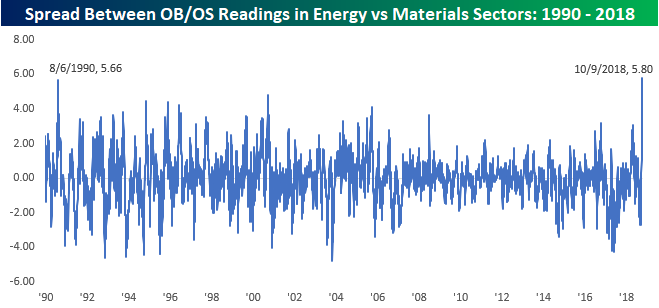
One example of that rotation is evident in the Materials and Energy sectors. As of yesterday, the Materials sector closed 3.83 standard deviations below its 50-DMA after dropping more than 3% yesterday. Meanwhile, the Energy sector has been acting well and finished the day 1.97 standard deviations above its 50-DMA. Going all the way back to 1990, there has never been a point where the spread between the two sectors Overbought/Oversold readings was wider. The prior record spread between the two sectors was in August 1990 just after Iraq invaded Kuwait. Talk about a divergence!
Start a two-week free trial to Bespoke Premium to see today’s full Morning Lineup report. You’ll receive it in your inbox each morning an hour before the open to get your trading day started.

Worst Performing Stocks This Month
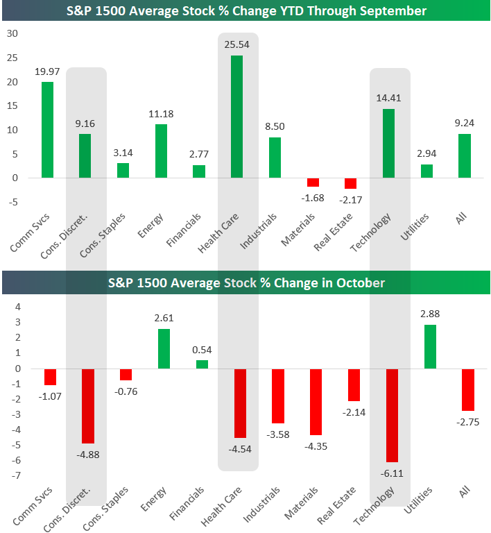
The average stock in the S&P 1500 was up 9.24% year-to-date through September, but October has been brutal for stocks thus far. On the surface, the S&P 1500 is only down 1.4% month-to-date, but what lies beneath is much worse. As shown in the chart below, the average stock in the index has fallen 2.75% this month, and cyclical sectors have taken it on the chin even harder.
While just 15 stocks in the S&P 1500 are up 10% or more this month, a whopping 106 are down more than 10%!
Technology stocks have been hit the hardest so far in October. After averaging a gain of 14.41% YTD through September, the average Tech stock has fallen 6.11% already this month. Other cyclicals like Health Care and Consumer Discretionary have been nearly just as bad with average declines of more than 4.5%.
As cyclicals have gotten crushed, investors have rotated into Utilities (defensives) the most with an average gain of 2.88% MTD.
Two other themes of October have been rising oil prices and the steepening of the yield curve. Rising oil prices have had a direct impact on Energy stocks, which have averaged a gain of 2.61% this month. The steepening of the yield curve helps banks make more money, and Financial stocks have averaged a gain of 0.54% in October.
Below is a list of the worst performing stocks in the S&P 1500 so far this month. All of the stocks listed have lost more than 15% of their value in just nine calendar days.
Akorn (AKRX) is down the most at -49.65%, followed by Cutera (CUTR) at -32.81% and LeMaitre Vascular (LMAT) at -30.2%. Both AKRX and CUTR were down on the year already coming into October, but LMAT was up 21.67% YTD as of the end of September. Now it’s down 15% YTD.
Other notables on the list of biggest losers include G-III Apparel (GIII), RH (Restoration Hardware), Microchip (MCHP), and American Airlines (AAL).

Chart of the Day: AAL The Way Down, But Not Out
The Closer — LIBOR Climbs, Real Rates Rise, Growth Rich To Value (Duh?) — 10/9/18
Log-in here if you’re a member with access to the Closer.
Looking for deeper insight on markets? In tonight’s Closer sent to Bespoke Institutional clients, we review rising interbank rates but falling spreads on those rates relative to the policy rate. We also discuss how big of a driver real yields have been in the recent UST selloff. Mexican and Brazilian equities have outperformed EM pretty dramatically of late, and the rotation within EM equities shows a new sensitivity to oil prices. We also discuss the extreme outperformance of growth relative to value and the enormous divergence in forward valuations between growth and value stocks.

See today’s post-market Closer and everything else Bespoke publishes by starting a 14-day free trial to Bespoke Institutional today!
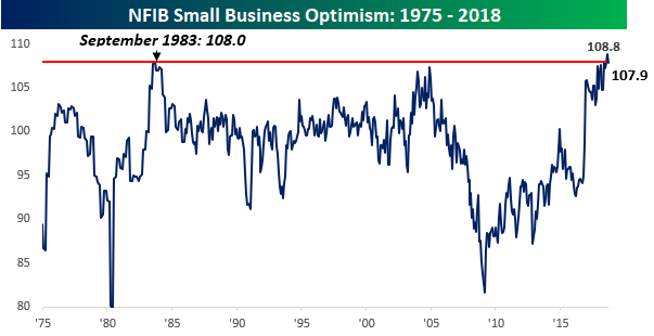
Small Businesses Slightly Less Optimistic
Small business sentiment for the month of September was released earlier this morning, and while the headline index saw a modest decline (108.8 down to 107.9) and came in below consensus forecasts of 108.3, the overall level is still extremely optimistic. One of the more interesting comments in the report was that “The economy is growing faster than our ability to support that growth without inflation or significant productivity gains.” It’s this line of reasoning which is exactly why the FOMC is so vigilant with respect to upward moves in prices.
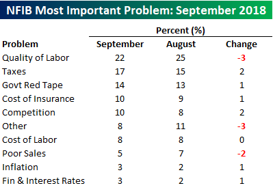
The table below summarizes the issues that small businesses currently cite as their biggest problems. Topping the list once again this month is Quality of Labor. While it could just be a one-month blip, it was a bit encouraging to see that this reading actually dropped from 25% in August to 22% in September. On the upside, the two components that saw the largest increases were Taxes (15 up to 17) and Competition (8 up to 10).
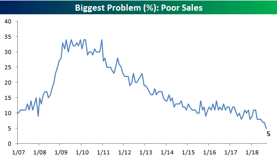
One other issue worth highlighting is the percentage of companies citing Poor Sales as their biggest problem. The percentage of companies citing this issue dropped from an already low level of 7% down to 5%. The last time the percentage was this low for the issue of Poor Sales was in January 1998, and it hasn’t been lower since the early 1980s. That’s a far cry from as recently as eight years ago when the percentage of small businesses citing Poor Sales as their biggest problem was more than six times higher at 34%! When “Poor Sales” are your biggest problem as a small business, your small business is in serious trouble. It will be critical to monitor this reading going forward because it can’t get much lower than this. When “Poor Sales” start to tick higher, it’s highly likely that it will coincide with the end of the current expansion.
Average Small Cap Stock in “Bear Market” Territory
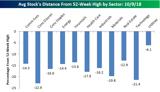
Most people watching have noticed that the recent weakness in equities has been especially tough on the small-cap space, and another illustration of that trend is to look at the distance that stocks are currently trading from their 52-week highs. Within the large-cap S&P 500, the average stock is currently 13.2% below its 52-week high. Moving down the market cap spectrum, though, the numbers get progressively worse. In the S&P 400 mid-cap space, the average spread is 16.9%, while members of the S&P 600 Small Cap index are down an average of 20.7%. Using the standard bear market definition of a 20% decline from a high, the average small-cap stock is in a bear market!

Looking at the spreads between current prices and 52-week highs, stocks in the Consumer Discretionary sector are further from their highs than any other sector (-22.9%), but Technology isn’t far behind at 21.4%. For two sectors that were market leaders, Tech and Discretionary have certainly seen a good deal of profit-taking lately. Outside of these two, other sectors where the ‘average’ stock has seen a pretty sizable pullback from its 52-week high include Materials (-19.8%), Health Care (-17.9%), and Consumer Staples (-16.6%). On the other end of the spectrum, Utilities (-6.1%) is the only sector where stocks are currently down by an average of less than 10% from their 52-week highs.