The Closer: End of Week Charts — 8/24/18
Looking for deeper insight on global markets and economics? In tonight’s Closer sent to Bespoke clients, we recap weekly price action in major asset classes, update economic surprise index data for major economies, chart the weekly Commitment of Traders report from the CFTC, and provide our normal nightly update on ETF performance, volume and price movers, and the Bespoke Market Timing Model. We also take a look at the trend in various developed market FX markets.
Below is a snapshot from today’s Closer highlighting weekly intraday price charts for major equity indices and other asset classes. If you’d like to see more, start a free trial below.

The Closer is one of our most popular reports, and you can sign up for a free trial below to see it!
See tonight’s Closer by starting a two-week free trial to Bespoke Institutional now!
Historical Earnings Report Statistics Using Bespoke’s Earnings Screener Tool
Our famous Earnings Screener is unmatched when it comes to historical earnings report data for publicly-listed US companies. The Earnings Screener allows users to easily search through historical quarterly earnings reports for every US stock going back to 2001. The bottom line is if you want to analyze “big data” related to earnings reports, our Earnings Screener is the tool to use.
Below we highlight a number of insightful statistics using the 143,000+ individual quarterly earnings reports that make up our Earnings Screener.
Our first chart simply shows the number of quarterly earnings reports in our database by sector. As shown, there are 30,742 individual quarterly reports for Technology sector stocks in the database, which is nearly 7,000 more than the next closest sector (Consumer Discretionary). Real Estate and Telecom have the fewest quarterly reports, mostly because Real Estate just became a sector last year while there are only a handful of publicly-traded Telecom companies left.

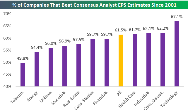
The second chart below shows the historical “beat rate” for earnings per share by sector going back to 2001. As shown, 61.5% of the 143,000+ quarterly reports since 2001 have seen EPS come in higher than consensus analyst expectations. Looking at individual sectors, Technology stands out once again. Since 2001, tech’s historical earnings beat rate has been 67.1%, which is nearly 5 percentage points higher than the next closest sectors. Consumer Discretionary, Industrials, and Health Care are the only other sectors with EPS beat rates that are higher than the overall beat rate of 61.5% for all stocks.
On the weaker end of the spectrum, Telecom has the lowest EPS beat rate at 49.8%, followed by Energy (54.4%), Utilities (56.0%), and Materials (56.9%).
Start a two-week free trial to Bespoke Institutional to start using our Earnings Screener now.
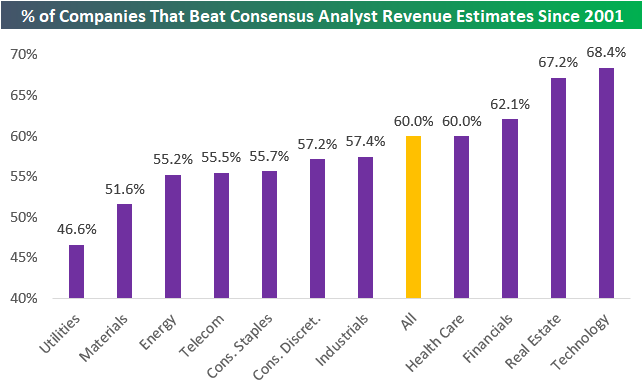
The chart above showed historical bottom-line EPS beat rates by sector, and the chart below shows historical top-line revenue beat rates. As shown, the revenue beat rate (% of companies that report actual revenues that are stronger than consensus analyst estimates) for all stocks reporting earnings since 2001 has been 60.0%, which is 1.5 percentage points lower than the historical EPS beat rate.
Technology ranks at the top of the list again with a revenue beat rate of 68.4%. Real Estate, Financials, and Health Care are the other three sectors with revenue beat rates higher than 60%.
Utilities has the weakest revenue beat rate at just 46.6%, while Materials, Energy, Telecom, and Consumer Staples are all below 56%. While Consumer Discretionary and Industrials have stronger-than-average EPS beat rates, they have weaker-than-average revenue beat rates.
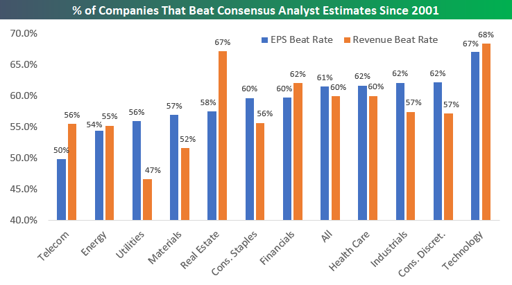
Below we offer a side-by-side comparison of EPS and revenue beat rates by sector since 2001:
In addition to looking at historical earnings and revenue beat rates by sector, we can also look at how stock prices have historically reacted to their earnings releases. Below we show the average one-day stock price reaction to earnings releases by sector. (For stocks that report in the morning before the open, we use that day’s price change. For stocks that report after the close, we use the next day’s price change.)
As shown, the average one-day stock price reaction for all 143,000 quarterly earnings reports since 2001 has been +0.08%. An average gain of 0.08% doesn’t seem like much but compounded over 143,000 reports, it adds up! Earnings ultimately drive the stock market.
Looking at individual sectors shows that, on average, Industrials stocks have gained the most on their earnings reaction days (+0.20%), followed by Consumer Discretionary (+0.17%), and Technology (+0.13%).
Two sectors have historically seen average share price declines on earnings reaction days — Energy and Utilities. Energy stocks have historically performed the worst in reaction to earnings with a one-day decline of -0.23%.

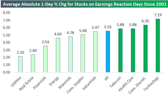
Our final chart today looks at stock price volatility in response to earnings reports. In this chart, we show the average absolute one-day price change for stocks in response to their earnings releases. Overall, the average absolute one-day change for all stocks since 2001 has been +/-5.55%. This means investors can basically assume that in a diversified portfolio of stocks, the average holding will have a one-day move up or down of 5.55% at least once per quarter.
While Technology stocks have the strongest earnings and revenue beat rates, they’re also the most volatile in reaction to their earnings reports. As shown below, the average Tech stocks moves +/-7.19% on its earnings reaction day. After Tech, Consumer Discretionary stocks are the second most volatile in response to earnings reports, followed by Health Care and Telecom.
As expected, the least volatile stocks in reaction to their earnings reports are Utilities and REITs. Utility stocks see an average absolute move of just +/-2.16% on their earnings reaction days!
If you’ve never used our popular Earnings Screener tool, we highly recommend trying it out! You can access it now with a two-week free trial to Bespoke Institutional.
Bespoke’s Idea Generator — Technicals — Most Volatile 8/24/18
Please click the image below to view our most recent Idea Generator report.

Energy’s Bounce Foretold
What a difference a week can make. In our Chart of the Day on August 15th, we noted that extreme oversold conditions (over 3 standard deviations below the 50 day moving averages) in the Energy sector had historically been a bullish signal in the near-term. Below we include the key data from that note.
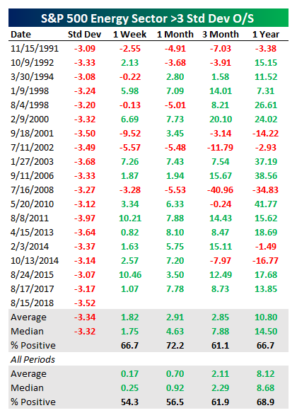
As shown in the chart below, the 3.27% gain over the week following the close on the 15th was even stronger than the 1.82% average for historical Energy sector bounces. As of today, the Energy sector is up over 3.5% from the >3 standard deviations oversold close last week. As shown in the table above, the longer-term outperformance from the lows tends to deliver solid outperformance as well.
Start a two-week free trial to any Bespoke membership level to receive our Chart of the Day in your inbox going forward.
The Closer — Transport Leads, PMI Fades, Eurozone Consumer, New Home Sales — 8/23/18
Log-in here if you’re a member with access to the Closer.
Looking for deeper insight on markets? In tonight’s Closer sent to Bespoke Institutional clients, we discuss negative data points from sentiment indices in the Eurozone today. We also discuss how long it typically takes the S&P 500 to catch up when the Dow Transports make a new all-time high. Finally, we review new home sales data released today by the US Census.

See today’s post-market Closer and everything else Bespoke publishes by starting a 14-day free trial to Bespoke Institutional today!
Bespoke’s Sector Snapshot — 8/23/18
We’ve just released our weekly Sector Snapshot report (see a sample here) for Bespoke Premium and Bespoke Institutional members. Please log-in here to view the report if you’re already a member. If you’re not yet a subscriber and would like to see the report, please start a two-week free trial to Bespoke Premium now.
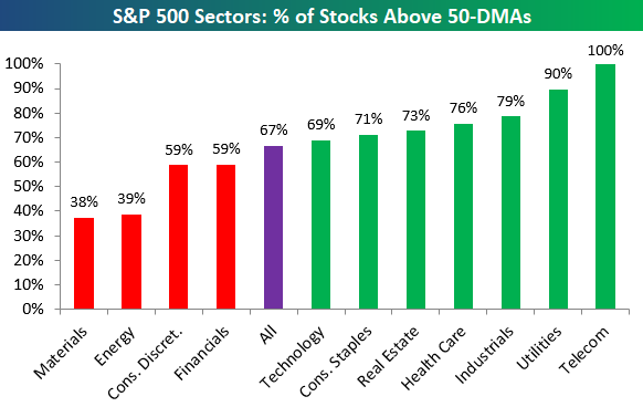
Below is one of the many charts included in this week’s Sector Snapshot, which shows the percentage of stocks in S&P 500 sectors trading above their 50-day moving averages.
To find out what this means and to see our full Sector Snapshot with additional commentary plus six pages of charts that include analysis of valuations, breadth, technicals, and relative strength, start a two-week free trial to our Bespoke Premium package now. Here’s a breakdown of the products you’ll receive.
Chart of the Day: Ascending Ascena (ASDA)
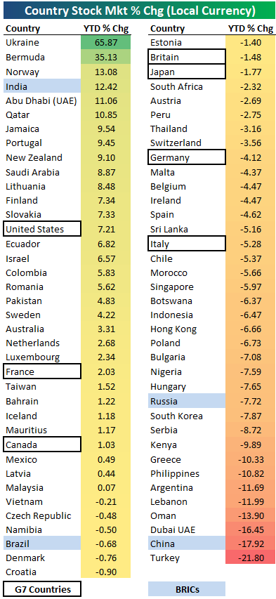
2018 Year-to-Date Country Stock Market Performance
Below is a look at the 2018 year-to-date performance of various country stock markets around the world. Returns are calculated in local currency, as if you were a domestic investor within each country.
The average year-to-date change of the 75 countries in the table is about as flat as it gets — down just 0.04%. More countries are in the red than in the green, though, with 32 up and 43 down.
Ukraine ranks at the top of the list with a gain of 65.87%. Bermuda ranks 2nd at +35.13%, while Norway, India, Abu Dhabi, and Qatar round out the top six. These six are also the only countries up double-digit percentages in 2018.
While there are six countries up 10%+ YTD, there are eight that are down 10%+. Turkey is down the most at -21.8%, followed by China at -17.9% and Dubai at -16.45%.
Looking specifically at the G7 countries, the US ranks first with a YTD gain of 7.21%. Along with the US, the only other two G7 countries in the green this year are France and Canada. Italy, Germany, Japan, and Britain are all in the red.
If it weren’t for India’s gain of 12.42%, the BRIC ETF (EEB) would be down a lot more this year. That’s because the other three BRIC countries are all in the red, with China down the most (-17.9%), followed by Russia at -7.7%.
Start a two-week free trial to Bespoke Institutional for in-depth global macro coverage.
Bullish Sentiment Slightly Above Average
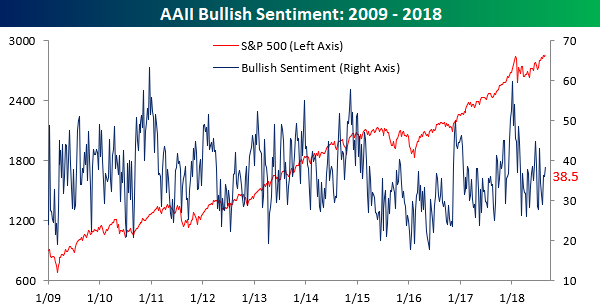
The media has been all over the place (wrongly) proclaiming that the current bull market is the longest ever while the S&P 500 touched an intraday all-time high earlier this week, so surely investor sentiment must be up to the rafters. Right? Not exactly. In this week’s sentiment survey from AAII, bullish sentiment increased from 36.2% up to 38.5%. That’s slightly above average, but with the market right near all-time highs in what is supposedly the longest bull market ever, one would think that investors would be a lot more confident. Or maybe they just know fake news when they see it!
With the increase in bullish sentiment, bearish sentiment ticked lower, falling from 29.1% down to 27.1%. That represents the third straight weekly decline but is only the lowest reading since late July. Hardly a sign of complacency.
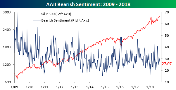
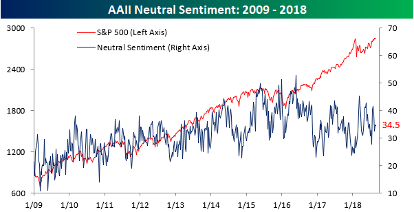
Finally, more than a third of individual investors surveyed consider themselves neutral. Again, when one out of every three investors can’t decide if they are bullish or bearish, it is not the picture you would envision years into a bull market where the S&P 500 is flirting with record highs.
Jobless Claims Continue to Sink
Jobless claims dropped 2K this week, falling from 212K down to 210K, but that was 7K lower than the consensus forecasts from economists. This week’s reading is also within 2K of the multi-decade low of 208K we saw in mid-July. If you look at the inset chart below, it’s almost as though the downtrend in claims is picking up steam! With this week’s reading, claims have been at or below 300K for a record 181 straight weeks, at or below 250K for 46 straight weeks (longest streak since January 1970), and at or below 225K for 7 straight weeks (longest streak since 1969). Those are pretty impressive stats to say the least!

With this week’s drop in claims, we came oh-so-close to a new multi-decade low in the four-week moving average. As shown in the chart below, the four-week moving average dropped to 213.75K. That now puts this indicator within a whisker of its cycle low of 213.5K from May. Also, as long as there are no upward revisions and claims don’t rise by more than 8K next week, we should see this reading drop to a new low!
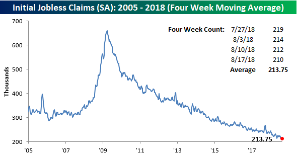
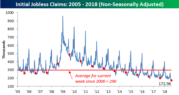
Finally, on a non-seasonally adjusted basis, jobless claims fell to 172.9K, which was the lowest reading for the current week of the year since 1969. More recently, this week’s print was more than 120K below the average for the current week of the year dating back to 2000.