The Closer: End of Week Charts — 10/19/18
Looking for deeper insight on global markets and economics? In tonight’s Closer sent to Bespoke clients, we recap weekly price action in major asset classes, update economic surprise index data for major economies, chart the weekly Commitment of Traders report from the CFTC, and provide our normal nightly update on ETF performance, volume and price movers, and the Bespoke Market Timing Model. We also take a look at the trend in various developed market FX markets.
Below is a snapshot from today’s Closer highlighting positioning of speculators in foreign exchange futures. If you’d like to see more, start a free trial below.

The Closer is one of our most popular reports, and you can sign up for a free trial below to see it!
See tonight’s Closer by starting a two-week free trial to Bespoke Institutional now!
The Bespoke Report — Baby Out With The Bathwater
While intraday performance for stocks in the back half of this week was uninspiring at best, the S&P 500 actually closed up on the week. Some of the price action is getting extreme, especially in cyclical sectors around the world. Today 266 stocks in our Chart Scanner closed at new 52-week lows, while just 17 closed at new highs. You can get a good look at the weakness in our asset class performance matrix below.
Is the baby being thrown out with the bathwater? We discuss in detail in this week’s Bespoke Report.

We’ve just published our latest weekly Bespoke Report newsletter, which is available to subscribers across all three of our membership levels. Sign up here to read the report.
To get up to speed on our thoughts regarding the market’s direction going forward, choose any membership option and access this week’s full Bespoke Report newsletter after signing up! You won’t be disappointed. Some of the topics discussed in this week’s report include:
- Does Buying Dips Below the 200-DMA Work?
- The Relationship Between Correlation & Volatility
- Seasonal Patterns In Volatility
- Dire Economic Expectations From Analysts Around The World
- Rolling Over Global Cyclical Economic Indicators
- European Equity Sectors Collapse
- Slow Eurozone Inflation
- Yields Around The World Rise
- Solid But Slowing Manufacturing Data In The US
- A Dearth Of Workers And Rising Turnover
- Weakening Housing Activity
- A One-Off Collapse In The Deficit
- Surging Transportation Costs
- An Economic Cycle Not Likely To End Soon

Morning Lineup – The Scariest Day
Yesterday wasn’t a fun day to be a bull. While the S&P 500 was close to unchanged late in the morning, sellers stepped in around lunch time and didn’t let up the entire day. Companies reporting earnings were even harder hit as the average stock reporting earnings after the close Wednesday or before the bell, Thursday fell an average of over 1.7% for the day. Today, equities are looking to make up some of that lost ground, but it’s still early on a Friday morning in October, so anything can really happen between now and the closing bell.
The economic calendar is pretty light today, with Existing Home Sales the only scheduled report, but we’ll also hear commentary from the Presidents of the Atlanta (Bostic) and Dallas Fed (Kaplan). In geopolitical/trade news, there’s a hint of optimism in the air as President Trump and Xi are expected to meet on the side at the G20 meeting later this month.
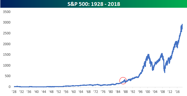
While Halloween is still 12 days away, the scariest day of the year for many equity investors is today, as it represents the anniversary of the 1987 stock market crash 31 years ago today. When you consider the fact that the S&P 500 fell 20% in a single day back in October 1987, the recent weakness seems like peanuts.
For anyone who was sitting around a trading desk at the time, we’re told that it was the scariest day of their careers. That being said, look at a simple historical chart of the S&P 500 since 1928. You can barely see the 1987 crash.
More importantly, though, remember the number 9.9% because that is what your annualized total return would have been if you had ‘bought’ the S&P 500 at the end of September 1987 before the crash and held through today. While anyone making that trade in 1987 would have felt pretty stupid pretty quickly, over the long term, even buying equities at one of the worst possibly timed points in the last 50 years would have netted you an annualized return of 9.9%. Nobody knows where the market is going in the short term, but time and time again throughout history, the long-term direction has been the same.
Start a two-week free trial to Bespoke Premium to see today’s full Morning Lineup report. You’ll receive it in your inbox each morning an hour before the open to get your trading day started.

The Closer: Thursday Thoughts — Vol, Trucking, Manufacturing, Leading Indicators — 10/18/18
Log-in here if you’re a member with access to the Closer.
Looking for deeper insight on markets? In tonight’s Closer sent to Bespoke Institutional clients, we take a look at market trends including the fact that all S&P 500 sectors are in drawdowns over 3%, the yield curve is still steepening despite equity market declines, and the relative performance of stocks and commodities. We also take a close look at the volatility market and correlations across stocks before moving on to economic data. While the economic signal from Conference Board leading indicator data was positive today, manufacturing activity indices look toppy and high transportation costs are starting to tamp down freight volumes.

See today’s post-market Closer and everything else Bespoke publishes by starting a 14-day free trial to Bespoke Institutional today!
Bespoke’s Sector Snapshot — 11/18/18
We’ve just released our weekly Sector Snapshot report (see a sample here) for Bespoke Premium and Bespoke Institutional members. Please log-in here to view the report if you’re already a member. If you’re not yet a subscriber and would like to see the report, please start a two-week free trial to Bespoke Premium now.
Below is one of the many charts included in this week’s Sector Snapshot, which shows the percentage of stocks above their 50-day moving averages by sector. As shown, just 6% of Tech and Financial stocks are above their 50-day moving averages, an extremely oversold reading for two of the three largest sectors of the market.
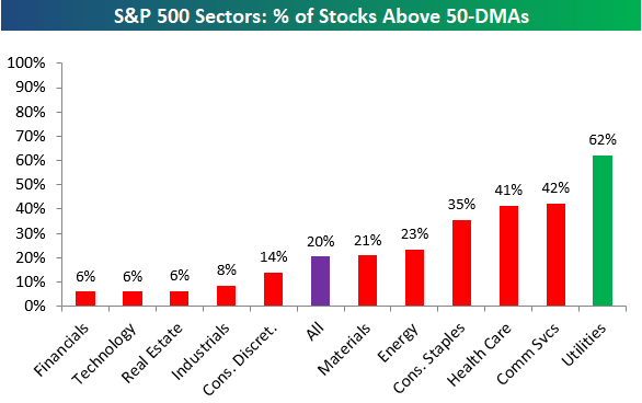
To find out what this means and to see our full Sector Snapshot with additional commentary plus six pages of charts that include analysis of valuations, breadth, technicals, and relative strength, start a two-week free trial to our Bespoke Premium package now. Here’s a breakdown of the products you’ll receive.
Chart of the Day – Much More Upside For Auto Part Retailers?
Housing Less Affordable, But Not Dramatically So
Housing data has come in weaker than expected across a number of indicators over the past several months, and as we discussed last night in The Closer, the Home Construction ETF (ITB) is near its worst levels versus the broad market in 6 1/2 years. With home prices relatively high, mortgage rates rising, a lack of cheap land to build on in many markets, tight labor availability, and input cost pressures, it’s not a huge surprise that homebuilders are in trouble.
All of that said, it’s remarkable how concerned markets and pundits are about housing. Each month, the National Association of Realtors puts out an index that combines home prices with income levels and mortgage rates to deliver a bottom-line affordability number. The level of the index is arbitrary; what matters is the change or relative level. Higher readings mean housing is more affordable, lower readings mean housing is less affordable. Post-crisis, the combination of lower rates and home prices dropping much more than incomes ever did mean housing became rapidly more affordable. For those that were able to take out a mortgage (credit was obviously very tight, many households couldn’t qualify, and households were deleveraging anyways), buying a house was cheap. Since home prices bottomed in 2012, though, things have gone the other way. Relative to the immediate post-crisis period, housing is now pretty expensive. But it’s important to keep in mind that relative to rates and incomes, it’s much, much less expensive now than it was at any point from 1989 through 2009. It’s important to keep this fact in mind when reading commentary about how hard mortgage rate increases will hit the housing market.
Bulls Stand Their Ground
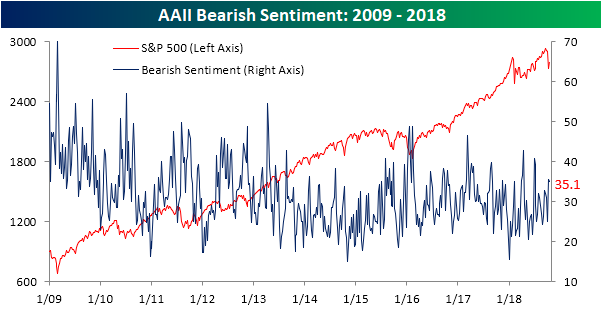
There may not be a whole lot of them, but among the bulls that remain, they held firm in the latest week as equity markets attempted to regain their footing. According to the weekly sentiment survey from AAII, bullish sentiment increased this week from 30.6% up to 33.9%. While slightly more than a third of investors are bullish, this reading remains below the historical average of 36.7% that has been in place throughout the bull market.
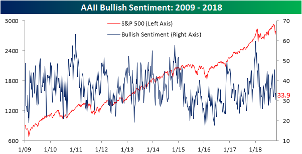
While bulls may have been resilient in the last week, so too were the bears. They held firm at 35.0% versus 35.5% last week.
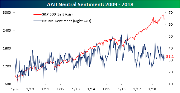
Investors considering themselves neutral saw the biggest decline this week, but even this reading saw little in the way of movement, falling from 33.9% down to 31.1%.
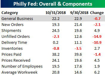
Philly Fed Slightly Better Than Expected
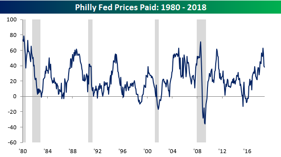
Like its New York counterpart, the October read on manufacturing in the Philadelphia Fed region came in slightly better than expected. While economists were forecasting the headline General Conditions index to come in at a level of 20.0 versus last month’s reading of 22.9, the actual reading of 22.2 showed only a slight decline. As it stands now, the Philly Fed has been positive for 29 straight months, which is the longest streak of growth readings since the 30-month streak ending in August 2015 and before that the 29-month streak ending in August 1998.

Breadth in this month’s report was skewed towards the positive side as five components increased m/m and just four declined. The biggest increase was in the Average Workweek followed by Shipments, while Unfilled Orders and Delivery Times saw the largest declines. Prices Paid also warrants a mention, as even though it didn’t see a large m/m decline, it remains well off of its multi-year high of 62.9 back in July (chart below).
Jobless Claims Fall Slightly More Than Expected
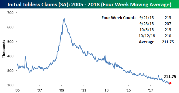
After reaching what was tied for the highest weekly reading (215K) since July last week, jobless claims fell slightly more than forecast, dropping from 215K down to 210K compared to expectations for a level of 211K. Perhaps the most noteworthy aspect of the previous sentence was the fact that a weekly reading of 215K represented a three-month high in claims. That’s just how low claims have been! As for the streaks, the weekly print has now been at or below 300K for a record 189 straight weeks, been at or below 250K for 54 straight weeks, and at or below 225K for 15 straight weeks.

Even though claims declined this week, the four-week moving average increased slightly, rising from 209.75K up to 211.75K. That’s still less than 6K from the multi-decade high of 206K back from mid-September, but based on the recent prints, it doesn’t look like we will be getting anywhere near that record in the near future.
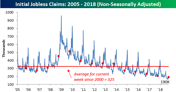
On a non-seasonally adjusted (NSA) basis, jobless claims fell from 199.9K down to 190K. For the current week of the year, that’s more than 130K below the average since 2000 and the lowest weekly print since the same week in 1969.