Chart of the Day: How Are Market Internals Doing?
The S&P 500’s record all-time closing high on Tuesday culminated a seven-month period of two massive swings in the US stock market. Bulls most certainly welcomed the new closing high, confirming the continuation of the bull market. But when it comes to some of our favorite internal market indicators, how does their recent performance stack up?
Continue reading this Chart of the Day by starting a two-week free trial to any of our research membership levels.
Highs Around the World
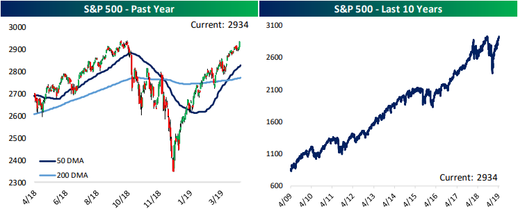
While headlines may have focused on the S&P 500 reaching all-time highs yesterday, the US was not alone in doing so. On the same day, 3 other of the 23 major countries that we track in our Global Macro Dashboard also reached all-time highs: Canada’s S&P/TSX Composite, Russia’s MICEX, and Switzerland’s SMI. In our Global Macro Dashboard each week we provide a look at these countries’ major indices in local currency over the past year and ten years in addition to other information on their economies. While the S&P has reached these highs, it has the fifth highest valuation of the 23 countries with a P/E of 19.23x. But this also comes with generally better than average data points for the broader economy as the US boasts the fifth highest GDP growth on a year-over-year basis.
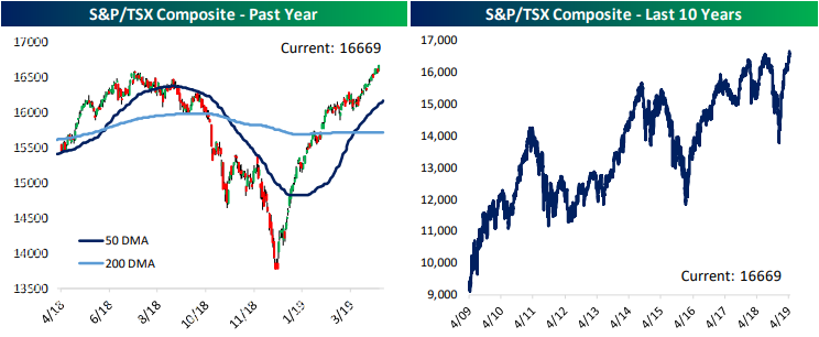
Canada’s S&P/TSX Composite index has a fairly similar chart to the S&P 500 over the past year. Like the US, our northern neighbor’s stock market sold off hard in the final quarter of 2018, bottoming very late in the year to surge in 2019. Whereas the US saw some hiccups near Q4 2018 highs, the S&P/TSX has been straight up with a new high yesterday. Of those sitting at all-time highs, Canada has one of the more reasonable valuations at 18.74, though it is still above the world average. At just over 3% the country’s dividend yield is also better than the US, though economic growth is a bit slower with GDP and Retail Sales growth nearly half that of the US. Industrial production is also about 1% YoY worse.
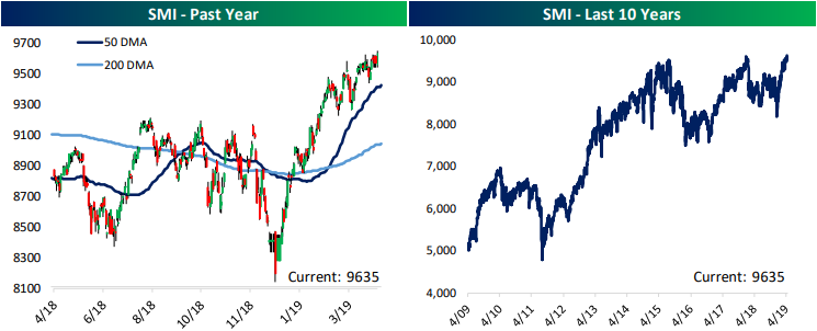
Moving to Europe, Switzerland’s Stock Market Index (SMI) has also been on a solid run this year up to all-time highs. The country’s economic picture is a bit mixed as it has below average GDP growth, one of the lowest inflation rates, and is one of four countries with declining retail sales growth. But at the same time, Industrial Production growth YoY is the second highest of the 23 countries and the unemployment rate is also one of the lowest.
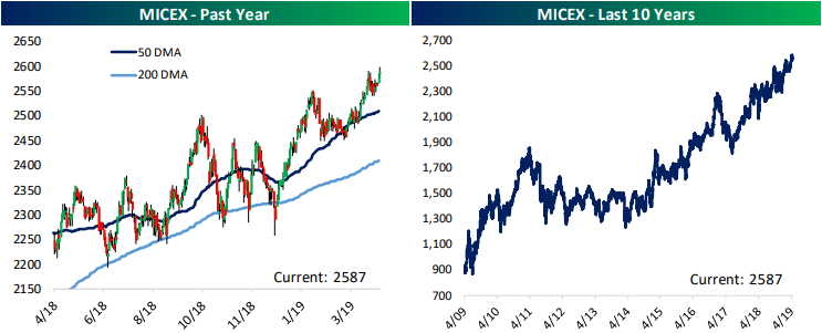
Even though it made a new high this week, Russia’s MICEX is the cheapest valued stock market index of the 23 countries we track with a P/E at an astoundingly low 5.2. At the same time, the dividend yield is 5.51%, the highest of these countries.
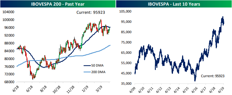
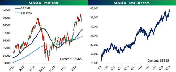
While they did not reach all-time highs yesterday, two other BRIC countries, Brazil and India, are worth noting as they too recently came up to highs. Brazil’s IBOVESPA closed at all-time high a bit further back in mid-March and has yet to make a strong push back up to there. But the country’s market has held its own hovering around the 50-DMA. The index is now looking to move back above the 50-DMA. On a longer term chart, the index has been on a tear since the country came out of a recession in 2016. India’s SENSEX has also been on a solid rally since 2016 despite a pullback in the late summer/fall of 2018. While the index has fallen over the past week, on the 16th, it closed at its highest level ever. India is also the highest growth country in our dashboard, and as a result, also has a very elevated valuation at 28.72. Start a two-week free trial to Bespoke Institutional to access our Global Macro Dashboard and much more.
Twitter (TWTR) on Top So Far This Earnings Season
Around 200 companies have reported earnings since the Q1 2019 reporting period began a couple of weeks ago. So far, the average stock that has reported earnings has gained 0.21% on its earnings reaction day. (For companies that report before the open, their earnings reaction day is that same trading day. For companies that report after the close, their earnings reaction day is the following trading day.)
We monitor stock price reactions to earnings reports because that basically tells an investor how good or bad the report was. You don’t have to look further than stock price reaction to know how well received the company’s quarterly numbers were.
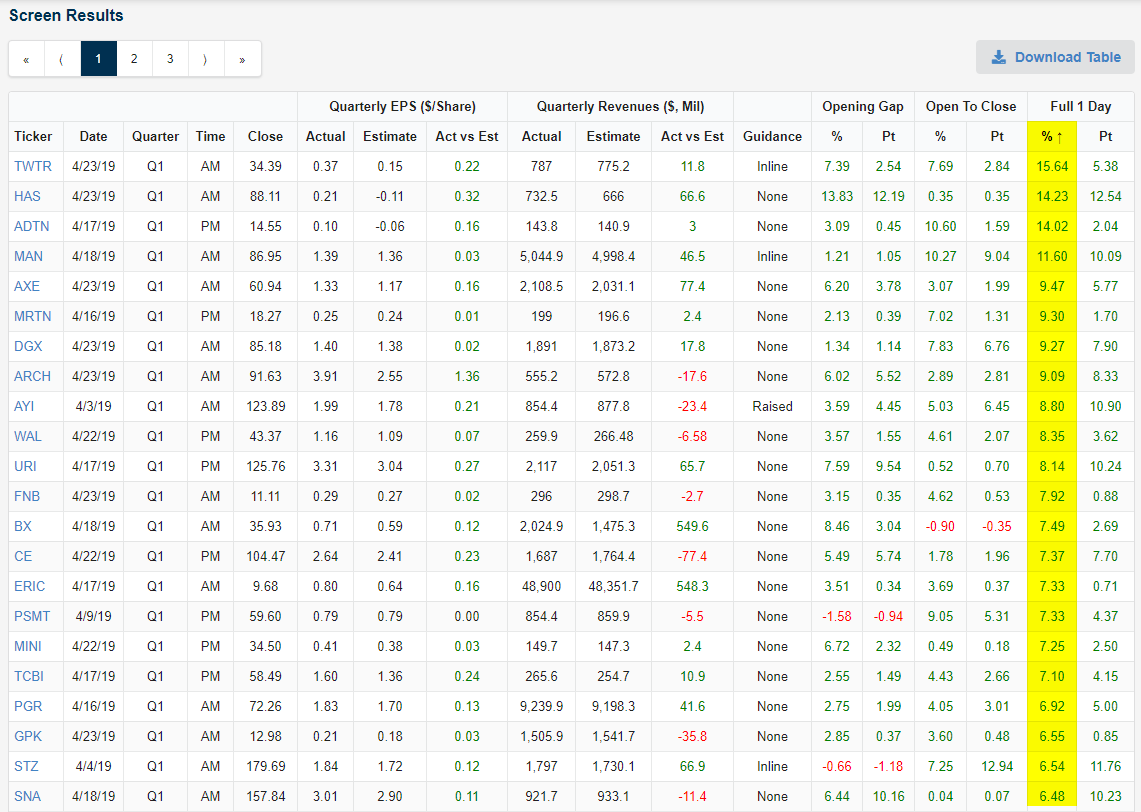
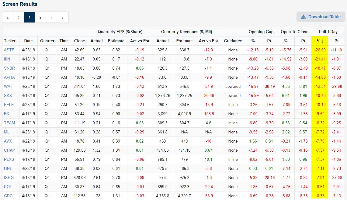
Using our Earnings Explorer screening tool, we’re able to find the stocks that have responded the most positively (or negatively) to earnings reports over any time period. During the current earnings season, Twitter (TWTR) has thus far had the most positive response to earnings with its one-day gain of 15.64% yesterday. As shown in the snapshot from our Earnings Explorer below, TWTR beat EPS estimates by 22 cents ($0.37 vs. estimates of $0.15). TWTR also beat sales estimates by $11.8 million.
TWTR initially gapped up 7.39% when it opened for trading yesterday, but investors continued to rush into the stock all day as it went up another 7.69% from the open to the close. By the close the stock was up $5.38/share.
Other notables on the list of biggest earnings season winners so far this season include Hasbro (HAS) with a gain of 14.23%, Acuity Brands (AYI) at +8.8%, and Constellation Brands (STZ) at +6.54%.
Of course there have been some losers as well this earnings season. Astec Industries (ASTE) currently ranks as the worst performer on earnings with a one-day decline of 26% yesterday. Insteel Industries (IIIN) is the only other stock that has fallen more than 20%. Other notables on the list of losers include Skechers (SKX), Check Point Software (CHKP), and Intuitive Surgical (ISRG). Start a two-week free trial to Bespoke Institutional to unlock our extremely useful Earnings Explorer tool!
Trend Analyzer – 4/24/19 – With New Highs Comes Extreme Overbought
As the S&P 500 and Nasdaq closed at new all time highs yesterday, conditions have made a push to more overbought levels. While the Core S&P Small Cap (IJR) and Micro-Cap (IWC) are still neutral as they have been for the past few weeks, all other major index ETFs are overbought. Four of which—the Dow (DIA), S&P 100 (OEF), Nasdaq (QQQ), and S&P 500 (SPY)—are now sitting at extremely overbought levels. Important to note, these are also some of the ones that have reached all time or new highs yesterday. While they have made it to new highs and extreme overbought levels, with the exception of the Nasdaq, the gains over the past week have not necessarily been that strong. This group is comprised of the only ETFs to have moved at least 1% or more over the past week. The other ETFs, mostly small and mid caps, have been a bit more stagnant rising around 0.2%-0.5%. Again, the Nasdaq is a bit of an outlier as it has rallied 2.39% in the past five days. The YTD gains are also blowing the other ETFs out of the water at 23.59%, over 3% more than the next highest gainer, the Russell Mid-Cap (IWR).

Looking at the individual charts of the ETFs above, the dichotomy between small and large caps becomes pretty evident. While large caps like the S&P 500 have distinctively retaken last year’s all time highs, small caps and mid caps both have a lot of progress to make up until they do the same. For example, the Micro-Cap ETF (IWC), which has been the weakest in the group recently, has yet to even make a recent high let alone a new 52-week high. Start a two-week free trial to Bespoke Premium to access our Trend Analyzer tool and much more.

Beige Book Bounce
We like to keep tabs on what the Federal Reserve’s Beige Book has to say about the economy, but it can be hard to take a bottom line from a wordy document running 15 thousand words! To help with this problem, we created an index of positive and negative words the Beige Book has featured over time, creating an index of sentiment from the aggregated language of the document. The results tend to do a pretty good job tracking GDP growth, as shown in the chart below.
Beige Book sentiment rolled over hard over the past 9 months, but April’s release (published last Thursday) saw sentiment bounce considerably. That’s consistent with a number of economic indicators we’ve seen over the last few months, as well as the rocket ship uptick in GDP Nowcasts like the Atlanta Fed GDPNow index, which has bounced over two percentage points from March lows to the near-3% growth tracked for Q1 at present. While only one Beige Book release does not an economic upturn make, this data definitely supports the thesis that growth is making a comeback despite weak global activity. Want to track our Beige Book Index on a regular basis? Become a Bespoke Institutional member now! CLICK HERE to start a two-week free trial.

Fixed Income Weekly – 4/24/19
Searching for ways to better understand the fixed income space or looking for actionable ideals in this asset class? Bespoke’s Fixed Income Weekly provides an update on rates and credit every Wednesday. We start off with a fresh piece of analysis driven by what’s in the headlines or driving the market in a given week. We then provide charts of how US Treasury futures and rates are trading, before moving on to a summary of recent fixed income ETF performance, short-term interest rates including money market funds, and a trade idea. We summarize changes and recent developments for a variety of yield curves (UST, bund, Eurodollar, US breakeven inflation and Bespoke’s Global Yield Curve) before finishing with a review of recent UST yield curve changes, spread changes for major credit products and international bonds, and 1 year return profiles for a cross section of the fixed income world.
In this week’s report we compare returns for equally-weighted versus market cap-weighted EM sovereign bond exposure.

Our Fixed Income Weekly helps investors stay on top of fixed income markets and gain new perspective on the developments in interest rates. You can sign up for a Bespoke research trial below to see this week’s report and everything else Bespoke publishes free for the next two weeks!
Click here and start a 14-day free trial to Bespoke Institutional to see our newest Fixed Income Weekly now!
Bespoke’s Global Macro Dashboard — 4/24/19
Bespoke’s Global Macro Dashboard is a high-level summary of 22 major economies from around the world. For each country, we provide charts of local equity market prices, relative performance versus global equities, price to earnings ratios, dividend yields, economic growth, unemployment, retail sales and industrial production growth, inflation, money supply, spot FX performance versus the dollar, policy rate, and ten year local government bond yield interest rates. The report is intended as a tool for both reference and idea generation. It’s clients’ first stop for basic background info on how a given economy is performing, and what issues are driving the narrative for that economy. The dashboard helps you get up to speed on and keep track of the basics for the most important economies around the world, informing starting points for further research and risk management. It’s published weekly every Wednesday at the Bespoke Institutional membership level.
You can access our Global Macro Dashboard by starting a 14-day free trial to Bespoke Institutional now!

Morning Lineup – Flat Morning After Record Highs
In another busy morning for earnings, we have already seen more than 50 companies report, and like yesterday, the EPS beat rate among these companies has been very strong at 67%. Unlike yesterday, though, the revenue beat rate hasn’t been nearly as strong as just under half of the companies reporting so far have managed to post better than expected revenues.
We’ve just published today’s Morning Lineup featuring all the news and market indicators you need to know ahead of the trading day. To view the full Morning Lineup, start a two-week free trial to Bespoke Premium.

With the S&P 500 closing just above its former record high yesterday, one would think the last seven months have been nothing more than running on a treadmill for the stock market. A look deeper, though, shows that there has been no shortage of big winners (and losers) in terms of industries.
The table below shows the ten best and worst performing S&P 500 industries since the S&P 500’s 2018 closing high on 9/20. Eight of the biggest winners are all up over 10%, including one – Power & Renewable Electricity- which is up over 20%. Who would have thought that an industry from the Utilities sector would have led the market? Outside of Utilities, Technology has been a big contributor to the market’s strength with three industries in the top ten (Communications Equipment, Software, and Semis). Another surprising sector with representation on the list is Consumer Staples. Both the Personal Products and Household Products industries are up 14.8% since the S&P 500’s 2018 high.
On the downside, Energy has been a drag as Energy Equipment and Services has dropped over 23% since 9/20 while Oil, Gas & Fuels is down 6%. One would think that with oil prices so high, that this group would have done better, but no such luck. Two groups that have felt the pinch from higher energy prices (and other issues like the 737) are Airlines and Air Freight. Both of these industries from the Industrials sector are down close to 10%.

Start a two-week free trial to Bespoke Premium to see today’s full Morning Lineup report. You’ll receive it in your inbox each morning an hour before the open to get your trading day started.
The Closer — Stocks Soar, New Home Sales Fly — 4/23/19
Log-in here if you’re a member with access to the Closer.
Looking for deeper insight on markets? In tonight’s Closer sent to Bespoke Institutional clients, as the S&P 500 reached an all-time high rising over 80 bps today, we begin tonight’s Closer by evaluating the forward returns for the past ten times the index rose to all-time highs in a similar fashion. We also make note of improved correlation while the dollar has also improved. Pivoting to economic data, we look at Multifactor Productivity for 2017 which was released today. We also update out Five Fed Manufacturing Composite with the addition of the Richmond Fed’s input. We finish with a recap of New Home Sales.

See today’s post-market Closer and everything else Bespoke publishes by starting a 14-day free trial to Bespoke Institutional today!
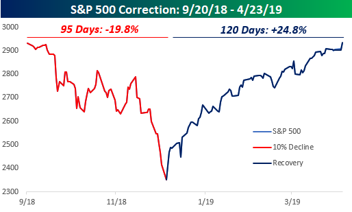
B.I.G. Tips – New Highs. Now What?
That was fast! When it comes to market recoveries from a correction, they don’t get much more v-shaped than the last seven months. After falling just short of a 20% decline (on a closing basis) in the span of 95 calendar days from 9/20/18 to 12/24/18, the S&P 500 has charged back and is on the cusp of closing above its record closing high from 9/20. If it closes above that level today, it will have rallied 24.7% in the span of just 120 days.
Present company included, there aren’t that many people who back in December would have anticipated a record closing high in the S&P 500 before April 30th! In our just-released B.I.G. Tips report, we took a look at prior corrections from all-time highs in the post-WWII period based on their magnitude and duration as well as how long it took them to reclaim their prior highs. We then compared those periods to the current one to find which ones had the most in common.
To gain access to the full report, please start a two-week free trial to our Bespoke Premium package now. Here’s a breakdown of the products you’ll receive.
