Claims Edge Towards The 2019 Low
Last week’s reading on initial jobless claims came in at 220K (revised up to 221K) which was above the past several weeks’ range. This week’s claims data fell back to the opposite end of this range with a 209K print. This handily beat expectations of a drop to only 216K and was the largest one-week decline in claims since the first week of July when it fell by 14K. As per usual lately, although this does not mark any new low, it is still a healthy reading. Seasonally adjusted claims have now remained at or below 300K for a total of 233 consecutive weeks and at or below 250K for 98 weeks.

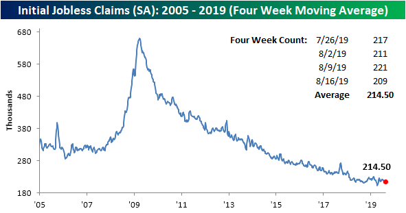
The move in the four-week moving average for claims, which helps to smooth out the fluctuations of the high-frequency indicator, was unexciting this week with a tiny 0.5K increase from last week. While the increases have been small, this week marked the third straight week that the moving average has moved higher. So far in 2019, there have been three other streaks like this with each one ending at the fourth week.
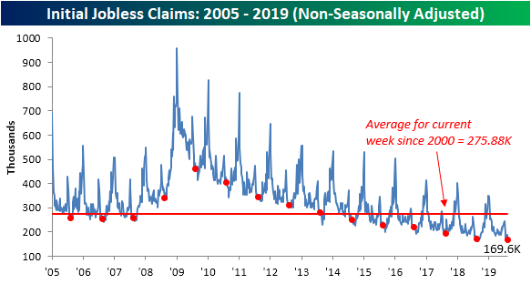
Non-seasonally adjusted claims came in at 169.9K this week, which is over 17K below last week’s number. For the current week of the year, this was the largest week-over-week drop in claims in five years when it fell by 20K in 2014. This was also the lowest number for the NSA data for the current week of the year (33rd week) of the cycle. This week’s NSA print was also 3.7K lower than the comparable week last year.
We must also note that over the coming weeks due to seasonal patterns, claims typically see their lowest levels of the year (usually in the final week of August or the first week of September). Start a two-week free trial to Bespoke Premium.
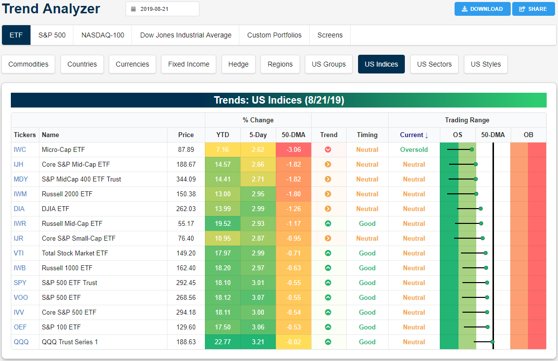
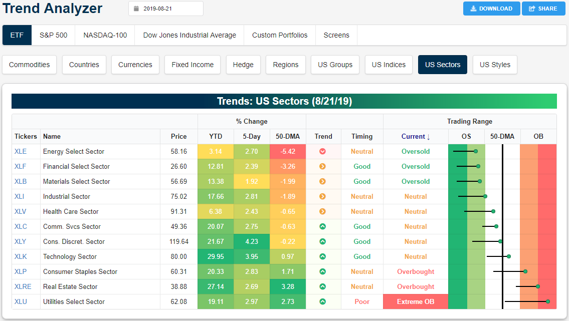
Trend Analyzer – 8/22/19 – Overbought/Oversold See-Saw
Major US index ETFs have seen a major bounce off of oversold levels over the last week. You can see the big jump in the snapshot from our Trend Analyzer tool below. Even with gains of 2-3% across the board over the last week, however, all of the ETFs shown remain below their 50-day moving averages. Bulls still have work to do to put the onus back on the bears.
As stocks sit higher versus last week, defensives are once again overbought with Utilities (XLU) at extreme levels and Real Estate (XLRE) not far behind. Along with Technology (XLK), these ETFs are the only ones that are currently above the 50-DMA. Meanwhile, more cyclical sectors like Energy (XLE), Financials (XLF), and Materials (XLB) all remain oversold. Granted, as with the small and mid-caps above, these three ETFs in addition to Industrials (XLI) and Health Care (XLV) were sitting at extreme oversold levels this time last week. Start a two-week free trial to Bespoke Premium to gain access to our popular Trend Analyzer tool and much more.
Bespoke’s Morning Lineup — More Retail Rallies
See what’s driving market performance around the world in today’s Morning Lineup. Bespoke’s Morning Lineup is the best way to start your trading day. Read it now by starting a two-week free trial to Bespoke Premium. CLICK HERE to learn more and start your free trial.

The Closer – Two Year Fibs, Solar Surge, Home Sales Surge, CBO Forecast, EIA – 8/21/19
Log-in here if you’re a member with access to the Closer.
Looking for deeper insight on markets? In tonight’s Closer sent to Bespoke Institutional clients, we kick things off with a look at the movement in the VIX relative to the move for equities. We also review the technicals of the 2-year yield and crude before moving onto the surge in solar stocks this year. Turning onto macroeconomic data, we look at today’s stronger than expected existing home sales and we take an in-depth look at the CBO’s economic projections. We finish with our weekly recap of EIA petroleum stockpile data.

See today’s post-market Closer and everything else Bespoke publishes by starting a 14-day free trial to Bespoke Institutional today!
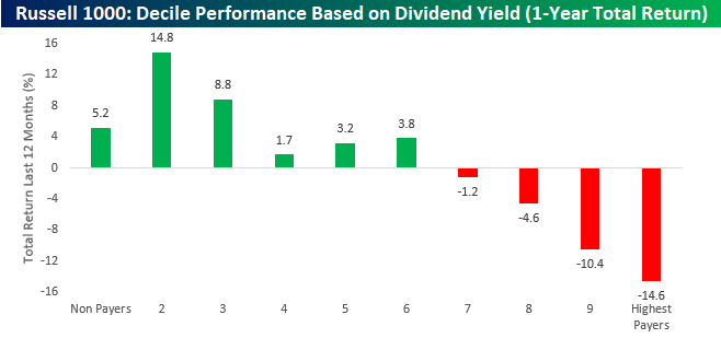
High Yielders Feeling Low
With plunging interest rates around the world continuing to mystify investors, one would think that high yielding stocks would be a primary beneficiary as investors search for alternative sources of yield. The fact is, though, that stocks with high dividend yields haven’t been very good performers over the last year. As shown in the chart below, the deciles of Russell 1000 stocks with the highest dividend yields are all down over the last year, including the deciles of the two highest yielders which are down an average of over 10%! Meanwhile, the deciles of stocks with little or no yields are all up. Start a two-week free trial to one of Bespoke’s premium equity market research services.
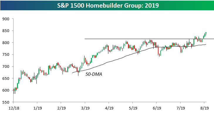
Homebuilders Still Cruising
The S&P 1500 Homebuilder group has had a great 2019 as mortgage rates have fallen over 100 bps from their highs in late 2018. As shown below, the group just recently broke out to new 2019 highs after a 3-month sideways period, and as of this morning, it was up 40% year-to-date.
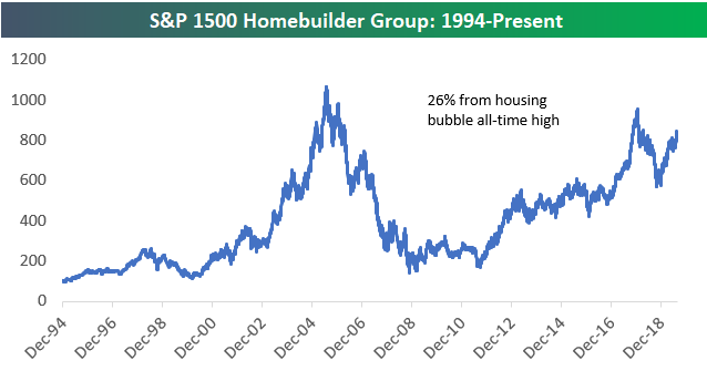
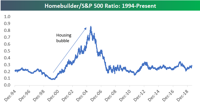
While 2019 has been a great year for homebuilders, remember that the group had a terrible 2018. As shown below, the group actually hit its peak of the current cycle in January 2018 when it actually got relatively close to its housing bubble highs from 2005. From high to low in 2018, however, the group was down 40%. That’s how you get a 40% YTD gain in 2019 without managing to re-take 2018 highs. At current levels, the homebuilders are roughly 26% from their bubble highs made in mid-2005.
In an earlier post today, we looked at the ratio of the Nasdaq 100 to the S&P 500. While the Nasdaq has outperformed the S&P 500 by a wide margin throughout the current bull market, the homebuilders have basically traded back and forth with the S&P for the last 10 years with periods of ups and downs. From a relative strength perspective, the homebuilders are nowhere close to recovering the gains they made versus the S&P during the housing bubble. Start a two-week free trial to one of Bespoke’s premium equity market research services.
Nasdaq 100 to S&P 500 Ratio
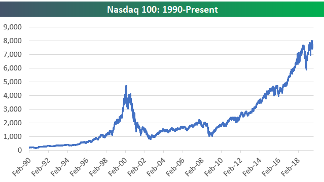
Below is a chart of the Nasdaq 100 going back to 1990. While it took 15+ years for the index to make a new all-time closing high following its March 2000 peak, the index is currently 65% above those March 2000 highs.
Below is a ratio chart of the Nasdaq 100’s price versus the S&P 500’s price since 1990. The ratio started well below 1 in early 1990 but quickly overtook the S&P in price by the mid-90s. As you can see, the ratio spiked dramatically above 3 during the peak of the Dot Com bubble in late 1999. The Nasdaq 100 then gave up much of that outperformance versus the S&P 500 over a 2-3 year period where the ratio got all the way back down to 1, but since then it has been steadily trending higher to its current level of 2.65. While it went through a bubble and a burst over a 5-year period, the Nasdaq has been outperforming the S&P 500 for a long time now. Start a two-week free trial to one of Bespoke’s premium equity market research services.
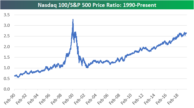
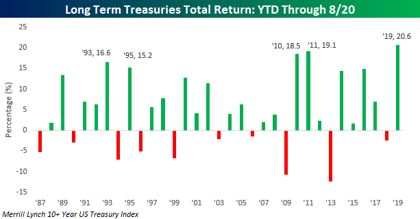
Chart of the Day: A Record Year For Long Term Bonds
August has been an exceptionally strong month for long-term US Treasuries, adding to what has already been an extremely strong year. Through yesterday, the Merrill Lynch 10+ Year Treasury Index’s YTD total return crossed 20%, making it the first year since at least 1987 that long-term US Treasuries were up over 20% YTD through 8/20. What does that kind of move in US Treasuries mean for the equity market going forward? In today’s Chart of the Day, we shed some light on this question through an analysis of equity market performance following similar intermediate and short-term moves in the past.
To view the report and see what history suggests going forward, start a two-week free trial to any of our research membership levels. You’ll be glad you did!
Fixed Income Weekly – 8/21/19
Searching for ways to better understand the fixed income space or looking for actionable ideas in this asset class? Bespoke’s Fixed Income Weekly provides an update on rates and credit every Wednesday. We start off with a fresh piece of analysis driven by what’s in the headlines or driving the market in a given week. We then provide charts of how US Treasury futures and rates are trading, before moving on to a summary of recent fixed income ETF performance, short-term interest rates including money market funds, and a trade idea. We summarize changes and recent developments for a variety of yield curves (UST, bund, Eurodollar, US breakeven inflation and Bespoke’s Global Yield Curve) before finishing with a review of recent UST yield curve changes, spread changes for major credit products and international bonds, and 1 year return profiles for a cross section of the fixed income world.
In this week’s report we show the compression of yields on USD assets after accounting for currency hedging costs.

Our Fixed Income Weekly helps investors stay on top of fixed income markets and gain new perspective on the developments in interest rates. You can sign up for a Bespoke research trial below to see this week’s report and everything else Bespoke publishes free for the next two weeks!
Click here and start a 14-day free trial to Bespoke Institutional to see our newest Fixed Income Weekly now!
Middle of the Pack
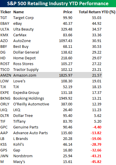
There’s a phrase usually not associated with Amazon (AMZN). While CEO, Chairman, and Founder Jeff Bezos was hob-nobbing with A-List celebrities last night at the company’s post-Prime Day concert, Amazon’s stock has been more of an ‘average Joe’ this year. With a YTD total return of 21.6%, AMZN is still modestly outperforming the S&P 500, but relative to other companies in the S&P 500 Retailing industry, its performance has been pretty much right in the middle of the pack. What’s even more surprising about performance among stocks in the S&P 500 Retailing industry is how many traditional brick and mortar retailers are outperforming AMZN this year. Target (TGT) — buoyed by strong earnings this morning — is at the top of the list and up more than double than AMZN on a year-to-date basis.
AMZN may be trailing some traditional retailers so far this year, but there have still been plenty of losers in the group. Both Macy’s (M) and Nordstrom (JWN) are down over 40%. The fact that more than 100 percentage points separate the biggest winner and loser in terms of performance this year shows just how bifurcated the sector has become. And this doesn’t even cover the horrific performance of mall REITs that provide space for brick and mortar retail. Start a two-week free trial to one of Bespoke’s premium equity market research services.