B.I.G. Tips – Years Like 2019: August Edition
We’ve highlighted the chart below comparing 2019 to 1998 a number of times over the last several weeks, and the similarities between the performance of the S&P 500 in each year has continued right up through the end of August. While the pullback from the highs this Summer hasn’t been as severe as it was in 1998, the timing of both and the subsequent periods of backing and filling has been striking. A continuation of the similar patters certainly wouldn’t be a positive in the short term, but the silver lining is that Q4 1998 was exceptionally strong.
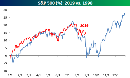
As we do throughout the year, in our most recent B.I.G. Tips report we compared the S&P 500’s trading pattern this year to all other years in order to see which ones were the most similar. With those similar years, we then analyzed how the S&P 500 performed for the remainder of the year in order to help come up with a framework for what to expect for the rest of this year. It shouldn’t surprise anyone that 1998 made the list, but a number of other notable years also had strong similarities to the pattern of 1998 with very different outcomes as well.
For anyone with more than a passing interest in the market’s seasonal patterns, this report is a must-read. To see it, sign up for a monthly Bespoke Premium membership now!
Jobless Claims Snoozefest
Initial jobless claims data were released this morning without any major new developments, largely as a result of seasonal effects. Last week saw claims come in at the lower end of their recent range at 209K. This reading was revised up to 211K and this week’s release showed another small increase to 215K, which was slightly ahead of the 214K forecast. Although claims came in weaker than expected, they remain at strong levels.
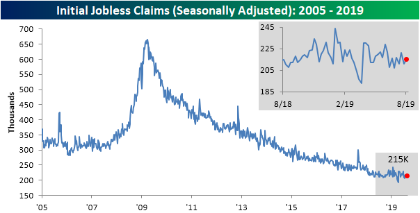
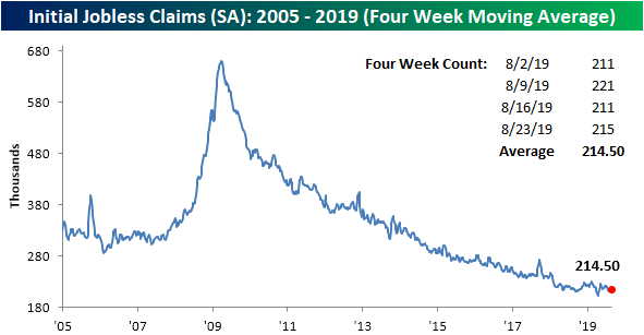
Likewise, the four-week moving average came in pretty flat once again this week only falling by 0.5K. With this modest improvement to 214.5K, through all of August, the moving average has been in a tight 2.25K range. This range is also still off of its lows set earlier this year in April.
Most of the reason for the lack of movement this week in initial jobless claims data is due to seasonal effects. Looking back at the current week of the year (34th week) over the past ten years, non-seasonally adjusted claims has only seen an average week-over-week change, in absolute terms, of just 3.4K. As shown in the second chart below, that is the smallest change for any given week of the year. That also actually makes this week’s 4.2K increase to 175.6K larger than normal. But still sticking to the script of little changes as well as the broader trend of slowing improvements in labor data, this week’s NSA data was only 0.1K lower year over year. One important thing to consider with this minor improvement from last year, over the next couple of weeks, non-seasonally adjusted claims typically make their yearly low. In other words, in the coming weeks, we should be able to get a pretty good idea on how this year’s low stacks up to prior years of the cycle. Start a two-week free trial to Bespoke Institutional to access our interactive economic indicators monitor and much more.
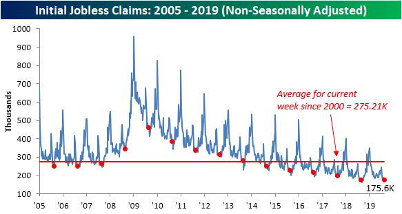
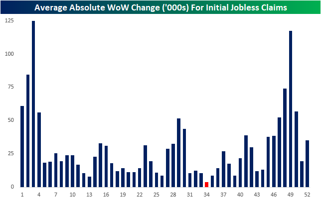
Chart of the Day: SLB Below Financial Crisis Lows, HAL Close
Bespoke’s Morning Lineup — Bulls Step In
See what’s driving market performance around the world in today’s Morning Lineup. Bespoke’s Morning Lineup is the best way to start your trading day. Read it now by starting a two-week free trial to Bespoke Premium. CLICK HERE to learn more and start your free trial.

The Closer – Home On The Range, Mexican Macro, ETF Flow, EIA Inventory Crash – 8/28/19
Log-in here if you’re a member with access to the Closer.
Looking for deeper insight on markets? In tonight’s Closer sent to Bespoke Institutional clients, as the S&P 500 remains rangebound in August, we take a look at the recently lower correlation between stocks and rates. Ahead of tomorrow’s GDP release, we also give an updated look at the Atlanta Fed’s GDPNow growth tracker. Next, we review weekly fund flow data, including data on mutual funds and ETFs. We then recap recent Mexican macro data before looking at the impressive results in this week’s EIA data.

See today’s post-market Closer and everything else Bespoke publishes by starting a 14-day free trial to Bespoke Institutional today!
Chart of the Day: Silver Soars But For How Long?
Fixed Income Weekly – 8/28/19
Searching for ways to better understand the fixed income space or looking for actionable ideas in this asset class? Bespoke’s Fixed Income Weekly provides an update on rates and credit every Wednesday. We start off with a fresh piece of analysis driven by what’s in the headlines or driving the market in a given week. We then provide charts of how US Treasury futures and rates are trading, before moving on to a summary of recent fixed income ETF performance, short-term interest rates including money market funds, and a trade idea. We summarize changes and recent developments for a variety of yield curves (UST, bund, Eurodollar, US breakeven inflation and Bespoke’s Global Yield Curve) before finishing with a review of recent UST yield curve changes, spread changes for major credit products and international bonds, and 1 year return profiles for a cross section of the fixed income world.
In this week’s report we show what is different this time about yield curve inversion, even if the outcome may not be different.

Our Fixed Income Weekly helps investors stay on top of fixed income markets and gain new perspective on the developments in interest rates. You can sign up for a Bespoke research trial below to see this week’s report and everything else Bespoke publishes free for the next two weeks!
Click here and start a 14-day free trial to Bespoke Institutional to see our newest Fixed Income Weekly now!
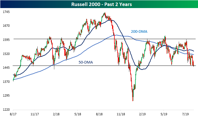
Russell 2000 (IWM) Testing Support
Unlike large-cap major indices like the Dow or S&P 500 which managed to reach record highs earlier this year, so far in 2019, the small-cap focused Russell 2000 never managed to so much as retest the highs from around this time last year. In fact, in the past year, other than the final leg down to December lows and the subsequent rally back up to previous levels in early 2019, the Russell has been in a range between support and resistance from last fall. This support and resistance can actually be traced back even further to the highs and lows of late 2017 and early 2018. This year has seen more tests of these support levels after May declines and once again this month.
At the beginning of August, the Russell collapsed through flat 50 and 200-DMAs finding relief at the bottom of this range. Since then, the index has been bouncing between this support and the 200-day with the most recent failed test of its 200-DMA coming just last week. Over the past few sessions, while it has not closed significantly below, intraday the index has breached these critical support levels. Fortunately, today the index is seeing some mean reversion from its extreme oversold levels as it is up rather than breaking out of the range to the downside. Start a two-week free trial to Bespoke Institutional to access our interactive Security Analysis tool and much more.
What’s Driven the S&P 500?
In last night’s Closer, we showed the biggest contributors to the S&P 500’s gain so far in 2019 as well as the stocks that have weighed on the index the most. Given the S&P’s 14% YTD gain, it’s probably not surprising to hear that only one stock in the entire S&P 500 has weighed on the total index performance by at least 20 bps: Pfizer (PFE). On the other hand, 11 different stocks have added at least 20 bps to total index performance in 2019. We show the 10 best and worst-performing stocks this year by the overall contribution to the S&P 500’s performance in the table below. As shown, mega-cap Tech like Microsoft (MSFT) and four of the five FAANG names have been the biggest contributors. When you add them all up, they’ve accounted for roughly 26% of the S&P’s gain this year. Two credit card companies — Mastercard (MA) and Visa (V), and two retailers — Walmart (WMT) and Home Depot (HD) — have also been big contributors to gains.
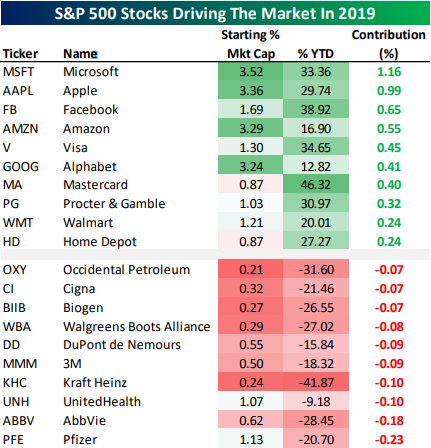
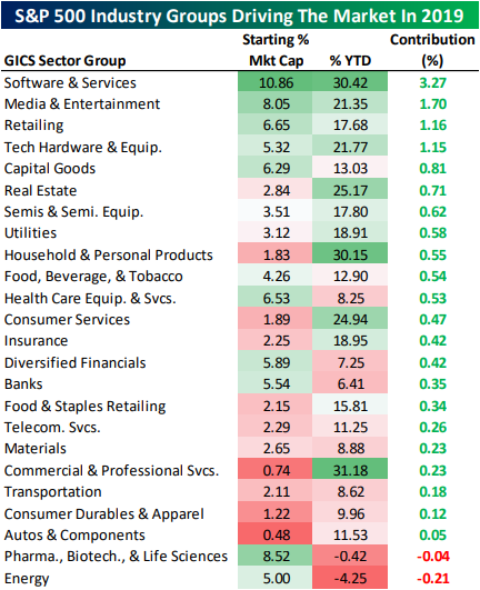
At the industry group level, health care stocks related to Pharmaceuticals, Biotech, and Life Sciences are one of only two industry groups to weigh on S&P 500 performance this year. Energy is the other standout with a 4% decline. Software & Services is the best performer, driving 3.3 percentage points of the S&P’s 14% gain this year. Media & Entertainment, Retail which includes Amazon (AMZN), and tech Hardware are the only other groups that have added at least 1% to the total 14.46% gain for the S&P 500 so far in 2019.
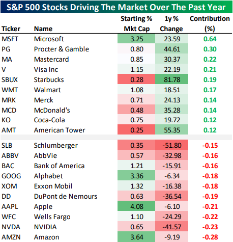
While YTD numbers look really great, things are not so hot versus this time last year; the S&P 500 is actually slightly lower year-over-year. As a result, the gap between the contribution of gainers and those of decliners is much narrower. Only four stocks drove a gain of at least 20 bps for the headline index over the past year: Microsoft (MSFT), Procter & Gamble (PG), Mastercard (MA), and Visa (V).
We note that the top ten gainers are almost exclusively very blue-chip stocks: large tech companies, credit card networks, and some consumer names. Only the cell phone tower REIT American Tower (AMT) is unusual in this list of big-cap, well-known stocks. Losers are concentrated in Health Care, Banks, and Tech.
While Alphabet (GOOG), Apple (AAPL), and Amazon (AMZN) aren’t down drastically versus last summer, their market caps are big enough to have cost a lot of performance for the S&P 500’s overall performance. Smaller cap stocks like NVIDIA (NVDA), DuPont (DD), AbbVie (ABBV), and Schlumberger (SLB) are a verry different story.
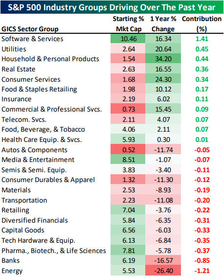
At the industry group level, there have been more decliners than gainers, though only Energy and Banks have cost the index more than 80 bps; on the flip side only Software has been a greater than 80 bps gainer. Defensive industry groups like Utilities, Household & Personal Products, and Real Estate have all driven the S&P 500 higher while cyclical industry groups like Capital Goods and Tech Hardware have weighed. Start a two-week free trial to one of Bespoke’s premium research services.
This Isn’t Normal
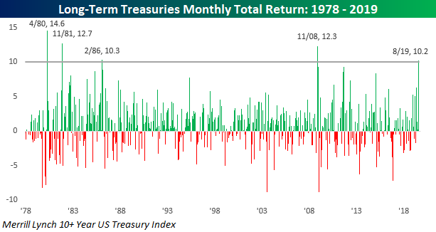
Being long bonds these days probably feels like being long tech stocks in the late 1990s. Every day you look at your portfolio, you expect it to be higher than the last time. This month through yesterday, the Merrill Lynch 10+ Year US Treasury Index is up over 10% and that doesn’t even include the rally we are seeing today. If the gains we have seen so far hold up into month-end, it will go down as just the 5th month since 1978 that long-term treasuries gained more than 10% in a single month. The last time we saw this large of a move in the long-term Treasury market was more than 10 years ago in November 2008, and before that you have to go all the way back to February 1986. In other words, this kind of move isn’t normal.
Besides the fact that long-term Treasuries are up over 10% this month, August marks the fourth straight month of gains for the asset class, and while that may not sound like much, the last time we saw a streak of four or more months of gains was in January 2015. With all these gains, the Merrill Lynch 10+ Year Treasury Index is up over 22% YTD. 22%! Start a two-week free trial to Bespoke Institutional to access our interactive Earnings Explorer, Triple Plays, and much more.