The Closer – Low Vol, High Returns, IPOs, Treasury Update – 1/13/20
Log-in here if you’re a member with access to the Closer.
Looking for deeper insight on markets? In tonight’s Closer sent to Bespoke Institutional clients, we begin with various looks at how low volatility has been recently. Next, we review the S-1 of upcoming IPO Casper before checking up on the performance of 2019’s biggest IPOs. Turning to macroeconomic data, we show the December budget deficit data.

See today’s post-market Closer and everything else Bespoke publishes by starting a 14-day free trial to Bespoke Institutional today!
The 40 Most Volatile Stocks on Earnings
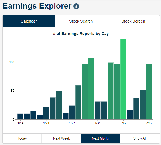
The Q4 2019 earnings reporting period starts up Tuesday with a number of key financials firms set to report, including Citigroup (C), JP Morgan (JPM), and Wells Fargo (WFC). Below is a snapshot of the number of earnings reports expected by day over the next month from our Earnings Explorer tool that’s available to Bespoke members. As shown, even though earnings season starts up this week, things don’t really pick up until the end of January.
As we do at the start of each quarterly earnings season, below is a list of the individual stocks that have historically been the most volatile on their earnings reaction days. These are stocks that experience the biggest average absolute one-day percentage change on the first trading day following the release of their quarterly earnings reports. To make the list, a stock has to have at least 10 years (40 quarters) worth of earnings reports in our Earnings Explorer database.
Infinera (INFN) is the most volatile stock on earnings with an average absolute one-day change of 14.90% on its 49 quarterly reports. YRC Worldwide (YRCW) ranks as the second-most volatile with an average one-day change of +/-13.00%, followed by Travelzoo (TZOO) at +/-12.79%.
The most notable stocks on the list are Netflix (NFLX) and Amazon (AMZN). Netflix (NFLX) ranks as the 4th most volatile earnings stock on the list of companies with at least 10 years of reports. NFLX has averaged a one-day move of +/-12.63% on the 70 quarterly earnings reports it has had in its history as a public company. While not as volatile on earnings as NFLX, Amazon (AMZN) has historically averaged an absolute change of 8.74% on its 73 earnings reaction days in our database. That ranks AMZN as the 35th most volatile stock on earnings with at least 10 years worth of data.

Below is a list of the most volatile stocks on earnings with less than 10 years of quarterly earnings data. Arlo Technologies (ARLO) ranks at the top with an average one-day change of +/-18.50% on its six prior earnings reaction days. Container Store (TCS) ranks second at +/-17.33%, followed by Snap (SNAP) at +/-17.21%. Other notables on the list include Yelp (YELP), Canada Goose (GOOS), Groupon (GRPN), Under Armour (UAA), Twitter (TWTR), GrubHub (GRUB), Twilio (TWLO), Yeti (YETI), and TripAdvisor (TRIP). Get access to all of Bespoke’s earnings tools with a two-week free trial to Bespoke Institutional. You won’t be disappointed!

B.I.G. Tips – Can Earnings Season Keep The Bulls Charging?
It was only three months ago that we were looking forward to earnings season providing a change of pace from the non stop headlines related to the trade war with China. Today, it’s the exact opposite. With the market seemingly doing nothing but trade higher, the upcoming earnings season is more of a concern over whether company reports will be good enough to keep the bulls on their feet. We’ll have our answer soon enough, though, as earnings season kicks off this week.
This week‘s batch of reports will be on the light side as just 25 companies are scheduled to report. The fact that only a small number of companies are reporting, though, doesn’t diminish their importance. On Tuesday morning alone we’ll hear from Citigroup (C ), JP Morgan (JPM), and Wells Fargo (WFC). Wednesday morning will be another busy one for the big Financials with Bank of America (BAC), Blackrock (BLK), Goldman Sachs (GS), PNC, and US Bancorp (USB) all reporting. Outside of the Financials sector, we’ll also hear from Dow component UnitedHealth (UNH).
We have just published our quarterly preview of the upcoming earnings season and what to expect in terms of the overall market and sector performance based on trends in analyst revisions. To gain access to the full report, start a two-week free trial to our Bespoke Premium package now. Here’s a breakdown of the products you’ll receive.
Chart of the Day: Healthcare and JP Morgan Healthcare Conference
Mystery Chart Unveiled – Tremendous Breakout
Last Thursday, we posted the following ‘mystery chart’ on Twitter, and asked whether it was a “buy” or a “sell.” Judging simply by the looks of it, the chart looks pretty attractive. It’s clearly trending higher, and after a brief pullback in the second half of 2019, it has seen a sharp rebound putting last year’s highs back into play.
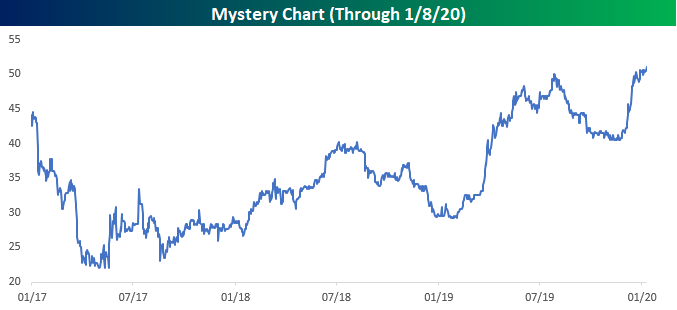
While it was only last week that we originally tweeted the chart, since then there has been a clear breakout above the summer high (~50). From a technical perspective at least, it looks like our ‘mystery chart’ has experienced a classic breakout.
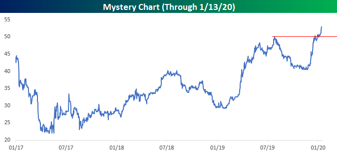
So what exactly is this mystery chart which appears to be in the early stages of a new leg higher? Drumroll, please! It’s actually the probability of President Trump winning re-election in November according to the website electionbettingodds.com. At the current level of 53.1%, the market’s pricing of President Trump’s re-election has never been higher.

While President Trump’s chances of winning re-election have seen a big boost lately, these gains have also been accompanied by some interesting moves on the Democratic side. Last Friday, a new Des Moines Register poll showed that Senator Bernie Sanders took the lead for the first time in its polling for the February 3rd Iowa caucus. At 20% in the poll now, Sanders hardly has a commanding lead, and three other candidates are polling at 15%+ (Warren, Buttigieg, and Biden). As a result of that poll, though, we saw a sharp drop in Biden’s chances of winning the nomination and further gains for Sanders after what has already been a strong showing in the last several weeks.
Whether the reasoning for Trump’s recent gains is that Sanders is less likely than Biden to win in a general election or that the party will be too divided to generate enough excitement around one candidate in a general election, the betting markets seem to be interpreting the recent surge in Sanders’ standing in the polls as a positive for President Trump’s re-election. That’s a positive for Trump fans in the present, but just like technical analysis, the election betting markets haven’t exactly had a perfect record at predicting the outcome of events. To read Bespoke’s most actionable stock market research, start a two-week free trial to Bespoke Premium. You’ll unlock our most popular reports like our Morning Lineup, Model Portfolios, and Chart of the Day.

Bespoke’s Morning Lineup – 1/13/20 – From Technology to Health Care
See what’s driving market performance around the world in today’s Morning Lineup. Bespoke’s Morning Lineup is the best way to start your trading day. Read it now by starting a two-week free trial to Bespoke Premium. CLICK HERE to learn more and start your free trial.

Last week was a good week for the Technology sector, and one catalyst for the sector was the Consumer Electronics Show (CES) which, as we highlighted in last Monday’s Chart of the Day, has historically provided a boost to the sector’s performance. With the CES now in the rearview mirror, this week may be the Health Care sector’s turn as the JP Morgan Health Care conference kicks off. Like the CES for Technology, this conference has historically been a positive catalyst for the Health Care sector.
Year to date, Health Care has already been the fourth-best performing sector and was the third best performing sector last week. Heading into this week, Health Care is already overbought (like just about every other sector), and its timing score in our Trend Analyzer is neutral. While the JP Morgan Health Care Conference is working in the sector’s favor, recent polling data that has Sanders and Warren in the top two spots in Iowa may limit some of that upside in the early going today.

Bespoke Brunch Reads: 1/12/20
Welcome to Bespoke Brunch Reads — a linkfest of the favorite things we read over the past week. The links are mostly market related, but there are some other interesting subjects covered as well. We hope you enjoy the food for thought as a supplement to the research we provide you during the week.
While you’re here, join Bespoke Premium for 3 months for just $95 with our 2020 Annual Outlook special offer.
Health Care
US cancer death rate sees largest-ever single-year drop, report says by Jacqueline Howard (CNN)
For a 26th year in a row, deaths from cancer dropped 2.2%, spurred by falling lung cancer death rates; treatment improvements across surgery and radiotherapy are the key to the general results in that area. [Link]
Crispr puts first human in-body gene editing to test by Hannah Kuchler (FT)
The precise method of gene editing has been around since 2012 but its first use in human beings is starting this year, as a treatment designed to restore sight is tried. [Link; paywall]
Elite Whimsy
How Carlos Ghosn Became the World’s Most Famous Fugitive by Matthew Campbell, Brian Bremner, Kae Inoue, and Ania Nussbaum (Bloomberg)
A tick-tock of the surprisingly easy escape staged by former Nissan executive Carlos Ghosn in his efforts to escape the Japanese justice system. [Link; soft paywall]
Iran’s Cyber Attack on Billionaire Adelson Provides Lesson on Strategy by Alyza Sebenius, Kartikay Mehrota, and William Turton (Yahoo!/Bloomberg)
In retaliation for a provocative comment made by Sheldon Adelson in 2013, Iranian intelligence deployed malware to the billionaire’s casinos in an attack that cost tens of millions of dollars to fix. [Link]
Tech
Dinner Bell vs. Doorbell: When Mom and Dad Cook, the Kids Send for DoorDash by Heather Haddon and James R. Hagerty (WSJ)
A developing front in the battle between parents and teenagers is the dinner bell: where once the stovetop gave parents a modicum of control, the ubiquity of new delivery services gives kids options that didn’t exist before. [Link; paywall]
Apple Airpods: iPhone Accessory Or The Next Big Thing? (Kevin Rooke)
The wireless headphones originally launched in 2016 have ramped up sales to roughly 60 million units representing as much as $12bn in revenue, almost 5% of the total for iPhone revenues; that’s more revenue than Adobe, NVIDIA, AMD, Spotify, Square, Twitter, Snap, or Shopify and just short of Uber top line numbers. [Link]
Admit It: You Have a Box of Cords You’ll Never, Ever Use Again by Katherine Bindley (WSJ)
An ode to the inevitable, massive, and utterly incomprehensible pile of cords that sits in the bottom of at least one closet in almost American home. [Link; paywall]
Incarceration
Lawmakers Refused to Increase an Infamous Prison’s Funding. Then, Chaos Erupted. by Jerry Mitchell (ProPublica)
Mississippi prisons have been underfunded for years, but in 2020 the combination of underpaid and understaffed workers, unsafe conditions, and large prison populations have reached a boiling point. [Link]
Retail
Four CEOs Found the Secret to Thriving During the Retail Apocalypse by Anders Melin and Jeff Green (Bloomberg)
Leadership teams at Ulta, Grocery Outlet, Wingstop, and Domino’s have helped steer their corporations through a collapsing traditional retail environment. It’s telling that two of the companies serve food rather than selling goods. [Link; soft paywall]
Sports
XFL Rule (XFL)
A fascinating set of rule changes for the new football league that promise to make the game of football more exciting, faster, and fairer for teams on the field. [Link]
Whiffs
How Jeffrey Gundlach’s Predictions for 2019 Turned Out by John Gittelsohn (Bloomberg)
The famed bond investor wrongly predicted EM outperformance, large dollar declines, no major change in energy prices, and a huge junk bond selloff in his outlook last year. [Link; soft paywall]
Economics
Economists Question the Benefits of Targeted Tax Breaks by Richard Rubin (WSJ)
A new paper suggests that while tax giveaways do help job growth in specific industries, they don’t tend to have large spillover effects that are often hoped-for by policymakers. [Link; paywall]
Read Bespoke’s most actionable market research by joining Bespoke Premium today! Get started here.
Have a great weekend!
The Bespoke Report — 1/10/19
This week’s Bespoke Report newsletter is now available for members.
The mess in Iran this week turned into a great contrarian indicator for equity markets as stocks ripped off the lows which geopolitical concerns forced equities to earlier in the week. Oil reversed off of its recent highs as well, with the crude-positive headlines offering an excellent chance to sell the news for a third time this year. European data has improved somewhat of late, part of a broader upturn in global economic surprises that has seen PMIs mostly return to expansion. Credit markets have confirmed that economic upturn and the equity market rally, and with the Fed likely to remain dovish thanks to weak wage growth revealed in the December Employment Situation Report released today, it’s easy to see why stocks have been so quick to shrug off the Iran mess.
In this week’s Bespoke Report, we provide our take on everything going on in the market this week, including the action in international markets, global economics, and cross-asset price action. To read the report and access everything else Bespoke’s research platform has to offer, start a two-week free trial to one of our three membership levels. You won’t be disappointed!

The Closer: End of Week Charts — 1/10/20
Looking for deeper insight on global markets and economics? In tonight’s Closer sent to Bespoke clients, we recap weekly price action in major asset classes, update economic surprise index data for major economies, chart the weekly Commitment of Traders report from the CFTC, and provide our normal nightly update on ETF performance, volume and price movers, and the Bespoke Market Timing Model. We also take a look at the trend in various developed market FX markets.
The Closer is one of our most popular reports, and you can sign up for a free trial below to see it!
See tonight’s Closer by starting a two-week free trial to Bespoke Institutional now!
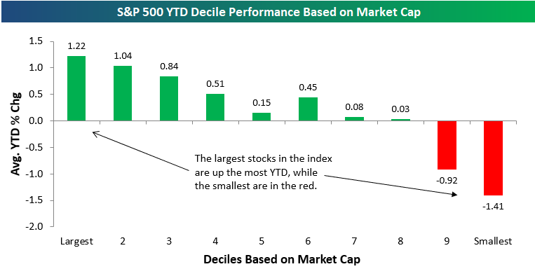
Mega Caps, Last Year’s Winners Remain on Top to Start 2020
We’re seven trading days into 2020, and so far the market has been behaving a lot like it did in 2019. Below we have broken up the S&P 500 into deciles (10 groups of 50 stocks each) based on stock performance in 2019. Decile one contains the 50 stocks that performed the best in 2019, while decile ten contains the 50 stocks that performed the worst in 2019. The 50 best-performing stocks last year are up the most on average so far in 2020 as well. Decile two has been the second-best decile so far this year, while decile three has been the third-best.
On the bottom end of the spectrum, the 50 worst-performing stocks in 2019 have actually bounced with an average YTD gain of 0.70%. But the 2nd and 3rd worst performing deciles in 2019 have averaged pretty steep losses so far this year. So, while investors have been sticking with the winners so far, they’ve also been doing a little bit of dumpster diving as well.

Market cap has seemingly been the most important factor in terms of performance so far this year. The 50 largest stocks in the S&P are up the most this year with an average gain of 1.22%. The next 50 stocks are up the second most with an average gain of 1.04%, and so on and so forth. The 50 smallest stocks in the S&P are down an average of 1.41%. Only deciles 5 and 6 are out of order or else there would be a perfectly uniform relationship between market cap and YTD performance. The larger, the better so far in 2020. To read Bespoke’s most actionable stock market research, start a two-week free trial to Bespoke Premium. You’ll unlock our most popular reports like our Morning Lineup, Model Portfolios, and Chart of the Day.