Chart of the Day – Leading Indicators Looking Recessionary
Bespoke’s Morning Lineup – 6/22/23 – Take a Hike
See what’s driving market performance around the world in today’s Morning Lineup. Bespoke’s Morning Lineup is the best way to start your trading day. Read it now by starting a two-week trial to Bespoke Premium. CLICK HERE to learn more and start your trial.
“The militarists in Berlin, and Rome and Tokyo started this war, but the massed angered forces of common humanity will finish it.” – Franklin D Roosevelt

Below is a snippet of content from today’s Morning Lineup for Bespoke Premium members. Start a two-week trial to Bespoke Premium now to access the full report.
It’s feeling a little big Goundhog Day-ish this week as equity futures are down setting the stage for a fourth straight day of declines and treasury yields are higher. The main culprit again this morning (besides profit-taking) is higher rates. As expected this morning, the Bank of England raised interest rates, but what wasn’t expected was the size of the hike which was 50 bps versus expectations for an increase of 25 bps. Elsewhere in Europe, Switzerland hiked rates by 25 bps and Norway hiked rates by 50 bps. The title for the biggest hike, however, goes to Turkey which boosted rates by 650 bps to 15.0%, and believe it or not, the size of that hike was actually much less than expected. And you thought another 25-bps hike from the Fed was a big deal!
There’s a lot of economic data on the calendar this morning with the Chicago Fed National Activity Index (weaker than expected) and Jobless Claims (initial weaker, continuing better than expected) at 8:30, Existing Home Sales and Leading Indicators at 10 AM, and the KC Fed Manufacturing report at 11. Besides those reports, buckle up for a ton of Fed speak with Powell, Waller, Bowman, Mester, and Barkin all scheduled to speak throughout the trading day.
On the earnings front, five companies have reported earnings this morning and all five reported better-than-expected earnings and four managed to top revenue forecasts as well.
79 years ago today, FDR signed the last of the New Deal reforms into law creating what has become known as the G.I. Bill which provided support for returning servicemen in the form of living assistance, low-interest loans for homes or small businesses as well as funds for education. With that piece of legislation, the G.I. Bill unleashed a massive expansion in the college education industrial complex where the percentage of Americans with four or more years of college education quickly expanded from under 5% in 1940 to 17% by 1980. In three of the four decades after FDR signed the legislation into law, the percentage of Americans with at least four years of college grew by over 34%. If it was a stock, imagine what kind of multiple it would have traded at.

Start a two-week trial to Bespoke Premium to read today’s full Morning Lineup.
Bespoke Baskets Update — June 2023
Chart of the Day – UK and US CPI: Who’s Leading Who?
Bespoke’s Morning Lineup – 6/21/23 – The Invisible Hand🖐️
See what’s driving market performance around the world in today’s Morning Lineup. Bespoke’s Morning Lineup is the best way to start your trading day. Read it now by starting a two-week trial to Bespoke Premium. CLICK HERE to learn more and start your trial.
“Even if there was a hand, it was the hand of God.” – Diego Maradona
Below is a snippet of content from today’s Morning Lineup for Bespoke Premium members. Start a two-week trial to Bespoke Premium now to access the full report.
It’s looking like another sluggish start to trading today as the market looks to digest the sharp gains from the last few weeks. There’s no economic data to speak of but higher-than-expected CPI data in the UK is weighing on global sentiment tied to inflation. While not an economic report, Powell’s testimony in front of the House Financial Services Committee at 10 AM will be a big market driver today.
After acting as a flare for a dark market in 2022, Energy has been an outlier again in 2023 but this time to the downside with the sector declining over 10%. The last week has seen more of the same with Energy falling more than 2.5% while no other sector is down even half of a percent. As shown in the snapshot below, Energy tops the list in terms of weakness as it is down more than any other sector YTD, down the most over the last five trading days, and is further below its 50-DMA than any other sector (-3.83%).

What’s interesting about the weakness in Energy stocks over the last week is that it has come as energy related commodities have rallied substantially. As shown below, the ETFs that track crude oil (USO) and natural gas (UNG) have rallied 6.1% and 9.8%, respectively.

While performance over the last week has been divergent, whether you look at six-month price charts of energy-related stocks or commodities, they all look like a mess with all of them much closer to six-month lows than six-month highs. Perhaps the only positive thing to say is that up until this point, they haven’t made lower lows. You could even say that the chart for UNG looks similar to the way some bombed-out growth stocks looked in late 2022, although given the way the ETF is structured, holding it for extended periods of time is likely to result in an enormous amount of decay.

Start a two-week trial to Bespoke Premium to read today’s full Morning Lineup.
Q1 2023 Earnings Conference Call Recaps
Bespoke’s Conference Call Recaps provide helpful summaries of corporate conference calls throughout earnings season. We go through the conference calls of some of the most important companies in the market and summarize key topics covered by management. These recaps include information regarding each company’s financial results, growth by segment, as well as some aspects of the business that management expects to impact future results. We also identify trends emerging for the broader economy in these recaps.
Bespoke’s Conference Call Recaps are available at the Bespoke Institutional level only. You can sign up for Bespoke Institutional now and receive a 14-day trial to read our newest Conference Call recaps. To sign up, choose either the monthly or annual checkout link below:
Bespoke Institutional – Monthly Payment Plan
Bespoke Institutional – Annual Payment Plan
Below is a list of the Conference Call Recaps published during the Q4 2022 and Q1 2023 earnings reporting periods.
Q1 2023 Recaps:
Adobe: Q2 2023

Kroger: Q1 2023

Lennar: Q2 2023

Oracle: Q4 2023

Broadcom: Q2 2023

Dollar General: Q1 2023

Lululemon: Q1 2023

Nordstrom: Q1 2024

Salesforce: Q1 2024

NVIDIA: Q1 2024


Procter & Gamble (PG): Q1 2023

Big Banks (JPM, C, BAC, GS): Q1 2023


Q4 2022 Recaps:
Walmart: Q4 2022
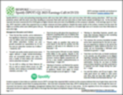
Shopify: Q4 2022
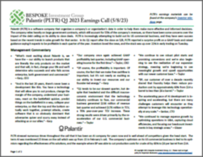
Palantir: Q4 2022
MGM Resorts: Q4 2022
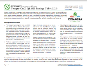
Tyson: Q1 2023
Amazon.com: Q4 2022
Meta Platforms: Q4 2022
Apple: Q1 2023
Alphabet: Q4 2022
Boats and ATVs: Brunswick (BC), MarineMax (HZO), and Polaris (PII)
Hershey Q4 2022
Old Dominion Q4 2022
PulteGroup Q4 2022
Whirlpool Q4 2022
Mastercard Q4 2022
Tesla Q4 2022
Microsoft Q2 2023
Johnson & Johnson Q4 2022
Netflix Q4 2022
Bank of America Q4 2022
Taiwan Semiconductor Q4 2022
Constellation Brands Q3 2023
Cintas Q2 2023
FedEx Q2 2023
Adobe Q4 2022
Lennar Q4 2022
Oracle Q2 2023
Costco Q1 2023
Lululemon Q3 2022
Recaps published during Q4 2022 are available with a Bespoke Institutional subscription
Chart of the Day: Streak of Extreme Overbought Readings
Bespoke’s Morning Lineup – 6/20/23 – Homebuilders Happy 🏡😃
See what’s driving market performance around the world in today’s Morning Lineup. Bespoke’s Morning Lineup is the best way to start your trading day. Read it now by starting a two-week trial to Bespoke Premium. CLICK HERE to learn more and start your trial.
“You’re going to need a bigger boat.” – Martin Brody, Jaws
Below is a snippet of content from today’s Morning Lineup for Bespoke Premium members. Start a two-week trial to Bespoke Premium now to access the full report.
48 years ago today, the relaxing effect of swimming in the ocean permanently changed forever when the movie Jaws hit the screens in movie theaters nationwide. These days, as the market rallies to 52-week highs and just recently moved past the 20% bull market threshold, the bulls look like they may need a bigger boat to accommodate the growing ranks of investors looking for higher stock prices. The market has reached overbought levels in the short term, so it shouldn’t surprise anyone to see at least a pause in the rally as we close out Q2 and shake out some of these new bulls.
In the here and now, futures are modestly lower this morning following up what was a negative start to the week for most international markets yesterday and further weakness this morning. It’s going to be another quiet week again for economic data (after a busy one last week), although the earnings calendar is starting to modestly pick up. Today, the only two economic reports on the calendar are Building Permits and Housing Starts, and the only notable earnings report is from FedEx (FDX) after the close. The economic data was just released, and Building Permits exceeded forecasts while Housing Starts were much stronger than forecast with the headline reading coming in at 1.631 million versus forecasts for a reading of 1.430 million. While still an enormous beat relative to expectations, April’s reading was revised lower by 71K.
Markets were closed for trading yesterday, but the National Association of Homebuilders (NAHB) announced yesterday that its homebuilder sentiment for the month of June came in at a level of 55 versus expectations for a level of 51 and up from last month’s level of 50. The move back above 50 indicates that homebuilders have net positive sentiment for the first time since last July, ending a streak of ten straight months of 50 or sub-50 readings. You can’t blame homebuilders for being in such a good mood given where the housing data came in this morning.
In looking at the historical chart of homebuilder sentiment, the current move above 50 started from a trough of 31 in December which is a level that historically has been associated with recessions. Also notable is the speed at which the index has rebounded from its trough. While not as quick as the rebound off the COVID lows, the magnitude of the reversal has been among the swiftest on record.

Start a two-week trial to Bespoke Premium to read today’s full Morning Lineup.
Bespoke’s Brunch Reads – 6/18/23
Welcome to Bespoke Brunch Reads — a linkfest of the favorite things we read over the past week. The links are mostly market-related, but there are some other interesting subjects covered as well. We hope you enjoy the food for thought as a supplement to the research we provide you during the week.
While you’re here, join Bespoke Premium with a 30-day trial!
History
“Tear Down This Wall” (National Archives)
Keeping with Bespoke’s Quote of the Day from Monday to commemorate the anniversary of the President Reagan’s famous speech that called for the Berlin Wall to be torn down, this publication tells the story of how the speech came to be despite the forces that suggested a softer approach. [link]
Economy
New Grads Have No Idea How to Behave in the Office. Help Is on the Way. (WSJ)
Recent graduates who spent much of their college and internship experience online are now learning the “soft skills” they never did from being on campus and in the office. Many students say they are ready to ditch Zoom and begin in-person work lives to improve the skills they lack from their remote studies. [link]
Renters Are About to Get the Upper Hand (WSJ)
Rents rose 25% nationally in less than two years. Now, its fastest deceleration in recent history has brought that number to just 2%. The major shift could help ease inflation as housing costs make up the biggest component of CPI, but it will hurt investors who purchased buildings thinking they could continue raising rents. [link]
San Francisco hit again as large mall owner walks away (Yahoo Finance)
After last week’s read about the city’s largest hotel (Park Hotels and Resorts) halting payments toward its mortgage and making an exit from the area, Tuesday’s newest closing spells more bad news for San Francisco. [link]
Corporate
Bud Light Loses Title as Top-Selling U.S. Beer (WSJ)
Modelo Especial is the new top-selling beer in the United States. Following a media debacle around a can featuring a transgender influencer, Bud Light sales have plummeted. Since April, boycotts have sent shares down 15% and distributors of the beer are facing tough financial decisions. [link]
Tesla Got Added to an ESG Index. But Oil and Tobacco Firms Scored Higher (Barron’s)
In an example of the road to hell being paved with good intentions, ESG investing has its merits, but in practice, some of the ways companies are rated is preposterous.[link]
Tesla’s “Self-Driving” System Never Should Have Been Allowed on the Road (The American Prospect)
Tesla introduced self-driving technology in 2016 that made overstated and ambitious promises. Now that technology is associated with more crashes and fatalities than previously thought, and critics are calling for stricter regulations to improve safety. [link]
Microsoft and OpenAI’s Bromance Is Off to a Rocky Start (Gizmodo)
OpenAI and Microsoft are leading the “AI revolution”, but the situation is more complicated than that. Microsoft has invested billions of dollars in OpenAI, but OpenAI isn’t owned by Microsoft outright. The two are not just partners, but also competitors working in the same sphere. Some Situations have raised tensions and trust issues. [link]
Home Depot Is Selling a Modern Tiny Home Kit Complete With a Rooftop Deck and a Spiral Staircase (My Modern Met)
Home Depot has collaborated with the architecture firm Plus 1 to bring a DIY tiny home kit to life. Priced at $43,832, this tiny home comes with a number of luxurious features. You have to check some of these places out! [link]
Science and Technology
A Day on Earth Used to Last Only 19 Hours. Now We Know Why. (ScienceAlert)
We all wish we could have 25 hours in a day, but consider yourself lucky that you weren’t alive 1.4 billion years ago when days were only 19 hours! As the Moon moves further away from Earth, our planet’s rotation slows down, lengthening the day. The research provides valuable insights into Earth’s geological history and the relationship between our planet and the Moon. [link]
Is Betelgeuse About to Become a Supernova? (Discover Magazine)
In late 2019, Betelgeuse, a red supergiant star, exhibited unprecedented dimming, sparking speculation about an imminent supernova event. Scientists concluded that it could be hundreds of thousands of years away. Now, that supernova may be close, as it behaves oddly again and has brightened 50% in the last month. [link]
Investing
New report flashes a warning light over 401(k) account balances (CNN Business)
Alarms have gone off after a report shows 401k balances were down well below 2021’s averages in 2022. The average 20% haircut was driven by the declines in equity and bond markets over the course of 2022. Households also faced financial stress and withdrew from retirement savings. [link]
AI Stock Pickers Grapple With Dot-com Déjà vu (Yahoo Finance)
Investors are being reminded of the dot-com era as technological advancements in AI begin to cause a market frenzy. AI is still in the early stages of development with seemingly unlimited potential, but that makes for FOMO and the ability to decipher winners and losers in the market tough to grapple with. [link]
U.S. Government Owns Way More Bitcoin Than Any Other Country–So Why Aren’t They Selling It? (Forbes)
While none of it was purchased seizures in criminal enterprises have allowed the US Federal Government to amass a larger pile of bitcoin than any other country in the world. Why haven’t they sold any? [link
Read Bespoke’s most actionable market research by joining Bespoke Premium today! Get started here.
Have a great weekend!
The Bespoke Report Newsletter — 6/16/23
This week’s Bespoke Report newsletter is now available for members. (Log in here if you’re already a subscriber.)

Continue reading this week’s Bespoke Report newsletter by starting a one-month trial, or click the image below to view our membership options page.
