The Closer – Tech Valuations, Rotation, Trade Prices – 3/25/26
Log-in here if you’re a member with access to the Closer.
- Over the past six months the decline in the P/E ratio of Tech versus the S&P 500 has fallen by the largest amount since 2002.
- Performance this week has appeared to be largely rotational as the best performers were also those that were the worst performers month-to-date through Friday.
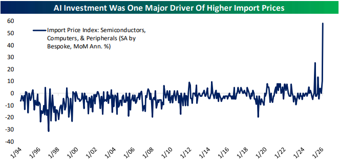
- After seasonal adjustment February saw the third-largest increase in ex petroleum import prices since monthly data begins at the end of the 1980s.
See today’s full post-market Closer and everything else Bespoke publishes by starting a 14-day trial to Bespoke Institutional today!
Chart of the Day: Magnificent Valuations
Bespoke’s Morning Lineup – 3/25/26 – More Headline Driven Moves
See what’s driving market performance around the world in today’s Morning Lineup. Bespoke’s Morning Lineup is the best way to start your trading day. Read it now by starting a two-week trial to Bespoke Premium. CLICK HERE to learn more and start your trial.
“It’s the rough side of the mountain that’s the easiest to climb; the smooth side doesn’t have anything for you to hang on to.” – Aretha Franklin

Below is a snippet of commentary from today’s Morning Lineup. Start a two-week trial to Bespoke Premium to view the full report.
Paul Hickey appeared on Fox Business yesterday. To view the segment, click on the image below.
Global equity markets are in rally mode this morning after reports of potential negotiations between the US and Iran to end the war. Asian markets surged overnight, and that flowed into the European open and US futures this morning. Some of the air has come out of the balloon as we type this, though, on reports that Iranian officials have rejected the US terms delivered via Pakistan. There’s really no way to know at this point what the facts are regarding the state of negotiations, as neither side has any real incentive to conduct talks via the press, so expect more whipsaw action as things continue to progress. The bottom line is that while Iran still holds some cards, the chips are stacked heavily against them.
Outside of equities, the 10-year yield is down 5 bps, crude oil is down 5%, gold is up nearly 4%, and Bitcoin is up 2.5% to more than $71K.
In economic data, the only report on the calendar was Import Prices, which came in at more than double expectations (1.3% m/m vs 0.6%). If you’re looking for lower rates or a dovish Fed, these are not pretty numbers.
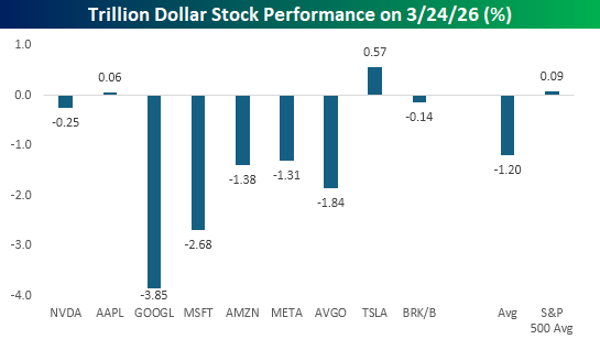
The S&P 500 finished down 0.37% yesterday, but most of the losses were focused in the trillion-dollar stock club, where the damage was much more concentrated. While the ‘average’ stock in the S&P 500 traded slightly higher yesterday, seven of the nine stocks in the trillion-dollar club traded lower, with an average of 1.2%. Stocks like Alphabet (GOOGL) and Microsoft (MSFT) were notably weak with declines of more than 2.5%, and both closed at multi-month lows. Other mega-caps like Broadcom (AVGO), Amazon.com (AMZN), and Meta Platforms (META) all fell more than 1%. The only mega-caps to buck the trillion-dollar market cap weight were Tesla (TSLA) and Apple (AAPL), which saw modest gains.
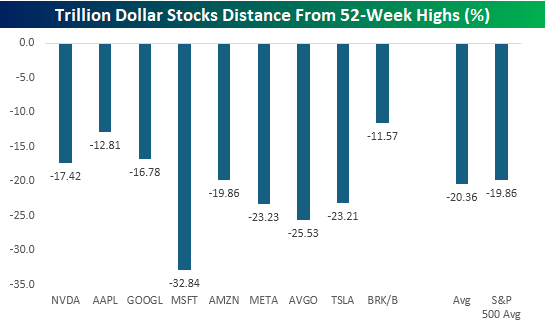
While the trillion-dollar stocks have been market leaders, they’re no longer the cool-kids table in the lunchroom. For months, they stood out above the rest of the market as the most popular in terms of where they were trading relative to 52-week highs, but now they no longer stand out. MSFT, AVGO, META, and TSLA are all down more than 20% from their respective 52-week highs, and the average drawdown from their peaks is just over 20%. That’s flirting with bear market territory and slightly more than the average 19.9% drawdown for all 500 stocks in the S&P 500.
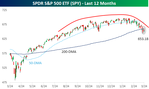
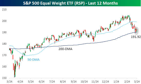
The cap-weighted S&P 500 (SPY) closed down just over 4% for the year yesterday, while the equal-weight version (RSP) is still slightly higher on the year (+0.2%), and their charts have two key differences.
First, as we’re all aware, the cap-weighted S&P 500 has been stuck in a sideways range for several months, forming a gradually curving, rounded top which accelerated when the war started at the turn of the month. The topping process for RSP was much sharper. From the start of the year right up until late February, RSP was steadily making new highs. Once the war broke out, though, the rally was stopped in its tracks, erasing two months’ worth of gains in less than a month.
Second, with RSP still holding on to gains for the year, it has also stayed above its 200-DMA. The same can’t be said for the S&P 500, which broke that level last Thursday. For now, bulls can rationalize SPY’s break of the 200-DMA by pointing to RSP still hanging on to that level. If both indices break that long-term average, though, bulls will have one less arrow in their quiver.
The Closer – 200-DMA Stop, Terrible 2s, 5 Fed – 3/24/26
Log-in here if you’re a member with access to the Closer.
- Throughout the S&P 500’s history, a hypothetical strategy that goes to cash when the index falls below its 200-DMA has outperformed.
- Today’s 2-year note auction saw terrible demand; similar to other coupon sales so far in March.
- Regional Fed surveys showed that there may have been supply chain stress even before the war with Iran began.
See today’s full post-market Closer and everything else Bespoke publishes by starting a 14-day trial to Bespoke Institutional today!
Chart of the Day – The Front Page Trap
Bespoke’s Morning Lineup – 3/24/26 – Market Wants an Offer Neither Side Can Refuse
See what’s driving market performance around the world in today’s Morning Lineup. Bespoke’s Morning Lineup is the best way to start your trading day. Read it now by starting a two-week trial to Bespoke Premium. CLICK HERE to learn more and start your trial.
“I don’t trust society to protect us, I have no intention of placing my fate in the hands of men whose only qualification is that they managed to con a block of people to vote for them.” – Mario Puzo, The Godfather
Below is a snippet of commentary from today’s Morning Lineup. Start a two-week trial to Bespoke Premium to view the full report.
Paul Hickey will be on Making Money With Charles Payne today on Fox Business between 2 PM and 3 PM to discuss markets and the latest events in Iran. Check it out if you can!
Equity futures have been ping-ponging between gains and losses since the close yesterday, and they’re now on the red side of the table. Futures on the S&P 500 and Nasdaq are both down 0.1%. The 10-year yield has moved back to 4.36%, gaining 3 basis points. Oil prices moved back above $90 as investors try to figure out how things will play out in Iran. Good luck with that! Gold and other precious metals have seen muted moves this morning, with gains or losses of 1%, while Bitcoin has a fractional gain of 0.5%, taking it back above $71K.
It’s a relatively busy day for data this morning with Non-Farm Productivity and Unit Labor Costs at 8:30, but both reports are stale given the war situation. Investors will probably focus more attention on flash PMIs for March from S&P at 9:45 and the Richmond Fed at 10 AM. All of these reports will take a backseat to whatever geopolitical headlines or “truths” hit the tape.
European stocks were still open for trading yesterday when President Trump made his comments regarding Iran. Therefore, they had the opportunity to adjust, but this morning they’re adding modestly to those gains with the STOXX 600 up 0.3%. Flash PMI readings for March were also released. While manufacturing indices were better than expected, service sector PMIs generally missed.
Asian stocks played catch-up and followed the US lead overnight with gains across the board. Japan was up 1.4% while China rallied nearly 2%, and the Kospi gained 2.7%. The gains weren’t steady, though. In South Korea, for example, the KOSPI started the day with a gain of more than 4% but gave back all those gains early in the session and briefly traded lower before rebounding in the second half of the session. Inflation data in the region was on the light side as Japanese CPI and South Korean PPI for February both rose less than expected. While the lower inflation data was welcome, flash PMIs for Australia and India were both lighter than expected.
After falling more than 50% in price terms from its closing high in August 2020 to its low in October 2023, long-term US Treasuries, as proxied by the iShares 20+ Year US Treasury ETF (TLT), remain in the back half of a lost decade. As shown in the chart below, while prices remain near their multi-year lows, they have stopped going down, and with the long end of the curve yielding close to 5%, a flat market in price terms isn’t so bad.
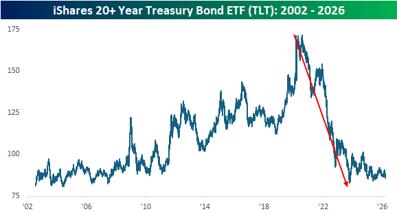
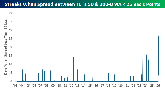
Looking at a one-year chart of TLT shows an interesting pattern. We’ve discussed the nowhere direction of the equity markets and some notable stocks like Nvidia (NVDA) extensively over the last several weeks, but the treasury market has also been comatose. Look at TLT’s 50 and 200-day moving averages (zoomed in on the inlay). Over the last several weeks, the two have moved in lockstep.
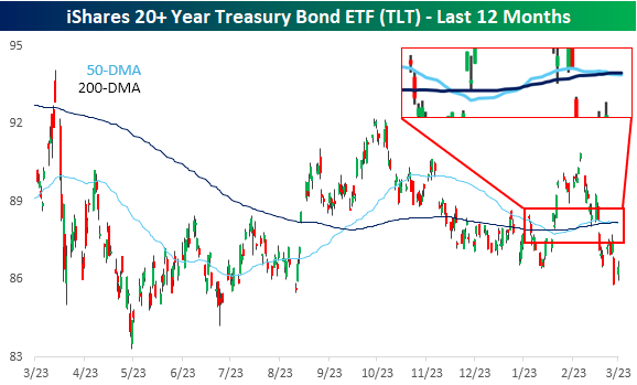
The two moving averages have been moving in such unison that yesterday was the 36th straight trading day the spread between the two was less than 25 basis points. Looking back at the ETF’s history over the last 20+ years, this current streak ranks as the longest in its history. It’s longer than the next closest one by more than two weeks! With the current spread between the two at less than 4 bps, it doesn’t appear likely to widen out to more than 25 bps any time soon!
The Closer – Vol, Risk Parity, Construction – 3/23/26
Log-in here if you’re a member with access to the Closer.
- While the VIX continues to trend higher, there are some other signs indicating that volatility may have peaked.
- Gold has seen a large rise in leverage over the last four weeks whereas the drop in corporate bonds leverage has been 3 standard deviation move.
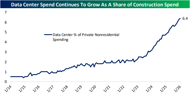
- Data center spending climbed to 6.4% of private nonresidential construction spending in January.
See today’s full post-market Closer and everything else Bespoke publishes by starting a 14-day trial to Bespoke Institutional today!
Six Years Since COVID Crash Low
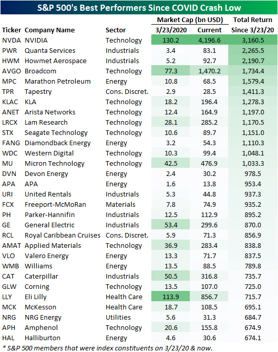
While it may feel like either ancient history or as though it was just yesterday, six years ago to the day, the S&P 500 put in its COVID Crash low. A lot has happened since then, but US equities have charged higher nonetheless. Since that low, the S&P has risen nearly 200%, with a number of huge moves under the surface driving those gains. In the table below, we show the 30 S&P 500 stocks that were a part of the index both at the time of the COVID Crash low (3/23/20) through today that have experienced the largest rallies over the past six years.
In total, there have been 17 ten-baggers since the COVID Crash low, and five stocks are up 1,500%+. That includes both Broadcom (AVGO) and NVIDIA (NVDA), which have joined the trillion dollar market cap club.
The 30 stocks shown below had a collective market cap of $735 billion at the time of the COVID low. Today, their combined market cap has eclipsed $10 trillion!
NVDA has been by far the biggest winner over this span thanks to both the early 2020s crypto boom and the emergence of AI. A number of Energy stocks have also found themselves on this list, thanks to a combination of solid dividend yields and exceptional price returns, especially more recently.
One final name that has been a top performer since COVID may be a surprise: Royal Caribbean Cruises (RCL). Even though six years ago this name was at the epicenter of lockdown doom, it’s up 857% since, which ranks as the 20th best.
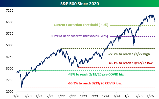
Pivoting back to the broader market, below we show the S&P 500 since the start of 2020. In the past several years, apart from the COVID Crash, there have been plenty of tough periods for the market including a prolonged bear in 2022, a near bear this time last year during the height of tariff turmoil, and this month once again with the war in Iran.
Amidst the turmoil, stocks haven’t struggled to eventually recover, and it would now take historic declines to return to levels from those prior periods.
Even after pulling back some from recent highs, we would note that it would require a 27.7% decline from current levels for the S&P 500 to return to its first post-COVID bull market high (1/3/22), and it would take a 46.1% drop to get back to the October 2022 bear market low.
For some historical context, only four (of the index’s 27 total) bear markets have seen larger declines than that over their full course from peak to trough. Further, it would require a nearly 50% drop to return to pre-COVID highs made on 2/19/20. There have only been three bear markets to see 50%+ drops in the S&P’s history. And finally, even if the S&P mirrored its worst bear market ever (a 62% decline during the 1931-1932 bear), the index would still be above its COVID Crash low from six years ago, which is 66% below current levels.
Like this analysis? Join our premium members by starting a trial today! Click below for details on how to sign up:

New Sector Snapshot Cover Page
Our Sector Snapshot provides a quick yet comprehensive look at several technical and fundamental readings across each of the eleven major sectors in addition to the S&P 500. Last week, we unveiled a freshened-up look for the cover page of our Sector Snapshot (shown below):
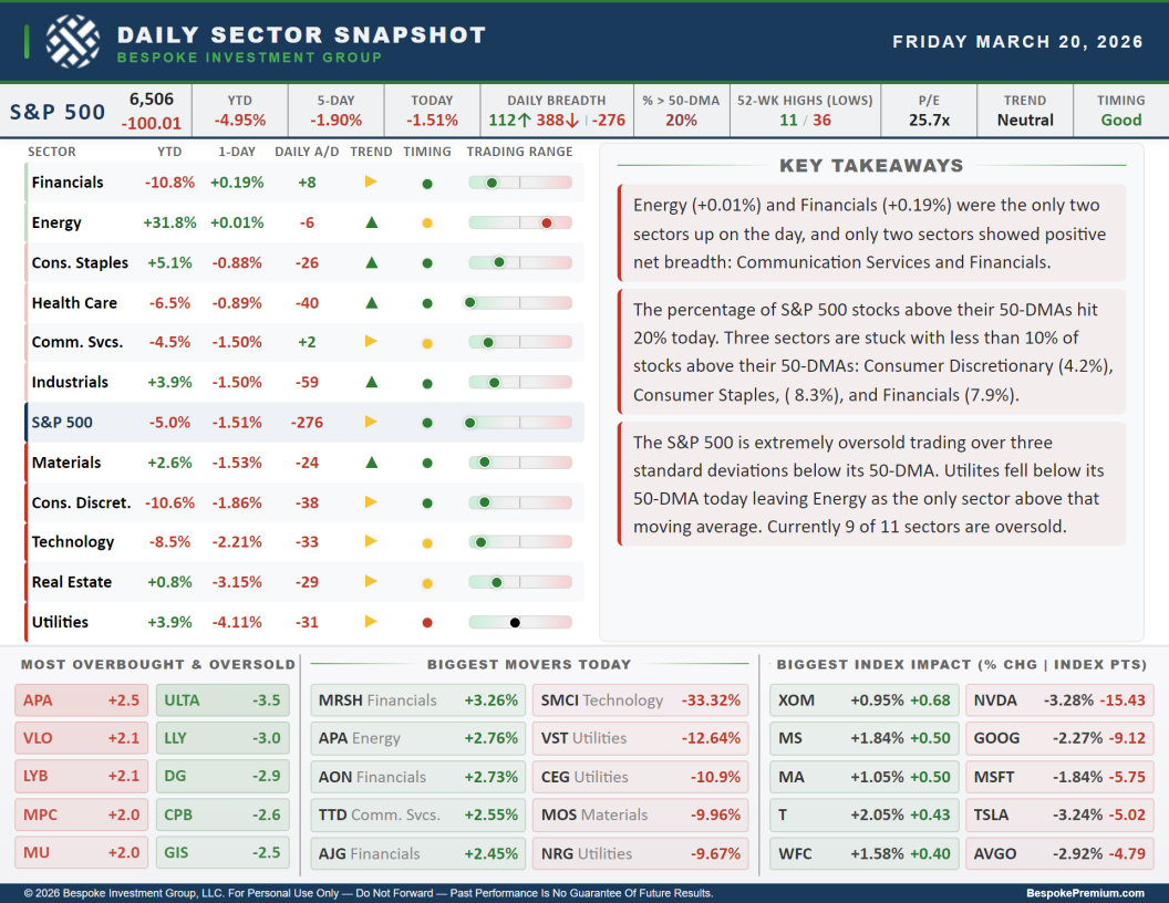
In the images below, we will work from top to bottom and left to right of the cover page to highlight each section.
At the top of the page is a ticker tape of performance and breadth readings for the S&P 500. Moving left to right, we show the index’s price level (and daily change in terms of index points directly below) followed by its year to date, one week, and daily percentage changes. Next up are breadth readings including the daily number of advancing (in green) and declining (in red) stocks in addition to the net reading (number of advancers minus decliners). We then show the percentage of stocks trading above their 50-DMAs and the number of S&P 500 constituents that hit new 52-week highs and lows. Finally, on the righthand end of the strip, we show the updated price-to-earnings ratio and the trend and timing scores per our Trend Analyzer tool.
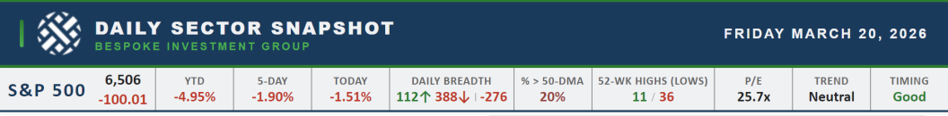
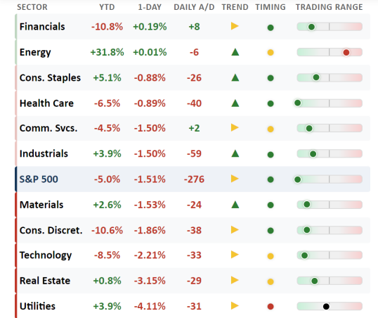
The next section is a matrix of the eleven S&P 500 sectors showing year to date and daily performance, the daily net advance/decline reading, a trend score (red arrows for downtrends, yellow arrows for sideways trends, and green arrows for uptrends), timing scores (red dots for poor, yellow dots for neutral, and green dots for good), and finally, a trading range chart. These bars’ midpoints are the sector’s 50-DMA, with the dot showing how far (in standard deviations) price is currently trading from that moving average. Readings further to the left or right indicate more extreme oversold or overbought readings, respectively. This matrix is sorted from best to worst based on one-day percentage change.
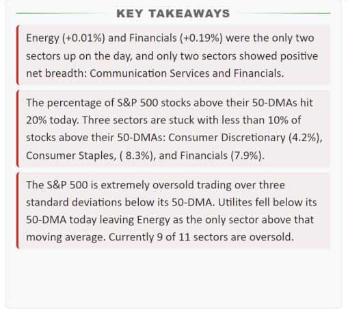
To the right of the sector matrix are key takeaways from recent sector price action. Refreshed daily, these notes parse through the indicators tracked throughout the full Sector Snapshot to highlight the most noteworthy findings.
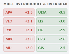
The bottom third of the page is dedicated to showing individual S&P 500 members that are standing out in various ways. The bottom left table shows the five S&P 500 stocks that are most overbought and oversold. This section includes tickers and how far each one is trading (in standard deviations) above or below its 50-DMA. Tickers in red are the most overbought stocks in the index, while tickers in green are the most oversold.
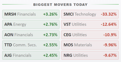
The bottom middle section highlights the S&P 500’s five biggest winners and losers each day:
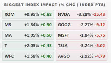
And finally, the bottom right section shows the five stocks that had the largest positive and negative impact on S&P 500 performance that day. For each of these stocks, its daily percentage change is shown in grey, while the numbers in green and red show the impact (in points) each stock had on the S&P 500’s price move that day.
If you have any questions or ideas for our daily Sector Snapshot, let us know!
Want to gain access to the Sector Snapshot? Join our premium or all access members by starting a trial today! Click below for details on how to sign up: