Dividend Stock Spotlight: Clorox (CLX)
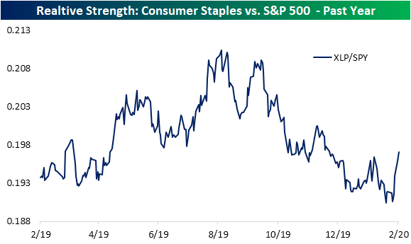
Safe havens like gold and US Treasuries have been surging but safe havens within the equities space, like Consumer Staples (XLP), have been unable to escape declines. While down about 3% over the past week, XLP, in addition to other defensive sectors like Utilities (XLU) and Real Estate (XLRE), have still managed to outperform the S&P 500. As shown in the relative strength chart below, the line over the past few days has risen sharply indicating outperformance of Consumer Staples versus the S&P 500.
One name worth mentioning within this sector is household cleaning product manufacturer Clorox (CLX). This is one of just 26 stocks in the S&P 500 that is trading higher today as of this writing. Since CLX has managed to shrug off the recent downturn, the stock has broken out of its sideways range between the low $160s and low $140s that has been in place for much of the past couple of years.

With a bullish technical backdrop, CLX’s fundamentals are looking more promising as well. The past few quarters have seen the company report negative year-over-year revenue growth for the first time since 2014. But the most recent quarterly report from earlier this month showed these declines slowed to a 1.6% YoY rate. Meanwhile, the recent run in price still leaves the price-to-earnings ratio well off of its highs and in the middle of its range of the past few years. Meanwhile, the price-to-book ratio remains historically low albeit on the rise over the past couple of years.
Given bond yields have continued to decline to record lows while equity declines have raised dividend yields, stocks now yield more than bonds by the highest margin in recent years as we discussed yesterday. The dividend yield of Clorox is the third-highest of the S&P 500’s Household & Personal Products industry group at 2.52%. That is also a higher yield than the 2.11% average yield for the broader Consumer Staples sector. Not only is CLX a high yielder but the dividend also seems to be a safe bet over the long run. The payout ratio remains at fairly healthy levels at 59.75%, meaning the company appears to have room to continue to pay shareholders and/or grow the dividend. On top of this, Clorox has a long history of uninterrupted dividend payments going back to the late 70’s. Not only has the company been paying shareholders for the past several decades, but it has also grown the dividend for 42 consecutive years, placing it in the club of Dividend Aristocrats (a group of stocks that have 25+ consecutive years of dividend increases). Start a two-week free trial to Bespoke Institutional to our full range of reports and interactive tools.

Not Even Triple Plays Are Safe
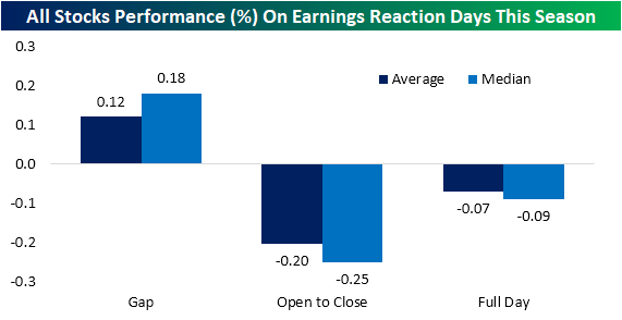
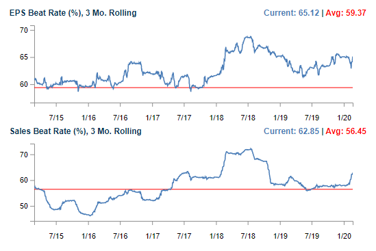
Since the beginning of 2020, one-day stock price reactions to earnings reports have been generally on the weak side. Despite gaps up at the open on both an average and median basis, stocks have faced selling from open to close to finish down 7 bps on average (median: 9 bps). That comes even though EPS and sales beat rates have remained fairly strong with both healthily above their long term averages as shown in the charts from our Earnings Explorer below.
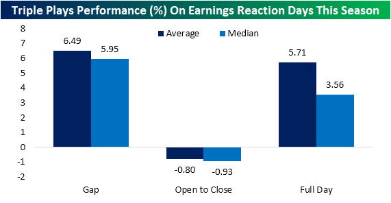
Although stocks broadly have been weak in reaction to earnings, stocks that have reported triple plays have seen stronger stock price reactions. A triple play is when a company beats EPS and sales estimates in addition to raising guidance. Of the 77 triple plays that have reported so far in 2020, the average gap up has been strong at +6.49%. Although there is some selling intraday, these stocks have finished up 5.71% on average by the end of the day after earnings.
While this has generally been the case this year, as headwinds from the coronavirus have ramped up in the past week, the dynamic of triple plays’ stronger response to earnings has fallen apart. On Friday, we noted that broader market selling had led the five triple plays of that day to turn sharply lower intraday despite solid gaps higher at the open. That has continued, if not worsened, this week. While intraday performance is a bit better than Friday, the gaps down of this week’s triple plays has been worse. In fact, of the six triple plays out since Monday only Cracker Barrel (CBRL) gapped up. On average, these six have fallen over 5% at the open in response to earnings with further selling on an average and median basis from open to close. In other words, selling the past few days has been pretty indiscriminate as even the positive catalyst of strong earnings have not been enough to pull in buyers.

In the charts below, we show six-month price charts of the stocks that have reported triple plays this week. As shown, most have gapped lower the day after earnings and have been met with further selling intraday with the exceptions of Kaman (KAMN) and National Storage Affiliates (NSA). In the cases of Guardant Health (GH), KAMN, and Sapiens (SPNS), uptrend lines or recent support have also been broken. On the other hand, the charts of Cracker Barrel (CBRL), Everquote (EVER), and National Storage Affiliates (NSA) are looking a bit more constructive despite the single day weakness on earnings. Start a two-week free trial to Bespoke Institutional to access our interactive Earnings Explorer, 100 Most Recent Triple Plays, and much more.

Americans Less Concerned than the Rest of the World?
When it comes to the Covid-19 coronavirus, sentiment over the potential for a global pandemic is in many ways just as important as the actual outbreak itself. After all, if consumers fear an imminent outbreak they will be more likely to curtail activity even before the onset of any spread. To that end, tracking search activity can provide a decent read into where sentiment regarding the coronavirus is now versus where it has been in the past. If people are worried about the coronavirus, they will be more likely to search for news and information on it.
On a global basis, search trends for ‘coronavirus’ peaked at the end of January and trended lower throughout February, but with recent news over the spread of the virus outside China, search activity began to rocket higher over the weekend and has been rising ever since. Just today, search trends topped their highs from late January, indicating that people are increasingly on edge.
One of the primary drivers for the increased concerns over the coronavirus was the spread in Italy over the weekend, and search data for the term in Italy really went parabolic in the last four days (second chart). While global searches for the term are only slightly above their January peak, searches in Italy are four times greater than they were at the end of January.
In the US, search trends for ‘coronavirus’ (third chart) have also started to move higher in the last few days. While search trends in Italy are more than four times the level they were at in late January, search trends in the US are still less than half of the level they were in late January. Now, if the US starts to see an increase in the number of confirmed cases in the coming days/weeks (not unlikely), it is highly likely that search volume here will also surge, but at this point, Americans have been relatively sanguine. Only time will tell if that is the right attitude or not. Get Bespoke’s most actionable ideas and analysis with a Bespoke Premium membership. Click here to start a two-week free trial.

Bespoke’s Morning Lineup – 2/25/20 – Tepid Tuesday
See what’s driving market performance around the world in today’s Morning Lineup. Bespoke’s Morning Lineup is the best way to start your trading day. Read it now by starting a two-week free trial to Bespoke Premium. CLICK HERE to learn more and start your free trial.
Futures are attempting a turnaround this morning, but the bounce is tepid at best. That’s especially true when you consider the magnitude of yesterday’s move. Unfortunately, clarity on the coronavirus will only come with time, and that’s one thing even the Fed can’t control.
Read today’s Bespoke Morning Lineup for the latest on the impact of the coronavirus, where it’s starting to show up in economic data, and the latest stock-specific news.

Yesterday was certainly one of those days where investors threw out everything including the kitchen sink. That was not only the case in the US but also in Europe. While just 13 stocks in the S&P 500 finished up on the day yesterday, for the STOXX 600, which includes stocks from all over the continent, only six stocks finished the day higher. That combined reading of just 19 stocks was the tenth weakest single-day breadth reading for the two indices going back to 1998. The table below lists each of the prior days where the total number of advancing issues between the S&P 500 and the STOXX 600 was below 20. Prior to yesterday, the last time breadth was as weak or weaker was back in August 2015 and before that 2011.

The Closer – Volumes Soar, International Revenues Driving Declines – 2/24/20
Log-in here if you’re a member with access to the Closer.
Looking for deeper insight on markets? In tonight’s Closer sent to Bespoke Institutional clients, after stocks fell dramatically we show the surge in volumes. Next, we show a decile analysis of what factors drove today’s declines. Then we take a look at gold’s strength before pivoting over to today’s economic data from the regional Federal Reserve banks.

See today’s post-market Closer and everything else Bespoke publishes by starting a 14-day free trial to Bespoke Institutional today!
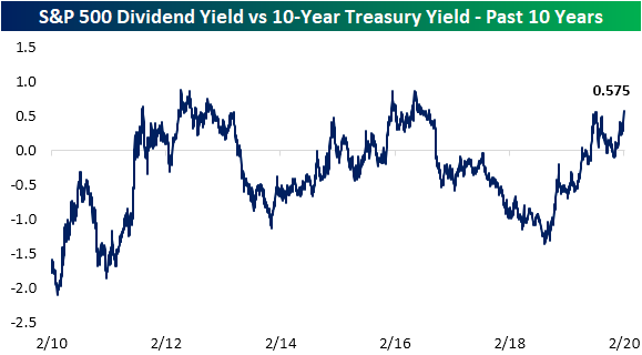
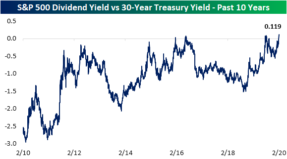
Dividend and Treasury Yield Spreads At Multiyear Highs
Risk assets are selling off in dramatic fashion today as the major indices are all down well over 3%. These declines have led the dividend yield on the S&P 500 to jump over 5 bps since Friday. Now at 1.94%, the S&P 500’s dividend yield is at its highest level since late October 2019.

Meanwhile, Treasury yields are cratering with the 10-Year down over 10 bps. That is the largest one-day decline in the 10-Year yield since August 14th of last year when it fell 12.43 bps. That brings the yield down to 1.37%, which is the lowest level since July 2016.

Going further out on the curve, the yield on the 30-Year Treasury bond is now at a record low of 1.82%. Similar to the 10 Year, that is nearly a 10 basis point decline from Friday.

Given these moves, holding constant the difference in risks associated with the two assets, the spread between the S&P 500’s dividend yield is higher than the 10-Year yield by its widest margin since September of 2016 at 0.575, eclipsing the previous high from last August. Prior to 2016, the spread was higher throughout much of 2012.

The spread between the S&P 500’s dividend yield and the 30-Year Treasury, on the other hand, is at its highest level in over a decade. The spread now stands at 0.119 which is the widest the spread has been since January 2009, and is favoring stocks (positive spread) for the first time since September. Unlike the spread between the S&P 500’s dividend yield and the 10-Year yield which has flipped back and forth between favoring stocks and Treasuries over the past decade, the 30-Year yield has much more consistently favored bonds. In fact, outside of today and briefly last September, the only other time we’ve seen a positive spread was in 2016. Get Bespoke’s most actionable ideas and analysis with a Bespoke Premium membership. Click here to start a two-week free trial.
Gold’s (GLD) Shiny Start
With risk assets sharply lower this morning, investors have flocked to safe havens. Treasuries are now at or near record-low yields and gold is up well over 2%. For the Gold ETF (GLD), today’s gap of 2.46% is the first gap up of 2% or more since November 9th, 2016; the day after the 2016 presidential election. Since the ETF first began trading in 2004, there have been a total of 57 days (including today and that 2016 occurrence) in which GLD has gapped up 2% or more. A little less than half (44%) of those occurrences happened during the last recession from December 2007 through June 2009. Otherwise, as shown in the chart below, these gaps have been fairly spread out without any obvious tendency to mark major tops or bottoms for the yellow metal.

Today’s gap of 2.46% is just about in line with the size of past gaps up larger than 2%. As for the rest of the day, these types of large moves at the open have not led to much further buying from open to close with an average gain of only 4 bps. GLD also only rises from open to close around half of the time. As for one week later, GLD has only been higher 48.2% of the time. Granted, the size of those pullbacks have not eaten into the gap up much with an average decline of just 11 bps (median is a 9 bps decline). Start a two-week free trial to Bespoke Institutional to access our interactive economic indicators monitor and much more.

US Down More than China
Of all the trends swirling around in the market this morning, the performance of US and Chinese equities relative to their YTD highs has to be one of the more surprising ones. Based on where equity futures are trading this morning, the S&P 500 would be down 3.91% from its YTD highs earlier this month while the Nasdaq would be down over 5%. So how much is the Chinese market down? Barely more than 3%. Just for reference, there have been a total of more than 75,000 coronavirus cases in China so far, including more than 500 today. So far in the US, there have been a total of 35 confirmed cases. Today, with the S&P 500 set to open down more than 2.5%, China’s Shanghai Composite fell just 0.28% on the day. Start a two-week free trial to Bespoke Institutional to access our full research suite including all of our interactive tools.

Bespoke’s Morning Lineup – 2/24/20 – Taking the Elevator Down
See what’s driving market performance around the world in today’s Morning Lineup. Bespoke’s Morning Lineup is the best way to start your trading day. Read it now by starting a two-week free trial to Bespoke Premium. CLICK HERE to learn more and start your free trial.
Global equities are in a bit of a free-fall this morning on rising concerns over the spread of the coronavirus. While the pace of the outbreak certainly appears to be slowing in China, flareups in South Korea and Italy over the weekend are causing increased concern of a global spread including here in the US. As of now, there have only been 35 confirmed cases in the US, but it’s hard to imagine that number not rising. Besides the coronavirus fears, the strong performance of Bernie Sanders in Nevada over the weekend isn’t helping sentiment for the market either.
Read today’s Bespoke Morning Lineup for the latest on the impact of the coronavirus, the results of the Nevada caucuses over the weekend, and the impact of the coronavirus on supply chains.
Bespoke Brunch Reads: 2/23/20
Welcome to Bespoke Brunch Reads — a linkfest of the favorite things we read over the past week. The links are mostly market related, but there are some other interesting subjects covered as well. We hope you enjoy the food for thought as a supplement to the research we provide you during the week.
While you’re here, join Bespoke Premium for 3 months for just $95 with our 2020 Annual Outlook special offer.
Climate
Here’s How the EU Could Tax Carbon Around the World by Ewa Krukowska (Bloomberg)
A new proposal would levy a tax upon import for the carbon content of goods purchased by other countries, a “border adjustment tax” for carbon emissions. [Link; soft paywall]
Are Floating Hotels, Office Buildings the Answer to Rising Sea Levels? by Konrad Putzier (WSJ)
If you can’t avoid a flood, why not ride on top of it? A new architectural trend is putting buildings on top of water instead of trying to resist the advance of seas. [Link; paywall]
Health Care
I’m Sorry to Say Skin-Cancer Screenings Are a Must by Katie Heaney (The Cut)
Regular skin cancer screenings can catch potentially lethal melanomas long before they become dangerous, a risk for virtually everybody but especially those who have used tanning beds which double the risk of skin cancer. [Link]
The effect of health insurance on crime: Evidence from the Affordable Care Act Medicaid expansion by Qiwei He and Scott Barkowski (Wiley Online)
A novel paper illustrates the benefit of improving access to health care via the Medicaid expansion of the ACA: reduced burglary, vehicle theft, homicide, robbery, and assault. [Link]
Powerful antibiotic discovered using machine learning for first time by Ian Sample (The Guardian)
Bacterial resistance to antibiotics is being tested by a new algorithm designed a special molecule from scratch in order to deal with the most harmful strains of bacteria. [Link]
Lives Lived
Meet the unknown female mathematician whose calculations helped discover Pluto by Meghan Bartels (Space)
The original calculations which led to the discovery of Pluto were undertaken by a woman who would end her life widowed and living in poverty in New Hampshire. [Link]
The Computer Scientist Responsible for Cut, Copy, and Paste, Has Passed Away by Andrew Liszewsk (Gizmodo)
While the Control+C and Control+V commands are ubiquitous today, that wasn’t always the case; they were first conceived back in the 1970s at the Xero Palo Alto Research Center. [Link]
Wealth
In America’s Richest Town, $500k a Year Is Now Below Average by Shelly Hangan, Wei Lu, and Sophie Alexander (Yahoo!/Bloomberg)
Average household income counts at $525,000 in the richest place in the United States, a Silicon Valley suburb where the cheapest listed house goes for $2.5mm and estates are more commonly priced in the 8 figure range. [Link]
Thanks, I Hate It
Corporate Buzzwords Are How Workers Pretend to Be Adults by Olga Khazan (The Atlantic)
Every culture has its own specific language, and the corporate hierarchies of US companies are no different as vocabulary and tone totally different from more prevalent language are good for some laughs. [Link; soft paywall]
Novo Mundi
Patreon Capital: An Alternative to Podcast Financing by Nicholas Quah (HotPod News)
Silicon Valley has gotten obsessed with lending based on other platform technologies, and this week Patreon entered the fray using a product that allows users fundraising on the platform to borrow based on their monthly donation revenues. [Link]
Psychedelic Fiber Offers a New Twist on the Science of Knots by Devin Powell (Wired)
The science of knots is more complex than one might think, drawing on mathematical techniques that have massive applications in other areas. [Link]
Read Bespoke’s most actionable market research by joining Bespoke Premium today! Get started here.
Have a great weekend!