Apr 12, 2016
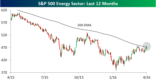 With today’s 3% rally, the S&P 500 Energy sector is poised to close above its 200-DMA for the first time in nearly a year and a half (9/24/14). The current streak of closes below the 200-DMA is the longest for the sector dating back to at least 1990. In today’s Chart of the Day, we took a look at prior periods where the Energy sector closed below its 200-DMA for an extended period of time.
To read our Chart of the Day, enter your info below and start a free Bespoke research trial. During your trial, you’ll also receive access to our model stock portfolios, daily market alerts, and weekly Bespoke Report newsletter.
[thrive_leads id=’59052′]
Apr 8, 2016
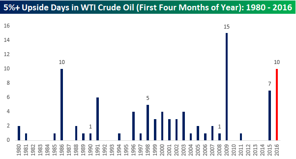 WTI crude oil is currently trading up over 6% in what is the best day for the commodity since its 12.3% rally back on 2/12. Just to highlight how volatile crude oil prices have been so far this year, today’s rally is the tenth one day gain of more than 5% for crude oil this year. The chart to the right shows the number of 5%+ upside days for crude oil in the first four months of a calendar year since 1980. With ten already, this year ranks as the second most. Even with all of these big one-day rallies for crude oil, though, you may be surprised to find that the front month futures price is up just 7% on the year.
To read our Chart of the Day, enter your info below and start a free Bespoke research trial. During your trial, you’ll also receive access to our model stock portfolios, daily market alerts, and weekly Bespoke Report newsletter.
[thrive_leads id=’59052′]
Apr 7, 2016
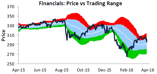 In what was a painful day for bulls on Thursday, the Financial sector had it especially tough as it fell more than any other sector (-1.93%). The chart to the right is from our weekly Sector Snapshots report (available to all Bespoke Premium and Institutional clients), which provides a quick look at where the S&P 500 and each of the ten sectors stand on a variety of different metrics. The chart to the right shows the Financial sector relative to its normal trading range (+/- one standard deviation above and below 50-DMA) in blue. Readings in red are considered overbought, while the green area represents oversold conditions. After nearing extreme overbought levels back in late March and making a lower high last Friday, the Financials sector has declined 3.4%, which is nearly twice the decline of the S&P 500 over that same span.
To read our Chart of the Day, enter your info below and start a free Bespoke research trial. During your trial, you’ll also receive access to our model stock portfolios, daily market alerts, and weekly Bespoke Report newsletter.
[thrive_leads id=’59052′]
Apr 6, 2016
With earnings season right around the corner, we are beginning to hear a lot of earnings related commentary regarding the market. One such comment today was that the most important thing to watch during earnings season is guidance. With that in mind, in today’s Chart of the Day, we look at how guidance during earnings season compares to the market’s actual performance during the reporting period.
To read our Chart of the Day, enter your info below and start a free Bespoke research trial. During your trial, you’ll also receive access to our model stock portfolios, daily market alerts, and weekly Bespoke Report newsletter.
[thrive_leads id=’59052′]
Apr 5, 2016
In today’s Chart of the Day, we look at the monthly surveys of commodities prices in the ISM reports and what they tell us about potential trends in inflation.
To read our Chart of the Day, enter your info below and start a free Bespoke research trial. During your trial, you’ll also receive access to our model stock portfolios, daily market alerts, and weekly Bespoke Report newsletter.
[thrive_leads id=’59052′]