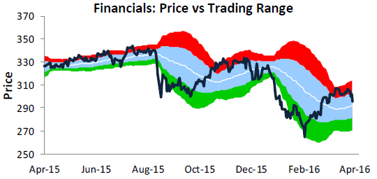
 In what was a painful day for bulls on Thursday, the Financial sector had it especially tough as it fell more than any other sector (-1.93%). The chart to the right is from our weekly Sector Snapshots report (available to all Bespoke Premium and Institutional clients), which provides a quick look at where the S&P 500 and each of the ten sectors stand on a variety of different metrics. The chart to the right shows the Financial sector relative to its normal trading range (+/- one standard deviation above and below 50-DMA) in blue. Readings in red are considered overbought, while the green area represents oversold conditions. After nearing extreme overbought levels back in late March and making a lower high last Friday, the Financials sector has declined 3.4%, which is nearly twice the decline of the S&P 500 over that same span.
To read our Chart of the Day, enter your info below and start a free Bespoke research trial. During your trial, you’ll also receive access to our model stock portfolios, daily market alerts, and weekly Bespoke Report newsletter.
[thrive_leads id=’59052′]
