Jan 29, 2026
The “Bespoke 50” is a basket of noteworthy growth stocks in the Russell 3,000. To make the list, a stock must have strong earnings growth prospects along with an attractive price chart based on Bespoke’s analysis. There were 9 changes to the list this week.
The Bespoke 50 is available with a Bespoke Premium subscription or a Bespoke Institutional subscription. With Bespoke Premium, you’ll receive a number of daily market updates from us along with our weekly newsletter and a portion of our investor tools. With Bespoke Institutional, you’ll receive everything that’s included with Premium plus additional daily macro analysis and more stock-specific research.
To see all 50 stocks that currently make up the Bespoke 50, simply start a two-week trial to Bespoke Premium or Bespoke Institutional.
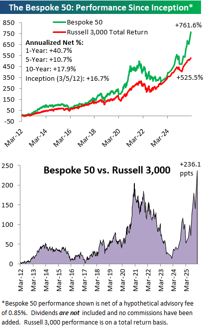
The Bespoke 50 performance chart shown does not represent actual investment results. The Bespoke 50 is updated monthly on Thursdays unless otherwise noted. Performance is based on equally weighting each of the 50 stocks (2% each) and is calculated using each stock’s opening price as of Friday morning after publication. Entry prices and exit prices used for stocks that are added or removed from the Bespoke 50 are based on Friday’s opening price. Any potential commissions, brokerage fees, or dividends are not included in the Bespoke 50 performance calculation, but the performance shown is net of a hypothetical annual advisory fee of 0.85%. Performance tracking for the Bespoke 50 and the Russell 3,000 total return index begins on March 5th, 2012 when the Bespoke 50 was first published. Past performance is not a guarantee of future results. The Bespoke 50 is meant to be an idea generator for investors and not a recommendation to buy or sell any specific securities. It is not personalized advice because it in no way takes into account an investor’s individual needs. As always, investors should conduct their own research when buying or selling individual securities. Click here to read our full disclosure on hypothetical performance tracking. Bespoke representatives or wealth management clients may have positions in securities discussed or mentioned in its published content.
Jan 28, 2026
Today will be the 65th Fed Day (FOMC day) of Chair Powell’s tenure, dating back to early 2018 when he first took the helm. The US stock market has more than doubled since Powell became Fed Chair, so his tenure has been a big success in that regards even though stock market gains are not part of the Fed’s mandate.
When it comes to stock market performance on Fed Days specifically, however, Powell’s tenure has been the weakest of the “modern” Fed era.
The “modern” Fed began in February 1994 when they first began announcing policy decisions on the day of FOMC meetings. Before 1994, the Fed didn’t announce interest rate decisions until weeks after their meetings, which forced investors to monitor the Fed’s open market trading desk activity in the meantime for any policy adjustments.
There have only been four Fed Chairs in the modern era, beginning with Alan Greenspan, who was Chair when the Fed first began announcing policy decisions on FOMC days. After Greenspan came Ben Bernanke in 2006, Janet Yellen in 2014, and Jerome Powell in 2018.
Below we’ve created a chart that shows the S&P 500’s average intraday path on regularly scheduled Fed Days since 1994.
As shown, Bernanke saw the best stock market performance on Fed Days with an average one-day gain of 0.50%, followed by Greenspan at 0.26% and Yellen at 0.16%. Powell currently ranks last of the four with an average one-day gain of just 0.07% on Fed Days during his tenure.
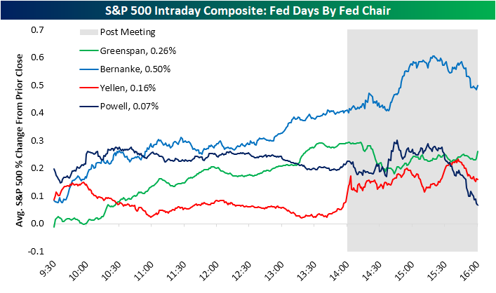
Notably, Powell has actually been the best Chair for the stock market in the first half-hour of trading on Fed Days. From there, though, the market has tended to trickle lower under Powell and then sell off sharply in the final hour of trading.
There have been many-a-Powell Fed Days that saw sharp market selloffs after Powell press conferences. Not every Powell Fed Day has seen a late-day selloff, of course, but the “average” tells the overall story.
Again, the stock market is up huge since Powell became Fed Chair, so buy-and-hold investors have nothing to complain about when it comes to late-day weakness on Powell Fed Days.
For short-term traders, though, the “post-Powell-presser-plunge” will soon become a distant memory once a new Chair takes the helm this spring.
Not a Bespoke client? We’d love for you to give our equity research platform, Bespoke Premium, a try. You can sign up for complimentary access for 14 days at this link to read our full 2026 Investor Sentiment report and start receiving our daily research emails today!

Jan 27, 2026
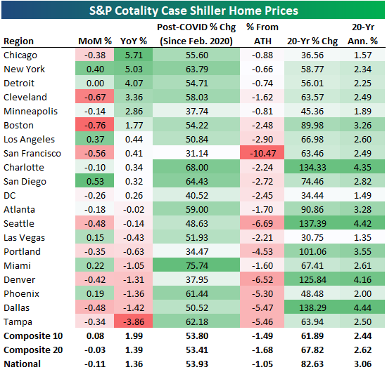
The latest Case Shiller home price data from S&P Cotality was published today and showed a small month-over-month decline of 0.11% at the national level. Home prices were up just 1.36% year-over-year nationally as well.
Across the twenty cities tracked, 13 saw small month-over-month declines, with Boston down the most at -0.76%. Of the six cities that were up on the month, San Diego (+0.53%) and New York (+0.40%) were up the most.
Six cities saw year-over-year gains of more than 1%, and they’re all in either the northeast or midwest: Chicago (+5.7%), New York (+5%), Detroit (+4.1%), Cleveland (+3.4%), Minneapolis (+2.9%), and Boston (+1.8%).
On the flip side, the five cities that are down over the last year are mostly in the Sunbelt: Miami (-1.1%), Denver (-1.3%), Phoenix (-1.4%), Dallas (-1.4%), and Tampa (-3.9%).
Below we show month-over-month and year-over-year home price changes from today’s data, along with a few additional stats like post-COVID change, % from all-time highs, and 20-year change.
Miami is up the most since COVID (February 2020) with a gain of 75.7%, while San Francisco is up the least at 31.1%. San Francisco is also down the most from all-time highs at -10.5%.
Unfortunately, not one city tracked made a new high in the latest data.
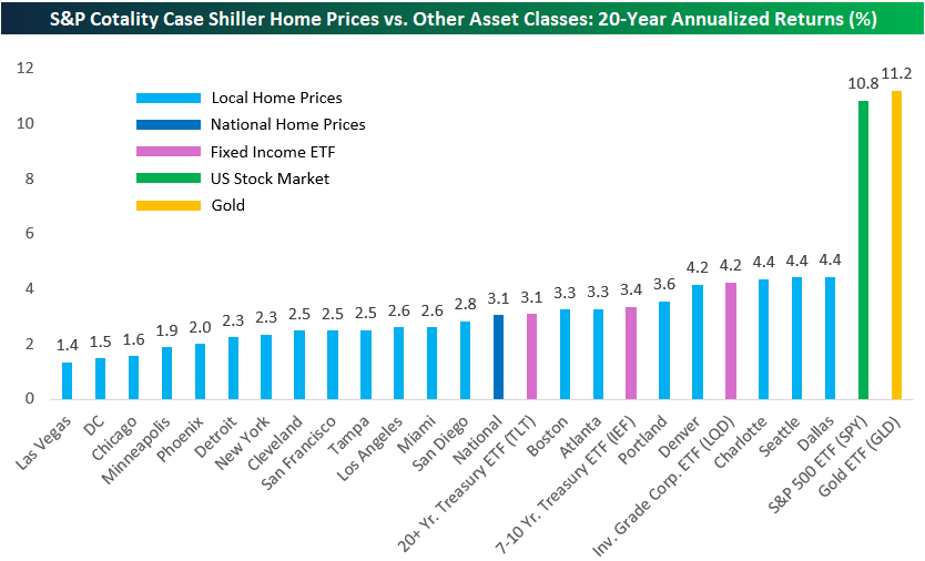
While it may seem like home prices have skyrocketed around the country, 20-year returns are actually pretty small and nowhere close to matching the returns of equities (or gold).
As shown below, most cities tracked have seen annualized home price gains of less than 3% over the last twenty years. That’s worse than the 3.1% annualized return for the long-term Treasury ETF (TLT).
Only three of the twenty cities have seen home prices gain more than the investment-grade corporate bond ETF (LQD): Dallas, Seattle, and Charlotte (4.4% annualized).
Compared to the S&P 500’s 10.8% annualized gains over the last twenty years and gold at 11.2%, home-price gains look puny.
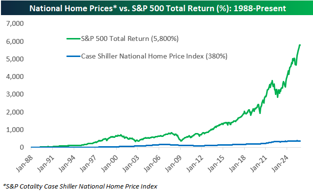
The National home price index tracked by Case Shiller goes back to the late 1980s, and as shown below, it’s up 380% since 1988 versus a total return of nearly 6,000% for the S&P 500.
While there are good reasons for homeownership that include the potential for price appreciation, it’s important to understand that excess capital has historically been better off put elsewhere.
Not a Bespoke client? We’d love for you to give our equity research platform, Bespoke Premium, a try. You can sign up for complimentary access for 14 days at this link to read our full 2026 Investor Sentiment report and start receiving our daily research emails today!
Jan 27, 2026
As domestic equities have struggled to hang onto gains so far this year, most country ETFs are already sitting on solid year-to-date returns.
Below is a snapshot of more than forty country ETFs traded on US exchanges. The average year-to-date change of all these country ETFs is already above 7%, while eleven are already up 10%+ and three are up 20%+. Peru (EPU) is up the most at +25%, followed by Colombia (COLO) and South Korea (EWY) at just over 20%.
Note that all seven G7 country ETFs (highlighted in light blue) are up less than the overall YTD average, with Japan (EWJ) up the most of this small group at +4.8%. The US (SPY) ranks 2nd to last of the G7 with its 1.6% YTD gain in front of only France (EWQ) at 1.5%.
Three country ETFs are in the red so far this year: Vietnam (VNAM), Kuwait (KWT), and India (INDA).
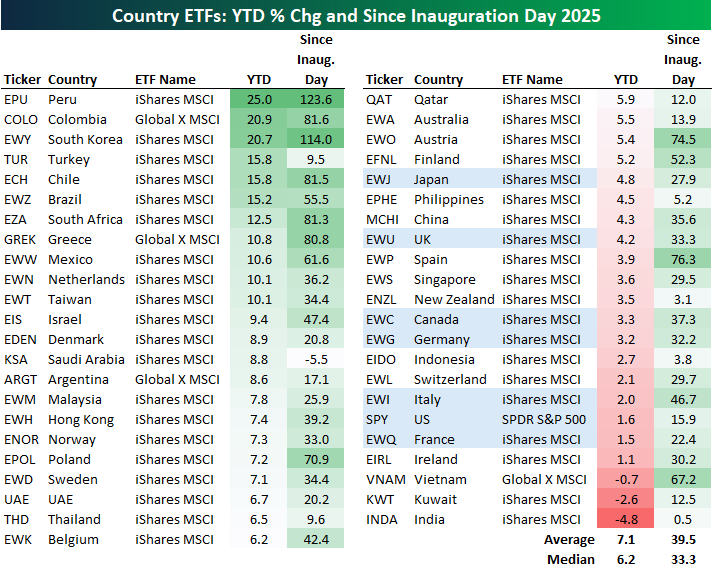
Along with strong outperformance versus US equities so far this year, country ETFs have outdone the US since Inauguration Day a little over a year ago as well. The 40+ country ETFs shown are up an average of 39.5% since President Trump’s 2nd term officially began last January, with Peru (EPU) and South Korea (EWY) leading the way with gains of 110%+. Colombia (COLO), Chile (ECH), South Africa (EZA), and Greece (GREK) rank 3rd through 6th with gains of just over 80%, while Spain (EWP), Austria (EWO), Poland (EPOL), and Vietnam (VNAM) round out the top ten.
Italy (EWI) has been the best performing G7 country since Inauguration Day 2025 with a gain of 46.7%, followed by Canada (EWC) at +37.3%. The US (SPY) has been the weakest G7 country over this time frame with a gain of just 15.9%.
Saudi Arabia (KSA) is the only country ETF that has seen a share-price decline (-5.5%) since Trump’s 2nd term began, while India (INDA) has done the second worst of the entire group with a gain of just 0.5%.
Not a Bespoke client? We’d love for you to give our equity research platform, Bespoke Premium, a try. You can sign up for complimentary access for 14 days at this link to read our full 2026 Investor Sentiment report and start receiving our daily research emails today!
Jan 27, 2026
This content is for members only