May 15, 2026
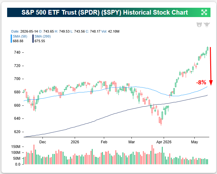
The S&P 500 has been driven higher by large-cap hyperscalers and semiconductors over the last month. This has pushed the index significantly above its 50-day moving average, indicating it’s well above trend right now.
As shown below, the index would need to fall 8% just to get back down to its 50-DMA from these levels!
The S&P’s price has now been “overbought” (more than one standard deviation above its 50-DMA) for 23 straight trading days:
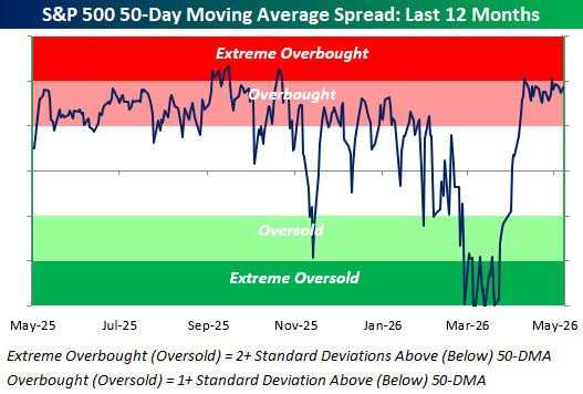
But while price is overbought, the underlying breadth in the index looks absolutely horrific.
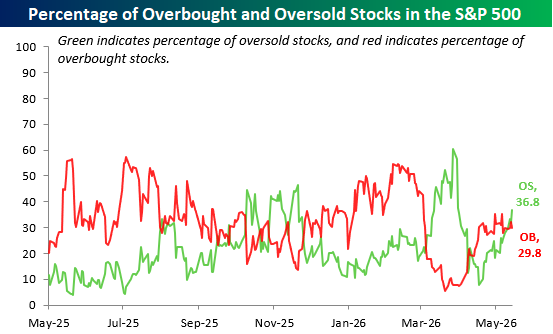
With the S&P remaining at overbought levels for more than a month, one would expect a majority of stocks in the index to be overbought as well. In reality, though, more than a third (36.8%) of S&P 500 stocks are actually “oversold” (more than one standard deviation below the 50-DMA), while just 29.8% are overbought.
The fact that so many more stocks are oversold than overbought in the S&P, even with the index’s price elevated well above its 50-DMA, highlights the narrowness of the recent rally.
Passive index investors have benefited even with the narrowness, but active investors without exposure to the AI infrastructure stocks have had a rough go of it.
Want to read more in-depth market analysis from Bespoke? Join our Think BIG mailing list or Bespoke Premium by starting a trial today! Click below for details on how to sign up for Premium:

May 13, 2026
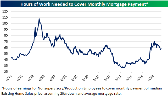
Based on mortgage rates, home prices, and average hourly earnings, it currently takes roughly 64 hours of work to cover a monthly mortgage payment.
Below is a look at this reading going back to the early 1970s so you can see how housing affordability has shifted over the last five decades.
Affordability was at its worst in the late 1970s/early 1980s when mortgage rates spiked into the teens, but from there it was a steady trek lower all the way until the early 2010s as rates declined.
At its nadir in 2012, it took just over 32 hours of work to cover a monthly mortgage payment, so the current number is double that.
We’ve at least seen affordability get a little better over the last few years. At its peak in October 2023, it took 76 hours of work to cover a mortgage payment, which was the highest reading since late 1990.
As you can see in the chart, while mortgage costs are indeed high relative to the last couple of decades, these types of levels were routine through the 1980s and 1990s.
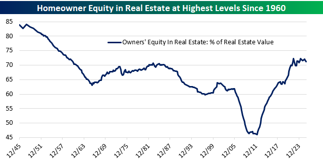
While affordability is worse now than it was during the ultra-low rate environment in the years after the Financial Crisis, homeowners are sitting on a boatload of equity. As shown below, homeowner equity plunged to just over 45% at its low point after home prices crashed in the late 2000s and early 2010s.
Low mortgage rates throughout the 2010s spurred a bounce-back in both home prices and loan activity, and then when prices spiked again in the early 2020s after COVID hit, homeowners were suddenly sitting on their highest amount of equity since 1960!
While home prices haven’t gone up in a few years, they also haven’t dropped, so that homeowner equity in the system remains a nice cushion.
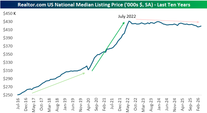
Speaking of home prices, below is a look at the median listing price of homes from Realtor.com data over the last ten years.
After a huge move higher in listing prices in the first two years after COVID hit in early 2020, we’ve seen prices flat-line.
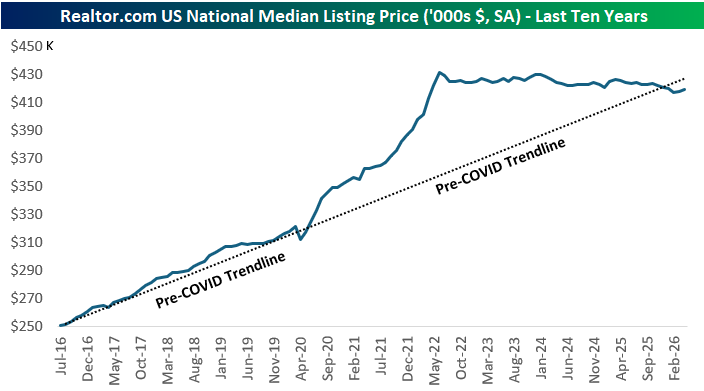
The two-year post-COVID surge could have just been one big multi-year pull forward in prices, however.
As shown below, if we extend out the pre-COVID trendline in listing prices all the way out to current levels, we’re currently right on trend. We just didn’t get there in a straight line.
Below is a look at the change in the median listing price versus the change in the homebuilder ETF (ITB) since 2016:
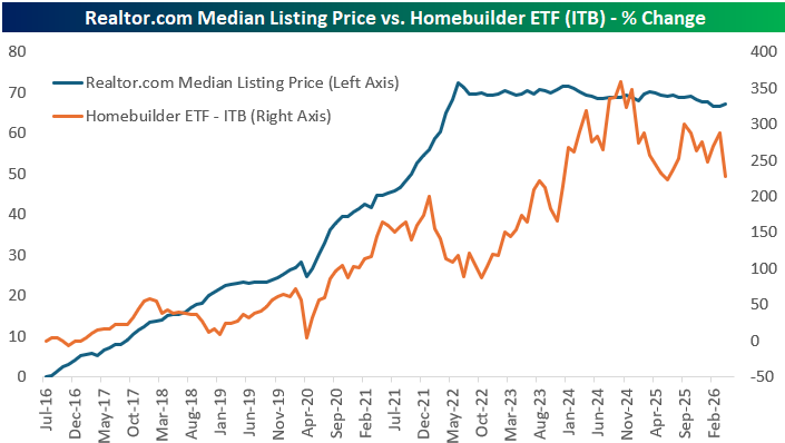
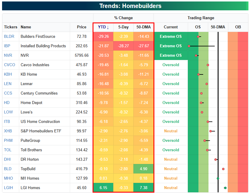
As shown below, the homebuilder space continues to get beaten up, with most stocks in the group at least 5% below their 50-DMAs in oversold territory. It’s been a rough 2026 so far, with ITB down 6.2% versus a gain of 9% for the S&P 500.
It’s likely that the builders will need to see some combination of lower rates or higher prices to get back on track.
Want to read more in-depth market analysis from Bespoke? Join our Think BIG mailing list or Bespoke Premium by starting a trial today! Click below for details on how to sign up for Premium:
May 13, 2026
Yesterday was a big day for inflation data as the BLS released April CPI (Consumer Price Index).
We all knew that spiking energy prices from the Iran War would impact headline CPI, but it was the core CPI reading, which strips out food and energy, that everyone was watching closely.
While economists expected core CPI to increase 0.3% month-over-month, it came in a tick higher than expected at 0.4% (4.6% annualized).
The jump in core CPI sent equity futures lower ahead of the open as interest rates rallied. Market pricing for Fed rate cuts took another hit, and the odds for rate hikes before year-end ticked higher.
When we looked underneath the surface of the core CPI print, the data wasn’t quite as scary.
The analysis below was included in our post-market macro note, The Closer, sent to Bespoke All Access subscribers yesterday. (Start a trial here to get it in your inbox going forward.)
While this was the second-largest monthly leap in core CPI since early 2023, rising 4.6% annualized, that acceleration was entirely due to the vagaries of the rent calculation.
Excluding rent, core CPI rose just 1.6% annualized and still looks similar to the pace it has trended at since 2023.
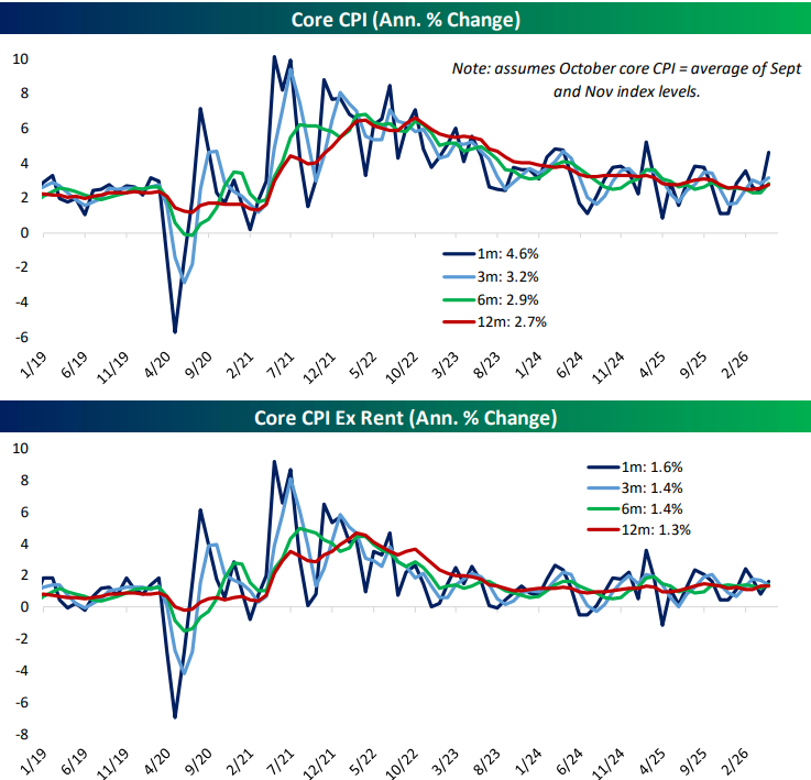
Because households are included in the rent survey on a six-month rotation, that index is still getting caught up from the government shutdown last year.
Households skipped in October were assumed to have no rent inflation for the last six months, which effectively jammed a year of rent increases for that subset into the April CPI report.
The result was a huge spike in rent in yesterday’s CPI release, which was a statistical mirage similar to the plunge observed in October. It should reverse in the coming months.
Want to read more in-depth market analysis from Bespoke? Join our Think BIG mailing list or Bespoke Premium by starting a trial today! Click below for details on how to sign up for Premium:
May 12, 2026
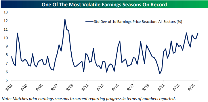
More than 1,500 stocks have reported earnings since the current season began in mid-April, and the average stock that has reported has seen an average absolute one-day share price reaction of roughly 7%. This means that the average stock is seeing its value change by +/-7% on the first trading day following its quarterly earnings report. That’s a big move!
In general, stocks have been getting more volatile on earnings in the last few years. Below is a chart highlighting earnings-day volatility for US stocks going back to 2001 using data from our Earnings Explorer tool.
The last time we saw earnings vol spike was during the Financial Crisis bear market when stocks were tanking. This time around, we’re seeing earnings vol increase during a strong AI-driven bull market. Should we chalk this up as another example of how AI is disrupting things?
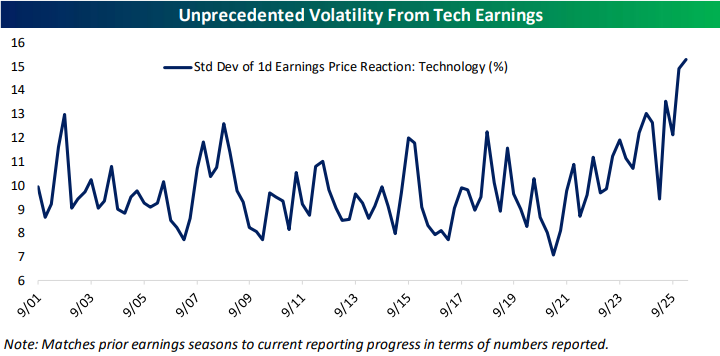
Below is a look at earnings-day volatility for Tech stocks specifically. During the Financial Crisis years when the average stock was seeing record earnings-day vol, Tech stocks didn’t see quite the same impact.
Now, though, Tech stocks are seeing record earnings-day volatility as investors and traders presumably make snap judgements about AI’s future impact on the bottom line.
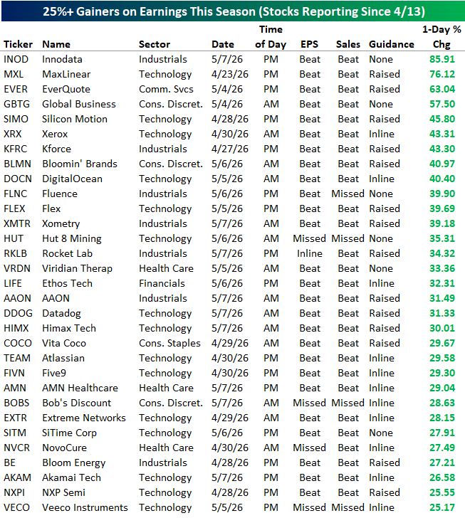
Speaking of earnings volatility, below are the 31 stocks that have seen one-day rallies of more than 25% following earnings this season. Nineteen stocks have gained more than 30% and four have gained 50%+!
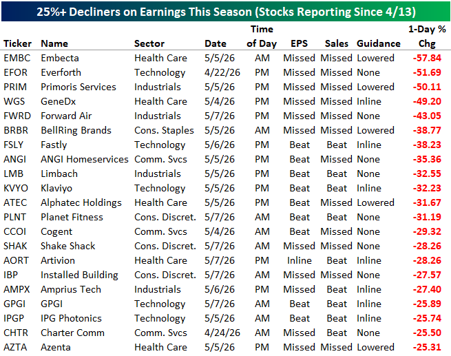
On the flip side, below are the 21 stocks that have fallen more than 25% on their earnings reaction days this season, including three that were cut in half:
Want to read more in-depth market analysis from Bespoke? Join our Think BIG mailing list or Bespoke Premium by starting a trial today! Click below for details on how to sign up for Premium:
May 12, 2026
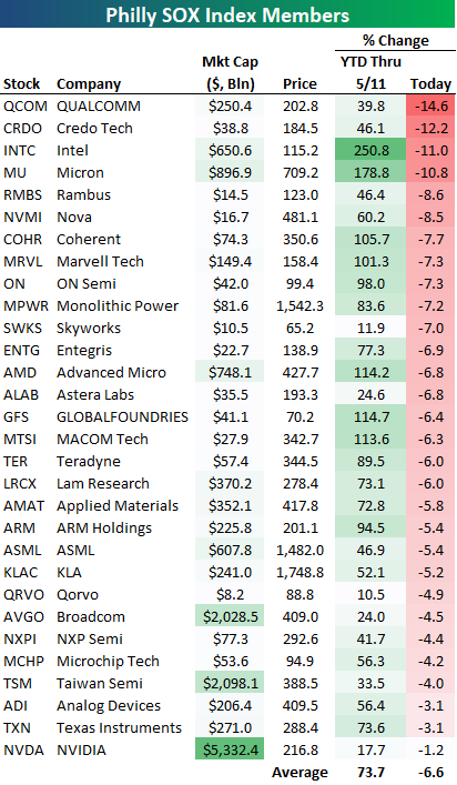
It wasn’t a matter of “if” the semis would see a short-term pull back, but “when.” The 30 semiconductor stocks in the Philadelphia SOX index were up an average of 73% year-to-date through yesterday (5/11). As shown at the bottom of the table below, they’re down an average of 6.6% in early afternoon trading today.
While NVIDIA (NVDA) has been one of the smallest gainers in the SOX this year, it’s down the least of any stock in the index today with a decline of just 1.2%.
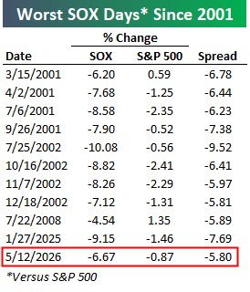
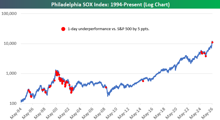
The SOX was down 6.67% today at around 1 PM ET while the S&P 500 was down 0.87%. That 5.8 percentage point spread of underperformance for the SOX would be its worst day versus the market since “DeepSeek Monday” last January 27th and the 3rd worst since 2003.
If you’re interested in historical precedent, below is a log chart of the SOX since 1994 with red dots marking the 64 trading days since then that the index has underperformed the S&P 500 by more than 5 percentage points:
Want to read more in-depth market analysis from Bespoke? Join our Think BIG mailing list or Bespoke Premium by starting a trial today! Click below for details on how to sign up for Premium:
