To the Moon! Space Stock ETFs Explode
While the Procure Space ETF (UFO) began trading way back in 2019, three new space-stock ETFs have hit the market in the last couple of months: NASA, MARS, and ORBX.
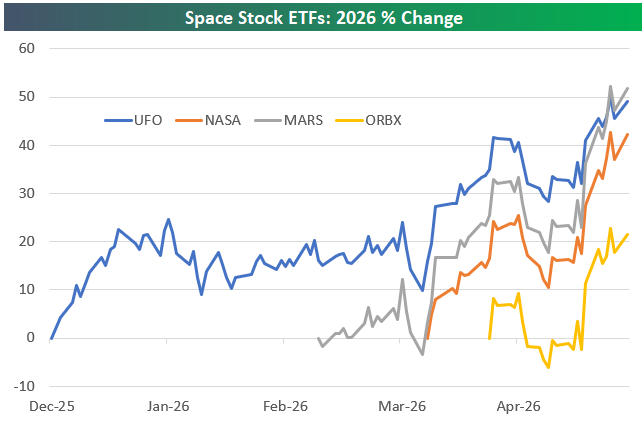
As shown below, space stocks have been soaring lately. UFO is up nearly 50% year-to-date, while MARS has gained more than 50% since it began trading in early March.
NASA is up 42% since it launched on April 1st, while ORBX began trading on April 15th and is already up 21%.
In terms of AUM, UFO has nearly $900 million, while NASA is up to $840 million. MARS is at just $52.3 million, while ORBX has just crossed the $20 million mark.
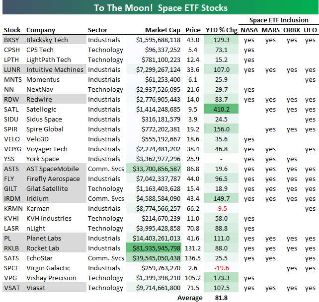
If you’re interested in the individual names that make up these space ETFs, we highlight them below.
Next to each ticker, we’ve marked “yes” if it’s included in one of the four space ETFs mentioned above.
Tickers in grey are included in all four of the space ETFs. These include names like Blacksky (BKSY), Intuitive Machines (LUNR), AST SpaceMobile (ASTS), Planet Labs (PL), and Rocket Lab (RKLB).
The 26 stocks on this list of space stocks have soared an average of 81.8% year-to-date! Satellogic (SATL) has been the biggest winner with a YTD gain of 410%, while Blacksky (BKSY), Intuitive Machines (LUNR), Spire Global (SPIR), Iridium (IRDM), Planet Labs (PL), Vishay Precision (VPG), and Viasat (VSAT) are all up 100% or more.
Want more from Bespoke? You can start by joining our Think BIG mailing list where you’ll receive an interesting market stat in your inbox a few times per week. All we need is your email address. Join now by clicking here or on the image below.

Love Stories Unwind
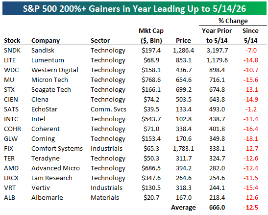
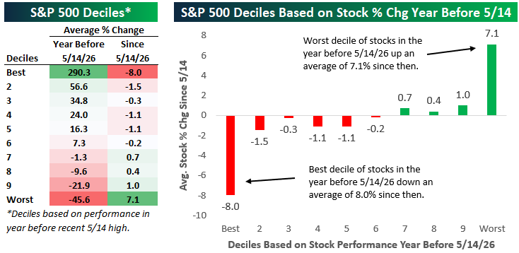
The average S&P 500 stock gained 35% in the year leading up to the index’s most recent all-time closing high made last Thursday (5/14). Since then, we’ve seen the biggest winners in the last year finally experience some gravity, while beaten-down stocks have shown signs of life.
The tables below show the most extreme moves in the index in the year leading up to May 14th along with performance in the two and a half trading days since then.
Sixteen S&P 500 stocks gained more than 200% year-over-year through 5/14. As shown in the first table below, every one of these stocks has fallen since 5/14 for an average decline of 12.5%.
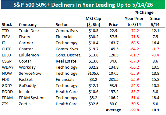
On the flip side, 13 S&P 500 stocks were more than cut in half (down 50%+) in the year leading up to 5/14. Since then, they’ve averaged a gain of 10.1%!
Below we’ve broken the S&P 500 into deciles (10 groups of 50 stocks each) based on year-over-year share-price performance through last Thursday (5/14). For each decile, we’ve calculated the average percentage change since 5/14.
As shown, the decile of the best performing stocks y/y through 5/14 is down an average of 8% since then, while the decile of the worst performing stocks y/y through 5/14 is up 7.1%.
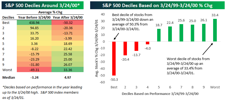
Last March 24th, we highlighted the 25-year anniversary of the Dot Com Bubble peak in a Chart of the Day for members.
The year leading up to the March 24th, 2000 peak saw similar but more extreme moves within the S&P 500. As shown below, the best performing decile of stocks in the year leading up to 3/24/2000 gained 438.9% over that period, while the worst performing decile of stocks fell an average of 49.3%.
In the year after the 3/24/2000 peak, the decile of best performers y/y at the Dot Com peak averaged a decline of 50%! The decile of worst performers in the year leading up to 3/24/2000 averaged a gain of 33.4% over the following year.
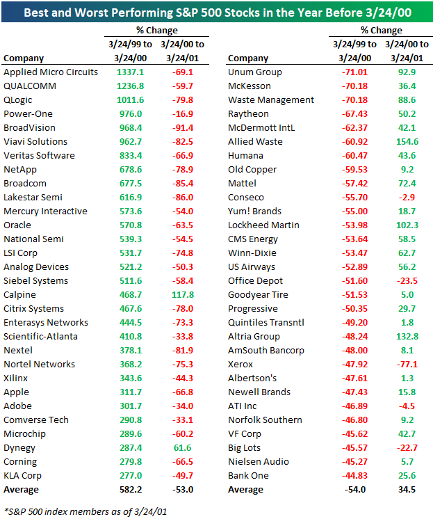
Below is a table showing the best and worst performing stocks in the year leading up to the Dot Com peak and how they did in the year after.
As you can see, it was an absolute bloodbath for the biggest Dot Com winners in the year after the peak, while the losers during the Dot Com run-up that were the furthest thing possible from the Internet space saw an epic recovery.
While the timing of the ultimate peak for any boom/bubble is as unpredictable as the love life of characters in a Taylor Swift song, the arc of the story has been repeated as frequently as her songs. When sentiment towards the market’s most loved stocks shifts, it happens fast. The names that the market is on cloud nine with today will eventually find themselves out in the cold, experiencing a sell-off by a thousand cuts, while the market ‘frogs’ turn into the new princes.
Want to read more in-depth market analysis from Bespoke? Join our Think BIG mailing list or Bespoke Premium by starting a trial today! Click below for details on how to sign up for Premium:

Chart of the Day: Post-May 1998 Performance
This content is for members onlyThe Best Quotes on Markets, Investing, and Life
Below are some of Bespoke’s favorite quotes about markets, investing, and life in general. We feature a Quote of the Day in our Morning Lineup sent to subscribers each day. Click here to sign up for Bespoke Premium to receive our Morning Lineup in your inbox every trading day.
“The future starts today, not tomorrow.” – Pope John Paul II
“I always like to look on the optimistic side of life, but I am realistic enough to know that life is a complex matter.” – Walt Disney
“Chinese restaurants in America today outnumber the five largest fast food chains in the US all combined.” – Donald Trump
“We should keep on going along the path of globalization. Globalization is good… when trade stops, war comes.” – Jack Ma
“And so castles made of sand fall into the sea, eventually.” – Jimi Hendrix
“The toughest thing about success is that you’ve got to keep on being a success.” – Irving Berlin
“There is nothing new in the world except the history you do not know.” – Harry Truman
“I shall seize Fate by the throat; it shall certainly not bend and crush me completely.” – Beethoven
“Good judgment comes from experience, and a lot of that comes from bad judgment.” – Will Rogers
“If you don’t use your experience, your past is wasted.” – Alan Shepard
“Nothing is impossible, the word itself says ‘I’m possible’!” – Audrey Hepburn
“If The Headline Is Big Enough, It Makes The News Big Enough.” – Citizen Kane
“We are seeing unprecedented internal and external demand for AI compute resources.” – Anat Ashkenazi, CFO, Alphabet
“We live in a world defined by the rapid pace of technological change.” – Jerome Powell
“People generally see what they look for, and hear what they listen for.” – Harper Lee
“Judge a man by his questions rather than his answers.” – Voltaire
“Let chaos reign, then rein in chaos.” – Andy Grove
“Better three hours too soon than a minute too late.” – William Shakespeare, The Merry Wives of Windsor
“When you sell your great companies and add to the losers, it’s like watering the weeds and cutting the flowers.” – Peter Lynch
“Success flourishes only in perseverance — ceaseless, restless perseverance.” – Baron Manfred von Richthofen
“If you’re in a good situation, don’t worry it’ll change.” – John A. Simone Sr.
“Power resides where men believe it resides. It’s a trick. A shadow on the wall.” — Lord Varys, Game of Thrones
“Our conviction in the multi-year AI megatrend remains high and we believe the demand for semiconductors will continue to be very fundamental.” – C.C. Wei, President and CEO, Taiwan Semiconductor
“We contend that for a nation to try to tax itself into prosperity is like a man standing in a bucket and trying to lift himself up by the handle.” – Winston Churchill
“The clouds appeared and went away, and in a while they did not try anymore.” – John Steinbeck
“Nothing gives one person so much advantage over another as to remain always cool and unruffled under all circumstances.” – Thomas Jefferson
“The market is a pendulum that forever swings between unsustainable optimism and unjustified pessimism.” – Jason Zweig
“Success is like Halley’s Comet, you know. Every now and then it just comes around.” – Ross Perot
“I looked for the same pitch my whole career, a breaking ball. I never worried about the fastball. They couldn’t throw it past me.” – Hank Aaron
“The secret of life is to say yes all the time, because when you’re old, you don’t want to say, ‘I wish I’d done this, I wish I had done that.” – Francis Ford Coppola
“It is the obvious which is so difficult to see most of the time.” ― Isaac Asimov
“The more wonderful the means of communication, the more trivial, tawdry, or depressing its contents seemed to be.” – Arthur C Clarke, 2001: A Space Odyssey
“I felt that if I stayed with them I would probably end up being the richest man in the cemetery.” – Ron Wayne, Co-Founder, Apple
“I try not to worry about things I can’t do anything about.” – Christopher Walken
“The circumstances of the world are so variable that an irrevocable purpose or opinion is almost synonymous with a foolish one.” William H. Seward
“If my answers frighten you then you should cease asking scary questions.” – Quentin Tarantino
“When we have computers that can do more and more jobs, it’s going to change how we think about work. There’s no way around that. You can’t wish it away.” – Larry Page
“It’s the rough side of the mountain that’s the easiest to climb; the smooth side doesn’t have anything for you to hang on to.” – Aretha Franklin
“I don’t trust society to protect us, I have no intention of placing my fate in the hands of men whose only qualification is that they managed to con a block of people to vote for them.” – Mario Puzo, The Godfather
“Appear weak when you are strong, and strong when you are weak.” – Sun Tzu
“The longest way must have its close – the gloomiest night will wear on to a morning.” ― Harriet Beecher Stowe
“How did you go bankrupt?” “Two ways. Gradually and then suddenly.” – Ernest Hemingway, The Sun Also Rises
“If you don’t understand what the professor is saying, don’t dismiss the possibility that he might be wrong.” – Paul Volcker
“Competitive golf is played mainly on a five-and-a-half-inch course… the space between your ears.” – Bobby Jones
“Philosophy is common sense with big words.” – James Madison
“Don’t let what you cannot do interfere with what you can do.” – John R. Wooden
“Great things are not accomplished by those who yield to trends and fads and popular opinion.” – Jack Kerouac
“I attack ideas. I don’t attack people. Some very good people have some very bad ideas.” – Antonin Scalia
“I think we’re at a bottom. I really do.” – Mark Haines, CNBC, 3/10/09
“There is no instance of a nation benefitting from prolonged warfare.” – Sun Tzu, The Art of War
“I never worry about the problem. I worry about the solution.” – Shaquille O’Neal
“The world makes much less sense than you think.” – Daniel Kahneman
“In wartime, truth is so precious that she should always be attended by a bodyguard of lies.” – Winston Churchill
“The hardest hits are yet to come from the U.S. military,” – Marco Rubio, US Secretary of State
“If what you have done yesterday still looks big to you, you haven’t done much today.” – Mikhail Gorbachev
“I wonder why progress looks so much like destruction.” – John Steinbeck
“Bang! Zoom! To the moon, Alice!” – Jackie Gleason
“To devastate is easier and more spectacular than to create.” – Anthony Burgess
“You can’t connect the dots looking forward; you can only connect them looking backwards. So you have to trust that the dots will somehow connect in your future.” – Steve Jobs
“I don’t know what happened. It was just euphoria. I can’t even explain what I was feeling, just pure joy.” – Charlie McAvoy
“I have a theory that the truth is never told during the nine-to-five hours.” – Hunter Thompson
“To know that we know what we know, and to know that we do not know what we do not know, that is true knowledge.” – Nicolaus Copernicus
“You just have to find that thing that’s special about you that distinguishes you from all the others, and through true talent, hard work, and passion, anything can happen.” – Dr Dre
“I’ve missed more than 9000 shots in my career. I’ve lost almost 300 games. 26 times, I’ve been trusted to take the game-winning shot and missed. I’ve failed over and over and over again in my life. And that is why I succeed.” – Michael Jordan
“It is myopic to base sweeping change on the narrow experience of a few years.” – Antonin Scalia
“Volatility obscures the future but does not necessarily determine the future.” – Peter Bernstein
“The greatest minds are capable of the greatest vices as well as of the greatest virtues.” – Rene Descartes
“We are all wrong so often that it amazes me that we can have any conviction at all over the direction of things to come.” – Jim Cramer
“All the measures of the Government are directed to the purpose of making the rich richer and the poor poorer.” – William Henry Harrison
“I have wondered at times what the Ten Commandments would have looked like if Moses had run them through the US Congress.” – Ronald Reagan
“The best way to keep something bad from happening is to see it ahead of time… and you can’t see it if you refuse to face the possibility.” – William S. Burroughs
“Wherever you come near the human race there’s layers and layers of nonsense.” – Thornton Wilder, Our Town
“The way we do things is to begin.” – Horace Greeley
“Shut your eyes and see.” – James Joyce
“Hi-yo, Silver!” – The Lone Ranger
“You can fool some of the people some of the time — and that’s enough to make a decent living.” – W.C. Fields
“The future doesn’t belong to the fainthearted; it belongs to the brave.” – Ronald Reagan, 1/28/1986
“We’re all mad here.” – Lewis Carroll, Alice in Wonderland
“I skate to where the puck is going to be, not where it has been.” – Wayne Gretzky
“Our conviction in the essential role of CPUs in the AI era continues to grow” – Lip-Bu Tan, Intel
“I’d say momentum is building around the world. So, ex-US has more momentum, healthy demand, lower vacancies.” – Chris Caton, Prologis
“A country, a style or an epoch are interesting only for the idea behind them.” – Christian Dior
“Remember, your mind is like a parachute: If it isn’t open, it doesn’t work. So keep an open mind!” – Buzz Aldrin
“My advisers built a wall between myself and my people. I didn’t realize what was happening. When I woke up, I had lost my people.” – Mohammed Reza Pahlavi
“Nothing makes a man so adventurous as an empty pocket.” – ― Victor Hugo, The Hunchback of Notre Dame
“While any number of risks continue, we are bullish on the U.S. economy in 2026.” -Brian Moynihan
“There’s nothing more dangerous than someone who wants to make the world a better place.” – Banksy
“Maintain a firm grasp of the obvious at all times.” – Jeff Bezos
“When the President does it, that means that it is not illegal.” – Richard Nixon
“Tomorrow belongs to those who can hear it coming” – David Bowie
“Without memory, there is no culture. Without memory, there would be no civilization, no society, no future.” – Elie Wiesel
“The freshest moments in my films have always been with unknown actors.” – John Singleton
“What can a first impression tell us about anyone? Why, no more than a chord can tell us about Beethoven, or a brushstroke about Botticelli.” – Amor Towles
“The only true wisdom is in knowing you know nothing.” – Socrates
“For eleven months and maybe about twenty days each year, we concentrate upon the shortcomings of others, but for a few days at the turn of the New Year we look at our own. It is a good habit.” – Arthur Hays Sulzberger
“I wake up every day and I can’t wait to go to work, and that’s a gift. Not too many people have the opportunity to feel that way.” – Tiger Woods
“Investors should purchase stocks like they purchase groceries, not like they purchase perfume.” – Benjamin Graham
“Destiny is what you are supposed to do in life. Fate is what kicks you in the ass to make you do it.” – Henry Miller
“I got my start by giving myself a start.” – Madam C. J. Walker
“I think the one lesson I have learned is that there is no substitute for paying attention.” – Diane Sawyer
“What we obtain too cheap, we esteem too lightly: it is dearness only that gives every thing its value.” – Thomas Paine
“Our coding teams are realizing productivity gains of 30% or more using agentic AI.” Mark Murphy, CFO Micron
“I can’t believe it, but it looks as though television has betrayed me.” – Bart Simpson, Episode 1, The Simpsons
“The more wonderful the means of communication, the more trivial, tawdry, or depressing its contents seemed to be.” – Arthur C. Clarke
“Life’s under no obligation to give us what we expect.”- Margaret Mitchell, Gone With the Wind
“Feel the city breakin’ and everybody shakin’, and we’re stayin’ alive, stayin’ alive” – Stayin’ Alive, Bee Gees
“In today’s regulatory environment, it’s virtually impossible to violate rules.” – Bernard Madoff
“I am in a charming state of confusion.” – Ada Lovelace
“Lesson Number One: Don’t Underestimate The Other Guy’s Greed!” – Frank Lopez, Scarface
“I’ve noticed that when people are joking they’re usually dead serious, and when they’re serious, they’re usually pretty funny.” – Jim Morrison
“What America needs now is a drink.” – Franklin Roosevelt, 12/5/33
“It’s not the pace of life I mind. It’s the sudden stop at the end.” – Thomas Hobbes
“Sometimes reality is too complex. Stories give it form.” – Jean Luc Godard
“Colonel Jessup! Did you order the Code Red?!” – Lieutenant Daniel Kaffee, A Few Good Men
“Many people are busy trying to find better ways of doing things that should not have to be done at all. There is no progress in merely finding a better way to do a useless thing.” – Henry Ford
“Scientific knowledge advances haltingly and is stimulated by contention and doubt.” – Claude Lévi-Strauss
Stop worrying about the world ending today. It’s already tomorrow in Australia.” – Charles Schulz
“You have put me in here a cub, but I will come out roaring like a lion, and I will make all hell howl!” – Carrie Nation
“No man becomes rich unless he enriches others.” – Andrew Carnegie
“To expect the unexpected shows a thoroughly modern intellect.” – Oscar Wilde
“Great ideas come from everywhere if you just listen and look for them. You never know who’s going to have a great idea.” – Sam Walton
“What we anticipate seldom occurs, what we least expected generally happens.” – Benjamin Disraeli
“Bitcoin is like anything else: it’s worth what people are willing to pay for it.” – Stanley Druckenmiller
“There’s no such thing as simple. Simple is hard.” – Martin Scorsese
“Beware of geeks bearing formulas.” – Warren Buffett
“We must go on, because we can’t turn back.” – Robert Louis Stevenson
“Luck’s a revolving door, you just need to know when it’s your time to walk through.” – Stan Lee
“The test of success is not what you do when you are on top. Success is how high you bounce when you hit the bottom.” – George S. Patton
“When they call the roll in the Senate, the Senators do not know whether to answer ‘Present’ or ‘Not Guilty’.” – Theodore Roosevelt
“There is a crack in everything, that’s how the light gets in.” – Leonard Cohen
“The problem with socialism is that you eventually run out of other peoples’ money.” – Margaret Thatcher
“When it is darkest there is always light ahead.” – Roald Amundsen
“America’s health care system is neither healthy, caring, nor a system.” – Walter Cronkite
“It would be a mistake to think something is wonderful just because it looks great.” – Anna Wintour
“The work of today is the history of tomorrow and we are its makers” – Juliette Gordon Low
“And so we always say we’re not on a preset path, and we really mean that.” – Jerome Powell
“People don’t care about what you say, they care about what you build.” – Mark Zuckerberg
“We are like chameleons, we take our hue and the color of our moral character, from those who are around us.” – John Locke
“If you could kick the person in the pants responsible for most of your trouble, you wouldn’t sit for a month.” – Theodore Roosevelt
“If everything you try works, you aren’t trying hard enough.” – Gordon Moore
“If you want to increase your success rate, double your failure rate.” – Thomas J. Watson, Sr
“Women who seek to be equal with men lack ambition” – Timothy Leary
“In hindsight, I slid into arrogance based upon past success.” – Reed Hastings
“It’s unbelievable how much you don’t know about the game you’ve been playing all your life.” – Mickey Mantle
“The main purpose of the stock market is to make fools of as many men as possible.” – Bernard Baruch
“‘That didn’t work’ is cool, but ‘that won’t work’ is not a way to go through life.” – John Mayer
“Stock prices have reached what looks like a permanently high plateau” – Irving Fisher, 10/15/29
“Pessimism never won any battle.” – Dwight Eisenhower
“Riches don’t make a man rich, they only make him busier.” – Christopher Columbus
“If you want a happy ending, that depends, of course, on where you stop your story.” – Orson Welles
“Reality leaves a lot to the imagination.” – John Lennon
“The harder life is for a man when he is young, the easier it will be in the future.” – Aleksandr I. Solzhenitsyn
“We learn from history that we don’t learn from history!” – Desmond Tutu
“A minute’s success pays the failure of years.” – Robert Browning
“I’m a greater believer in luck, and I find the harder I work the more I have of it.” – Thomas Jefferson
“The most common market take can be described as “person who didn’t see this coming is now 100% confident about what happens next.” – Morgan Housel
“When one tugs at a single thing in nature, he finds it attached to the rest of the world.” – John Muir
“It is easy to ignore the rain if you have a raincoat” – Truman Capote
“Never make anything more accurate than it needs to be.” – Enrico Fermi
“This is the way the world ends, not with a bang but a whimper.” – T.S. Eliot
“The best fiction is far more true than any journalism.” – William Faulkner
“Life starts all over again when it gets crisp in the fall.”- F. Scott Fitzgerald
“I am who I am today because of the choices I made yesterday.” – Eleanor Roosevelt
“A man who is certain he is right is almost sure to be wrong.” – Michael Faraday
“Language fits over experience like a straight-jacket.” – William Golding
“He who waits to do a great deal of good at once will never do anything.” – Samuel Johnson
“To hell with facts! We need stories!” – Ken Kesey
“The beautiful thing about learning is nobody can take it away from you.” – B.B. King
“The best way to make your dreams come true is to wake up.” – Muhammad Ali
“A cynic is a man who, when he smells flowers, looks around for a coffin.” – H.L. Mencken
“We just need every single person in this country to think about where we are and where we want to be. To ask ourselves, is this it?” – Spencer Cox
“I believe people have to follow their dreams – I did.” – Larry Ellison
“Wrong does not cease to be wrong because the majority share in it.” – Leo Tolstoy
“Time lost can never be recovered.” – Erik Larson
“Change before you’re forced to change.” – Roger Goodell
“If you fail to prepare, you’re prepared to fail.” – Mark Spitz
“Not only strike while the iron is hot, but make it hot by striking.” – Oliver Cromwell
“I was never part of the crowd.” – Jimmy Connors
“Happiness is good health and a bad memory.” – Ingrid Bergman
“There is nothing more frightful than ignorance in action.” – Johann Wolfgang von Goethe
“We’re moving from a world where we have to understand computers to a world where they will understand us.” – Jensen Huang
“If you can go through life without experiencing pain you probably haven’t been born yet.” – Neil Simon
“Some people without brains do an awful lot of talking, don’t you think?” – The Wizard of Oz
“There is winning and there is misery.” – Bill Parcells
“Solving big problems is easier than solving little problems.” – Sergey Brin
“Only in America can you find so many angry people claiming to love their country, while hating almost anyone in it.” – Don King
“A lot of people are scared to ask questions because they don’t want people to know how dumb they are. I’ve never had that problem.” – Ken Langone
“If you’re afraid – don’t do it, – if you’re doing it – don’t be afraid!” – Genghis Khan
“The greatest danger occurs at the moment of victory” – Napoleon Bonaparte
“Don’t dream it, be it” – Dr Frank-N-Furter, Rocky Horror Picture Show
“Ideas come from everything” – Alfred Hitchcock
“Reading the record, it is striking how many calamities that I anticipated did not in fact materialise.” – George Soros
“As I grow older, I pay less attention to what men say. I just watch what they do.” – Andrew Carnegie
“But the interest of the Nation must always come before any personal considerations.” – Richard Nixon
“If you absolutely can’t tolerate critics, then don’t do anything new or interesting.” – Jeff Bezos
“If everyone isn’t beautiful, then no one is.” – Andy Warhol
“History is a sequence of random events and unpredictable choices, which is why the future is so difficult to foresee.” – Neil Armstrong
“If you have to ask what jazz is, you’ll never know.” – Louis Armstrong
“Simple can be harder than complex”– Steve Jobs
“’Deserves’ is an impossible thing to decide. No one deserves anything.” – Milton Friedman
“Measuring programming progress by lines of code is like measuring aircraft building progress by weight.” – Bill Gates
“I can’t change the fact that my paintings don’t sell.” – Vincent van Gogh
“I want to live my life, not record it.” – Jacqueline Kennedy Onassis
“When you’re good at something, you’ll tell everyone. When you’re great at something, they’ll tell you.” – Walter Payton
“Don’t confuse schooling with education. I didn’t go to Harvard, but the people that work for me did.” – Elon Musk
“Restlessness is a fickle catalyst; it can drive you to achieve or it can coax your demise” – Slash
“My buddies wanted to be firemen, farmers or policemen, something like that. Not me, I just wanted to steal people’s money!” – John Dillinger
“Happiness in intelligent people is the rarest thing I know.” – Ernest Hemingway
“Life is a helluva lot more fun if you say yes rather than no” – Richard Branson
“All money is a matter of belief.” – Adam Smith
“There is always some kid who may be seeing me for the first time. I owe him my best.” – Joe DiMaggio
“The first step towards getting somewhere is to decide that you are not going to stay where you are.” – J.P. Morgan
“Try and fail,but don’t fail to try.” – John Quincy Adams
“If you don’t fail sometimes, you are not being ambitious enough.” – Sundar Pichai
“A great wind is blowing, and that gives you either imagination or a headache.” – Catherine the Great
“History is a guide to navigation in perilous times. History is who we are and why we are the way we are.” – David McCullough
“Governments are instituted among Men, deriving their just powers from the consent of the governed.” – Declaration of Independence
“Never do things others can do and will do, if there are things others cannot do or will not do.” – Amelia Earhart
“Every story needs an element of suspense – or it’s lousy.” – Sydney Pollack
“It would be good to be a fake somebody rather than a real nobody.” – Mike Tyson
“If we really want to know who is responsible for the mess we’re in, all we have to do is look in the mirror.” – Ross Perot
“It takes a great deal of bravery to stand up to our enemies, but just as much to stand up to our friends.” – JK Rowling
“Every generation imagines itself to be more intelligent than the one that went before it, and wiser than the one that comes after it.” – George Orwell
“I start early and I stay late, day after day, year after year, it took me 17 years and 114 days to become an overnight success.” – Lionel Messi
“At some stage therefore, we should have to expect the machines to take control.” – Alan Turing
“There, where I have passed, the grass will never grow again.” – Attila the Hun
“As long as the reason of man continues fallible, and he is at liberty to exercise it, different opinions will be formed.” – James Madison
“A man has cause for regret only when he sows and no one reaps.” – Charles Goodyear
“When the lambs is lost in the mountain, he said. They is cry. Sometime come the mother. Sometime the wolf.” – Cormac McCarthy, Blood Meridian
“Being Irish, he had an abiding sense of tragedy, which sustained him through temporary periods of joy.” – WB Yeats
“I will never apologize for the United States of America. Ever. I don’t care what the facts are.” – George H.W. Bush
“The dictionary is the only place that success comes before work.” – Vince Lombardi
“Too many people miss the silver lining because they’re expecting gold.” – Maurice Sendak
“If I have to go around telling everyone how great I am, then there’s something wrong with my act.” – Les Paul
“The greatest discovery of the 21st century will be the discovery that Man was not meant to live at the speed of light.” – Marshal McLuhan
“The difficulty lies not so much in developing new ideas as in escaping from old ones.” – John Maynard Keynes
“If you don’t have time to do it right, when will you have time to do it again?” – John Wooden
“In 1989, we were at a crossroads to see what kind of society China would have. Now it’s settled: You can get rich, but you can’t open your mouth.” – Adi Ignatius
“Every strike brings me closer to the next home run.” – Babe Ruth
“If you don’t occasionally make a mistake, you’re not doing your job.” – Jim Sinegal
“No technology has ever had the opportunity to address a larger part of the world’s GDP than AI.” – Jensen Huang
“Most ways of making big money take a long time. By the time one has made the money one is too old to enjoy it.” – Ian Fleming
“Corrupt politicians make the other ten percent look bad.” – Henry Kissinger
“If you want to keep your memories, you first have to live them.”– Bob Dylan
“The president wants lower rates… He and I are focused on the 10–year Treasury and what is the yield of that.” – Scott Bessent
“Zeroing in on the best sectors or the best regions of the world is great, but zeroing in on the very best individual stocks is the key to making truly impressive profits.” – Lou Navellier
“Every man who says frankly and fully what he thinks is so far doing a public service.” – John Stuart Mill
“Successive US administrations and Congress have failed to agree on measures to reverse the trend of large annual fiscal deficits and growing interest costs.” – Moody’s, 5/16/25
“The most important decision you make is to be in a good mood.” – Voltaire
“How you begin life is not nearly as important as how you end up.” – Emmitt Smith
“The only strategy that is guaranteed to fail is not taking risks.” – Mark Zuckerberg
“Do you know the only thing that gives me pleasure? It’s to see my dividends coming in.” – John D. Rockefeller
“You never know what worse luck your bad luck has saved you from.” – Cormac McCarthy
“If it’s in the papers, it’s in the price.” – Bill Miller
“Wise and humane management of the patient is the best safeguard against infection.” – Florence Nightingale
“Inspiration is a guest that does not willingly visit the lazy.” – Pyotr Tchaikovsky
“I’d rather be dead than sing ‘Satisfaction’ when I’m 45.” – Mick Jagger, 1975
“This period has been… It’s really nothing. This is not a very dramatic bear market or anything of the sort.” – Warren Buffett (on recent market weakness)
“The jungle is dark but full of diamonds” – Arthur Miller, Death of a Salesman
“AI is transforming everything we do” – Mark Zuckerberg
“There are no lines in nature, only areas of colour, one against another.” – Edouard Manet
“If you’ve made your own hell, then only you have the power to escape it.” – Willie Nelson
“As sure as time, history is repeating itself, and as sure as man is man, history is the last place he’ll look for his lessons.” – Harper Lee
“I always tell the truth. Even when I lie.” – Al Pacino
“The lack of a sense of history is the damnation of the modern world.” – Robert Penn Warren
“There is nothing either good or bad, but thinking makes it so.” – William Shakespeare, Hamlet
“I don’t wanna be a product of my environment; I want my environment to be a product of me.” – Jack Nicholson
“The world in which we live is collapsing and may be nearing the breaking point,” – Pope Francis
“Had it not been for the recent uncertainty from global tariffs and their downstream impacts, we would have raised our expectations for 2025.” – Tim Arndt, CFO, Prologis
“In seeking truth, you have to get both sides of a story.” – Walter Cronkite
“The Titanic hit the iceberg not because they could not see it coming but because they could not change direction.” – Dean Devlin
“Concentration is that ability to not think about anything.” – Pete Rose
“Never interrupt your enemy when he is making a mistake.” – Napoleon Bonaparte
“Self–praise is for losers. Be a winner. Stand for something. Always have class and be humble.” – John Madden
“One should always be drunk. That’s all that matters…But with what? With wine, with poetry, or with virtue, as you chose. But get drunk.” ― Charles Baudelaire, Paris Spleen
“Learn to use your emotions to think, not think with your emotions.” – Robert Kiyosaki
“By 1864 Wall Streeters had spies in the Confederate high command and could learn southern battle plans before colonels in the Army of Virginia did.” – Mike Wallace
“There is nothing more corrupting, nothing more destructive of the noblest and finest feelings of our nature, than the exercise of unlimited power.” – William Henry Harrison
“The signing of this act is a momentous occasion in the world’s quest for enduring peace.” – Harry Truman
“There is no terror in the bang, only in the anticipation of it.” – Alfred Hitchcock
“On April Fools’ Day, believe nothing, trust no one, just like any other day.” – Unknown
“At its best, life is completely unpredictable.” – Christopher Walken
“I like the dreams of the future better than the history of the past.” – Thomas Jefferson
“You make no friends in the pits and you take no prisoners. One minute you’re up half a million in soybeans and the next, boom, your kids don’t go to college and they’ve repossessed your Bentley.” – Louis Winthorpe III, Trading Places
“I’d rather be optimistic and wrong than pessimistic and right.” – Elon Musk
“What the eyes see and the ears hear, the mind believes.” – Harry Houdini
“What’s your hurry? Because now is the only time there ever is to do a thing in.” – Uncle Tom’s Cabin, Harriet Beecher Stowe
“The world keeps ending but new people too dumb to know it keep showing up as if the fun’s just started.” – John Updike
“Though the people support the government; the government should not support the people.” – Grover Cleveland
“I’ve had great success being a total idiot.” – Jerry Lewis
“I know not with what weapons World War III will be fought, but World War IV will be fought with sticks and stones.” – Albert Einstein
“All life is, is a series of consecutive risks joined together with hairs stood on end.” – L. Ron Hubbard
“It must be the policy of the United States to support free peoples who are resisting attempted subjugation by armed minorities or by outside pressures.” – Harry Truman
“A man who has made no enemies is probably not a very good man.” – Antonin Scalia
“Everybody in the world is a long–term investor until the market goes down.” – Peter Lynch
“The most terrifying fact about the universe is not that it is hostile but that it is indifferent.” – Stanley Kubrick
“I am convinced that there is nothing they admire so much as strength, and there is nothing for which they have less respect than for weakness.” – Winston Churchill
“We so often look so long and so regretfully upon the closed door, that we do not see the ones which open for us.” – Alexander Graham Bell
“Everybody deserves a fresh start every once in a while.” – Bugsy Siegel
“I really try to put myself in uncomfortable situations. Complacency is my enemy.” – Trent Reznor
“Greatness comes from character, and character is not formed out of smart people, it’s formed out of people who suffered.” – Jensen Huang
“What you’re thinking is what you’re becoming.” – Muhammad Ali
“I never look at where a candidate has gone to school. Never!” – Warren Buffett
“You will become way less concerned with what other people think of you when you realize how seldom they do.” – David Foster Wallace
“High expectations are the key to everything.” – Sam Walton
“There are no rules here –– we’re trying to accomplish something.” – Thomas Edison
“We all go through a challenge in life because without a challenge there’d be no reason to keep going toward your future.” – Mark Twain
“With regard to matters requiring thought: the less people know and understand about them, the more positively they attempt to argue concerning them.” – Galileo
“Time would become meaningless if there were too much of it.” – Ray Kurzweil
“Common sense is the most widely shared commodity in the world, for every man is convinced that he is well supplied with it.” – René Descartes
“To become good at anything you have to know how to apply basic principles. To become great at it, you have to know when to violate those principles.” – Garry Kasparov
“Status quo, you know, is Latin for ‘the mess we’re in.’” – Ronald Reagan
“The reason we are so excited about the AI opportunity is we know we can drive extraordinary use cases because the cost of actually using it is going to keep coming down.” – Sundar Pichai
“I think that people just have this core desire to express who they are. And I think that’s always existed.” – Mark Zuckerberg
“As has been often noted but seldom heeded, selling during a selling panic is rarely an effective strategy.” – Bill Miller
“The most important lesson an investor can learn is to be dispassionate when confronted by unexpected and unfavorable outcomes.” – Peter Bernstein
“Discrepancies – and hence opportunities – in securities originate most often when events move faster than quotations.” – Benjamin Graham
“The music is not in the notes, but in the silence between.” – Mozart
“One of the most helpful things that anybody can learn is to give up trying to catch the last eighth—or the first. These two are the most expensive eighths in the world.” – Edwin Lefèvre, Reminiscences of a Stock Operator
“The more people who own little businesses of their own, the safer our country will be, and the better off its cities and towns; for the people who have a stake in their country and their community are its best citizens.” – John Hancock
“If a man will begin with certainties, he shall end in doubts; but if he will be content to begin with doubts, he shall end in certainties.” – Francis Bacon
“In America, the impossible is what we do best.” – Donald J. Trump
“You may delay, but time will not.” – Benjamin Franklin Saavedra, Don Quixote
“The most perceptive character in a play is the fool, because the man who wishes to seem simple cannot possibly be a simpleton.” ― Miguel de Cervantes Saavedra, Don Quixote
“Mothers are often fondest of the child which has caused them the greatest pain.” ― Victor Hugo, The Hunchback of Notre–Dame
“I took a negative and I turned it into a positive.” – Garo Yepremian
“There is no compression algorithm for experience.” – Andy Jassy
“The most contrarian thing of all is not to oppose the crowd but to think for yourself.” – Peter Thiel
“Self–education is, I firmly believe, the only kind of education there is.” – Isaac Asimov
“When people are intimidated about having their own opinions, oppression is at hand.” – Jimmy Carter
“We’re developing a new citizenry. One that will be very selective about cereals and automobiles, but won’t be able to think.” – Rod Serling
“It’s so much darker when a light goes out than it would have been if it had never shone.” – John Steinbeck, The Winter of Our Discontent
“Being very early and being wrong look exactly the same 99% of the time.” – Seth Klarman
“If we all worked on the assumption that what is accepted as true is really true, there would be little hope of advance.” – Orville Wright
“Abnormally good or abnormally bad conditions do not last forever.” – Benjamin Graham
“In general, things either work out or they don’t, and if they don’t, you figure out something else, a plan B.” – Dick Van Dyke
“You only live once, and the way I live, once is enough.” – Frank Sinatra
“I certainly wouldn’t invest in the stock market. I never believed in it. Most people lose money because of the emotional difficulty involved.” – Bernie Madoff
“Having faith is believing in something you just know ain’t true.”– Mark Twain
“I’ve got an old saying: at the poker table, you’ve got to pay to learn. You can talk all you want, but you’ve got to get in the game.” – Steve Cohen
“It is not heroes that make history, but history that makes heroes.” – Joseph Stalin
“If I read as many books as most men do, I would be as dull–witted as they are.” – Thomas Hobbes
“You never bet on the end of the world, that only happens once, and the odds of something that happens once in an eternity are pretty long.” – Art Cashin
“Here’s your law: If a company, can’t explain, in one sentence, what it does… it’s illegal.” – Lewis Black
“There are far, far better things ahead than any we leave behind.” – C.S. Lewis
“Knowledge speaks, but wisdom listens” – Jimi Hendrix
“I think I’ve discovered the secret of life –– you just hang around until you get used to it.” – Charles Schultz
“If you place your head in a lion’s mouth, then you cannot complain one day if he happens to bite it off.” – Agatha Christie
“Of course it’s the same old story. Truth usually is the same old story.” – Margaret Thatcher
“Nobody owes nobody nothing.” – Rocky Balboa
“And like most other overnight successes, it was about twenty years in the making.” – Sam Walton
“It is a very sobering feeling to be up in space and realize that one’s safety factor was determined by the lowest bidder on a government contract.” – Alan Shepard
“I know not all that may be coming, but be it what it will, I’ll go to it laughing.” – Herman Melville, Moby Dick
“The punishment of every disordered mind is its own disorder.” – St Augustine
“No one ever accomplishes your dreams for you” – Nadia Comaneci
“It doesn’t take a hero to order men into battle. It takes a hero to be one of those men who goes into battle.” ‒ H. Norman Schwarzkopf
“Commonplaces never become tiresome. It is we who become tired when we cease to be curious and appreciative.” – Norman Rockwell
“The ignorance of one voter in a democracy impairs the security of all.” – John F. Kennedy
“The liabilities are always 100 percent good. It’s the assets you have to worry about.” – Charlie Munger
“Reality is an undefeated champion.” – Jeff Bezos
“People never lie so much as after a hunt, during a war or before an election.” – Otto von Bismarck
“Prudent investors are now buying stocks in huge quantities and will profit handsomely when this hysteria is over.” – John J. Raskob, 10/29/1929
“Well it’s kind of the last great American adventure, you know what I mean? Human beings need a little danger, a little uncertainty, a little adventure in their lives and our society frowns upon that.” – Phil Lesh
“Wanting alone doesn’t get anything done.” – Bobby Knight
“If you want to increase your success rate, double your failure rate.” – Thomas Watson, IBM CEO 1914 – 1956
“If you are first you are first. If you are second, you are nothing.” – Pele
“Aggressive conduct, if allowed to go unchecked and unchallenged ultimately leads to war.” – John F Kennedy, 10/22/1962
“If machines are going to take jobs away from the worker, then he will need to find something else to do. Perhaps he’ll get back to the soil. But we must care for him during the period of change. We must keep him away from red literature, red ruses; we must see that his mind remains healthy.” – Al Capone
“Nothing’s worse than a guy who loses fair and square and then whines about it.” – Evel Knievel
“You can’t stay in your corner of the forest waiting for others to come to you. You have to go to them sometimes.” – A.A. Milne
“Age needs the company of youth.” – Eleanor Roosevelt
“At first, dreams seem impossible, then improbable, and eventually inevitable.”– Christopher Reeve
“I believe in everything until it’s disproved.” – John Lennon
“Being an intellectual creates a lot of questions and no answers.” – Janis Joplin
“The corporate grip on opinion in the United States is one of the wonders of the Western world. No First World country has ever managed to eliminate so entirely from its media all objectivity—much less dissent.” – Gore Vidal
“For civilization to survive, the human race has to remain civilized.” – Rod Serling
“What is time? Swiss manufacture it, French hoard it, Italians squander it, Americans say it is money. Hindus say it does not exist. Know what I say? I say time is a crook.” – Truman Capote
“We can no longer afford to be second best. I want people all over the world to look to the United States again” – John F Kennedy
“I putt like I did when I was a kid. When you’re a kid, you’re not scared of anything.” – Arnold Palmer
“Show me a hero, and I’ll write you a tragedy.” – F. Scott Fitzgerald
“Show me a man with a million dollars, and I’ll show you a million guys trying to take it away from him.” – Mickey Rooney
“Winners train, losers complain. Give me twelve players that want to win, and they will find a way to win.” – Red Auerbach
“We did everything adults would do. What went wrong?” – William Golding. Lord of the Flies
“It’s good to be in something from the ground floor. I came too late for that and I know. But lately, I’m getting the feeling that I came in at the end. The best is over.” – Tony Soprano
“I don’t carry the burden of the past or the madness of the future. I live in the present.” – Narendra Modi
“All great and honorable actions are accompanied with great difficulties, and both must be enterprised and overcome with answerable courage.” – William Bradford
“If you can make it through the night, there’s a brighter day.” – Tupac Shakur
“America was targeted for attack because we’re the brightest beacon for freedom and opportunity in the world. And no one will keep that light from shining.” – George W. Bush
“The line between failure and success is so fine… that we are often on the line and do not know it.” –Elbert Hubbard
“The sea is dangerous and its storms terrible, but these obstacles have never been sufficient reason to remain ashore.” – Ferdinand Magellan
“Do right and risk the consequences.” – Sam Houston
“Obsolescence is the very hallmark of progress.” – Henry Ford II
“Practice isn’t the thing you do once you’re good. It’s the thing you do that makes you good.” – Malcolm Gladwell
“What we learn from history is that people don’t learn from history.” – Warren Buffett
“Virtual reality, all the A.I. work we do, all the robotics work we do – we’re as close to realizing science fiction as it gets.” – Jensen Huang
“Forget about style; worry about results.” – Bobby Orr
“We will keep at it until we are confident the job is done.”– Jerome Powell, 8/26/22
“Common sense is very uncommon.” – Horace Greeley
“He who moulds public sentiment goes deeper than he who enacts statutes or pronounces decisions.” – Abraham Lincoln
“Capitalism does live by crises and booms, just as a human being lives by inhaling and exhaling.” – Leon Trotsky
“We’re using modern technology to revert to primitive kinds of human relations.” – Bill Clinton
“Don’t think about the start of the race, think about the ending.” – Usain Bolt
“History is a set of lies agreed upon.” – Napoleon Bonaparte
“Talent is never enough. With few exceptions the best players are the hardest workers.” – Magic Johnson
“What frightens us today is exactly the same sort of thing that frightened us yesterday. It’s just a different wolf.” – Alfred Hitchcock
“The distance between insanity and genius is measured only by success.” – Ian Fleming
“There are three things in the world that deserve no mercy; hypocrisy, fraud, and tyranny.” – Frederick William Robertson
“If you have someone equal in ability to me I will beat him every time because I will try harder.” – Pete Rose
“Fear is the most contagious disease you can imagine. It makes the virus look like a piker.” – Warren Buffett
“The best laid plans of mice and men often go awry” – Robert Burns
“The more you sweat in peace, the less you bleed in war.” – Norman Schwarzkopf
“Run faster, jump higher, reach farther, and you’ll always win!” – Jerry Garcia
“One of the great mistakes is to judge policies and programs by their intentions rather than their results.” – Milton Friedman
“In this building, it’s either kill or be killed. You make no friends in the pits and you take no prisoners.” – Louis Winthorpe III
“Scientists have proven that it’s impossible to long–jump 30 feet, but I don’t listen to that kind of talk.” – Carl Lewis
“I Didn’t Set Out to Beat the World; I Just Set Out to Do My Absolute Best.” – Al Oerter
“Success is not the key to happiness. Happiness is the key to success. If you love what you are doing, you will be successful.” – Bela Karolyi
“There are two hundred million idiots, manipulated by a million intelligent men.” – Pablo Escobar
“An emperor’s an entertainer, an empire a super–show.” – Nero
“The brave may not live forever – But the cautious do not live at all.” – Richard Branson
“Mercy to the guilty is cruelty to the innocent.” – Adam Smith
“It’s funny. All you have to do is say something nobody understands and they’ll do practically anything you want them to.” – J.D. Salinger
“Make every detail perfect and limit the number of details to perfect.” – Jack Dorsey
“People generally see what they look for and hear what they listen for.” – Harper Lee, To Kill a Mockingbird
“Constantly seek criticism. A well thought out critique of whatever you’re doing is as valuable as gold.” – Elon Musk
“In business, people are judged on results. In Washington, people are measured by their ability to get reelected.” – Ross Perot
“No matter who you are, the grass is never greener on the other side.” – Venus Williams
“Maintain a firm grasp of the obvious at all times.” – Jeff Bezos
“Prudence, indeed, will dictate that Governments long established should not be changed for light and transient causes.” – Thomas Jefferson, Declaration of Independence
“Our whole constitutional heritage rebels at the thought of giving government the power to control men’s minds.” – Thurgood Marshall
“Don’t give up at half time. Concentrate on winning the second half.” – Paul Bear Bryant
“The end may justify the means as long as there is something that justifies the end.” – Leon Trotsky
“It is in knowledge that man has found his greatness and his happiness.” – James Smithson
“We do not inherit the Earth from our Ancestors, we borrow it from our Children.” – Crazy Horse
“A champion is someone who gets up when he can’t.” – Jack Dempsey
“Saying that you don’t care about privacy because you have nothing to hide is no different from saying you don’t care about freedom of speech because you have nothing to say.” – Edward Snowden
“The greatest danger occurs at the moment of victory” ― Napoleon Bonaparte
“Common sense is seeing things as they are; and doing things as they ought to be.” – Harriet Beecher Stowe
“Government has no wealth, and when a politician promises to give you something for nothing, he must first confiscate that wealth from you” – John Wayne
“Being the richest man in the cemetery doesn’t matter to me. Going to bed at night saying we’ve done something wonderful… that’s what matters to me.” – Steve Jobs
“Tell me a musician who’s got rich off digital sales. Apple’s doing pretty good though, right?” – Prince
“If you put the federal government in charge of the Sahara Desert, in 5 years there’d be a shortage of sand.” – Milton Friedman
“Never make excuses. Your friends don’t need them and your foes won’t believe them.” – John Wooden
“It is not the mountain we conquer, but ourselves.” – Edmund Hillary
“When everybody thinks alike, nobody thinks.” – Bill Walton
“The legacy of heroes is the memory of a great name and the inheritance of a great example.” – Benjamin Disraeli
“Volatility is a welcome creator of opportunity.” – Seth Klarman
“The most difficult thing is the decision to act, the rest is merely tenacity.” – Amelia Earhart
“The best way to predict the future is to invent it.” – Alan Kay
“The sports page records people’s accomplishments, the front page usually records nothing, but man’s failures.” – Barbara Walters
“The world has been very well served with low tariffs and free trade.” – Darren Woods
“When stocks are rising for no better reason than that they have risen, the greater fool is at work.” – Seth Klarman
“In general people put too much faith in the rich, the famous, the politicians, and not enough faith in themselves.” – Bono
“Leaders get out in front and stay there by raising the standards by which they judge themselves—and by which they are willing to be judged.” – Fred Smith
“Extremes to the right and to the left of any political dispute are always wrong.” – Dwight Eisenhower
“Success is having to worry about every damn thing in the world, except money.” – Johnny Cash
“How you finish, is what they will remember.” – Unknown
“You don’t need to be a rocket scientist. Investing is not a game where the guy with the 160 IQ beats the guy with 130 IQ.” – Warren Buffett
“It was the best of times, it was the worst of times.” – Charles Dickens
“Endure what is difficult to endure and to suffer what is difficult to suffer.” – Hirohito
“Lots of companies don’t succeed over time. What do they fundamentally do wrong? They usually miss the future.” – Larry Page
“Move fast and break things. Unless you are breaking stuff, you are not moving fast enough.” – Mark Zuckerberg
“The best kept secret in the investing world: Almost nothing turns out as expected.” – Harry Browne
“Far more money has been lost by investors preparing for corrections, or trying to anticipate corrections, than has been lost in corrections themselves.” – Peter Lynch
“Don’t hope. Hope is for people who aren’t prepared.” – Kareem Abdul–Jabbar
“All taxes discourage something. Why not discourage bad things like pollution rather than good things like working?” – Lawrence Summers
“The difference between fiction and reality? Fiction has to make sense.” – Tom Clancy
“The road to Easy Street goes through the sewer.” – John Madden
“The most confident critics are generally those who know the least about the matter criticized.” – Ulysses S. Grant
“Europe was created by history. America was created by philosophy.” – Margaret Thatcher
“Birds scream at the top of their lungs in horrified hellish rage every morning at daybreak to warn us all of the truth, but sadly we don’t speak bird.” – Kurt Cobain
“I really had a lot of dreams when I was a kid, and I think a great deal of that grew out of the fact that I had a chance to read a lot.” – Bill Gates
“Don’t fight the problem, decide it.” – George C. Marshall
“Know what you are talking about.” – Pope John Paul II
“If you plan on being anything less than you are capable of being, you will probably be unhappy all the days of your life.” – Abraham Maslow
“Even if you don’t have the authorities – and frankly I didn’t have the authorities for anything – if you take charge, people will follow.” – Hank Paulson
“If my answers frighten you, then you should cease asking scary questions.” – Jules Winnfield, Pulp Fiction
“Youth is like having a big plate of candy.” – F. Scott Fitzgerald, This Side of Paradise
“Don’t be afraid of failing. Don’t be afraid of making an ass of yourself. I do it all the time—and look what I got.” – William Shatner
“We live in a world defined by the rapid pace of technological change.” – Jerome Powell
“Never give up, for that is just the place and time that the tide will turn.” – Harriet Beecher Stowe
“Destiny is not a matter of chance, it is a matter of choice; it is not a thing to be waited for, it is a thing to be achieved.” – William Jennings Bryan
“You can disagree without being disagreeable.” – Ruth Bader Ginsburg
“If you can’t explain it to a six–year old, you don’t understand it yourself.” – Albert Einstein
“I tend to approach bad news as a problem that can be worked through and solved, something I have control over rather than something happening to me.” – Robert Iger
“It is your problem no less than it is mine. Together we cannot fail.” – Franklin D. Roosevelt
“A written constitution is needed to protect values against prevailing wisdom.” – Antonin Scalia
“I’ve never seen the consumer, or the Americans just generally, more fearful than this.” Warren Buffett, March 9, 2009
“The greatest danger for most of us is not that our aim is too high and we miss it, but that it is too low and we reach it.” – Michelangelo
“Nothing in life is as important as you think it is when you are thinking about it.” – Daniel Kahneman
“Wilderness is impersonal. It does not care whether you live or die. It does not care how much you love it.” – Lee Whittlesey
“We must walk consciously only part way toward our goal, and then leap in the dark to our success.” – Henry David Thoreau
“Truth is not determined by a majority vote.” – Pope Benedict XVI
“No story has power, nor will it last, unless we feel in ourselves that it is true” – John Steinbeck
“I don’t look to jump over seven–foot bars; I look around for one–foot bars that I can step over.” – Warren Buffett
“We should not look back unless it is to derive useful lessons from past errors, and for the purpose of profiting by dearly bought experience.” – George Washington
“Software is eating the world, but AI is going to eat software.” – Jensen Huang, May 2017
“The older I get, the better I used to be.” – John McEnroe
“It is myopic to base sweeping change on the narrow experience of a few years.” – Antonin Scalia
“America will never be destroyed from the outside. If we falter and lose our freedoms, it will be because we destroyed ourselves.” – Abraham Lincoln
“How old would you be if you didn’t know how old you are?” – Satchel Paige
“I don’t play small. You have to go out and play with what you have. I admit I used to want to be tall. But I made it in high school, college, and now the pros. So it doesn’t matter.” – Spud Webb
“If your work is so smart that only smart people get it, it’s not that smart.” – Chris Rock
“Government is like a baby: an alimentary canal with a big appetite at one end and no sense of responsibility at the other.” – Ronald Reagan
“Alexander Hamilton started the U.S. Treasury with nothing, and that was the closest our country has ever been to being even.” – Will Rogers
“The function of socialism is to raise suffering to a higher level.” – Norman Mailer
“No man can tame a tiger into a kitten by stroking it.” – Dick Cheney
“Believe nothing you hear, and only one half that you see.” – Edgar Allan Poe
“You have to work hard in the dark to shine in the light” – Kobe Bryant
“No pressure, no diamonds.” – Thomas Carlyle
“The best argument against democracy is a five–minute conversation with the average voter.” – Winston Churchill
“The more they actually know, the less confident they become.” – Charles Dow
“Those who will not reason, are bigots, those who cannot, are fools, and those who dare not, are slaves.” – Lord Byron
“The man who wants to lead the orchestra must turn his back on the crowd.” – Captain Cook
“We must guard against the acquisition of unwarranted influence, whether sought or unsought, by the military–industrial complex. The potential for the disastrous rise of misplaced power exists and will persist.” – Dwight D. Eisenhower, 1/17/61
“The fault lies not with the mob, who demands nonsense, but with those who do not know how to produce anything else.” – Miguel de Cervantes, Don Quixote
“I hear ya, Ton’, but that was before inflation” – Christopher Moltisanti
“Time makes more converts than reason.” – Thomas Paine
“When we put it all together, we’ve got to be perhaps the greatest club ever.” – Bill Sharman
“All truths are easy to understand once they are discovered; the point is to discover them.” – Galileo
“It took two decades and two hundred million words to convince people the bridge was feasible.” – Joseph Strauss, Chief Engineer of Golden Gate Bridge
“Intelligence is an accident of evolution, and not necessarily an advantage.” – Isaac Asimov
“You can’t be brave if you’ve only had wonderful things happen to you.” – Mary Tyler Moore
“There are no traffic jams along the extra mile.” – Roger Staubach
“Chance favours the prepared mind.” – Louis Pasteur
“This century hasn’t got the lock on insanity.” – William Peter Blatty, The Exorcist
“The clash of ideas is the sound of freedom.” – Lady Bird Johnson
“There was no established way for a man to tell his wife he was going to the moon. A man could tell his wife he was going to sea or going to war; men had been doing that for millennia. But the moon? It was a whole new conversation.” – Jeff Kluger, Apollo 8: The Thrilling Story of the First Mission to the Moon
“What good is the warmth of summer, without the cold of winter to give it sweetness.” – John Steinbeck
“It is always the person not in the predicament who knows what ought to have been done in it, and would unquestionably have done it too” – Charles Dickens, A Christmas Carol
“Victory awaits him who has everything in order, luck, people call it.” – Roald Amundsen
“Just because you make a good plan, doesn’t mean that’s what’s gonna happen.” – Taylor Swift
“How can I go forward when I don’t know which way I’m facing?” – John Lennon
“Unlike the mediocre, intrepid spirits seek victory over those things that seem impossible.” – Ferdinand Magellan
“If a farsighted capitalist had been present at Kitty Hawk, he would have done his successors a huge favor by shooting Orville down.” – Warren Buffett
“In a crisis, be aware of the danger––but recognize the opportunity.” – John F Kennedy
“We can know only that we know nothing. And that is the highest degree of human wisdom.” – Leo Tolstoy
“There’s no such thing as simple. Simple is hard.” – Martin Scorsese
“Asking economists for investment advice is like asking a physicist to fix a broken toilet. Not their field, though sort of related.” – Milton Friedman
“Anyone with any degree of mental toughness ought to be able to exist without the things they like most for a few months at least.” – Georgia O’Keefe
“It is better to fail in originality than to succeed in imitation.” – Herman Melville
“If you’re lonely when you’re alone, you’re in bad company.” – Jean–Paul Sartre
“I am a slow walker, but I never walk back.” – Abraham Lincoln
“You cannot keep birds from flying over your head, but you can keep them from building a nest in your hair.” – Martin Luther
“If you could kick the person in the pants responsible for most of your trouble, you wouldn’t sit for a month.” – Theodore Roosevelt
“I’ll be back.” – Arnold Schwarzenegger, The Terminator
“Computers are useless. They can only give you answers.” – Pablo Picasso
“Coming up with an idea is the least important part of creating something great.” – Larry Page
“Success is no accident. It is hard work, perseverance, learning, studying, sacrifice and most of all, love of what you are doing or learning to do.” – Pele
“The difference between winning and losing is most often not quitting.” – Walt Disney
“The more I see the less I know for sure.” – John Lennon
“The daily blips of the market are, in fact, noise –– noise that is very difficult for most investors to tune out.” – Seth Klarman
“At night a candle’s brighter than the sun.” – Sting
“For those who believe, no proof is necessary. For those who disbelieve, no amount of proof is sufficient.” – Ignatius of Loyola
“There is one kind of prison where the man is behind bars, and everything that he desires is outside; and there is another kind where the things are behind the bars, and the man is outside.” ― Upton Sinclair, The Jungle
“A wrong decision is better than indecision.” – Tony Soprano
“You can spend minutes, hours, days, weeks, or even months over–analyzing a situation; trying to put the pieces together, …or you can just leave the pieces on the floor and move…on.” – Tupac Shakur
“You hit home runs not by chance but by preparation.” Roger Maris
“It’s not what you look at that matters, it’s what you see.” – Henry David Thoreau
“Security is mostly superstition. It does not exist in nature, nor do the children of men as a whole experience it. Avoiding danger is no safer in the long run than outright exposure. Life is either a daring adventure or nothing.” –– Helen Keller
“You can’t have a better tomorrow if you are thinking about yesterday all the time.” – Charles Kettering
“Defeat is a state of mind; no one is ever defeated until defeat has been accepted as a reality.” – Bruce Lee
“Some people without brains do an awful lot of talking, don’t you think?” – Frank Baum, The Wonderful Wizard of Oz
“Life is fragile. We’re not guaranteed a tomorrow so give it everything you’ve got.” – Tim Cook
“It’s a funny thing, the more I practice, the luckier I get.” – Nolan Ryan
“Learn to deal with the valleys and the hills will take care of themselves.” – Count Basie
“Conquering the world on horseback is easy; it is dismounting and governing that is hard.” – Genghis Khan
“When things go wrong, don’t go with them.” – Elvis Presley
“Kill them with success and bury them with a smile.” – Usain Bolt
“Everything looks nicer when you win.” – Billy Martin
“Goodness is the only investment that never fails.” – Henry David Thoreau
“The optimist thinks this is the best of all possible worlds. The pessimist fears it is true.” – J. Robert Oppenheimer
“You can never cross the ocean unless you have the courage to lose sight of the shore.” – Christopher Columbus
“True courage is being afraid, and going ahead and doing your job anyhow, that’s what courage is.” – Norman Schwarzkopf
“Live life expecting the worst, hoping for the best, and living for the future” – Jerry Garcia
“It is dangerous to make everybody go forward by the same road.” –Ignatius of Loyola
“Don’t take life too seriously. You’ll never get out alive!” – Elbert Hubbard
“There are no gains, without pains.” – Benjamin Franklin
“We can’t buy one minute of time with cash; if we could, rich people would live longer.” – O. Henry
“When people talk, listen completely. Most people never listen.” – Ernest Hemmingway
“If trouble comes when you least expect it then maybe the thing to do is to always expect it.” – Cormac McCarthy
“Quick decipherment is very important to avoid the systematic errors which invariably arise from prolonged reflection.” – Jean Francois Champollion
“Hidden talent counts for nothing” – Nero
“The first hundred thousand – that was hard to get, but afterwards, it was easy to make more.” – John Jacob Astor
“An absolutely new idea is one of the rarest things known to man.” – Thomas More
“No one ever made a difference by being like everyone else.” – P.T. Barnum
“The essence of America — that which really unites us — is not ethnicity, or nationality, or religion. It is an idea — and what an idea it is: that you can come from humble circumstances and do great things. That it doesn’t matter where you come from, but where you are going.” – Condoleezza Rice
“Perfection is a theory.” – Mikhail Baryshnikov
“It is better to be roughly right than precisely wrong.” – John Maynard Keynes
“College isn’t the place to go for ideas.” – Helen Keller
“The debt is like a crazy aunt we keep down in the basement. All the neighbors know she’s there, but nobody wants to talk about her.” – Ross Perot
“If you think your boss is stupid, remember: you wouldn’t have a job if he was any smarter.” – John Gotti
“Once you know where the roller coaster is going, are you in for the ride?” – Robert Fulghum
“There are so many worlds, and I have not yet conquered even one.” – Alexander the Great
“The Edge… There is no honest way to explain it because the only people who really know where it is are the ones who have gone over.” – Hunter Thompson
“I’m not in this world to live up to your expectations and you’re not in this world to live up to mine.” – Bruce Lee
“Never miss a good chance to shut up.” – Will Rogers
“When people see some things as beautiful, other things become ugly. When people see some things as good, other things become bad.” – Lao Tzu
“These are the days that must happen to you.” – Walt Whitman
“I hate the idea of trends. I hate imitation; I have a reverence for individuality.” – Clint Eastwood
“Only two things are infinite, the universe and human stupidity, and I’m not sure about the former.” – Albert Einstein
“The age of AI is in full throttle.” – Jensen Huang
“There is no subtler, no surer means of overturning the existing basis of society than to debauch the currency.” – John Maynard Keynes
“A grain of gold will gild a great surface, but not so much as a grain of wisdom.” – Henry David Thoreau
“Think big and don’t listen to people who tell you it can’t be done. Life’s too short to think small.” – Tim Ferriss
“Success is making ourselves useful in the world.” – George Dayton, Founder of Target
“If any of my competitors were drowning, I’d stick a hose in their mouth.” – Ray Kroc
“A bank is a place where they lend you an umbrella in fair weather and ask for it back when it begins to rain.” – Bob Hope
“If you know the edge of your own ability pretty well, you should ignore most of the notions of our experts about what I call ‘deworsification’ of portfolios.” – Charlie Munger
“Employment is nature’s physician and is essential to human happiness.” – Galen
“Time takes it all, whether you want it to or not.” – Stephen King, The Green Mile
“In Technology, whatever can be done will be done” – Andy Grove
“I don’t think people understand there’s 100% correlation with what happens to a company’s earnings over several years and what happens to the stock.” – Peter Lynch
“It is not enough that we do our best; sometimes we must do what is required.” – Winston Churchill
“Computers are magnificent tools for the realization of our dreams, but no machine can replace the human spark of spirit, compassion, love, and understanding.” – Lou Gerstner
“If you want to build a ship, don’t drum up the people to gather wood, divide the work, and give orders. Instead, teach them to yearn for the vast and endless sea.” – Reed Hastings
“Either write something worth reading or do something worth writing.” – Ben Franklin
“When you put your hand in a flowing stream, you touch the last that has gone before and the first of what is still to come.” – Leonardo da Vinci
“People who exit the stock market to avoid a decline are odds–on favorites to miss the next rally.” – Peter Lynch
“What are the odds that people will make smart decisions about money if they don’t need to make smart decisions—if they can get rich making dumb decisions?” – Michael Lewis
“I don’t think one should ever be satisfied with any objective that you’re trying to accomplish because perfection is never attained.” – Fred Ridley
“If you want to make enemies, try to change something.” – Woodrow Wilson
“We always overestimate the change that will occur in the next two years and underestimate the change that will occur in the next ten.” – Bill Gates
“Man himself is the beginning and the end of every economy.” – Carl Menger
“Good publicity is preferable to bad, but from a bottom–line perspective, bad publicity is sometimes better than no publicity at all. Controversy, in short, sells.” – Donald Trump
“If you want total security, go to prison. There you’re fed, clothed, given medical care, and so on. The only thing lacking… is freedom.” – Dwight D Eisenhower
“It is well enough that people of the nation do not understand our banking and monetary system, for if they did, I believe there would be a revolution before tomorrow morning.” – Henry Ford
“Those who have the task of making such policy don’t expect you to applaud.” – William McChesney Martin
“Bank failures are caused by depositors who don’t deposit enough money to cover losses due to mismanagement.” – Dan Quayle
“You’re finished…When you’re down by half, people figure you can go down all the way. They’re going to push the market against you.” Vinny Mattone, When Genius Failed: The Rise and Fall of Long–Term Capital Management
“Beware the Ides of March.” – Shakespeare, Julius Caesar
“History is largely a history of inflation, usually inflations engineered by governments for the gain of governments.” – Friedrich August von Hayek
“I believe that banking institutions are more dangerous to our liberties than standing armies.” – Thomas Jefferson
“A minute’s success pays the failure of years.” – Robert Browning
“Impossible is not a fact. It’s an opinion.” – Muhammad Ali
“Observation is a dying art.” – Stanley Kubrick
“If you find yourself suddenly wearing a hot cup of coffee on the way to work, the day can only get better from there.” – Anonymous
“Life, Liberty, and the Pursuit of Happy Hour.” – Hawkeye Pierce
“Money cannot consistently be made trading every day or every week during the year.” – Jesse Livermore
“I shall never surrender or retreat.” – Sam Houston
“Intuition will tell the thinking mind where to look next.” – Jonas Salk
“In business, as in politics, it is never easy to go against the beliefs and attitudes held by the majority.” – J. Paul Getty
“The man who reads nothing at all is better educated than the man who reads nothing but newspapers.” – Thomas Jefferson
“Like it or not, life is a game. Whoever denies that truth, whoever simply refuses to play, gets left on the sidelines.” – Phil Knight
“No company can afford not to move forward. It may be at the top of the heap today but at the bottom of the heap tomorrow, if it doesn’t.” – James Cash Penney
“When it’s grim, be the Grim Reaper and go get it.” – Andy Reid
“Losing a Super Bowl destroys all the good things that happened to get you there.” – Don Shula
“I have civilized my own subjects; I have conquered other nations; yet I have not been able to civilize or to conquer myself” – Peter the Great
“As long as we enjoy it, we’ll do it. ‘Cause we enjoyed it before we made any money.” – George Harrison, 2/7/1964
“The key to a 3–peat is change. You can’t ‘repeat’ the formula. Your opponent has already figured it out.” – Phil Jackson
“The greatest leader is not necessarily the one who does the greatest things. He is the one that gets the people to do the greatest things.” – Ronald Reagan
“If you just set out to be liked, you would be prepared to compromise on anything at any time, and you would achieve nothing.” – Margaret Thatcher
“Money is the MC–mansion in Sarasota that starts falling apart after 10 years. Power is the old stone building that stands for centuries.” – Frank Underwood, House of Cards
“I would rather hire a man with enthusiasm, than a man who knows everything.” – John D. Rockefeller
“There is no better teacher than history in determining the future. There are billion–dollar answers in $30 history books.” – Charlie Munger
“If it doesn’t matter who wins or loses, then why do they keep score?” –– Vince Lombardi
“Market makers know that the market is always right. You are wrong if you are losing money for any reason at all. Market makers have that drilled into their head. They know value is irrelevant in times of market stress.” –– Michael Platt, founder of Bluecrest Capital
“I’ve actually made a prediction that within 30 years a majority of new cars made in the United States will be electric. And I don’t mean hybrid, I mean fully electric.” – Elon Musk, 6/25/08
“It’s obvious that we don’t know one millionth of one percent about anything.” – Thomas Edison
“Your mind is like a parachute: If it isn’t open, it doesn’t work.” – Buzz Aldrin
“It seems like people don’t learn from the past.” – Thomas Peterffy
“Every once in awhile, you do have a bad day.” – Adam Vinatieri, retired placekicker who holds the NFL career points record
“What weather they shall have is not ours to rule.” – J.R.R. Tolkien
“It is easy to quit; I’ve done it at least a hundred times.” – Unknown
“Instinct is a marvelous thing. It can neither be explained nor ignored.” – Agatha Christie
“The finest steel has to go through the hottest fire.” – Richard Nixon
“The telegraph would bind man to his fellow–man in such bonds of amity as to put an end to war.” – Samuel Morse
“Yesterday’s home runs don’t win today’s games.” – Babe Ruth
“Yet we still live in a troubled and perilous world. There is no longer a single threat. There are many. They differ in intensity and in danger. They require different attitudes and different answers.”– Lyndon B Johnson
“The beginning is always today.” – Mary Shelley
“Hope smiles from the threshold of the year to come, whispering ‘it will be happier’…” – Alfred Lord Tennyson
“There is no greater sorrow than to recall in misery the time when we were happy.” – Dante Alighieri
“I have no views as to where it will be, but the one thing I can tell you is it won’t do anything between now and then except look at you.” – Warren Buffett (discussing gold)
“Anything worth doing is worth overdoing.” – Mick Jagger
“I put my heart and soul into my work, and I have lost my mind in the process.” – Vincent van Gogh
“Make a game plan and stick to it. Unless it’s not working.” – Yogi Berra
“To lose is to win” – Japanese Proverb
“It isn’t what we say or think that defines us, but what we do.” – Jane Austen
“Adventure is just bad planning.” – Roald Amundsen
“The best is yet to come.” – Frank Sinatra
“I’m lazy. But it’s the lazy people who invented the wheel and the bicycle because they didn’t like walking or carrying things. ” – Lech Walesa
“Happiness is just how you feel when you don’t feel miserable.” – John Lennon
“Sometimes, you can learn more from criticism than you can from flattery.” – Doug McMillon
“To bring about change, you must not be afraid to take the first step. We will fail when we fail to try.” – Rosa Parks
“There is nothing government can give you that it hasn’t taken from you in the first place.” – Winston Churchill
“Amateurs want to be right. Professionals want to make money.” – Alan Greenspan
“What I learned is that nothing is given easy to you.” – Christian Pulisic
“I became a good pitcher when I stopped trying to make them miss the ball and started trying to make them hit it.” – Sandy Koufax
“It is not down on any map; true places never are.” – Herman Melville, Moby Dick
“Our goal has never been to make the most. It’s always been to make the best.” – Tim Cook
“A man is worked upon by what he works on. He may carve out his circumstances, but his circumstances will carve him out as well.” – Frederick Douglass
“It’s better to burn out than to fade away.” – Neil Young
“It’s the nearest thing to a meltdown that I ever want to see.” – John Phelan, NYSE Chairman (1987)
“Though I am often in the depths of misery, there is still calmness, pure harmony and music inside me.” Vincent Van Gogh
“There is no more miserable human being than one in whom nothing is habitual but indecision.” – William James
“Just before you break through the sound barrier, the cockpit shakes the most.” – Chuck Yeager
“Inflation is the crabgrass in your savings.” – Robert Orben
“It is well that war is so terrible, or we should grow too fond of it.” – Robert E. Lee
“Sometimes the wheel turns slowly, but it turns.” – Lorne Michaels
“When nobody wants something, that creates an opportunity.” – Carl Icahn
“So the last shall be first, and the first last: for many be called, but few chosen.” – Matthew 20:16
“If I’ve made myself clear, I’ve misspoken.” – Alan Greenspan
“We must recognize that no amount of formal planning can anticipate changes” – Andrew Grove
“When you see only problems, you’re not seeing clearly.” – Phil Knight
“History, Stephen said, is a nightmare from which I am trying to awake.” – James Joyce
“Treasury securities are considered a safe and secure investment” – treasurydirect.gov
“But I do think that we’re going to do all that we can at the Federal Reserve to avoid deep, deep pain. And I think there are some scenarios where that’s likely to happen.” – Raphael Bostic
“The worst of Covid may be behind us, but the economic challenges we face are no less daunting.” – Jane Fraser
“Objects in motion stay in motion in the same direction unless acted upon by an unbalanced force.” – Isaac Newton
“While higher interest rates, slower growth, and softer labor market conditions will bring down inflation, they will also bring some pain to households and businesses.” – Jerome Powell
“The key to risk management is never putting yourself in a position where you cannot live to fight another day.” – Dick Fuld
“He who fears being conquered is sure of defeat.” – Napoleon Bonaparte
“As soon as you become complacent your show gets canceled.” – Dick Wolf
“See things in the present, even if they are in the future. ” – Larry Ellison
“I believe that, young or old, we have as much to look forward to with confidence and hope as we have to look back on with pride.” – Queen Elizabeth II
“There are things done today in electrical science which would have been deemed unholy by the very man who discovered electricity” – Bram Stoker
“I’m just opposed to a pure inflation–only mandate in which the only thing a central bank cares about is inflation and not employment.” – Janet Yellen
“Someday computers will make us all obsolete.” – Bobby Fischer
“The market is not an invention of capitalism. It has existed for centuries. It is an invention of civilization.” – Mikhail Gorbachev
“Logic will get you from A to Z; imagination will get you everywhere.” – Albert Einstein
“It’s hard to live your life in color, and tell the truth in black and white.” – Gregg Allman
“If you want to succeed you should strike out on new paths, rather than travel the worn paths of accepted success.” – John D. Rockefeller
“Coaches have to watch for what they don’t want to see and listen to what they don’t want to hear.” – John Madden
“You are always a student, never a master. You have to keep moving forward.” – Conrad Hall
“If you don’t know who you are, the stock market is an expensive place to find out.” – Adam Smith, The Money Game
“Remember this: When you are doing nothing, those speculators who feel they must trade day in and day out, are laying the foundation for your next venture. You will reap benefits from their mistakes.” – Edwin Lefèvre, Reminiscences Of A Stock Operator
“What started as a temporary measure driven by the pandemic is now our new standard.” – Brian Cornell
“You should always go to other people funerals, or they wont go to yours.” – George Herman Ruth
“A day wasted on others is not wasted on one’s self.” – Charles Dickens
“Pressure is what you live for… if you are going to be successful in life, you’re going to have pressure.” – Jack Nicklaus
“My fellow Americans, I am pleased to tell you today that I’ve signed legislation that will outlaw Russia forever. We begin bombing in five minutes.” – Ronald Reagan
“Having a little inflation is like being a little pregnant.” – Leon Henderson
“Somebody needs to do something — it’s just incredibly pathetic that it has to be us.” – Jerry Garcia
“Because only if you’ve been in the deepest valley can you ever know how magnificent it is to be on the highest mountain.” – Richard Nixon
“When you invest, you are buying a day that you don’t have to work.” – Aya Laraya
“Far and away the best prize that life offers is the chance to work hard at work worth doing.” – Theodore Roosevelt
“Ladies and gentlemen, rock and roll.” – John Lack
“The time to hesitate is through. No time to wallow in the mire.” – The Doors
“In a world that changing really quickly, the only strategy that is guaranteed to fail is not taking risks.” – Mark Zuckerberg
“Learning to fly is not pretty but flying is.” – Satya Nadella
“A good thing never ends.” – Mick Jagger
“It’s a recession when your neighbor loses his job; it’s a depression when you lose yours.” – Harry Truman
“The impossible could not have happened, therefore the impossible must be possible in spite of appearances.” – Agatha Christie
“I like liquor — its taste and its effects — and that is just the reason why I never drink it.” – Stonewall Jackson
“The single observation I would offer for your consideration is that some things are beyond your control.” – Neil Armstrong
“Lots of companies don’t succeed over time. What do they fundamentally do wrong? They usually miss the future. I try to focus on that: What is the future really going to be?” – Larry Page
“Let me assert my firm belief that the only thing we have to fear is fear itself.” – Franklin D. Roosevelt
“The erosion of our confidence in the future is threatening to destroy the social and the political fabric of America.” – President Jimmy Carter
“I am struck that so many of our leaders in the U.S. forget how strong our country can be.” – Jamie Dimon
“Inflation is like toothpaste. Once it’s out, you can hardly get it back in again.” – Karl Otto Pöhl
“The euro was born with great hopes. Reality has proven otherwise.” – Joseph Stiglitz
“Our predecessors overcame many troubles and much suffering, but each time got back up stronger than before.” – Shinzo Abe
“Politics is not a game, but a serious business.” – Winston Churchill
“There is no free market for oil. It’s controlled by a cartel, OPEC.” – Frederick W. Smith
“Know your strengths and take advantage of them.” – Greg Norman
“Remember too that your time is your one finite resource, and when you say “yes” to one thing you are inevitably saying “no” to another.” – Andrew S Grove
“Everything is going to be fine in the end. If it’s not fine it’s not the end.” – Oscar Wilde
“In times of adversity and change, we really discover who we are and what we’re made of.” – Howard Schultz
“When the final result is expected to be a compromise, it is often prudent to start from an extreme position.” – John Maynard Keynes
“The riskiest strategy is to try to avoid risk altogether.” – Fredrick W. Smith
“Being on the tightrope is living; everything else is waiting.” – Karl Wallenda
“There are no easy fixes nor any short–term answers to the global supply and demand imbalances aggravated by Russia’s invasion of Ukraine.” – Mike Wirth, CEO of Chevron
“A ship is safe in harbor, but that’s not what ships are for.” – William Shedd
“We can offer sunshine that glows bright in the afterthought, and scatters the darkness of the tenement for the price of a nickel or a dime.” – L.A. Thompson
“Everything is bearable.” – Wendy Byrde, Ozark
“Everything you’ve ever wanted is on the other side of fear.” – George Adair
“He says we’re going the wrong way.” “Oh, he’s drunk. How would he know where we’re going.” – Planes, Trains, and Automobiles
“Come what may, all bad fortune is to be conquered by endurance.” – Virgil
“Inflation is when you pay fifteen dollars for the ten–dollar haircut you used to get for five dollars when you had hair.” – Sam Ewing
“Everything must be taken into account. If the fact will not fit the theory–––let the theory go.” – Agatha Christie
“You must always examine what’s working, evolve your ideas, and change the way you do things.” – Marc Benioff
“The only thing you can be sure of is that there are times when large numbers of stocks are priced too high and other times when they’re priced too low.” – Benjamin Graham
“The eyes of the world are upon you. The hopes and prayers of liberty–loving people everywhere march with you.” – Dwight D. Eisenhower
“Work takes on new meaning when you feel you are pointed in the right direction. Otherwise, it’s just a job, and life is too short for that.” – Tim Cook
“We should take comfort that while we may have more still to endure, better days will return.” – Queen Elizabeth II
“Often we look so long at the closed door that we do not see the one which has been opened for us.” – Helen Keller
“We can draw lessons from the past, but we cannot live in it.” – Lyndon Johnson
“You take an educated gamble. If you don’t occasionally make a mistake, you’re not doing your job.” – James Sinegal
“Someday neither AI nor us will be able to tell whether we are in a virtual or physical world.” – Jensen Huang
“All ballplayers should quit when it starts to feel as if all the baselines run uphill.” – Babe Ruth
“It can be terribly dangerous, even perilous, to assume that because people hold positions of responsibility they are therefore acting responsibly.” – David McCullough
“A library outranks any other one thing a community can do to benefit its people. It is a never–failing spring in the desert.” – Andrew Carnegie
“You make most of your money in a bear market, you just don’t realize it at the time.” – Shelby M.C. Davis
“It is never too late to be wise.” – Daniel Defoe, Robinson Crusoe
“I’d be a bum on the street with a tin cup if the markets were always efficient.” – Warren Buffett
“Money does not buy you happiness, but lack of money certainly buys you misery.” – Daniel Kahneman
“It always seems impossible until it’s done.” – Nelson Mandela
“History provides a crucial insight regarding market crises: they are inevitable, painful, and ultimately surmountable.” – Shelby M.C. Davis
“Invest in yourself. Your career is the engine of your wealth.” – Paul Clitheroe
“Democracy is the destiny of humanity; freedom its indestructible arm” – Benito Juárez
“During this time of reopening, we are likely to see some upward pressure on prices…But those pressures are likely to be temporary as they are associated with the reopening process.” – Jerome Powell
“In times of great stress or adversity, it’s always best to keep busy, to plow your anger and your energy into something positive.” – Lee Iacocca
“Take a simple idea, and take it seriously.” – Charlie Munger
“Risk comes from not knowing what you’re doing.” – Warren Buffett
“Your time is limited, so don’t waste it living someone else’s life.” – Steve Jobs
“I much prefer the sharpest criticism of a single intelligent man to the thoughtless approval of the masses.” – Johannes Kepler
“Good ideas are always crazy until they’re not” – Larry Page
“Thus fear of danger is ten thousand times more terrifying than danger itself.” – Daniel Defoe, Robinson Crusoe
“Interest rates are like gravity on valuations. If interest rates are nothing, values can be almost infinite. If interest rates are extremely high, that’s a huge gravitational pull on values.” – Warren Buffett
“In trading, you have to be defensive and aggressive at the same time. If you are not aggressive, you are not going to make money, and if you are not defensive, you are not going to keep the money.” – Ray Dalio
“Companies rarely die from moving too fast, and they frequently die from moving too slow.” – Reed Hastings
“When something is important enough, you do it even if the odds are not in your favor.” – Elon Musk
“The difference between death and taxes is death doesn’t get worse every time Congress meets.” – Will Rogers
“You only get out of it what you put into it. If you are a sheep in this world, you’re not going to get much out of it.” – Greg Norman
“We remain optimistic on the economy, at least for the short term – consumer and business balance sheets as well as consumer spending remain at healthy levels – but see significant geopolitical and economic challenges ahead due to high inflation, supply chain issues and the war in Ukraine. – Jamie Dimon
“In spite of the cost of living, it’s still popular.” – Kathleen Norris
“You get recession, you have stock market declines. If you don’t understand that’s going to happen, then you’re not ready, you won’t do well in the markets.” – Peter Lynch
“Whenever you see a successful business, someone once made a courageous decision.” – Peter F. Drucker
“If you can learn to create a state of mind that is not affected by the market’s behaviour, the struggle will cease to exist.” – Mark Douglas
“Bond investors are the vampires of the investment world. They love decay, recession – anything that leads to low inflation and the protection of the real value of their loans.” – Bill Gross
“The meek shall inherit the Earth, but not its mineral rights.” – J. Paul Getty
“Given that Twitter serves as the de facto public town square, failing to adhere to free speech principles fundamentally undermines democracy.” – Elon Musk
“The strength of the team is each individual member. The strength of each member is the team.” – Phil Jackson
“I ought to be jealous of the tower. She is more famous than I am.” – Gustave Eiffel
“Damn the torpedoes. Four bells, Captain Drayton, go ahead. Jouett, full speed.” – David Farragut
“Price is rarely the most important thing.” – Tim Cook
“The way to crush the bourgeoisie is to grind them between the millstones of taxation and inflation.” – Vladimir Lenin
“Your information sources should complement one another, and also be redundant because that gives you a way to verify what you’ve learned.” – Andrew S Grove
“I may have been born at night, but it wasn’t last night” – T. Boone Pickens
“Don’t be afraid to give up the good to go for the great.” – John D. Rockefeller
“Patience and fortitude conquer all things.” – Ralph Waldo Emerson
“Let Hercules himself do what he may / The cat will mew and dog will have his day.” – William Shakespeare
“Economics is a very difficult subject. I’ve compared it to trying to learn how to repair a car when the engine is running.” – Ben Bernanke
“There’s no one thing that’s true. It’s all true.” – Ernest Hemingway
“In times of rapid change, experience could be your worst enemy.” – L. Paul Getty
“Life is like riding a bicycle. To keep your balance, you must keep moving.” – Albert Einstein
“And lord, we’re especially thankful for nuclear power, the cleanest safest energy source there is. Except for solar, which is just a pipe dream.” – Homer Simpson
“The best way to destroy the capitalist system is to debauch the currency.” – Vladimir Lenin
“Your reality is as you perceive it to be. So, it is true, that by altering this perception we can alter our reality.” – William Constantine
“No fact begins with if” – Nicholas II
“Facts do not cease to exist because they are ignored.” – Aldous Huxley
“If you’re changing the world, you’re working on important things, you’re excited to get up in the morning.” – Larry Page
“He who knows when he can fight and when he cannot will be victorious.” – Sun Tzu
“The lesson of history is that you do not get a sustained economic recovery as long as the financial system is in crisis.” – Ben Bernanke
“One doesn’t recognize the really important moments in one’s life until it’s too late.” – Agatha Christie
“The two most powerful warriors are patience and time.” – Leo Tolstoy
“Don’t blindly follow someone, follow market and try to hear what it is telling you.” – Jaymin Shah
“Shut your eyes and see.” – James Joyce
“Do you believe in miracles?” – Al Michaels
“In preparing for battle I have always found that plans are useless, but planning is indispensable.” – Dwight D. Eisenhower
“If you have more than 120 or 130 IQ points, you can afford to give the rest away. You don’t need extraordinary intelligence to succeed as an investor.” – Warren Buffett
“Swim upstream. Go the other way. Ignore the conventional wisdom.” – Sam Walton
“What we know is a drop, what we don’t know is an ocean.” – Isaac Newton
“I’m just one person on the committee.” – James Bullard
“If you’re not a risk taker, you should get the hell out of business.” – Ray Kroc
“Things there are no solution to: Inflation, bureaucracy & dandruff.” – Malcolm Forbes
“A deception that elevates us is dearer than a host of low truths.” – Marina Tsvetaeva
“We don’t have to be smarter than the rest. We have to be more disciplined than the rest.” – Warren Buffett
“I have never in my life envied a human being who led an easy life. I have envied a great many people who led difficult lives and led them well.” – Theodore Roosevelt
“Always buy your straw hats in the Winter” – Benjamin Graham
“There are decades where nothing happens; and there are weeks where decades happen.” – Vlad Lenin
“It is an old device in Wall Street—to change the colour of the certificates in order to make them more valuable.” – Edwin Lefèvre
“To be successful in life, you must get in the habit of turning negatives into positives.” – George Foreman
“Success is not final; failure is not fatal: It is the courage to continue that counts.” – Winston Churchill
“I’m only rich because I know when I’m wrong.” – George Soros
“There is no risk–free path for monetary policy.” – Jerome Powell
“The path to innovation begins with curiosity.” – Robert Iger
“The only place success comes before work is in the dictionary.” – Vince Lombardi
“Control your own destiny or someone else will.” – Jack Welch
“The shortage of skilled workers is now so serious that it is dramatically slowing down our economy,” – Christian Duerr, Leader of Free Democratic Party in German Parliament
“If you absolutely can’t tolerate critics, then don’t do anything new or interesting.” – Jeff Bezos
” A good first impression can work wonders.” – J.K. Rowling
“A pessimist sees the difficulty in every opportunity; an optimist sees the opportunity in every difficulty.” – Winston Churchill
“When you expect things to happen – strangely enough – they do happen.” – J.P. Morgan
“Today people who hold cash equivalents feel comfortable. They shouldn’t. They have opted for a terrible long–term asset, one that pays virtually nothing and is certain to depreciate in value.” – Warren Buffett
“It is a way to take people’s wealth from them without having to openly raise taxes. Inflation is the most universal tax of all.” – Thomas Sowell
“We will use our tools to support the economy and a strong labor market and to prevent higher inflation from becoming entrenched.” – Jerome Powell
“Extinction is the rule. Survival is the exception.” – Carl Sagan
“Find a job you enjoy doing, and you will never have to work a day in your life.” – Mark Twain
“Just because the tide is out, doesn’t mean there is less water in the ocean.” – Seth Godin
“Never confuse movement with action.” – Ernest Hemingway
“While you’re saving your face, you’re losing your ass.” – Lyndon Johnson
“For last year’s words belong to last year’s language and next year’s words await another voice.” – T.S. Eliot
“Time sometimes passes quite quickly.” – Jimmy Page
“It’s how tenacious you are that will determine your success.” – Steve Ballmer
“Economics is extremely useful as a form of employment for economists.” – John Kenneth Galbraith
“In the business world, the rearview mirror is always clearer than the windshield.” – Warren Buffett
“The best stock to buy is the one you already own.” – Peter Lynch
“Times and conditions change so rapidly that we must keep our aim constantly focused on the future.” – Walt Disney
“We must take the current when it serves, or lose our ventures.” – William Shakespeare
“No one goes there nowadays, it’s too crowded.” – Yogi Berra
“There’s always an element of chance and you must be willing to live with that element. If you insist on certainty, you will paralyze yourself.” – J. Paul Getty
“Theory is splendid but until put into practice, it is valueless.” – James Cash Penney
“To be a better investor, you have to stand on your own. You just can’t copy other people’s insights.” – Li Lu
“Inflation is just like alcoholism. The good effects come first.” – Milton Friedman
“Indecision may or may not be my problem.” – Jimmy Buffett
“Change is the investor’s only certainty.” – Thomas Rowe Price Jr.
“Look at market fluctuations as your friend rather than your enemy. Profit from folly rather than participate in it.” – Warren Buffett
“I would say that financial markets are very inefficient, and capable of extremes of being completely dysfunctional.” – Jeremy Grantham
“Never confuse genius with a bull market.” – Unknown
“Our liquidity is fine. As a matter of fact, it’s better than fine. It’s strong.” – Kenneth Lay
“I am a warrior, so that my son may be a merchant, so that his son may be a poet.” – John Quincy Adams
“History doesn’t repeat itself, but it often rhymes.” – ???
“The ability to concentrate and to use time well is everything.” – Lee Iacocca
“Anytime anybody tells me the trend is such and such, I go the opposite direction. I hate the idea of trends.” – Clint Eastwood
“The individual investor should act consistently as an investor and not as a speculator.” – Benjamin Graham
“No man ever steps in the same river twice, for it’s not the same river and he’s not the same man.” – Hereclitus
“Failure is simply the opportunity to begin again, this time more intelligently.” – Henry Ford
“There are two main drivers of asset class returns – inflation and growth.” – Ray Dalio
“Trying to sell short in this market is like being run over by a train that’s going to derail a mile down the road.” – Julian Robertson
“If everybody is doing it one way, there’s a good chance you can find your niche by going exactly in the opposite direction.” – Sam Walton
“The challenge of the retail business is the human condition.” – Howard Schultz
“Life’s tragedy is that we get old too soon and wise too late.” – Ben Franklin
“He died unquestioning, uncomplaining, with faith in his heart and hope on his lips, that his country should triumph and its civilization survive.” – Warren G Harding
“Success or failure in business is caused more by the mental attitude even than by mental capacities.” – Walter Scott
“It’s such a fine line between stupid, and uh…” – David St. Hubbins, Spinal Tap
“If you wish to increase your success rate, double your failure rate.” – Thomas Watson
“I don’t mind going back to daylight saving time. With inflation, the hour will be the only thing I’ve saved all year.” – Victor Borge
“The riskiest thing we can do is just maintain the status quo.” – Bob Iger
“It’s amazing what you can accomplish if you do not care who gets the credit.” – Harry S. Truman
“Don’t worry about failure; you only have to be right once.” – Drew Huston
“Nature is pleased with simplicity. And nature is no dummy” – Isaac Newton
“Don’t find fault, find a remedy; anybody can complain.” – Henry Ford
“Are you green and growing or ripe and rotting?” – Ray Kroc
“Some people don’t like change, but you need to embrace change if the alternative is disaster.” – Elon Musk
“We can guarantee cash benefits as far out and at whatever size you like, but we cannot guarantee their purchasing power.” – Alan Greenspan
“The problem is that a lot of big companies, process becomes a substitute for thinking. You’re encouraged to behave like a little gear in a complex machine. Frankly, it allows you to keep people who aren’t that smart, who aren’t that creative.” – Elon Musk
“Stone Age. Bronze Age. Iron Age. We define entire epics of humanity by the technology they use.” – Reed Hastings
“The worst market I have ever seen in my lifetime or would hope to see again.” – John J. Phelan Jr.
“Success usually comes to those who are too busy to be looking for it.” – Henry David Thoreau
“It will fluctuate.” – J. P. Morgan
“Inflation is bringing us true democracy. For the first time in history, luxuries and necessities are selling at the same price.” – Robert Orben
“Many will start fast, few will finish strong.” — Gary Ryan Blair
“No problem can be solved until it is reduced to some simple form. The changing of a vague difficulty into a specific, concrete form is a very essential element in thinking.” – J. P. Morgan
“The greatest teacher I know is the job itself.” – James Cash Penney
“If everyone is moving forward together, then success takes care of itself.” – Henry Ford
“If a window of opportunity appears, don’t pull down the shade.” – Tom Peters
“As an investor my job is to figure out what will happen rather than what should happen.” – David Einhorn
“If you don’t have a competitive advantage, don’t compete.” – Jack Welch
“Individuals who cannot master their emotions are ill–suited to profit from the investment process.” – Benjamin Graham
“My formula for success is rise early, work late, and strike oil.” – J. Paul Getty
“The uncreative mind can spot wrong answers, but it takes a very creative mind to spot wrong questions.” – Antony Jay
“And, you know, it tells a story of inflation expectations moving up.” – Jay Powell
“We learn who we are in practice, not in theory.” – David Epstein – Range
“You can’t predict, [but] you can prepare.” – Howard Marks
“failing to raise the debt limit would produce widespread economic catastrophe.” – Janet Tellen
“If you buy things you do not need, soon you will have to sell things you need.” – Warren Buffett
“It’s not like the CIA. We don’t have private, secret data on the economy.” – Jerome Powell
“I never once considered that it was appropriate to put taxpayer money on the line in resolving Lehman Brothers.” – Henry Paulson
“There is a time to make money and a time to not lose money.” – David Tepper
“The reason I’ve been able to be so financially successful is my focus has never, ever for one minute been money.” – Oprah Winfrey
“No day shall erase you from the memory of time.” – Virgil
“Today I will do what others won’t, so tomorrow I can accomplish what others can’t” – Jerry Rice
“A government big enough to give you everything you want is a government big enough to take from you everything you have.” – Gerald Ford
“Only those who will risk going too far can possibly find out how far one can go.” – T.S. Eliot
“Who controls the memes controls the universe.” – Elon Musk
“You are remembered for the rules you break.” – Douglas MacArthur
“Uneasy lies the head that wears a crown.” – William Shakespeare
“I always tried to turn every disaster into an opportunity.” – John D. Rockefeller
“The roots of education are bitter, but the fruit is sweet.” – Aristotle
“Every time we can force our opponents into a bad decision, we win.” – Annie Duke
“Nothing great was ever achieved without enthusiasm – Ralph Waldo Emerson
“I have always believed that it’s important to show a new look periodically. Predictability can lead to failure.” – T. Boone Pickens
“They always say time changes things, but you actually have to change them yourself.” – Andy Warhol
“Creating success is tough. But keeping it is tougher. You have to keep producing, you can’t ever stop.” – Pete Rose
“I always believe that prices move first and fundamentals come second.” – Paul Tudor Jones
“A trader, in addition to studying basic conditions, remembering market precedents and keeping in mind the psychology of the outside public as well as the limitations of his brokers, must also know himself and provide against his own weaknesses.” – Edwin Lefèvre, Reminiscences of a Stock Operator
“There is only one boss. The customer. And he can fire everybody in the company from the chairman on down, simply by spending his money somewhere else.” – Sam Walton
“All animals are equal, but some animals are more equal than others.” – George Orwell, Animal Farm (published on this day in 1945)
“Governments never learn. Only people learn.” – Milton Friedman
“I was never afraid to go back to Pittsburgh and work in the steel mills.” – David Tepper, when asked where his “preternatural confidence” when making trades comes from.
“If I knew I’d live this long, I would have taken better care of myself.” – Mickey Mantle
“Blessed are the young, for they shall inherit the national debt.” – Herbert Hoover
“All that glitters is not gold.” – William Shakespeare
“It’s far better to buy a wonderful company at a fair price than a fair company at a wonderful price.” – Warren Buffett
“Not only our future economic soundness but the very soundness of our democratic institutions depends on the determination of our government to give employment to idle men.” – Franklin D Roosevelt
“Tides do what tides do – they turn.” – Derek Landy
“The most important investment you can make is in yourself.” – Warren Buffett
“A wise man will make more opportunities than he finds.” – Francis Bacon
“Start every day off with a smile and get it over with.” – W.C. Fields
“Friends congratulate me after a quarterly–earnings announcement and say, ‘Good job, great quarter,'” Bezos said to Forbes. “And I’ll say, ‘Thank you, but that quarter was baked three years ago.’ I’m working on a quarter that’ll happen in 2021 right now.”
“It’s all about the journey, not the outcome.” – Carl Lewis
“Companies that get confused, that think their goal is revenue or stock price or something. You have to focus on the things that lead to those.” – Tim Cook
“Learn everyday, but especially from the experiences of others. It’s cheaper!” – John Bogle
“When the facts change, I change my mind.” – John Maynard Keynes
“We don’t get paid for activity, just for being right. As to how long we’ll wait, we’ll wait indefinitely.” – Warren Buffett
“If you don’t study any companies, you have the same success buying stocks as you do in a poker game if you bet without looking at your cards.” – Peter Lynch
“The market does not beat them. They beat themselves, because though they have brains they cannot sit tight.” – Jesse Livermore
“The definition of insanity is doing the same thing over and over again, but expecting different results.” – Albert Einstein
“Change before you have to.” – Jack Welch
“The first principle is that you must not fool yourself, and you are the easier person to fool.” – Richard Feynman
“Giving debt relief to people that really need it, that’s what foreclosure is.” – J.P. Morgan
“I continue to believe that the American people have a love–hate relationship with inflation. They hate inflation but love everything that causes it.” – William E. Simon
“If everyone is thinking alike, then somebody isn’t thinking.” – George S. Patton
“I believe that space travel will one day become as common as airline travel is today.” – Buzz Aldrin
“Know what you own and know why you own it.” – Peter Lynch
“People don’t pay attention until they have to.” – Meredith Whitney
“Truly brilliant marketing happens when you take something most people think of as a weakness and reposition it so people think of it as a strength.” – Reed Hastings
“The best time to plant a tree was 20 years ago. The second best time is now.” – Chinese Proverb
“My dream is of a place and a time where America will once again be seen as the last best hope of earth.” – Abraham Lincoln
“The difficulty lies, not in the new ideas, but in escaping from the old ones.” – John Maynard Keynes
“There’s not many things less important than the score at halftime.” – Bill Self
“Some people get rich studying artificial intelligence. Me, I make money studying natural stupidity.” – Carl Icahn
“Beating the competition is relatively easy. Beating yourself is a never–ending commitment.” – Phil Knight
“Altogether too often, people substitute opinions for facts and emotions for analysis.” – Andrew S. Grove
“The only constant in the technology industry is change.” – Marc Benioff
“If you’re feeling good, don’t worry. You’ll get over it.” – Yogi Berra
“I’m the fellow who takes away the punch bowl just when the party is getting good.” – William McChesney Martin, Jr.
“I think it’s natural we’ve tilted a little bit hawkish.” – James Bullard
“Face reality as it is, not as it was or as you wish it to be.” – Jack Welch
“You simply flooded the system with money?” – Scott Pelley
“It’s tough to make predictions, especially about the future.” – Yogi Berra
“The curious task of economics is to demonstrate to men how little they really know about what they imagine they can design.” – Friedrich August von Hayek
“Americans are getting stronger. Twenty years ago, it took two people to carry ten dollars’ worth of groceries. Today, a five–year–old can do it.” – Henny Youngman
“Inflation hasn’t ruined everything. A dime can still be used as a screwdriver.” – H. Jackson Brown, Jr.
“The reason that you can win at poker and horse racing is the same – you are not betting against the house; you are betting against the other players.” – Steven Crist
“You can only do so many things great, and you should cast aside everything else.” – Tim Cook
“We contend that for a nation to try to tax itself into prosperity is like a man standing in a bucket and trying to lift himself up by the handle.” – Winston Churchill
“Public business, my son, must always be done by somebody. It will be done by somebody or other. If wise men decline it, others will not; if honest men refuse it, others will not.” – John Adams
“We caution you against investing in our Class A common stock, unless you are prepared to incur the risk of losing all or a substantial portion of your investment” – AMC Entertainment
“Do not anticipate and move without market confirmation—being a little late in your trade is your insurance that you are right or wrong.” – Jesse Livermore
“Time is your friend; impulse is your enemy.” – John Bogle
“Focus on the 20 percent that makes 80 percent of the difference.” – Marc Benioff
“I have thought it my duty to exhibit things as they are, not as they ought to be.” – Alexander Hamilton
“The history of mankind is the history of money losing value.” – Milton Friedman
“Personally, I’d rather have bitcoin than a bond.” – Ray Dalio
“I see life almost like one long University education that I never had — everyday I’m learning something new.” – Richard Branson
“It’s not so important who starts the game, but who finished it.” – John Wooden
“The typical trader wants to be right on every single trade. He is desperately trying to create certainty where it just doesn’t exist.” – Mark Douglas
“Age doesn’t matter, unless you’re cheese.” – John Paul Getty
“You don’t pay taxes; they take taxes.” – Chris Rock
“Sometimes buying early on the way down looks like being wrong, but it isn’t.” – Seth Klarman
“Learn to take losses. The most important thing in making money is not letting your losses get out of hand.” – Marty Schwartz
“Inflation is not all bad. After all, it has allowed every American to live in a more expensive neighborhood without moving.” – Alan Cranston
“Earnings don’t move the overall market, it’s the Federal Reserve Board… focus on the central banks, and focus on the movement of liquidity… most people in the market are looking for earnings and conventional measures. It’s liquidity that moves markets.” – Stanley Druckenmiller
“Remember that stocks are never too high for you to begin buying or too low to begin selling.” – Jesse Livermore
“Fear incites human action far more urgently than does the impressive weight of historical evidence.” – Jeremy Siegel
“Chronic indecision is not only inefficient and counterproductive, but it is deeply corrosive to morale.” – Robert Iger, The Ride of a Lifetime
“When everything seems to be going against you, remember that the airplane takes off against the wind, not with it.” – Henry Ford
“As society becomes more and more complex, cheating will in many ways become progressively easier and easier to do and harder to police or even understand.” – Vitalik Buterin
“Time is the scarcest resource and unless it is managed, nothing else can be managed.” – Peter Drucker
“No man’s knowledge here can go beyond his experience.” – John Locke
“I didn’t know what Facebook was, and now that I do know what it is, I have to say, it sounds like a huge waste of time.” – Betty White
“I believe that if you show people the problems and you show them the solutions they will be moved to act.” – Bill Gates
“When Henry Ford made cheap, reliable cars people said, ‘Nah, what’s wrong with a horse?’ That was a huge bet he made, and it worked.” – Elon Musk
“Focus and simplicity…once you get there, you can move mountains.” – Steve Jobs
“Real knowledge is to know the extent of one’s ignorance.” – Confucius
“Be brutally honest about the short term and optimistic and confident about the long term.” – Reed Hastings
“If a man didn’t make mistakes he’d own the world in a month. But if he didn’t profit by his mistakes he wouldn’t own a blessed thing.” – Edwin Lefevre
“I look at a streak as I don’t lose – literally.” – Tiger Woods
“It all comes down to interest rates. As an investor, all you’re doing is putting up a lump–sum payment for a future cash flow.” – Ray Dalio
“Money is made by sitting, not trading.” – Jesse Livermore
“No price is too great for a work of unquestioned beauty and known authenticity.” – J.P. Morgan
“There are only three ways to meet the unpaid bills of a nation. The first is taxation. The second is repudiation. The third is inflation.” – Herbert Hoover
“The person who starts simply with the idea of getting rich won’t succeed; you must have a larger ambition.” – John D. Rockefeller
“Slow and steady wins the race.” – Aesop
“I am so far from being a pessimist…on the contrary, in spite of my scars, I am tickled to death at life.” – Eugene O’Neill
“The discipline of writing something down is the first step toward making it happen.” – Lee Iacocca
“How did you go bankrupt? Two ways. Gradually, then suddenly.” – Ernest Hemingway, The Sun Also Rises
“The value of an idea lies in the using of it.” – Thomas Edison
“If the end doesn’t justify the means, what does?” – Robert Moses
“End? No, the journey doesn’t end here.” – J.R.R. Tolkien
“The window to the world can be covered by a newspaper.” – Stanislaw Jerzy Lec
“When you combine ignorance and leverage, you get some pretty interesting results.” – Warren Buffett
“‘Experience’ is what you got when you didn’t get what you wanted.” – Howard Marks
“Experience is a good school. But the fees are high.” – Heinrich Heine
“It’s not whether you’re right or wrong that’s important, it’s how much money you make when you’re right and how much you lose when you’re wrong.” – George Soros
“In a wicked world, relying upon experience from a single domain is not only limiting, it can be disastrous.” – David Epstein – Range
“The road to success and the road to failure are almost exactly the same.” – Colin R. Davis
“If football taught me anything about business, it is that you win the game one play at a time.” – Fran Tarkenton
“Faced with the choice between changing one’s mind and proving that there is no need to do so, almost everyone gets busy on the proof.” – John Kenneth Galbraith
“PELLEY: Fair to say you simply flooded the system with money? POWELL: Yes. We did.”
“Change is the law of life and those who look only to the past or present are certain to miss the future.” – John F. Kennedy
“Capital isn’t scarce, vision is.” – Sam Walton
“If you work really hard, and you’re kind, amazing things will happen.” – Conan O’Brien
“The key to making money in stocks is not to get scared out of them.” – Peter Lynch
“The first panacea for a mismanaged nation is inflation of the currency; the second is war. Both bring a temporary prosperity; both bring a permanent ruin. But both are the refuge of political and economic opportunists.” – Ernest Hemingway
“There are no facts, only interpretations.” – Friedrich Nietzsche
“Even a mistake may turn out to be the one thing necessary to a worthwhile achievement.” – Henry Ford
“You must not only learn to live with tension, you must seek it out. You must learn to thrive on stress.” – J. Paul Getty
“The reasonable man adapts himself to the world; the unreasonable one persists in trying to adapt the world to himself.” – George Bernard Shaw
“I went looking for trouble, and I found it.” – Charles Ponzi
“It is said that good things come to those who wait. I believe that good things come to those who work.” – Wilt Chamberlain
“A market downturn doesn’t bother us. It is an opportunity to increase our ownership of great companies with great management at good prices.” – Warren Buffett
“We will ensure that there is no unwarranted tightening of financing conditions,” – Isabel Schnabel, ECB Board Member
“All intelligent investing is value investing. Acquiring more that you are paying for. You must value the business in order to value the stock.” – Charlie Munger
“Nothing is so exhausting as indecision, and nothing is so futile.” – Bertrand Russell
“If your only goal is to become rich, you will never achieve it.” – John D. Rockefeller
“The stock market is filled with individuals who know the price of everything, but the value of nothing.” – Phillip Fisher
“Lately it occurs to me, what a long, strange trip it’s been.” – “Truckin'”, Grateful Dead
“Big market price changes happen when lots of people are forced to reevaluate their prejudices, not necessarily when the world actually changes – Colm O’Shea
“Finance is not merely about making money. It’s about achieving our deep goals and protecting the fruits of our labor. It’s about stewardship and, therefore, about achieving the good society.” – Robert J. Shiller
“Wherever we look upon this earth, the opportunities take shape within the problems.” – Nelson A. Rockefeller
“Be willing to make decisions. That’s the most important quality in a good leader. Don’t fall victim to what I call the Ready– Aim–Aim–Aim Syndrome. You must be willing to fire.” – T. Boone Pickens
“The desire to perform all the time is usually a barrier to performing over time.” – Robert Olstein
“Everyone is digging deeper into their own trench and rarely standing up to look in the next trench over, even though the solution to their problem happens to reside there.” – David Epstein – Range
“Gambling, beer and football filled the horizons of their minds.” – George Orwell
“An investor without investment objectives is like a traveler without a destination.” – Ralph Seger
“Your margin is my opportunity” – Jeff Bezos
“I very frequently get the question: ‘What’s going to change in the next 10 years?’ And that is a very interesting question; it’s a very common one. I almost never get the question: ‘What’s not going to change in the next 10 years?’ And I submit to you that that second question is actually the more important of the two –– because you can build a business strategy around the things that are stable in time. – Jeff Bezos
“The stock market is a device to transfer money from the impatient to the patient.” – Warren Buffett
“Short cuts make long delays.” – J.R.R. Tolkien
“There is nothing new in Wall Street. There can’t be because speculation is as old as the hills. Whatever happens in the stock market to–day has happened before and will happen again. I’ve never forgotten that.” – Edwin Lefevre
“Beware of false knowledge; it is more dangerous than ignorance.” – George Bernard Shaw
“Every once in a while, the market does something so stupid it takes your breath away.” – Jim Cramer
“It’s not how much money you make, but how much money you keep, how hard it works for you, and how many generations you keep it for.” – Robert Kiyosaki
“Complacency often afflicts precisely those who have been the most successful.” – Andrew Grove
“A plan without action isn’t a plan, it’s a speech.” – T. Boone Pickens
“But every difference of opinion is not a difference of principle. We have called by different names brethren of the same principle. We are all Republicans, we are all Federalists.” – Thomas Jefferson
“Most entrepreneurial ideas will sound crazy, stupid and uneconomic, and then they’ll turn out to be right.” – Reed Hastings
“We may have all come on different ships, but we’re in the same boat now.” – Martin Luther King Jr.
“The ability to recognize that the winds have shifted and to take appropriate action before you wreck your boat is crucial to the future of an enterprise” – Andrew Grove
“The intelligent investor is a realist who sells to optimists and buys from pessimists.” – Benjamin Graham
“In the midst of chaos, there is also opportunity” – Sun–Tzu
“If I had nine hours to chop down a tree, I would spend the frist six sharpening my ax.” – Abraham Lincoln
“Even the intelligent investor is likely to need considerable willpower to keep from following the crowd.” – Benjamin Graham
“The truth does not change according to our ability to stomach it.” – Flannery O’Connor
“What is now proved was once only imagined.” – William Blake
“The most important election that has taken place since the adoption of the federal constitution.” – Pittsfield Sun, 1813
“An end is only a beginning in disguise.” – Craig D. Lounsbrough
“The record shows I took the blows and did it my way.” – Frank Sinatra, “My Way”
“Charity is injurious unless it helps the recipient to become independent of it.” – John D. Rockefeller
“Simple can be harder than complex: You have to work hard to get your thinking clean to make it simple.” – Steve Jobs
“Business opportunities are like buses, there’s always another one coming.” – Richard Branson
“‘Twas the night before Christmas, when all through the house. Not a creature was stirring, not even a mouse” – Clement Clarke Moore
“If you’re in a bad situation, don’t worry it’ll change. If you’re in a good situation, don’t worry it’ll change.” – John A. Simone Sr.
“I can calculate the motions of the heavenly bodies, but not the madness of people.” – Isaac Newton
“The path to innovation begins with curiosity” – Robert Iger, The Ride of a Lifetime
“Buying’s easier, selling’s hard – [it’s] hard to know when to get out.” – Seth Klarman
“What the wise do in the beginning, fools do in the end.” – Warren Buffett
“Spend each day trying to be a little wiser than you were when you woke up.” – Charlie Munger
“Diplomacy is the art of telling people to go to hell in such a way that they ask for directions.” – Winston Churchill
“A fool and his money are soon parted.” – Thomas Tusser
“There’s a way to do it better. Find it.” – Thomas Edison
“Now that I can work from home, I simply don’t have an excuse to quit.” – Howard Stern
“The greatest danger in times of turbulence is not the turbulence—it is to act with yesterday’s logic.” – Peter Drucker
“I buy when other people are selling.” – J. Paul Getty
“Confidence is not ‘I will profit on this trade.’ Confidence is ‘I will be fine if I don’t profit from this trade.'” – Yvan Byeajee
“Well, I don’t have any greater insight than anybody else.” – Jensen Huang
“I believe you have to be willing to be misunderstood if you’re going to innovate.” – Jeff Bezos
“You can’t solve a problem on the same level that it was created. You have to rise above it to the next level.” – Albert Einstein
“I love to talk about nothing. It’s the only thing I know anything about.” – Oscar Wilde
“I am grateful for what I am and have. My thanksgiving is perpetual.” – Henry David Thoreau
“Things are not always what they seem; the first appearance deceives many; the intelligence of a few perceives what has been carefully hidden.” – Phaedrus
“You live and you learn. At any rate, you live.” – Douglas Adams
“I used to be indecisive but now I am not quite sure.” – Tommy Cooper
“If the only tool you have is a hammer, you tend to see every problem as a nail.” – Abraham Maslow
“In investing, what is comfortable is rarely profitable.” – Robert Arnott
“Formal education will make you a living; self–education will make you a fortune.” – Jim Rohn
“I was reading in the paper today that Congress wants to replace the dollar bill with a coin. They’ve already done it. It’s called a nickel.” – Jay Leno
“Honor to the soldier and sailor everywhere, who bravely bears his country’s cause. Honor, also, to the citizen who cares for his brother in the field and serves, as he best can, the same cause.” – Abraham Lincoln
“The truth is, we know so little about life, we don’t really know what the good news is and what the bad news is.” – Kurt Vonnegut Jr.
“The fear, not the disease, threatened to break the society apart.” – John M. Barry, The Great Influenza: The Story of the Deadliest Pandemic in History
“Happiness does not come from a job. It comes from knowing what you truly value, and behaving in a way that’s consistent with those beliefs.” – Mike Rowe
“Information is not knowledge.” – Albert Einstein
“The poll that matters is the one that happens on Election Day.” – Heather Wilson
“I have an idea about voting, how about on every ballot we include “None of the above”. People may laugh at that, but what that is, it is a vote of no confidence in your government and I’m willing to bet that in some elections, ‘None of the Above’ would win. Imagine if you won the election but lost to ‘None of the Above’. Wouldn’t that make you re–think your positions?” – Jesse Ventura
“The whole framework of the presidency is getting out of hand. It’s come to the point where you almost can’t run unless you can cause people to salivate and whip on each other with big sticks. You almost have to be a rock star to get the kind of fever you need to survive in American politics.” – Hunter Thompson
“My model for business is The Beatles. They were four guys who kept each other kind of negative tendencies in check. They balanced each other and the total was greater than the sum of the parts. That’s how I see business: great things in business are never done by one person, they’re done by a team of people.” – Steve Jobs
“It’s not what happens to you, but how you react to it that matters.” – Epictetus
“I believe in analysis and not forecasting.” – Nicolas Darvas
“Life is not about waiting for the storm to pass, it is about learning to dance in the rain.” – Unknown
“Do I contradict myself? Very well then I contradict myself, (I am large, I contain multitudes.)” – Walt Whitman
“When the winds of change blow, some people build walls and others build windmills.” – Unknown
“It’s easy to come up with new ideas; the hard part is letting go of what worked for you two years ago, but will soon be out of date.” – Roger von Oech
“If you want to know what God thinks of money, just look at the people he gave it to.” – Dorothy Parker
“You never really know a stock until you own it.” – Walter J. Schloss
“You can’t have a mid–life crisis in the airline industry because every day is a crisis.” – Herb Kelleher
“My main life lesson from investing: self–interest is the most powerful force on earth.” – Jesse Livermore
“If a business does well, the stock eventually follows.” – Warren Buffett
“A few solid pros are more powerful than dozens of cons,” – Steve Jobs
“Grow or die, that’s what I believed, no matter the situation.” – Phil Knight, Shoe Dog
“When you learn to let go of the need to be right, being wrong gradually loses its power to disturb you.” – Yvan Byeajee
“I sometimes compare my brainstorming on paper to the drilling of oil wells. The only way to strike oil is to drill a lot of wells.” – Tom Monaghan, Founder Domino’s Pizza
“Never judge a potato by its skin. One day, it will be french fries.” – Ian Wilson
“Beyond this, the problem is universal. It is that governments are now held responsible for the welfare of the people. The aspirations of the people can outrun their ability to pay for them, and nobody has yet found a way to create answers to the aspirations out of thin air.” – Adam Smith, The Money Game
“How many millionaires do you know who have become wealthy by investing in savings accounts? I rest my case.” – Robert G. Allen
“Every morning I jump out of bed and step on a landmine. The landmine is me. After the explosion, I spend the rest of the day putting the pieces together.” – Ray Bradbury
“However beautiful the strategy, you should occasionally look at the results.” – Winston Churchill
“Full of sound and fury, signifying nothing.” – Macbeth
“There is only one side to the stock market; and it is not the bull side or the bear side, but the right side.” – Jesse Livermore
“Do more of what works and less of what doesn’t.” – Steve Clark
“Short term volatility is greatest at turning points and diminishes as a trend becomes established.” – George Soros
“For September so far this year the spending by $BAC customers both on debit and credit cards is up––spending overall is up.” – Brian Moynihan, CEO Bank of America
“Cash combined with courage in a time of crisis is priceless.” – Warren Buffett
“In the middle of difficulty lies opportunity.” – Albert Einstein
“I want to put a ding in the universe.” – Steve Jobs
“We are drowning in information but starved for knowledge.” – John Naisbitt
“The person who turns over the most rocks wins the game.” – Peter Lynch
“The first one gets the oyster, the second gets the shell.” – Andrew Carnegie
“The light at the end of the tunnel is just the light of an oncoming train.” – Robert Lowell
“Teachers Open The Doors, But You Must Enter By Yourself.” – Chinese Proverb
“The report continues to be that a plane hit the World Trade Center.” – Mark Haines, CNBC 9/11/01
“Seek advice on risk from the wealthy who still take risks, not friends who dare nothing more than a football bet.” – J. Paul Getty
“We’re not retreating, we’re advancing in reverse” ––Skulduggery Pleasant, Playing with Fire by Derek Landy
“Invest for the long haul. Don’t get too greedy and don’t get too scared.” – Shelby M.C. Davis
“The eyes are more exact witnesses than the ears.” – Herclitus
“Drunkenness is not romantic; it’s a form of temporary insanity. And hangovers are the body’s way of asking, ‘What were you thinking?” ― Susan J Anderson
“I’m totally used to deflation. Deflation is finished.” – RIchard Fisher
“Although it’s easy to forget sometimes, a share is not a lottery ticket… it’s part ownership of a business.” – Peter Lynch
“If I had asked the public what they wanted, they would have said a faster horse.” – Henry Ford
“Compound interest is the eighth wonder of the world. He who understands it, earns it … he who doesn’t … pays it.” – Albert Einstein
“The most important quality for an investor is tremperament, not intellect. You need a temperament that neither derives great pleasure from being with the crowd or against the crowd.” – Warren Buffett
“Stock market bubbles don’t grow out of thin air. They have a solid basis in reality, but reality as distorted by a misconception.” – George Soros
“You have people walking around with all the knowledge of humanity on their phone, but they have no idea how to integrate it.” – David Epstein – Range
“Behind every stock is a company. Find out what it’s doing.” – Peter Lynch
“An investment in knowledge pays the best interest.” – Benjamin Franklin
“Waiting helps you as an investor and a lot of people just can’t stand to wait.” – Charlie Munger
“In business or in life, don’t follow the wagon tracks too closley.” – H. Jackson Brown Jr.
“As sure as the spring will follow the winter, prosperity and economic growth will follow recession.” – Bo Bennett
“The most dangerous people in the world are very smart traders who have never gotten their teeth kicked in.” – F. Helmut Weymar
“If most traders would learn to sit on their hands fifty percent of the time, they would make a lot more money.” – Bill Lipschutz
“Time is the friend of the wonderful company, the enemy of the mediocre.” – Warren Buffett
“From neither the White House nor any other senior administration post would there come any leadership, any attempt to set priorities, any attempt to coordinate activities, any attempt to deliver resources.” – John M. Barry, The Great Influenza
“The investor’s chief problem – and his worst enemy – is likely to be himself. In the end, how your investments behave is much less important than how you behave.” – Benjamin Graham
“There is a huge difference between a good trade and good trading.” – Steve Burns
“The four most dangerous words in investing are: this time it’s different.” – Sir John Templeton
“Investing should be more like watching paint dry or watching grass grow. If you want excitement, take $800 and go to Las Vegas.” – Paul Samuelson
“There is a time to go long, a time to go short, and a time to go fishing.” – Jesse Livermore
“Wall Street sells stocks and bonds but what it really peddles is hope.” – Jason Zweig
“I have talked to the heads of almost every single one of these firms in the last 72 hours, and Ben Bernanke has no idea what it’s like out there. None. And Former St. Louis Fed. President Bill Poole has no idea what it’s like out there. My people have been in this game for 25 years and they’re losing their jobs, and these firms are going to go out of business, and he’s nuts! They’re nuts! They know nothing! … This is a different kind of market, and the Fed is asleep.” – Jim Cramer
“The person who is the star of previous era is often the last one to adapt to change, the last one to yield to logic of a strategic inflection point and tends to fall harder than most.” – Andrew Grove
“The secret to investing is to figure out the value of something – and then pay a lot less.” – Joel Greenblatt
“Someone’s sitting in the shade today because someone planted a tree a long time ago.” – Warren Buffett
“Every time one person buys, another sells, and both think they are astute.” – William Feather