Jul 12, 2022
As of today, the percentage of inverted points on the yield curve reached the YTD highs seen in mid-June of 17.9%. This comes as the 10-year and 1-year invert, as well as the 5-year and 2-year. The inversion of points on the yield curve (particularly 2s&10s) tends to be cited as a leading recession indicator, due to the fact that higher near-term yields imply a higher risk in the near-term rather than the long-term, the inverse of what is typically true. The graph below shows the rolling percentage of inverted points on the curve over the last six months. Click here to learn more about Bespoke’s premium stock market research service.

As mentioned above, the spread between the 10-year and 1-year treasury inverted today, which is the first occurrence since October of 2019. Following prior inversions of this part of the yield curve since 1970, a recession has followed in the next two years 99.8% of the time which would suggest that a recession at some point in the next two years is almost certain. Following the first inversion in at least one year when a recession did follow, it has taken an average of 271 trading days to officially enter a recession. The shortest time it took to enter into a recession following 1s and 10s inversion was in 1973, when it took just 191 trading days. As mentioned, going back to 1970, recessions have followed within two years of an inversion 99.8% of the time. The only time that this part of the curve inverted and a recession did not follow within two years was after a brief stint in the fall of 1998.

Jun 1, 2022
Searching for ways to better understand the fixed income space or looking for actionable ideas in this asset class? Bespoke’s Fixed Income Weekly provides an update on rates and credit every Wednesday. We start off with a fresh piece of analysis driven by what’s in the headlines or driving the market in a given week. We then provide charts of how US Treasury futures and rates are trading, before moving on to a summary of recent fixed income ETF performance, short-term interest rates including money market funds, and a trade idea. We summarize changes and recent developments for a variety of yield curves (UST, bund, Eurodollar, US breakeven inflation and Bespoke’s Global Yield Curve) before finishing with a review of recent UST yield curve changes, spread changes for major credit products and international bonds, and 1 year return profiles for a cross section of the fixed income world.
In this week’s report we discuss the worst bond market in history through May.

Our Fixed Income Weekly helps investors stay on top of fixed income markets and gain new perspective on the developments in interest rates. You can sign up for a Bespoke research trial below to see this week’s report and everything else Bespoke publishes free for the next two weeks!
Click here and start a 14-day free trial to Bespoke Institutional to see our newest Fixed Income Weekly now!
May 10, 2022
In 2020 and most of 2021, dividend stocks underperformed the broader S&P 500 as investors put an emphasis on growth due largely to the low-rate environment. Since the Fed pivot to a tightening bias beginning in late 2021, though, there has been a sharp reversal in this trend.
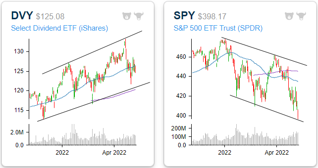
As it currently stands, the iShares Select Dividend ETF (DVY) has made up just about all of its pandemic-era underperformance versus the S&P 500 (SPY). Since the pre-pandemic highs, DVY has gained 16.9% versus a 17.9% advance for SPY, and that doesn’t even include the impact of dividends. After taking into account DVY’s higher yield (3.0 vs 1.6%), it is actually outperforming SPY during this span. Looking more closely at just 2021, DVY has outperformed SPY by 17.7 percentage points (+1.3% vs -16.3%) as investors have exited growth and into more value and income-oriented investments.

Whereas all of the major indices have entered downtrends, DVY is yet to break its uptrend. The ETF is trading well above its 200-DMA but slightly below the 50-DMA. Overall, the technical picture is relatively attractive, especially in comparison to the broader market. The following graphs are accessible through our Chart Scanner tool. Gain access to our proprietary tools by clicking here to view Bespoke’s premium membership options.

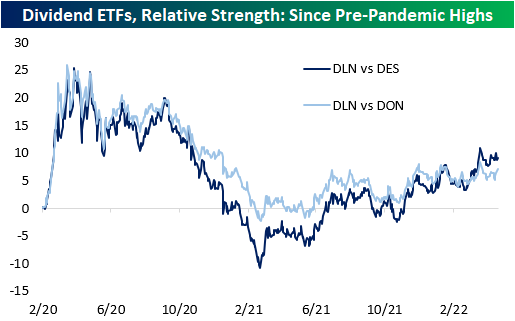
Within the high-dividend space, large caps have outperformed both mid and small caps. The WisdomTree US Large Cap Dividend ETF (DLN), the WisdomTree US Mid Cap Dividend ETF (DON), and the WisdomTree US Small Cap Dividend ETF (DES) were the funds used to compare performance across market caps. As you can see from the chart below, the larger companies that pay hefty dividends have outperformed mid-caps, and mid-caps have outperformed small caps. All three ETFs have similar yields, so the market cap discrepancies are likely more market-related.

While the average S&P 500 stock is down 11.8% on a year-to-date total return basis (median: -14.7%), the 25 highest dividend-paying stocks excluding energy (shown below) are down an average of 8.6% (median: -11.8%). Although this performance is not stellar, the average is still 320 basis points above that of the broader index. Given the recent surge in energy prices over the last year, a number of stocks in the Energy sector have seen their dividend payouts surge. Given the volatile nature of energy prices, the level of these yields may not be sustainable, so for that reason, we have left them out of this specific list.

Apr 11, 2022
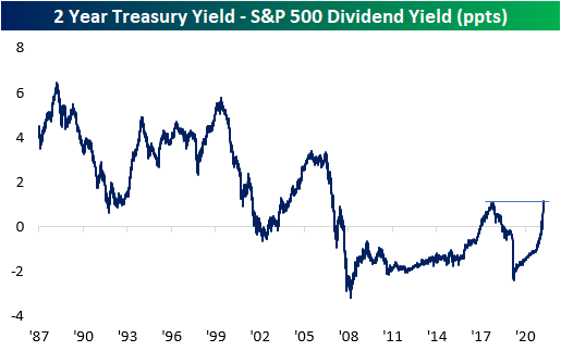
Since mid to late-2019 when interest rates really started to fall, the dividend yield on the S&P 500 consistently provided a higher yield than the two-year US Treasury. With a higher payout plus the potential for price appreciation, equities looked more attractive to many investors. The period from the Financial Crisis through 2017 also saw a similar setup where the S&P 500’s dividend yield was higher than the yield on the 2-year, but before the Financial Crisis and the FOMC’s zero-interest-rate policy, it was extremely uncommon for the S&P 500 to yield more than the two-year Treasury. This year has caused a tidal shift in the balance of power in yield between the S&P 500 and the two-year Treasury. As the Fed came to the conclusion that inflation wasn’t as transitory as originally thought and found itself behind the inflation curve, it shifted from a much more accommodative stance to one that was more biased towards tightening, and that shift resulted in one of the most rapid increases in two-year Treasury yields in decades. In the process of this spike in rates, back in February, the yield on the two-year rose back above the dividend yield of the S&P 500 for the first time since 2019.

As Treasury yields have continued to spike, the premium in yield of two-year Treasuries relative to the dividend yield of the S&P 500 reached an important milestone last Friday (4/8). As shown in the chart below, the spread between their yields widened out to 110 basis points (bps), taking out the high of 108 bps from 2018. At these levels, the spread between the two is now the widest it has been in fourteen years since the Financial Crisis. It started with long-term Treasury yields, but as the overall trend in rates has been higher, most of the Treasury yield curve is now yielding more than the S&P 500. For years now, investors have had a TINA (There Is No Alternative) relationship with the stock market, but as interest rates have shot higher, TINA is taking a backseat to BABY (Bonds Are Better Yielders). Click here to try out Bespoke’s premium research service.
