We’ve just released our weekly Sector Snapshot report (see a sample here) for Bespoke Premium and Bespoke Institutional members. Please log-in here to view the report if you’re already a member. If you’re not yet a subscriber and would like to see the report, please start a 14-day trial to Bespoke Premium now.
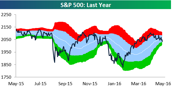
Below is our trading range chart for the S&P 500 that’s always included in the Sector Snapshot. The green area in the chart represents oversold territory for the index, and as you can see, we hit oversold levels today just barely for the first time since mid-February.
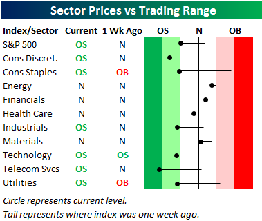
Below our chart of the S&P 500, we provide our trading range screen for the ten S&P 500 sectors. For each sector, the dot represents where it’s currently trading, while the tail end represents where it was trading one week ago. The black vertical “N” line represents each sector’s 50-day moving average. Last week at this time, two of ten sectors were overbought while just one was oversold. As of today, six sectors are oversold while none are overbought. Just three sectors remain above their 50-day moving averages — Energy, Financials, and Materials. These are the three sectors that had been performing the worst coming into 2016, and yet now they’re the sectors keeping the market afloat.
To see our full Sector Snapshot with additional commentary plus six pages of charts that include analysis of valuations, breadth, technicals, and relative strength, start a 14-day free trial to our Bespoke Premium package now. Here’s a breakdown of the products you’ll receive.