Dec 7, 2018
Our 2019 Bespoke Report market outlook is the most important piece of research that Bespoke publishes each year. We’ve been publishing our annual outlook piece since the formation of Bespoke in 2007, and it gets better and better each year! In this year’s edition, we’ll be covering every important topic you can think of dealing with financial markets as we enter 2019.
The 2019 Bespoke Report contains sections like Washington and Markets, Economic Cycles, Market Cycles, The Fed, Sector Technicals and Weightings, Stock Market Sentiment, Stock Market Seasonality, Housing, Commodities, and more. We’ll also be publishing a list of our favorite stocks and asset classes for 2019 and beyond.
We’ll be releasing individual sections of the report to subscribers until the full publication is completed by year-end. Today we have published the “Yield Curve & Fed” section of the 2019 Bespoke Report, which focuses on financial conditions, the level of the yield curve, and the stance of the FOMC heading into 2019.
To view this section immediately and all other sections, sign up for our 2019 Annual Outlook Special!
Dec 7, 2018
Our 2019 Bespoke Report market outlook is the most important piece of research that Bespoke publishes each year. We’ve been publishing our annual outlook piece since the formation of Bespoke in 2007, and it gets better and better each year! In this year’s edition, we’ll be covering every important topic you can think of dealing with financial markets as we enter 2019.
The 2019 Bespoke Report contains sections like Washington and Markets, Economic Cycles, Market Cycles, The Fed, Sector Technicals and Weightings, Stock Market Sentiment, Stock Market Seasonality, Housing, Commodities, and more. We’ll also be publishing a list of our favorite stocks and asset classes for 2019 and beyond.
We’ll be releasing individual sections of the report to subscribers until the full publication is completed by year end. Today we have published the “Economic Cycles” section of the 2019 Bespoke Report, which focuses on where we currently are in the business cycle and the likelihood of recession in the year ahead.
To view this section immediately and all other sections, sign up for our 2019 Annual Outlook Special!
Dec 7, 2018
Our 2019 Bespoke Report market outlook is the most important piece of research that Bespoke publishes each year. We’ve been publishing our annual outlook piece since the formation of Bespoke in 2007, and it gets better and better each year! In this year’s edition, we’ll be covering every important topic you can think of dealing with financial markets as we enter 2019.
The 2019 Bespoke Report contains sections like Washington and Markets, Economic Cycles, Market Cycles, The Fed, Sector Technicals and Weightings, Stock Market Sentiment, Stock Market Seasonality, Housing, Commodities, and more. We’ll also be publishing a list of our favorite stocks and asset classes for 2019 and beyond.
We’ll be releasing individual sections of the report to subscribers until the full publication is completed by year end. Today we have published the “Seasonality” section of the 2019 Bespoke Report, which looks at the historical trading pattern for US indices, sectors, and other asset classes throughout the calendar year.
To view this section immediately and all other sections, sign up for our 2019 Annual Outlook Special!
Jul 6, 2018
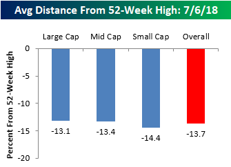
In a tweet yesterday, we noted that the S&P 500 was trading right at the exact mid-point of its 2018 closing high and closing low, putting the index about 5% below its 52-week high. While that’s a relatively modest decline, stocks in the S&P 1500, which includes large, mid, and small caps, are down an average of 13.7% from their respective 52-week highs. Before we all go and start talking about how these numbers suggest much weaker internals than the overall market averages suggest, keep in mind that not all stocks hit their own highs simultaneously with the market. Therefore, this reading is always weaker than the overall reading for the S&P 500. In fact, even when the S&P 500 was hitting highs earlier this year, the average stock in the index was down in the mid to high single-digits.
What is interesting to note about current levels is how uniform they are across each market cap range. Between the average large cap, which is down 13.1% from its high, and the average small cap, which is down 14.4%, only 1.3 percentage points separates the two. Normally the gap is much wider (with small caps usually down much more), but with small cap domestically focused stocks outperforming recently, the gap has narrowed.
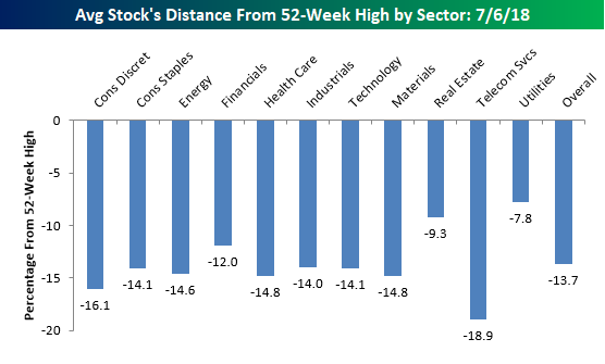
In terms of average stock declines by sector, the handful of stocks in the Telecom Services sector are down the most with an average decline of 18.9% from their respective highs. Behind that sector, you may be surprised to see that the next weakest sector based on this measure is Consumer Discretionary, where the average stock is down over 16%. Consumer Discretionary has been one of the better performing sectors this year with a gain of 11%. A lot of that strength, however, is the result of big gains in Amazon.com (AMZN) and Netflix (NFLX), which have large weightings in the market cap weighted sector performance. Among smaller cap names in the sector, the picture isn’t quite as strong.
Sectors holding up the best relative to their highs are Utilities (-7.8%) and Real Estate (-9.3%). These are the only two sectors where the average stock is down less than 10%, and that’s largely due to the fact that both sectors are defensive and not very volatile by nature. Stocks in these two sectors may well be holding up the best, but both sectors are actually underperforming the S&P 500 YTD.
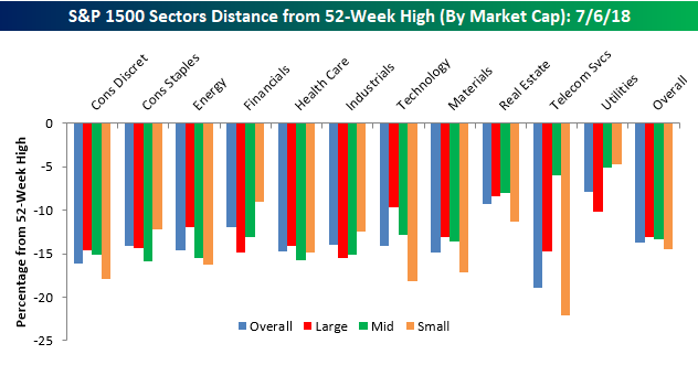
Finally, our last chart breaks down the average decline from a 52-week high by sector and market cap. Here there are some interesting divergences. We already mentioned the Consumer Discretionary sector above, but a similar dynamic is playing out in Energy, and even more so in Technology. Within the Technology sector, the average decline from a 52-week high among large caps is less than 10%, while the average decline for a small cap is more than twice that at 18.2%. Besides small cap tech, the only group weaker has been small cap Telecom Services, which is made up of just eight stocks compared to 95 for the small cap Technology sector.
While large caps are holding up a lot better than small caps in many sectors, we have seen the opposite pattern play out in the Financials sector. All we seem to hear this year is how Financials have been so weak, and while that may be true among large cap Financials which are down an average 14%+ from their highs, small cap Financials are down less than 10%.
Mar 22, 2018
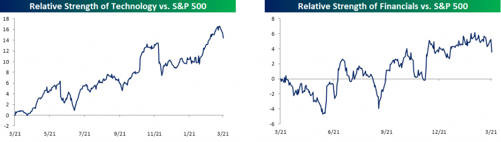
It has been a pretty nutty week for the equity market over the last four days as sectors which had been holding things up have sold off sharply, while sectors that had been left for dead have been picking up a little bit of late. The charts below show the relative strength of the S&P 500 Technology and Financial sectors. As usual, rising lines indicate that the sector is outperforming the S&P 500 and vice versa. For much of 2018, these two sectors have been outperforming the rest of the market. With the two sectors accounting for just about 40% of the entire S&P 500, their strength was enough to hold the rest of the market up. This week, that has all changed, though, as both sectors are down around 4%. For Technology, it hasn’t seen a downturn relative to the broader market that was this steep since late November, while the last decline of this magnitude for the Financial sector was in December.
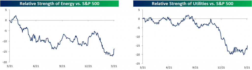
So which sectors have been picking up the slack? Well, of course, it’s the ones that everyone left for dead a few weeks ago. The charts below show the relative strength of the Energy and Utilities sectors, and in both cases, the sectors sold off sharply to start the year, but with the broader market weakness, both sectors have gotten a lift – relatively speaking. While the two have outperformed this week, they are still marginally lower.
One area of the market that has seen a big boost with all the tariff talk is small caps. Despite Trump’s “America First” policies and rhetoric, the Russell 2000 has underperformed the S&P 500 over the course of President Trump’s time in office. Ever since the President brought up the issue of tariffs, though, the Russell has rallied and is now up 3% in March compared to a 2% decline in the S&P 500.


