Aug 7, 2025
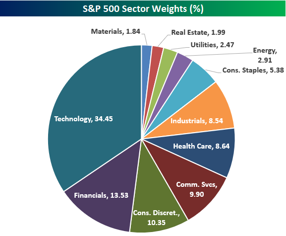
The Technology sector now has a weighting of 34.45% in the S&P 500, which is basically near record-highs only seen at the peak of the Dot Com Bubble in early 2000. Below is a pie chart showing current S&P 500 sector weights. Tech’s weighting is now more than 20 percentage points higher than Financials (13.53%), which is the second largest sector in the index.
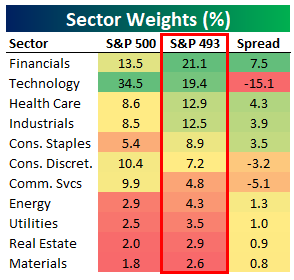
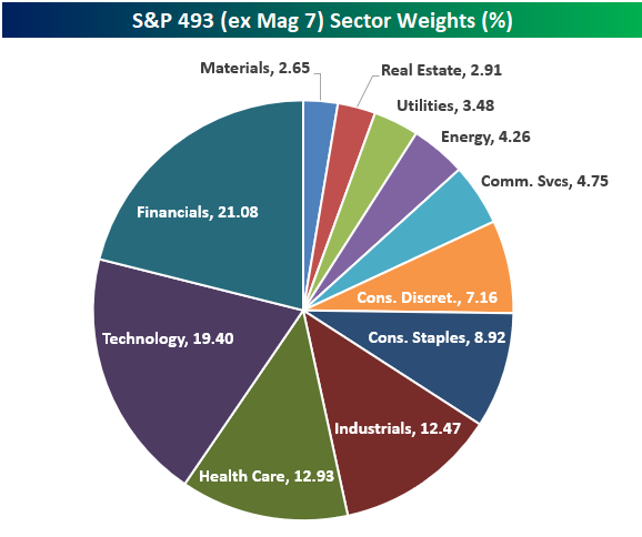
Things look significantly different if we remove the mega-cap Mag 7 stocks (AAPL, AMZN, META, MSFT, NVDA, TSLA) and only look at the “S&P 493.” As shown in the table and pie chart below, Tech is no longer the largest sector when looking at the S&P 500 ex Mag 7. Financials actually takes the top spot with a 21.1% weighting in the S&P 493. Tech moves down to second with a weighting of 19.4%, followed by Health Care (12.9%) and Industrials (12.5%) in third and fourth. Consumer Discretionary and Communication Services also become quite a bit smaller when looking at their weightings in the S&P 493. Consumer Discretionary is the 3rd largest sector in the S&P 500 at 10.4%, but it ranks as just the 6th largest in the S&P 493 at 7.2%. Communication Services sees an even bigger drop when going from the S&P 500 to S&P 493, falling from 9.9% down to 4.8%.
On the flip side, Consumer Staples jumps from the 7th largest sector in the S&P 500 to the 5th largest sector when looking at the S&P 500 ex Mag 7. Similar to how large-cap valuations look a lot less excessive when removing the Mag 7 from the equation, sector weightings also become a lot more balanced.

Dec 27, 2024
Our Bespoke Report – 2024 Recap is now available for Bespoke subscribers. This report is a must-read rundown of everything that went on across financial markets in 2024. Below is a look at some of the topics covered:
- The year in headlines
- Thematic performance
- Seasonality
- Sector performance
- Sector weightings
- Mega-caps
- Earnings triple plays
- International markets
- Earnings themes
- ETF performance matrix
You can read our 2024 Recap by signing up for our 2025 All Access Special that gets you the first two months of Bespoke Institutional access for just $20, or start a two-week trial to our Bespoke Premium plan. You can review our membership plans here to help make your decision.

Nov 25, 2024
Log-in here if you’re a member with access to the Closer.
Looking for deeper insight into markets? In tonight’s Closer sent to Bespoke Institutional clients, we look at the new highs for small caps after a drawdown that lasted three years and what that means for forward returns as well as which sectors have driven small caps (page 1). We then dive into the differences between small and large cap sector weightings with a focus on the Industrial sector (page 2), before moving on to a look at the 15 small cap industrials which have performed best since the last time the index was at a record (page 3). Finally, we preview 5 and 7 year note auctions later this week and review today’s 2 year note auction before discussing what drove the big Treasury rally today (page 4).

See today’s full post-market Closer and everything else Bespoke publishes by starting a 14-day trial to Bespoke Institutional today!
Oct 23, 2024
The rise of the “mega-caps” in recent years has caused a significant divergence in the performance of the S&P 500 — which is market cap weighted — and the S&P 500 Equal Weight index. As the mega-caps like Alphabet (GOOGL), Amazon (AMZN), Apple (AAPL), Meta (META), Microsoft (MSFT), and NVIDIA (NVDA) have pushed ever higher into multi-trillion dollar companies, their weight in the S&P 500 has ballooned to more than 25% of the index. In the S&P 500 Equal Weight index, however, where each of the 500 stocks has a 0.2% weighting after quarterly re-balancing, the six mega-caps make up just 1.2% of the index. Given these differences, it’s easy to see how the performance between a cap-weighted and equal-weighted index can diverge.
As shown below, the cap-weighted S&P 500 has posted a total return of just over 110% over the last five years compared to a gain of roughly 84% for the S&P 500 Equal Weight index. As you can see in the chart, the gap between the two didn’t really start widening until early on during this bull market in early 2023.

Anecdotally, the cap-weighted version of the S&P 500 seems to be getting all the love these days, with some calling it the perfect momentum index. Combining that recent sentiment with the very clear differences between the two indices, readers may be surprised that the longer-term performance between the two has been similar and even tilts towards the equal-weight version.
As shown below, over the last 20 years, the cap-weighted index has just recently overtaken the equal-weighted index on a total return basis, but outperformance has gone back and forth many times over this time frame.

And since 1990, the equal-weighted version of the S&P has actually been the clear winner over the cap-weighted version.
As you can see in the chart below, the Dot Com Bubble of the late 1990s pushed the cap-weighted S&P solidly above the equal-weighted version in the final years of that bubble, but the bursting of the bubble and the 2003-2007 bull market resulted in a performance shift that allowed the equal-weight index to pull ahead. While the mega-caps of today have had a leg up on the rest of the market for the past few years, an extended period of underperformance from them would allow the equal-weighted version to become en-vogue again.

Below is a look at the differences in sector weightings for the S&P 500 (cap-weighted) and S&P 500 Equal Weight indices. By default, the sectors with the largest number of stocks in the index will have the highest weightings in the equal-weight index.
While the Tech sector makes up nearly a third of the cap-weighted index, it’s only 13.7% of the equal-weight index. Industrials and Financials each have a larger weight than Tech in the equal-weight index, while they combine for a weighting that’s just 2/3 of Tech’s weighting in the cap-weighted index.
When looking at the pie charts below, it’s the equal-weight version that appears more balanced and diversified at the moment. No sector has a weighting below 4.4% in the equal-weight index, while the cap-weighted index has four sectors with weightings below 3.3%. Movements in Materials, Real Estate, Utilities, and Energy have virtually no impact on the cap-weighted index as a whole these days.

Like this content? We think you’ll love our premium equity market research. Below are two Bespoke membership options to choose from. Start a two-week trial to one of them today!
