Fixed Income Weekly – 1/8/20
Searching for ways to better understand the fixed income space or looking for actionable ideas in this asset class? Bespoke’s Fixed Income Weekly provides an update on rates and credit every Wednesday. We start off with a fresh piece of analysis driven by what’s in the headlines or driving the market in a given week. We then provide charts of how US Treasury futures and rates are trading, before moving on to a summary of recent fixed income ETF performance, short-term interest rates including money market funds, and a trade idea. We summarize changes and recent developments for a variety of yield curves (UST, bund, Eurodollar, US breakeven inflation and Bespoke’s Global Yield Curve) before finishing with a review of recent UST yield curve changes, spread changes for major credit products and international bonds, and 1 year return profiles for a cross section of the fixed income world.
In this week’s report we talk about the direct linkages between oil and interest rate markets.

Our Fixed Income Weekly helps investors stay on top of fixed income markets and gain new perspective on the developments in interest rates. You can sign up for a Bespoke research trial below to see this week’s report and everything else Bespoke publishes free for the next two weeks!
Click here and start a 14-day free trial to Bespoke Institutional to see our newest Fixed Income Weekly now!
Bespoke’s Global Macro Dashboard — 1/8/20
Bespoke’s Global Macro Dashboard is a high-level summary of 22 major economies from around the world. For each country, we provide charts of local equity market prices, relative performance versus global equities, price to earnings ratios, dividend yields, economic growth, unemployment, retail sales and industrial production growth, inflation, money supply, spot FX performance versus the dollar, policy rate, and ten year local government bond yield interest rates. The report is intended as a tool for both reference and idea generation. It’s clients’ first stop for basic background info on how a given economy is performing, and what issues are driving the narrative for that economy. The dashboard helps you get up to speed on and keep track of the basics for the most important economies around the world, informing starting points for further research and risk management. It’s published weekly every Wednesday at the Bespoke Institutional membership level.
You can access our Global Macro Dashboard by starting a 14-day free trial to Bespoke Institutional now!

Bespoke’s Morning Lineup – 1/8/20 – Futures Flat; Quiet Night?
See what’s driving market performance around the world in today’s Morning Lineup. Bespoke’s Morning Lineup is the best way to start your trading day. Read it now by starting a two-week free trial to Bespoke Premium. CLICK HERE to learn more and start your free trial.

Based on the reaction of crude oil to the events of the last week, it doesn’t appear as though investors are concerned about last night’s events. Not only is crude oil now down relative to where it was before last night’s attacks, but it has now given up almost all of its gains that followed last week’s drone strike on Iranian general Soleimani.

The Closer – Value, Real Yields, FX Rally, Factory Sales, Chinese Imports – 1/7/20
Log-in here if you’re a member with access to the Closer.
Looking for deeper insight on markets? In tonight’s Closer sent to Bespoke Institutional clients, we begin with a look at the relationship between value and momentum stocks with the yield curve. We also take a look at real yields and EMFX. Turning to economic data, we review today’s factory orders and durable goods numbers before finishing with a recap of the trade balance.

See today’s post-market Closer and everything else Bespoke publishes by starting a 14-day free trial to Bespoke Institutional today!
Chart of the Day: Time to Play Defense With Defense Stocks?
Another Iran-Related Conflict Kills a Crude Oil Rally
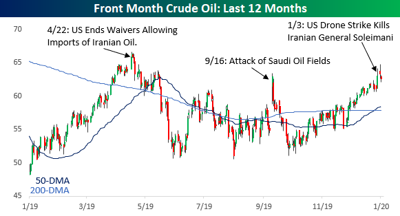
It may sound completely illogical now, but another Middle-East conflict involving Iran looks like it’s going to stop a crude oil rally in its tracks. After last Friday’s drone strike in Iraq that killed Iranian General Soleimani, crude oil prices originally surged 6% rising from $61.18 up to $64.72. Since that peak, though, prices have given up 60% of their gains and are now up just 2.4% since last Thursday’s close. While prices are still higher relative to where they were last Thursday, the current pattern is beginning to look a lot like the pattern we saw following other Iran-related issues in the Middle East over the last year.
Back in April 2019, crude oil capped off a 30% rally with a gain of 2.5% after the US announced it would end any waivers to countries importing Iranian oil. Cutting off Iranian oil from the market would cut supply which should have led to higher prices, but after that short-term move higher, prices reversed lower falling more than 20% in less than two months. In September, crude oil prices saw an even larger one-day move of nearly 15% after Saudi oil fields were attacked by what was widely believed to be Iranian drones. The rally from that attack lasted all but a day and within two weeks all of the gains (and more) were erased. The latest surge in crude oil prices also followed what was a steady uptrend (like the one in April), and like that rally, will Friday’s rally end up marking another blow-off top? Join Bespoke Premium to receive our best investment research on a daily basis. Click here to receive half off for the first three months.
Updated S&P Case Shiller Home Price Data
Below is an updated look at home price changes across the country using the most recent S&P Case Shiller home price indices. As shown, the National index rose just 10 basis points month-over-month and 3.34% year-over-year. Notably, the number of cities that saw rising and falling home prices month-over-month was evenly split at ten apiece, so we’re no longer seeing broad-based, nationwide increases like we were a few years ago. Mid-west cities like Detroit, Cleveland, and Chicago were three of the four biggest decliners month-over-month, while the West Coast and Northwest cities like Portland, San Francisco, Seattle, and San Diego all declined as well.
After seeing an epic surge in home prices for years during the current expansion, San Francisco is now the only city that is down year-over-year with a decline of 0.43%.
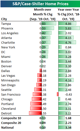
Below is a chart showing the change in home prices from their peak level at the top of the housing bubble in mid-2005. This allows you to see which areas have fully recovered from the housing crash and which have not. Denver and Dallas are both more than 50% higher now than they were at their peaks in the mid-2000s, while the National index has eclipsed its housing bubble highs by 15%.
On the downside, Las Vegas is the farthest below its prior highs at -17%, followed by Chicago at -14%, Phoenix at -13%, and Miami at -12%. DC, Tampa, and New York are the three remaining cities that have still not recovered all of their losses from the housing crash/financial crisis.

Below is a look at how much home prices have risen from their housing crash lows that were mostly reached in 2012. The National index is now up 59% from its lows, while San Francisco and Las Vegas are both up more than 110%. Remember, though, that while San Francisco has easily eclipsed its prior highs from the mid-2000s, Las Vegas is still 17% below its prior highs even though prices have more than doubled off of their post-crash lows.
On the weak side, New York home prices are up the least of any city at just 29%. (Note that the 20 cities are usually based on the city and its surrounding areas. For the New York region, it includes New York City, Long Island, the mid-and lower Hudson Valley, Newark, Jersey City, Paterson, Elizabeth, and Edison, NJ, and Bridgeport, New Haven, Stamford, Waterbury, Norwalk, and Danbury, CT.)

Below are historical charts of all the home price indices tracked by S&P Case Shiller. Cities with green shading are ones that have made new highs this cycle above their highs at the peak of the housing bubble in the mid-2000s. These indices are all indexed to 100 as of January 2000. Join Bespoke Premium to receive our best investment research on a daily basis. Click here to receive half off for the first three months.


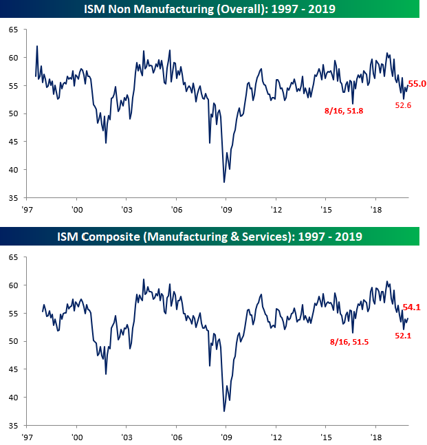
Services Sector Bounces Back
Unlike the manufacturing sector which continues to find itself stuck in contraction, the Services sector (Non Manufacturing) continues to show growth. The latest release of the ISM Services sector highlights this trend as the headline index bounced from 53.9 up to 55.0 this month versus expectations for a bounce to 54.5. If we combine this month’s Services reading with this month’s Manufacturing reading and weight them based on their share of the overall economy, the overall December ISM bounced from 53.3 up to 54.1. In the case of both the Services (first chart below) and the combined ISM readings, we have seen a nice bounce from lows last fall which threatened to take out the prior lows from 2016.
Unlike the commentary section for the manufacturing sector which was almost universally negative, commentary in the Services sector was much more positive.

Looking at trends within the December ISM Services report, breadth was skewed moderately positive on a m/m basis in this month’s report with five categories showing growth, four declining, and Prices Paid unchanged. Relative to last year, though, declines were much more widespread. Looking ahead to this Friday’s Non-Farm Payrolls report, unlike the manufacturing sector where the employment component dropped to its lowest level in nearly four years, the decline in the employment component of the Services sector was much smaller and is still comfortably in the range of growth at 55.2.
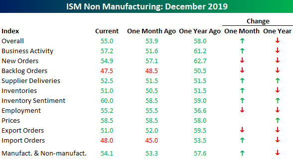
The biggest move in this month’s report, though, was in Business Activity which surged from 51.6 up to 57.2. Looking at the chart for this category over the last several months shows a volatile ride. After hitting its highest level in over a decade last February, it dropped to its lowest level since December 2009 last month but then saw a considerable bounce from 51.6 up to 57.2. Start a two-week free trial to Bespoke Institutional to access our quarterly Equity Market Pros and Cons report, economic calendar, and all of our other research tools.

Bespoke Stock Scores — 1/7/20
Bespoke’s Morning Lineup – 1/7/20 – Shaking it Off
See what’s driving market performance around the world in today’s Morning Lineup. Bespoke’s Morning Lineup is the best way to start your trading day. Read it now by starting a two-week free trial to Bespoke Premium. CLICK HERE to learn more and start your free trial.
As mentioned above, the euro has been acting well relative to the dollar in recent weeks, and that’s partly due to what has been a strong showing in economic data relative to expectations. As shown in the chart below, the currency has broken out of its downtrend relative to the dollar carving out an uptrend with closed above both its 50 and 200-DMAs. While the currency has rallied, it’s still just in the middle of its uptrend from the October lows.
