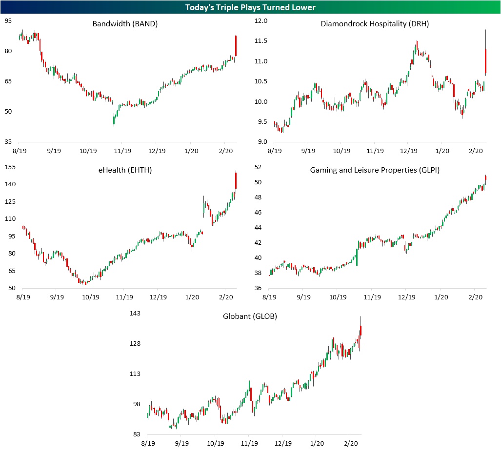
Big Week But Bad Day For Triple Plays
Even though earnings season unofficially came to a close on Tuesday with Wal-Mart’s (WMT) report and despite a shortened week due to President’s Day on Monday, this week saw the highest number of Earnings Triple Plays of any week so far in 2020. A stock reports a Triple Play when it beats EPS and revenue estimates and also raises guidance. Today alone there were five: Bandwidth (BAND), Diamondrock Hospitality (DRH), eHealth (EHTH), Gaming and Leisure Properties (GLPI), and Globant (GLOB).

Given the strong fundamental results, triple plays typically experience strong stock price reactions to earnings. On average, Triple Plays this year have gapped up 5.57% but have sold off from open to close, falling just over 1% for a full day gain of 4.43%. That compares to a full day loss of 6 bps for all stocks that have reported earnings this year. Of today’s Triple Plays, performance has been worse though only having risen 3.1% on average. But that was not the case for the entire session. The gaps up at the open were actually much stronger than normal with an average gap up of 9.9%, but broader market weakness has led these names to sell off intraday. The worst of these was Bandwidth (BAND) which is down over 11% from the open. EHTH and DRH were also notable decliners having fallen 9.13% and 5.18% since the open, respectively. Start a two-week free trial to Bespoke Institutional to access our Earnings Explorer, Triple Plays, and more.
Yet Another Corona Friday
The major indices decided it was five o’clock somewhere right off the bat today as they experience yet another “Corona Friday”. More concerns around the coronavirus have sent stocks lower with the S&P 500 down around 1.1% as of this writing and the Nasdaq down nearly 2% today. Declines on a Friday have become par for the course in 2020. Fridays have been the weakest day of the week so far in 2020; the only one to average a decline. On average, the S&P 500 has fallen 0.52% on Fridays while the next worst day has been Monday which has averaged a gain of 0.19%. Fridays have also been the day that the S&P 500 has closed higher the least. Only 28.6% of Fridays this year have seen the S&P 500 finish in the green. That compares to a positive close more than three-quarters of the time on Mondays, Wednesdays, and Thursdays. While it has averaged a gain of 0.24%, Tuesdays have also experienced a positive close less than half of the time. Try Bespoke’s premium research package for free for two weeks. Click here to start your free trial now.

Bespoke’s Morning Lineup – 2/21/20 – A Case of the Fridays
See what’s driving market performance around the world in today’s Morning Lineup. Bespoke’s Morning Lineup is the best way to start your trading day. Read it now by starting a two-week free trial to Bespoke Premium. CLICK HERE to learn more and start your free trial.
It’s looking like another negative end to a week as investors don’t want to make any major moves heading into a weekend where there’s the potential for more negative headlines related to the coronavirus. Gold is on pace for its 11th positive day in the last 12, while the 10-year yield drops below 1.5% to its lowest levels since last September.
Read today’s Bespoke Morning Lineup below for the latest on the impact of the coronavirus, the rare simultaneous rally in the dollar and gold, European economic data, and diverging performance of European equities from the perspectives of US and European investors.

US markets look set to continue their pullback from overbought levels as we close out the week. Over the last five trading days, most sectors have pulled back within their trading ranges, and in the majority of cases, we’ve seen a move from overbought to less overbought levels. Energy is the only sector below its 50-DMA (it is also the only sector that is oversold). Meanwhile, the Consumer Discretionary sector remains at extreme overbought levels, while Real Estate isn’t far behind.
Despite the lackluster market performance this week, overall US stock market performance this year yeas been strong. Energy and Materials are the only two sectors that are down YTD while five sectors are up over 5%, including Technology which is already in the double-digit percentage range, and Utilities which is up just over 9%.

The Closer – Weights Not Worrying, Five Fed, Slippery Inventories – 2/20/20
Log-in here if you’re a member with access to the Closer.
Looking for deeper insight on markets? In tonight’s Closer sent to Bespoke Institutional clients, we begin by showing why the weightings of the homebuilders and semis are not sending any worrying signals. Next, we update out Five Fed Manufacturing composite with the releases of the Philadelphia and Empire State readings. We finish tonight with a look at EIA petroleum stockpiles.

See today’s post-market Closer and everything else Bespoke publishes by starting a 14-day free trial to Bespoke Institutional today!
Bespoke’s Sector Snapshot — 2/20/20
Chart of the Day: Atlassian (TEAM) Gains Altitude
Philly Pops
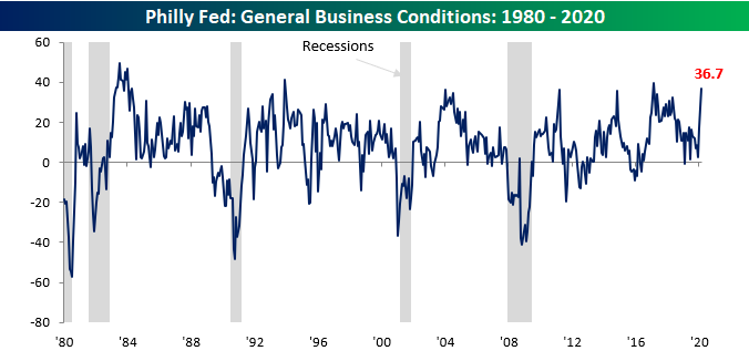
After a strong report on manufacturing in the New York area earlier this week, the Philly Fed Manufacturing report one-upped its neighbor with a blowout report. While economists were expecting a modest decline in the headline reading from 17.0 to 11.0, the actual reading came in at 36.7, more than triple expectations! This was the strongest reading for the headline index since February 2017, but before that, you have to go all the way back to December 1993 to find a stronger reading. Not only that, but relative to expectations, this month’s report was the biggest beat on record (going back to 1998).
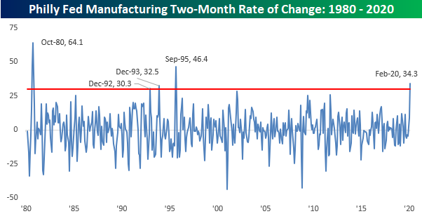
Not only was this month’s report strong, but it also followed the January report which also increased 14.6 points on a m/m basis. Combining the back to back increases together, it was the strongest two-month increase in the Philly Fed headline index since September 1995 and the third strongest two-month gain in the history of the report going back to 1980!
Breadth in this month’s report was also very positive as just two components — Prices Paid and Number of Employees — declined. Meanwhile, a number of components saw double-digit increases including New Orders, Unfilled Orders, and Inventories. When it comes to the Philly Fed Manufacturing report, they don’t get much stronger than this! Start a two-week free trial to Bespoke Institutional to access our interactive economic indicators monitor and much more.

Sentiment Stable
With the major indices little changed over the past week, sentiment readings from AAII‘s weekly investor survey likewise moved only slightly. The percentage of respondents reporting as bullish remains above 40% but pulled back slightly from 41.33% last week. The 0.73 percentage point drop was the smallest move in bullish sentiment (either positive or negative) since November 28th of last year when bullish sentiment fell only 0.6 percentage points.
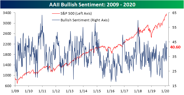
With bullish sentiment declining, respondents reporting as bearish picked up the difference rising 2.3 percentage points to 28.7%. Although up versus last week, bearish sentiment remains fairly subdued at 1.63 percentage points below the past year’s average of 30.33% and around the low end of the past several years’ range.
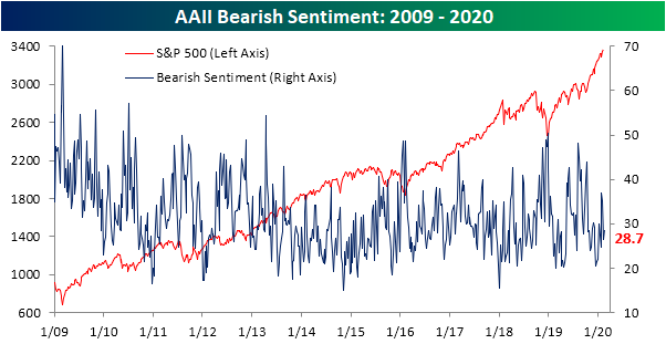
Neutral sentiment was also little changed, dropping 1.47 percentage points to 30.8%. Similar to bearish sentiment, neutral sentiment continues to come in at the low end of its range as it has averaged readings of 35.9% over the past year. This was the sixth week in a row that neutral sentiment has come in below its 52-week average; the longest such streak since a 15-week long streak ending in January of last year. Start a two-week free trial to Bespoke Institutional to access our interactive economic indicators monitor and much more.

Jobless Claims Match Expectations
Initial jobless claims totaled 210K this week, matching expectations but rising slightly from an upwardly revised 206K last week. Despite the increase, claims remain low no matter how you measure it.
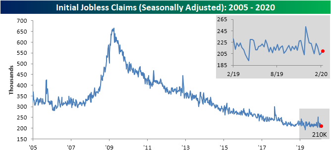
The past few weeks have seen claims come in at some of their strongest levels since the cycle low of 193K that was put in place back in April. Without a continued move to the downside though, that April low is still firmly in place. That means it has now been 44 weeks without a new cycle low in seasonally adjusted jobless claims. Looking back since the end of the Financial Crisis, that ties another 44-week long streak that came to an end in July of 2014. Given claims remain at healthy levels just off of those cycle lows, this seems to point more towards the indicator having plateaued rather than deteriorating.

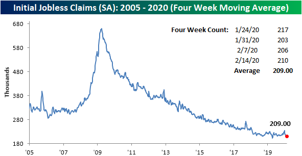
Even though claims rose this week, a higher reading of 223K rolled off of the four-week moving average which led the average to drop 3.25K. That leaves the four-week average at 209K which is the lowest reading since mid-April when it reached 206K. That was also only one week after the moving average put in its cycle low of 201.5K
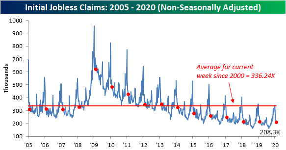
On a non-seasonally adjusted basis, jobless claims continued to decline as is seasonally normal for this time of year, falling to 208.3K. That is 2.4K lower than the comparable week last year and the lowest reading for the current week of the year for all years of the current cycle. Given this, it is also well over 100K below the average for the current week of the year since 2000. Start a two-week free trial to Bespoke Institutional to access our interactive economic indicators monitor and much more.
Bespoke’s Morning Lineup – 2/20/20 – Philly Special
See what’s driving market performance around the world in today’s Morning Lineup. Bespoke’s Morning Lineup is the best way to start your trading day. Read it now by starting a two-week free trial to Bespoke Premium. CLICK HERE to learn more and start your free trial.
Wow! That was an impressive print in the Philly Fed Manufacturing report. While economists were expecting the headline index to come in at a level of 11.0, the actual reading was more than triple that at 36.7. While the Philly Fed report tends to be volatile, this morning’s release was the strongest relative to expectations going back to at least 1998! Not only that, but the actual level of the index is also one of the strongest readings we have seen since the mid-1990s. Jobless Claims were also strong coming right in line with expectations at a level of 210K. So, how many cuts was the market pricing in?
Read today’s Bespoke Morning Lineup below for the latest on the impact of the coronavirus, the major shift in betting markets following last night’s Democratic debates, earnings data out of Europe, and the latest credit growth figures out of China.
As fears over the coronavirus start to ebb, Chinese stocks have been on a tear. Since reopening from the Lunar New Year holiday earlier this month, the Shanghai Composite has rallied more than 11% and actually closed last night above where it finished heading into the holiday. There has been a consensus among investors that the impact of the coronavirus would be transitory, but we’re not sure anyone expected all of the post-New Year declines to be erased in just three weeks!
