Bespoke’s Weekly Sector Snapshot — 8/28/25
The Bespoke 50 Growth Stocks – 8/28/25
The “Bespoke 50” is a basket of noteworthy growth stocks in the Russell 3,000. To make the list, a stock must have strong earnings growth prospects along with an attractive price chart based on Bespoke’s analysis. There were 6 changes to the list this week.
The Bespoke 50 is available with a Bespoke Premium subscription or a Bespoke Institutional subscription. With Bespoke Premium, you’ll receive a number of daily market updates from us along with our weekly newsletter and a portion of our investor tools. With Bespoke Institutional, you’ll receive everything that’s included with Premium plus additional daily macro analysis and more stock-specific research.
To see all 50 stocks that currently make up the Bespoke 50, simply start a two-week trial to Bespoke Premium or Bespoke Institutional.
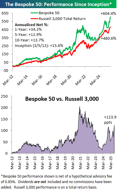
The Bespoke 50 performance chart shown does not represent actual investment results. The Bespoke 50 is updated monthly on Thursdays unless otherwise noted. Performance is based on equally weighting each of the 50 stocks (2% each) and is calculated using each stock’s opening price as of Friday morning after publication. Entry prices and exit prices used for stocks that are added or removed from the Bespoke 50 are based on Friday’s opening price. Any potential commissions, brokerage fees, or dividends are not included in the Bespoke 50 performance calculation, but the performance shown is net of a hypothetical annual advisory fee of 0.85%. Performance tracking for the Bespoke 50 and the Russell 3,000 total return index begins on March 5th, 2012 when the Bespoke 50 was first published. Past performance is not a guarantee of future results. The Bespoke 50 is meant to be an idea generator for investors and not a recommendation to buy or sell any specific securities. It is not personalized advice because it in no way takes into account an investor’s individual needs. As always, investors should conduct their own research when buying or selling individual securities. Click here to read our full disclosure on hypothetical performance tracking. Bespoke representatives or wealth management clients may have positions in securities discussed or mentioned in its published content.
Q2 2025 Earnings Conference Call Recaps: Best Buy (BBY)
Bespoke’s Conference Call Recaps use AI to summarize lengthy earnings calls. The commentary below is AI-generated and then edited by Bespoke for quality control. As always, none of these summaries should be construed as recommendations to buy or sell any securities, and investors should do their own research and/or consult with a financial professional before making any investment decisions.
Our latest recap available to Bespoke subscribers covers Best Buy’s (BBY) Q2 2026 earnings call.
![]()
Best Buy (BBY) is the largest specialty retailer of consumer electronics in North America, offering everything from laptops, gaming consoles, and mobile phones to home theater systems and appliances. The company operates as a true omnichannel player, blending its digital presence with a nationwide store network where 45% of online orders are picked up in-store. Best Buy is notable for its deep vendor partnerships with tech leaders like Apple, Microsoft, Samsung, and Nintendo, as well as new collaborations like IKEA. Its scale, Geek Squad services, and immersive in-store showcases make it a unique lens into consumer tech adoption and spending habits across households. Sales rose 1.6% to $9.4B, with EPS of $1.28 and comps up 1.6%, driven by strong gaming (Switch 2 launch) and record laptop sales, the best Q2 volume in 15 years. Online sales grew to 33% of domestic revenue, while deal-focused consumers continued to anchor around big promotional events. Best Buy launched its third-party marketplace, tripling mobile accessories and expanding into new categories, and rolled out AI-powered search ahead of the holiday season. Tariffs remain a manageable headwind as sourcing shifts away from China. Home theater and appliances lagged, but are being addressed with sharper pricing and faster fulfillment. BBY shares fell as much as 8.9% from the open on 8/28, despite better-than-expected results…
Continue reading our Conference Call Recap for BBY by becoming a Bespoke Institutional subscriber. You can sign up for Bespoke Institutional now and receive a 14-day trial to read our newest Conference Call Recap. To sign up, choose either the monthly or annual checkout link below:
Q2 2025 Earnings Conference Call Recaps: CrowdStrike (CRWD)
Bespoke’s Conference Call Recaps use AI to summarize lengthy earnings calls. The commentary below is AI-generated and then edited by Bespoke for quality control. As always, none of these summaries should be construed as recommendations to buy or sell any securities, and investors should do their own research and/or consult with a financial professional before making any investment decisions.
Our latest recap available to Bespoke subscribers covers CrowdStrike’s (CRWD) Q2 2026 earnings call.
![]()
CrowdStrike (CRWD) is a cybersecurity company best known for its Falcon platform, which provides endpoint protection, cloud security, identity defense, and next-gen SIEM solutions. Its technology combines real-time threat intelligence, AI-driven analytics, and managed detection to stop breaches at scale. CrowdStrike serves enterprises across industries, from Fortune 500s to SMBs, with a growing partner ecosystem that includes Amazon, NVIDIA, and managed service providers. CrowdStrike’s Q2 was defined by acceleration: record net-new ARR of $221M pushed total ARR to $4.66B (+20% YoY), ahead of expectations. Demand was fueled by AI security concerns, with management highlighting adversaries using GenAI and positioning CrowdStrike as the leader in securing AI models, workloads, and identities. Charlotte AI, its autonomous SOC analyst, grew more than 85% sequentially, while Next-Gen SIEM (Security Information and Event Management) ARR surged 95% YoY, bolstered by the announced acquisition of Onum for real-time data pipeline detection. Identity protection, now extending to non-human and AI agents, topped $435M ARR, and cloud security surpassed $700M ARR (+35%). Falcon Flex licensing continued to gain traction, with early re-Flex deals driving about 50% ARR uplift. Partnerships with Amazon, NVIDIA, and MSSPs further supported platform adoption. CRWD shares fell 7.25% after hours on 8/27, but rebounded 12.5% from the low on 8/28…
Continue reading our Conference Call Recap for CRWD by becoming a Bespoke Institutional subscriber. You can sign up for Bespoke Institutional now and receive a 14-day trial to read our newest Conference Call Recap. To sign up, choose either the monthly or annual checkout link below:
AI Earnings Lead to Record Gains
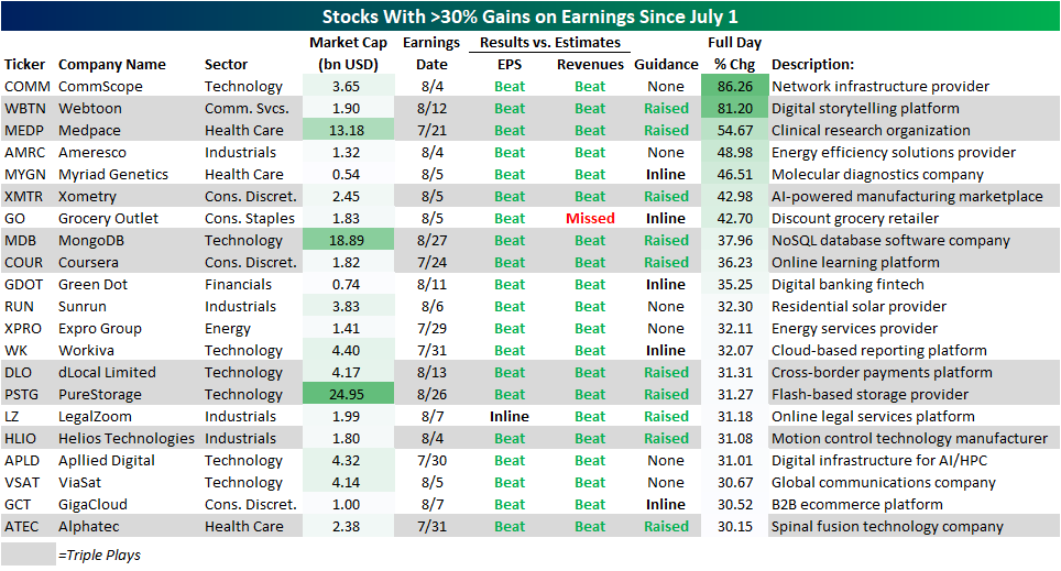
Earnings season is now more or less in the rearview, especially after the final mega-cap result released after yesterday’s close—that is NVIDIA (NVDA). As one of the most prolific AI players, NVDA is trading modestly lower in response to decelerating growth reported in its results. Elsewhere in the AI space, this earnings season (or more specifically, this week) has seen enormous moves on earnings. As we discussed in The Closer last night, earnings results of our AI Basket members have been generally positive, although stock price reactions have not been overwhelmingly positive. With that said, a few names have experienced explosive moves on earnings. PureStorage (PSTG) reported a triple play last night as the company is realizing revenues from a recent deal with Meta Platforms (META). In response, the stock surged over 30% in Thursday’s session. That’s good enough for the stock’s largest single-day gain in the nearly 10 years since it hit the public markets. Just prior to PSTG results, Tuesday night saw a triple play come from database software maker MongoDB (MDB). We covered the earnings call in yesterday’s Conference Call recap, and that release highlighted substantial growth in its Atlas cloud database in large part thanks to enterprise usage of AI. Like PSTG, MDB experienced a record daily gain after that earnings Triple Play. As for the long-term charts, the two stocks’ recent moves are in the context of opposite trends. For PSTG, the jump on earnings brings it to new highs, re-establishing what has been a multi-year uptrend. Meanwhile, MDB has made a series of lower highs since late 2021, albeit things could have been worse as there have been no lower lows made since the late 2022 bottom.

Using data from our Earnings Explorer Tool, below we show the stocks that have risen the most on earnings since the start of the quarter. Each of these names rallied at least 30% in response to quarterly results and those include PSTG and MDB. In fact, those two stocks were the largest market caps on this list, with the next largest stock being Medpace (MEDP), which rose an astounding 54.7% after its late July report. Apart from PSTG and MDB, AI-adjacent businesses were a theme in other big gainers such as CommScope (COMM), Xometry (XMTR), and Applied Digital (APLD).

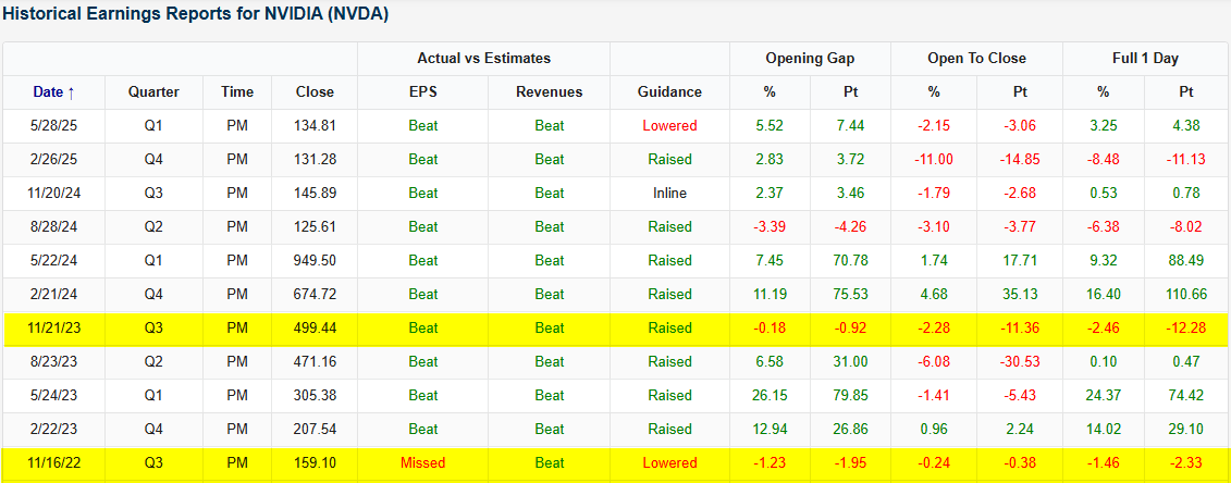
Q2 2025 Earnings Conference Call Recaps: NVIDIA (NVDA)
Bespoke’s Conference Call Recaps use AI to summarize lengthy earnings calls. The commentary below is AI-generated and then edited by Bespoke for quality control. As always, none of these summaries should be construed as recommendations to buy or sell any securities, and investors should do their own research and/or consult with a financial professional before making any investment decisions.
Our latest recap available to Bespoke subscribers covers NVIDIA’s (NVDA) Q2 2026 earnings call.
![]()
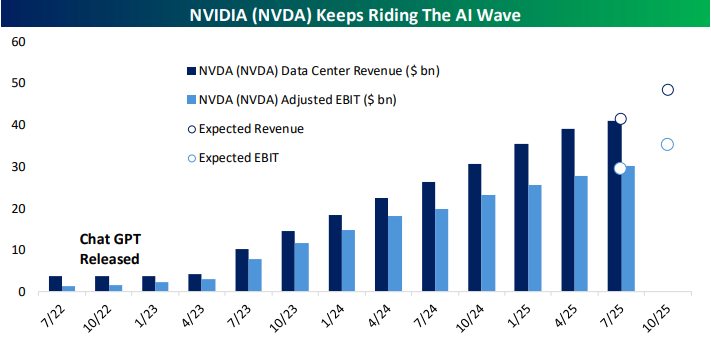
NVIDIA (NVDA) is the global leader in accelerated computing, best known for its GPUs that power artificial intelligence, gaming, data centers, and increasingly robotics and autonomous systems. The company develops full-stack platforms that span hardware, software, and networking, giving it unmatched influence over the direction of AI infrastructure. Its chips support everything from generative AI model training to enterprise cloud workloads, while its gaming and professional visualization products serve millions of consumers and businesses worldwide. The company posted record revenue of $46.7B, driven by 56% YoY growth in data center sales. The star was the Blackwell GB300 platform, now ramping at 1,000 racks per week with 10x inference efficiency and broad adoption from OpenAI, Meta, and others. CEO Jensen Huang emphasized the explosive shift to “reasoning” and “agentic” AI, which can require 100x more compute than one-shot models and is fueling demand for robotics and physical AI. Networking revenue nearly doubled YoY to $7.3B, led by InfiniBand and Spectrum-X. Rubin, NVIDIA’s next-gen platform, remains on track for 2026. Geopolitics remain a headwind, with H20 shipments to China dependent on US licensing. Shares were down as much as 3.1% in after-hours trading on 8/27 after posting better-than-expected EPS and revenue results…
Continue reading our Conference Call Recap for NVDA by becoming a Bespoke Institutional subscriber. You can sign up for Bespoke Institutional now and receive a 14-day trial to read our newest Conference Call Recap. To sign up, choose either the monthly or annual checkout link below:
A Small Cap in a Big Cap’s Clothing
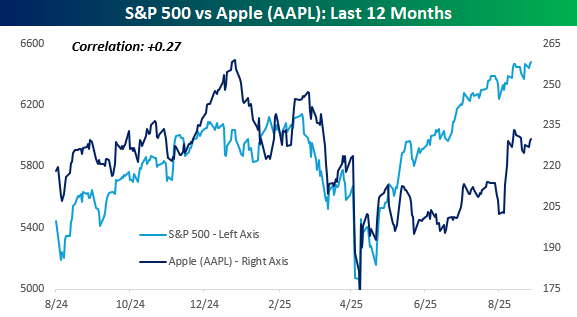
Remember back in the day when Apple (AAPL) was the largest company in the world, and you would always hear the phrase, “As goes AAPL, so goes the market”? It was a comment that usually came from bears at times when AAPL’s stock was weak, and they used it as a justification for their bearish sentiment. Reality showed that while AAPL was a large share of the entire market, there were several times when the stock faltered, and the broader market remained strong, and vice versa.
AAPL is no longer the largest company in the world and now trails both Nvidia (NVDA) and Microsoft (MSFT) in terms of market cap, which further illustrates the point that the market can rally without AAPL. Just like with AAPL, the market can rally without NVDA and/or MSFT, too. It can also fall at times when those stocks rally. With a market cap of over $3 trillion, AAPL is still a significant part of the S&P 500, but the two can still move independently of each other. The last 12 months are a perfect example.
The chart below compares the performance of AAPL versus the S&P 500 over the last year. While the two traded in similar directions late last year, their paths haven’t been very similar in 2025. AAPL hasn’t closed at a record high since late December, while the S&P 500 is on pace today for its 20th record close of the year. Also, back in February, when the S&P 500 was making new highs, AAPL topped out with a lower high. In the rally off the April lows, as well, the S&P 500 surged, but from mid-May through early August, AAPL moved sideways. As a result of their divergent paths, the correlation between the closing prices of AAPL and the S&P 500 over the last year has been just +0.27.
Where things really get interesting is when you compare the performance of AAPL versus the Russell 2000 over the last year. AAPL may be the third-largest stock in the world, but it has tracked the performance of the Russell 2000 much more closely than the S&P 500. Don’t take our word for it, just look at the chart. While the correlation between AAPL and the S&P 500 over the last year has been just 0.27, with the Russell 2000, it has been +0.66!
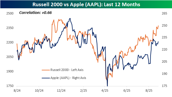
Whether AAPL trades more like a small cap than a large cap can be debated, but what about AAPL itself? After trading in a sideways range from late March through early August, AAPL finally broke out of that range just over two weeks ago and broke its downtrend from last December’s high in the process. Immediately after that breakout, the stock tested those breakout points, and provided those levels hold in the days ahead, you probably won’t be hearing that the market can’t rally without AAPL much in the weeks ahead.
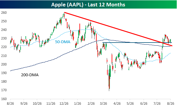
Chart of the Day: Unusual Occidental (OXY)
Bespoke’s Morning Lineup – 8/28/25 – NVDA Comes and NVDA Goes
See what’s driving market performance around the world in today’s Morning Lineup. Bespoke’s Morning Lineup is the best way to start your trading day. Read it now by starting a two-week trial to Bespoke Premium. CLICK HERE to learn more and start your trial.
“There is nothing more frightful than ignorance in action.” – Johann Wolfgang von Goethe

Below is a snippet of commentary from today’s Morning Lineup. Start a two-week trial to Bespoke Premium to view the full report.
It’s another quiet morning in the markets despite what has been a busy overnight session for earnings. Of the 33 companies that reported since the close yesterday, just six missed EPS forecasts. On the geo-political front, there have been some ripples as Mexico announced that it will increase tariffs on Chinese imports, while Japan’s trade representative has cancelled a planned trip to the US, which will further delay trade negotiations. Regarding the Fed, the only speaker on the calendar today is Governor Waller after the close.
The economic calendar is busy this morning. Q2 revised GDP came in at 3.3% vs forecasts for 3.1% while Personal Consumption and the GDP Price Index were right in line with forecasts. Initial Jobless Claims came in at 229K, which was 1K lower than estimates. Continuing Claims, which have been drifting higher lately, also came in lower than expected at 1.954 million versus forecasts for 1.966 million.
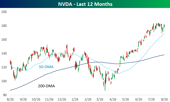
We made it through NVDA’s earnings report. The world’s largest publicly traded company released an uneventful earnings report last night, and while results were better than expected, that hasn’t been enough this earnings season to provide a meaningful boost to a stock’s price. In pre-market trading, NVDA is trading down less than 2%, which is basically a rounding error relative to the stock’s historical reaction to earnings. Over the last 25 years, NVDA’s average one-day reaction to earnings has been a gain or loss of just under 8%. Since the launch of ChatGPT, there have only been two other quarters out of 11 where the stock gapped up or down less than 2% in reaction to earnings, and today will likely be the third time in the last 12. For more than a week, all we heard about was the importance of NVDA’s earnings report and what it would mean for the market. Well, NVDA earnings came, and NVDA earnings went, and the most hyped earnings report in weeks has ended up being a non-event.
NVDA came into last night’s earnings report in a bit of a holding pattern after hitting record highs a couple of weeks ago. The stock has been gradually trending lower in the short term, but remains above its 50-DMA, so provided the stock doesn’t experience a significant move during the trading session, today’s action and last night’s report will have no impact on the stock’s technical picture.
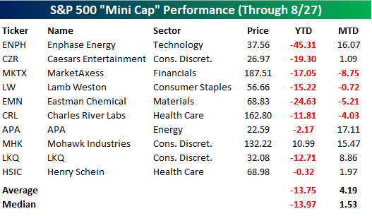
There’s been a lot of talk over the last several weeks regarding rotation within the market, but strength at the top has been consistent. The ten largest stocks in the S&P 500 are up an average of 3.94% (median: 3.64%) so far this month, and just three are in the red. On a YTD basis, the ten stocks are up an average of 12.40% (median: 9.48%), and only two are down.
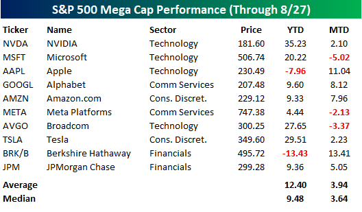
At the other end of the market cap spectrum within the S&P 500, the ten smallest stocks in the index are slightly underperforming the ten largest stocks this month on an average basis but outperforming on a median basis. Where the big discrepancy shows up is in the YTD column, where the average performance has been a decline of 13.75%, or a performance gap of more than 26 percentage points!
The Closer – Crude Market Checkup, AI Earnings – 8/27/25
Log-in here if you’re a member with access to the Closer.
Looking for deeper insight into markets? In tonight’s Closer sent to Bespoke Institutional clients, after a bit more commentary on the situation surrounding Fed Governor Cook, we review the latest earnings including results from NVIDIA (NVDA) (page 1). We then review crude oil markets (pages 2 – 4) before closing out with a rundown on overall earnings results for AI stocks (page 5).
See today’s full post-market Closer and everything else Bespoke publishes by starting a 14-day trial to Bespoke Institutional today!