Testing Testing Testing
We have recently begun publishing a daily look at state by state metrics for the COVID-19 outbreak that includes both the total number and day over day increases in the number of confirmed cases, deaths, and tests performed. In addition to the actual numbers, each day we also include a look at these metrics on a per capita basis to better highlight which states are doing the best and worst. This daily snapshot provides a very useful tool to stay on top of the latest trends in the pandemic.
Through the end of March, there have been a total of 183,935 confirmed cases of the COVID-19 virus, and of those, there have been 3,727 deaths. Looking just at those numbers, a 2% fatality rate is a very scary number. Almost everyone agrees, however, that the actual number of COVID-19 cases in the United States is probably much higher. The only question is how many more cases are out there? Right now, unless you are a celebrity or an athlete, it seems that you can only get tested if you are showing symptoms or you have been in close contact with someone who has been confirmed to have it. Therefore in order to get a better idea on the scope of the outbreak, testing has to become much more widespread and focus not just on suspected cases, but also on randomized samples.
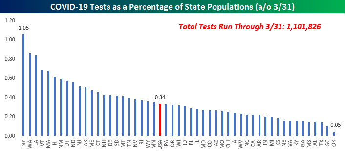
While there has been a significant improvement compared to a few weeks ago, the pace of testing in the US still has a lot of room for improvement. In the entire United States, we have only just surpassed a total of one million tests which represents just 0.34% of the population. The chart below shows a rundown of testing as a percentage of each state’s population. New York currently leads the way with over 205K tests, representing just over 1% of its population. Other states with per capita testing at the high end of the range include Washington, Louisiana, Vermont, and Massachusetts. On the downside, Oklahoma is right on the bottom of the list with just 0.05% of its population having been tested. One notable state where testing has been low is in California. While it was one of the first states to feel the outbreak, only 0.22% of its population has been tested. One of the major factors that will drive when Americans can get back to some sense of normalcy in their lives is to find out how widespread the COVID-19 outbreak has been in terms of who has or has already had it, but until there are some major improvements in the pace of testing, that’s going to be a hard trend to get a grasp of. Start a two-week free trial to Bespoke Premium to see our list of “Stocks for the COVID Economy.”
Q1 2020 Country Stock Market Performance (Local Currency)
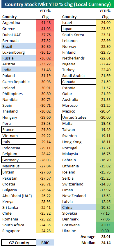
Below is a snapshot of year-to-date country stock market returns through the first quarter of 2020, all in local currency. Of the 72 countries shown, the average year-to-date change is -23.91%, with only one of 72 in the green. A total of 68 out of 72 countries are down more than 10%, while 53 of 72 are down more than 20%.
Investors in the Ukraine are the only ones in the world that can say their stock market is in the black year-to-date. It’s up 0.30%.
On the downside, Argentina and Greece have fallen the most at -40%+, while another 14 are down 30%+. Three of the four BRIC countries are down at least 30% — Brazil, Russia, and India. China is the only BRIC country not down 30%, and in fact, it is one of the best-performing countries year-to-date with a decline of only 10%.
Looking at the major G7 countries, Europe has been hit the hardest with France, Italy, Germany, and the UK all down more than 27.5%. The US is the top-performing G7 with a decline of 20%, while Japan is down 23.6% and Canada is down 21.6%. Start a two-week free trial to Bespoke Premium to see our list of “Stocks for the COVID Economy.”
US Equity Index ETFs at the Start of Q2 2020
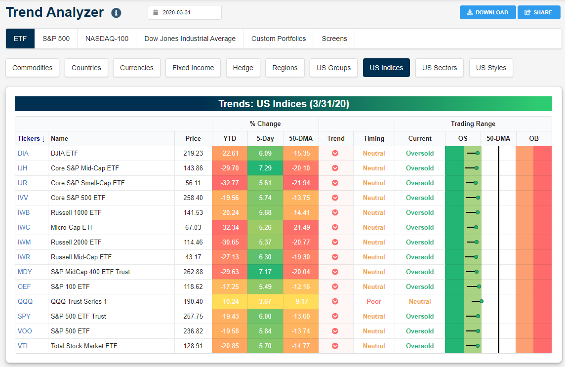
Below is a snapshot of major US equity index ETFs from our Trend Analyzer tool available to Bespoke members. Every ETF in this group was down 10% or more in the first quarter, with the Nasdaq 100 (QQQ) down the least at -10.24%. Small-caps (IJR, IWM) and micro-caps (IWC) were the worst performers in Q1 with declines of more than 30%. The S&P 500 (SPY) was down 19.4% in Q1 while the Dow 30 (DIA) was down 22.6%.
Notably, every single major index ETF is now in a long-term downtrend based on our “Trend” scoring system. All but one are trading in oversold territory, which means they’re more than one standard deviation below their 50-day moving averages. QQQ is the only ETF in the group that didn’t end the first quarter of 2020 at oversold levels.
Over the last five days, these ETFs are up 5%+ pretty much across the board. The only exception is the Nasdaq 100 (QQQ), which is up just 3.7% over the last week. As bad as things look now, they were actually a lot worse a week ago. Start a two-week free trial to Bespoke Premium to see our list of “Stocks for the COVID Economy.”
Bespoke’s Morning Lineup – 4/1/20 – In Like a Bear…
See what’s driving market performance around the world in today’s Morning Lineup. Bespoke’s Morning Lineup is the best way to start your trading day. Read it now by starting a two-week free trial to Bespoke Premium. CLICK HERE to learn more and start your free trial.
Happy April Fool’s Day. If only the picture of the futures market right now were a prank, but those numbers are real (at least for now). After a month-end rally tied to rebalancing, US futures are kicking off the new quarter on a down note as comments from the President last night that his administration now expects 100K – 240K deaths from the COVID-19 outbreak under a best-case scenario has really spooked investors. While those estimates are no doubt concerning, we would reiterate the point we have been making for some time now that the headlines are going to get a lot worse in the days and weeks ahead, so this shouldn’t be a major surprise.
Read today’s Bespoke Morning Lineup for a discussion of the latest trends and statistics of the outbreak, overnight moves in the market, and our updated state by state summary of the latest COVID-19 trends in the United States. One notable trend of the summary is that in the state of New York, 1% of the entire population has now been tested.

The S&P 500 is poised to open down over 3.5% this morning and if those numbers hold through the close it would be the 2nd worst start to a quarter in the history of the S&P 500. The only one that was worse was the first trading day of 1932 when the S&P 500 kicked off the quarter with a decline of 6.9%. The only other quarter besides that where the S&P 500 declined more than 3% was in October 1998 during the Russian debt crisis and the collapse of the hedge fund Long-Term Capital Management.
Hopefully, this quarter’s weak start isn’t a sign that we’re in for more of the same in Q2 as we saw in Q1 and March. For starters, the S&P 500’s average daily change during the month of March was 4.8% which ranks as the most volatile month in the history of the S&P 500 (first chart)! Second, with a decline of 20% during the quarter, the S&P 500 had its worst quarter since Q4 2008 and just the 9th 20%+ decline on record (second chart).


Bespoke’s Global Macro Dashboard — 4/1/20
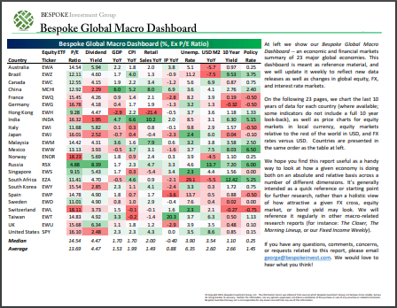
Bespoke’s Global Macro Dashboard is a high-level summary of 22 major economies from around the world. For each country, we provide charts of local equity market prices, relative performance versus global equities, price to earnings ratios, dividend yields, economic growth, unemployment, retail sales and industrial production growth, inflation, money supply, spot FX performance versus the dollar, policy rate, and ten year local government bond yield interest rates. The report is intended as a tool for both reference and idea generation. It’s clients’ first stop for basic background info on how a given economy is performing, and what issues are driving the narrative for that economy. The dashboard helps you get up to speed on and keep track of the basics for the most important economies around the world, informing starting points for further research and risk management. It’s published weekly every Wednesday at the Bespoke Institutional membership level.
You can access our Global Macro Dashboard by starting a 14-day free trial to Bespoke Institutional now!
The Closer – The End of the Beginning or the Beginning of the End? – 3/31/20
Log-in here if you’re a member with access to the Closer.
Looking for deeper insight on markets? In tonight’s Closer sent to Bespoke Institutional clients, we recap the S&P 500’s worst and most volatile quarter on record before reviewing today’s consumer confidence numbers from the Conference Board. We then take a look at equities’ inability to move above their 50-DMAs. Next, we look at quarterly BEA data on the net international investment position of the US and the latest in the Fed’s liquidity provisions. Looking to tomorrow, we close out tonight’s note with the typical intraday pattern of the first day of the new quarter.

See today’s post-market Closer and everything else Bespoke publishes by starting a 14-day free trial to Bespoke Institutional today!
Daily Sector Snapshot — 3/31/20
B.I.G. Tips — Market Performance After Big Down Months, Quarters
Chart of the Day: Streaks of Oversold Readings
Bespoke Market Calendar — April 2020
Please click the image below to view our April 2020 market calendar. This calendar includes the S&P 500’s average percentage change and average intraday chart pattern for each trading day during the upcoming month. It also includes market holidays and options expiration dates plus the dates of key economic indicator releases. Start a two-week free trial to one of Bespoke’s three research levels.
