B.I.G. Tips – All 10 Sectors Back Above Their 200-DMAs
Netflix (NFLX) Down Big on Earnings
Start a 14-day no obligation free trial to get the full Bespoke research experience.
Netflix (NFLX) is down 11% today after reporting stronger-than-expected earnings but lowered guidance for international subscriber estimates. Notably, NFLX has averaged a move of +/-13.8% on its earnings reaction days throughout its history as a public company, so today’s 11% decline is actually less volatile than normal. Using our Interactive Earnings Report Database, we pulled all earnings reaction day drops of 5%+ for NFLX. Since 2002 when NFLX went public, the stock has experienced 5%+ drops following earnings 24 times! That’s pretty amazing when you think about how well this stock has done over the years. If you owned the stock and then sold it following any of these big one-day drops on earnings due to quarterly numbers that investors obviously interpreted negatively, you likely missed out on big gains. As recently as October 2014, the stock dropped 20% in reaction to its Q3 2014 numbers, but since that day the stock is up 100%+. Plenty of investors that loved the company heading into that earnings report got spooked and sold after the 20% drop.
In the table below, we show the 24 prior quarters where NFLX fell 5%+ on its earnings reaction day. We also show how the stock performed on the day after the big drop, over the next week, month, and three months as well. At the bottom of the table, we show NFLX’s average and median change over all four time periods. As shown, NFLX has typically bounced back in the weeks and months after big earnings drops. That’s not surprising given the stock’s upward trajectory over the years, but median returns following big earnings drops have been even stronger than median returns over any given one-day, one-week or one-month period for the stock. The only time frame where the stock has underperformed on a median basis is over the following three months (8.22% vs 13.62%).
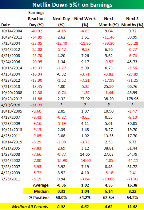
Chart of the Day – MMSI Merits Attention
Bespoke CNBC Appearance (4/19)
Bespoke’s Paul Hickey appeared on CNBC’s Squawk Box this morning to discuss the current market set-up heading into the peak period of earnings season. To view the segment, please click on the image below.

Housing Starts and Building Permits Miss By a Mile
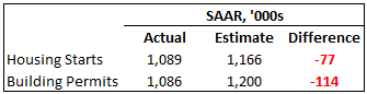 This morning’s monthly data on Housing Starts and Building Permits showed widespread weakness in terms of the actual readings and relative to expectations. As shown to the right, starts missed expectations by 77K on a SAAR rate and declined 8.8% m/m. Building Permits missed expectations by an even wider amount (-114K) and fell 7.7% m/m. Looking back at recent releases of these indicators, the magnitude of the miss in Housing Starts wasn’t a huge outlier, but the miss in Building Permits was the largest since at least 2002. While some of the weakness in this month’s report may have been the result of give-back after warm weather in the winter months allowed more projects to break ground earlier and prior data was revised higher, there is no other way to categorize today’s report as being anything but weak.
Looking at the long range charts below, Housing Starts are still comfortably in the middle of the range they have been in since early 2015. For Building Permits, the trend is less positive. After making a lower high in November, this month’s reading took out the prior low from September.

The table below shows the m/m and y/y change in Housing Starts and Building Permits by size of unit and on a regional basis. With the exception of the Northeast, every other sequential reading was negative in March. On a y/y basis, however, most readings are up. In the case of both starts and permits, the y/y readings for single-family units are up by double-digit rates while multi-family readings are both negative.
ETF Trends: US Sectors & Groups – 4/18/16
Chart of the Day: Dow “Golden Cross” Upcoming
The “Golden Cross” is a technical term (as in stock market technicals) used to describe the 50-day moving average crossing above the 200-day moving average as both moving averages are rising. That last part about “both moving averages rising” is key because instances where the 50-day crosses above the 200-day when the 200-day is still falling occur quite a bit (the last occurred this past December), and they don’t qualify as a “Golden Cross”.
Right now the Dow Jones Industrial Average’s 50-day and 200-day moving averages are indeed both rising, and within a day or two, its 50-day is going to cross back above its 200-day, marking the first “Golden Cross” for the index since January 3rd, 2012. If you follow financial media in the coming days, you’ll likely hear about this nifty-named technical formation that is supposed to be bullish, but is it actually bullish? We analyzed historical “Golden Crosses” for the Dow in today’s Chart of the Day, which you can read by signing up for one of our membership levels below. Click here for a quick look at what you get with each membership level.
Newsletter Annual – $316/yr (20% off)
Newsletter Monthly – $39/mo (20% off)
Premium Annual – $795/yr (20% off)
Premium Monthly – $79/mo (20% off)
Institutional Annual – $1595/yr (20% off)
Institutional Monthly – $155/mo (20% off)
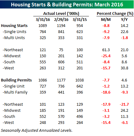
B.I.G. Tips – Russell 2000 Back Above 200-Day Moving Average
After starting off the day on a down note, US equities have rebounded early on with all the major averages now in the green on the day. If the rally holds, the small cap Russell 2000 index is poised to close above its 200-day moving average for the first time since last August.
In a B.I.G. Tips report just sent to Bespoke Premium and Bespoke Institutional members, we looked at prior periods where the Russell 2000 broke an extended streak of closes below its 200-DMA and summarized how the index performed going forward.
See the full B.I.G. Tips report by signing up for a monthly Bespoke Premium membership now. Click this link for a 10% discount ($89/month).
Bespoke Stock Seasonality: 4/18/16
Bespoke’s Country Trading Range Screen
Start a 14-day no obligation free trial to get the full Bespoke research experience.
Below is a look at our trading range screen for 30 country ETFs heading into the open this Monday morning. For each country, the dot represents where its stock market is currently trading relative to its normal range, while the tail end represents where it was trading one week ago. The black vertical “N” line represents each ETF’s 50-day moving average, while the red and green zones represent overbought and oversold territory.
As you can see, equity markets across the globe are similarly positioned at the moment. Outside of a few countries like Indonesia, Taiwan, Thailand and Vietnam, nearly all of the ETFs shown are trading in the light red zone, which is overbought territory, but not excessively so. Most have upside momentum heading into the new trading week as well, as is evidenced by the dots trading to the right of the tails. This means prices have moved higher within their respective trading ranges over the last week.
