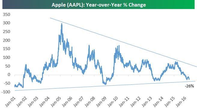
Apple (AAPL) Year-Over-Year Return Dips to -26%
Start a 14-day no obligation free trial to see Bespoke’s premium market research.
After today’s post-earnings drop of 6%+, Apple (AAPL) is now down 26% over the last year. Below is a chart showing Apple’s year-over-year percentage change since 2001. As you can see, in the post-iPhone era, the stock has only had two other periods where it dipped into negative territory on a year-over-year basis. One was during the Financial Crisis (market related) and the other was in late 2012/early 2013 (company specific).
If you believe in Apple long-term, these dips haven’t lasted very long, but it’s also worth noting that year-over-year gains following the dips have gotten smaller and smaller. Given its market saturation in smartphones, the days of Apple as a “growth stock” are over. The only way for Apple to kick-start things again is through acquisitions or the “new products” category. They’ve done it before, and they can do it again, but for now, Apple is a “show me” stock. As in “show me” the path for growth going forward.
While Apple (AAPL) is no longer a growth stock, that doesn’t mean it’s not worth owning of course. Even though it’s the largest company in the world, its relative valuation is extremely attractive, and yesterday’s dividend hike gives it a yield that’s higher than the yield of the S&P 500 and the 10-Year Treasury Note.
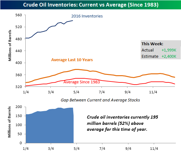
Crude Oil Inventories Rise Less Than Expected
We had to adjust the y-axis again. Crude oil increases for the latest week rose less than expected rising by 1.999 million barrels compared to estimates for an increase of 2.4 million. While the build in stockpiles was less than expected, it still represents a multi-decade high in inventories. As shown in the chart below, stockpiles are now 195 million barrels above their historical average for this time of year relative to the last ten years. While crude oil inventories have been steadily increasing in the last few weeks, seasonal factors would suggest that stockpiles should begin their seasonal drawdown in early May.
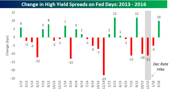
High Yield Spreads on Fed Days
While many readers tend to focus on how equities perform on Fed days, we wanted to take a slightly different approach this morning and look at what impact Fed days have had on the high yield debt market. High yield debt and equities tend to trade in similar directions, so even if your main focus is on equities, you should have an understanding of how the high yield market reacts to the Fed. The top chart below shows the move in spreads on high yield debt relative to treasuries on the day of FOMC meetings since the start of 2013.
The top chart below shows the move in spreads on high yield debt relative to treasuries on the day of FOMC meetings since the start of 2013. When spreads increase, it indicates that investors are becoming more risk-averse (demanding more yield relative to treasuries), while tighter spreads indicate less risk aversion. In the 26 Fed meetings since the start of 2013, high yield spreads have tightened on the day of an FOMC policy announcement 15 times for an overall median decline of 1 basis point. In the chart, we have also highlighted the one meeting where the Fed hiked rates last December. Even on that day, spreads narrowed by 11 bps.
While high yield spreads have typically narrowed on the day of an FOMC meeting, we also wanted to highlight how they move following the meeting. Do spreads continue to tighten? Or do they move the other direction? Given that FOMC announcements typically occur on a Wednesday, we looked to see how spreads moved following an FOMC meeting over the remainder of the week. In these two days, the results show a continuation of the tightening with spreads narrowing by a median of 2.5 bps and tightening 14 out of 26 times. Focusing again on the December rate hike, while spreads actually narrowed in a relief rally on the day of that hike, in the two days following they erased all of the decline and more, widening by 22 bps. What is interesting about the overall results, though, is that while you would expect some degree of volatility in spreads on Fed days, the two days following a meeting have actually seen bigger moves in spreads than on the day of the actual policy announcement. Whereas spreads have moved up or down an average of 7 bps on the day of an FOMC meeting, they have seen an average move of 11 bps in the two days following meetings.

B.I.G. Tips – Anything But Golden Crosses
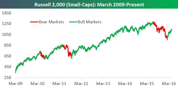
Chart of the Day: Smallcaps Enter New Bull Market
After falling 26% from its high last June through February 11th, the Russell 2,000 index of smallcap stocks is now up 20.5%. That 20.5% gain means the index has entered a new bull market.
In today’s Chart of the Day sent to our paid research members, we look at historical bull and bear markets for the Russell 2,000 to show how they typically run their course.
You can access today’s Chart of the Day by starting a 14-day no-obligation free trial to our paid research platform.
ETF Trends: International – 4/26/16
Bespoke Stock Scores: 4/26/16
B.I.G. Tips – Fed Days and Historical Market Impact
Defense Boosts Durable Goods
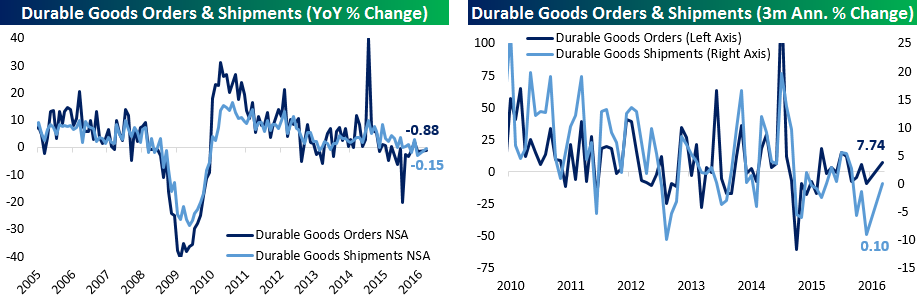
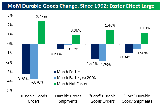
As shown above, durable goods orders and shipments reported in the US Census’ Advance Manufacturers’ Sales, New Orders, and Inventories report bounced somewhat over the last three months. This month’s report missed headline estimates for MoM gains. Headline durable goods were expected to rise 1.9% after a 3.0% decline in February, but were only up 78 bps. Ex Transportation, instead of a 50 bps rise as expected, orders were down 24 bps. Our measure of “core” durable goods orders declined 94 bps MoM; this measure strips out volatile series like Defense, and that made a big difference this month. Defense aircraft orders are only 2.7% of total orders but their 65.66% gain MoM added 1.74% to total orders MoM. The one caveat is seasonality; as shown below, when Easter falls in March there tend to be large declines in Durable Goods Orders & Shipments (which feed into GDP tracking, and “Core” Durable Goods Orders/Shipments. In The Closer tonight, we will investigate what that could mean for April, and we break down the details of this month’s report further.
Start a 14-day no obligation free trial to see tonight’s Closer plus the rest of our research product.
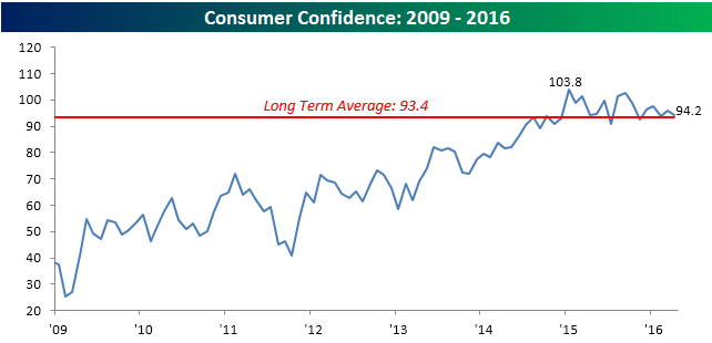
Consumer Confidence Weaker Than Expected
Consumer Confidence saw a larger than expected decline in April falling from last month’s reading of 96.1 down to 94.2 versus expectations of 95.8. As shown in the chart below, Consumer Confidence is hanging in there above its long-term average of 93.4, but the trend of lower highs is concerning.
For all consumers, the headline index for Consumer Confidence barely declined in April, but among lower middle-income consumers, confidence really plummeted. The chart below shows confidence among consumers with incomes of more than 50K and those with incomes between $35K and $50K. While the confidence index for consumers with incomes above $50K dropped from 116.4 down to 112.2, the index for those with incomes between $35K and $50K absolutely plummeted from 94.3 down to 71.0. For that cohort, April’s decline was the largest one-month decline since October 2008 and the fifth largest on record dating back to 1989.

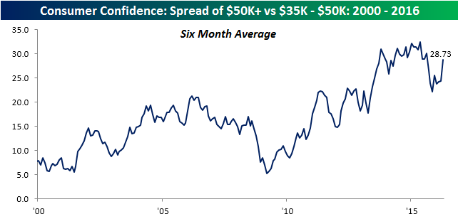
It may seem odd to see confidence decline by so much for one specific income group of consumers, and while this month’s steep drop may have been an anomaly, it is part of a longer term trend we have seen for the last several years where confidence among higher income consumers has rebounded and held up much better than confidence among lower income consumers. As shown in the chart below, the six-month average spread between consumers with incomes above 50K and those with incomes between $35K and $50K rose to record levels from the 2009 lows through last May, saw a steep drop beginning last summer, and has since resumed its upward trend. So what could be driving this widening wedge between consumers of different income levels? One key factor is the stock market. In a seven year period where the stock market has roared while the actual economy has seen one of its slowest recoveries on record, the increased wealth effect of higher stock prices has had a disproportionate impact on consumers with more disposable income. Conversely, when the stock market declines (as it did in the second half of last year), you can expect to see the opposite pattern play out.
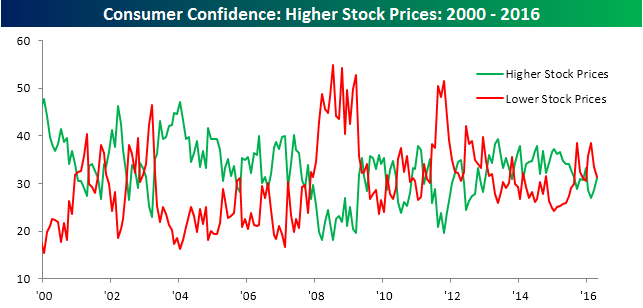
Speaking of the stock market, consumers currently have a mixed view. In this month’s survey, the numbers were pretty much evenly split between those expecting stock prices to increase (31.1%) and those expecting stock prices to decline (31.3%).