Chart of the Day: Q2 Dash for Trash
Dynamic Upgrades/Downgrades: 6/22/16
The Closer 6/21/16 – “More Wage Measures, More Wage Growth”
Looking for deeper insight on global markets and economics? In tonight’s Closer sent to Bespoke clients, we update our chart on the comprehensive monthly data released by the Atlanta Fed relating to wage growth. One measure of that wage growth is at the highest level since the early 2000s, surpassing the highs seen during the mid-2000s economic expansion.

The Closer is one of our most popular reports, and you can sign up for a trial below to see it and everything else Bespoke publishes free for the next two weeks!
Click here to start your no-obligation free Bespoke research trial now!
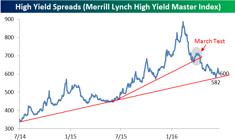
High Yield Spreads Nearing a Key Level
High yield spreads have really come in by a large margin since they widened out to just under 900 bps earlier this year. Through yesterday’s close, spreads were sitting at 600 bps above treasuries according to the yield on the Merrill Lynch High Yield Master Index. Most readers are aware that tighter spreads indicate looser risk appetites, so when spreads narrow it indicates that investors are more open to riskier assets and vice versa. As things currently stand, spreads are testing a key level here representing the uptrend line from their cycle lows nearly two years ago. High yield spreads bounced off of that trend-line on June 8th when they got as low as 582 bps but then widened out to as much as 632 bps last Thursday. Since then, they have come in by 32 bps in a pattern resembling the one we saw back in late March when spreads initially tested and bounced at the trend-line from last Summer’s low just before oil prices collapsed. If you are a bull here, you really want to see spreads repeat the pattern from March once again this time around.
ETF Trends: US Sectors & Groups – 6/21/16
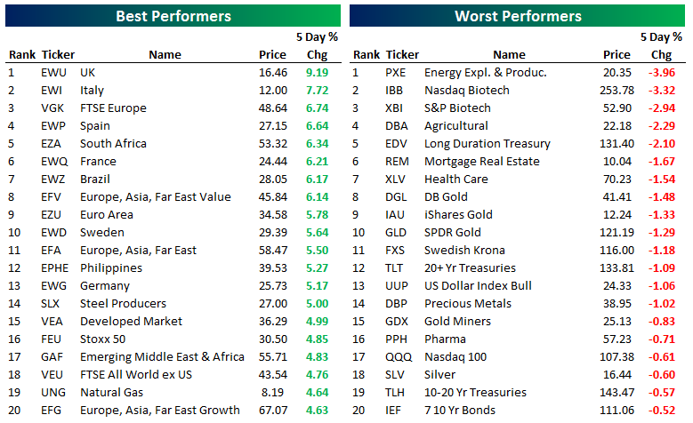
Below is our daily list of the twenty best and twenty worst performing ETFs over the last five trading days. Similar to yesterday, country and region based exposures were the winners, taking an astounding 17 out of the top 20 spots; a weak dollar and global equity rally were the key drivers. UK was up nearly 10% over the past five days as odds of a Brexit continued to drop. The biotech stocks remained among the big losers. Gold exposures and treasuries continued to struggle.
Bespoke provides Bespoke Premium and Bespoke Institutional members with a daily ETF Trends report that highlights proprietary trend and timing scores for more than 200 widely followed ETFs across all asset classes. If you’re an ETF investor, this daily report is perfect. Sign up below to access today’s ETF Trends report.
See Bespoke’s full daily ETF Trends report by starting a no-obligation free trial to our premium research. Click here to sign up with just your name and email address.
Dow 30 Trading Range Screen
Below is an updated look at our Dow 30 trading range screen. For each stock, the dot represents where it’s currently trading within its range, while the tail end represents where it was trading one week ago. The black vertical “N” line represents each stock’s 50-day moving average, while moves into the red or green zone are considered overbought or oversold.
The 30 members of the Dow remain mostly scattered, with 11 currently overbought and 5 oversold. Most names have experienced upside momentum over the last week, especially stocks like 3M (MMM), Verizon (VZ), IBM, General Electric (GE), and Home Depot (HD). Cisco (CSCO), Johnson & Johnson (JNJ), Pfizer (PFE), and Visa (V) are the four names that have seen downside momentum since last week at this time.
On a year-to-date basis, the average Dow stock is up 2.5%. Goldman Sachs (GS) is down the most with a decline of 18.2%, while UnitedHealth (UNH), Verizon (VZ), Wal-Mart (WMT), and Exxon Mobil (XOM) are up the most.
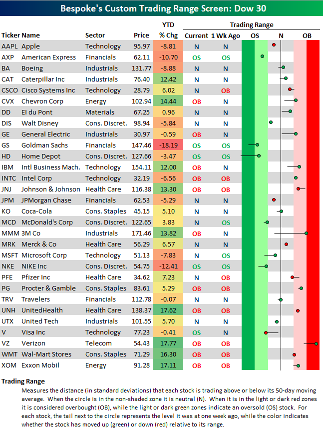
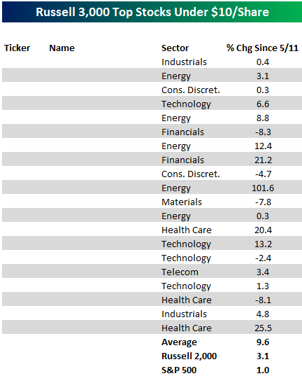
Chart of the Day: Top Stocks Under $10
Below is a table from our Top Stocks Under $10 report published back on May 11th. In today’s Chart of the Day sent to paid subscribers, we provide an update of that report and feature a bullish chart pattern for one of the names. To view the report (and see the original list of stocks), please start a 14-day free trial below.
Bespoke Stock Scores: 6/21/16
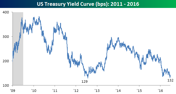
Yield Curve Nearing Cycle Lows
“The yield curve—specifically, the spread between the interest rates on the ten-year Treasury note and the three-month Treasury bill—is a valuable forecasting tool. It is simple to use and significantly outperforms other financial and macroeconomic indicators in predicting recessions two to six quarters ahead.” -NY Fed (June 1996)
With such a strong endorsement from the New York Fed as well as others in the economist community, the yield curve is one of the most widely watched indicators regarding the health of the US economy. More specifically, when the spread between the yields on the ten-year and three-month US treasuries inverts, or turns negative, there is a high probability of a recession on the horizon. The chart below shows the yield curve since the beginning of 2009. As shown in the chart, the slope of the yield curve peaked shortly into 2010, and outside of a brief period in late 2013, has been trending lower the entire time. Interestingly, in just the last few weeks, the slope of the curve has flattened further and is now within 3 bps of its flattest level of the cycle. While the slope of the curve is still far from being inverted, flatter yield curves are generally associated with lower rates of economic activity. In that light, the flattening of the curve isn’t exactly sending a bullish signal regarding economic growth.