Chart of the Day: Drudge Headline Indicator
B.I.G. Tips – Manufacturing Turns The Corner
Dynamic Upgrades/Downgrades: 7/22/16
The Closer 7/21/16 – National Activity, National Currency
Looking for deeper insight on global markets and economics? In tonight’s Closer sent to Bespoke clients, we update our tracking of GDP growth using the Chicago Fed’s National Activity Index, and also take a look at the value of the USD in terms of interest rate differentials.

The Closer is one of our most popular reports, and you can sign up for a trial below to see it and everything else Bespoke publishes free for the next two weeks!
Click here to start your no-obligation free Bespoke research trial now!
ETF Trends: International – 7/21/16
Below is our daily list of the twenty best and twenty worst performing ETFs over the last five trading days. Biotech ETFs were the top two performers on the week. Poland and Hong Kong continue to hold their positions among the strongest performing regional stocks, while on the other side Turkey fell further to keep the top spot on the worst performers. Gold exposures were up from yesterday but still were among the worst performers on the week. Oil and energy stocks were also down both on the day and on the week.

Bespoke provides Bespoke Premium and Bespoke Institutional members with a daily ETF Trends report that highlights proprietary trend and timing scores for more than 200 widely followed ETFs across all asset classes. If you’re an ETF investor, this daily report is perfect. Sign up below to access today’s ETF Trends report.
See Bespoke’s full daily ETF Trends report by starting a no-obligation free trial to our premium research. Click here to sign up with just your name and email address.
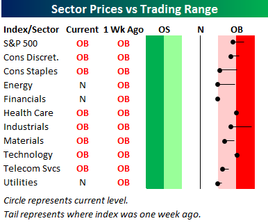
Bespoke’s Sector Snapshot — 7/21/16
We’ve just released our weekly Sector Snapshot report (see a sample here) for Bespoke Premium and Bespoke Institutional members. Please log-in here to view the report if you’re already a member. If you’re not yet a subscriber and would like to see the report, please start a 14-day trial to Bespoke Premium now.
Below is our trading range screen of the S&P 500 and its ten sectors. For each sector, the dot represents where it’s currently trading within its range, while the tail end represents where it was trading one week ago. Moves into the red zone are considered “overbought,” while moves into the green zone are considered “oversold.”
The black vertical “N” line in the screen represents each sector’s 50-day moving average. As you can see, the S&P 500 and all ten sectors remain above their 50-day moving averages, and seven of ten sectors remain overbought. That being said, we’ve seen some downside momentum over the last week as well.
To see our full Sector Snapshot with additional commentary plus six pages of charts that include analysis of valuations, breadth, technicals, and relative strength, start a 14-day free trial to our Bespoke Premium package now. Here’s a breakdown of the products you’ll receive.
Chart of the Day: Earnings and Revenue Beat Rates
In today’s Chart of the Day sent to paid subscribers, we focus on the earnings and revenue “beat rates” for companies that have reported their Q2 numbers so far this season. Were analysts too bullish or bearish on earnings coming into this reporting period, and what impact might that have on the market? Sign up for a free Bespoke research trial below to view today’s Chart of the Day.