Dow Jones Seven Day Losing Streaks
It has been an unlucky seven straight days of declines for the Dow Jones Industrial Average since the close on July 22nd. Seven-day losing streaks for the DJIA aren’t that rare by any stretch of the imagination, though. Since 1900, there have been 85 prior losing streaks of seven or more trading days, so it works out to about once every 16 months. What is unique about the DJIA’s current losing streak, though, is that the declines have been contained. While most investors would not want to see seven straight days of declines, if there was ever a seven-day losing streak one had to endure, it has been the current one. Through Tuesday, the DJIA’s total decline during the current seven-day decline was just 1.38%. Of all the 85 prior seven-day losing streaks, there has never been a smaller decline. Interestingly, the next closest streak in terms of smallest declines also spanned the period from late July to early August of 1941 (-1.5%).
Not only has the Dow seen muted declines, but the S&P 500 and Nasdaq are even down less. In fact, during the seven days that the DJIA has been down, the S&P 500 has been up on four out of seven days, while the Nasdaq has only had two down days. The table below lists each of the prior 23 seven-day losing streaks for the DJIA since 1971 (the year the Nasdaq began). For each streak, we show the returns of all three indices over that seven-day span as well as the DJIA’s change over the following week and month. As shown in the table, the current streak is only the second one where the Nasdaq traded higher during the course of the DJIA’s losing streak. Meanwhile, during the prior streaks for the DJIA, the S&P 500’s decline was never as small as the 0.83% decline over the last seven trading days. The one period where the performance figures over the seven-day losing streak were similar to the declines in the current period was in May 1989.
Finally, looking at the returns of the DJIA following prior streaks, the forward one-week and one-month returns have not been particularly strong. One week later, the DJIA averaged a decline of 0.36% (median: -0.05%) with positive returns just 43% of the time. A month later, the average return improved to +0.43%, but the median got even worse (-0.51%). Looking on the bright side, though, the one period where the major averages saw similar returns to the ones seen in the current streak was in May 1989. Following that streak, the DJIA traded 3.7% higher over the next week and 5.8% over the following month.
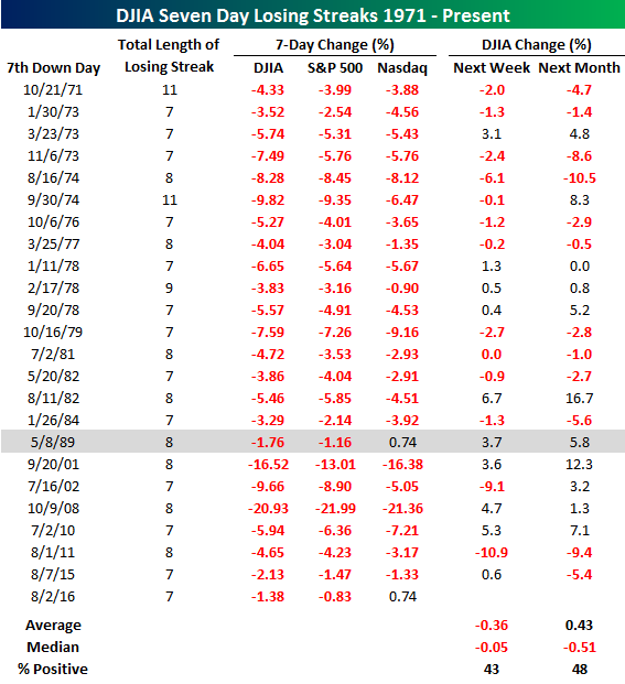
Chart of the Day – A Chart We Don’t Like – And One We Do
Bespoke Stock Scores: 8/2/16
Bespoke Pulse Points — Facebook Demographics
If you’re reading this message, you currently do not have access to our Consumer Pulse add-on package. Sign up for a 30-day free trial here to see our Facebook survey analysis now.
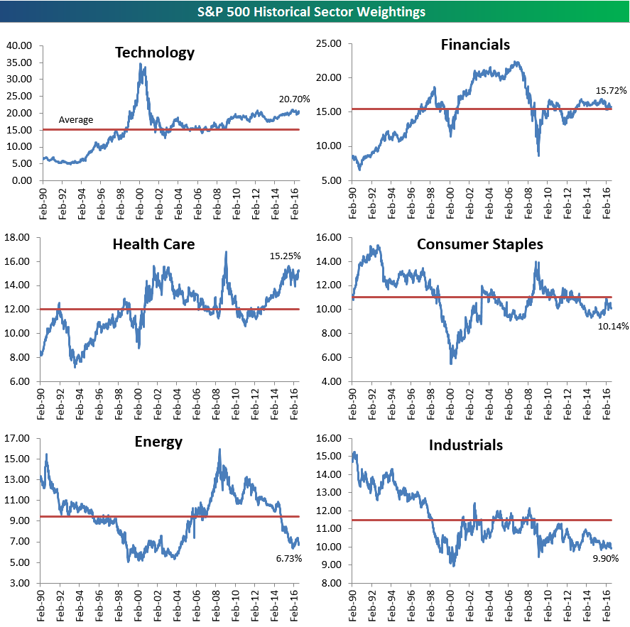
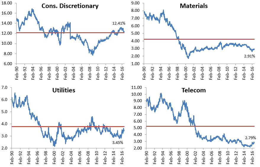
Historical S&P 500 Sector Weightings
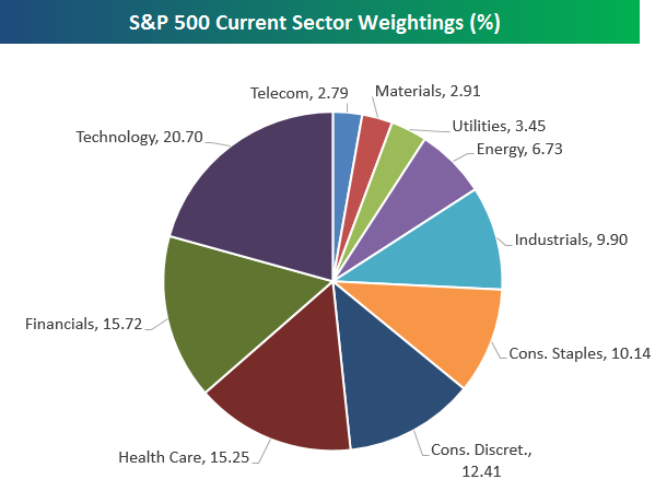
Below is an updated snapshot of current S&P 500 sector weightings. As of the close yesterday, the Technology sector’s weighting had crept up to 20.70%. That’s just about five percentage points higher than the next biggest sector — Financials — at 15.72%. Health Care has really outperformed lately, bringing its weighting up to 15.25%. The three largest sectors — Technology, Financials, Health Care — now make up more than 50% of the market (51.67% to be exact)! The three smallest sectors — Telecom, Utilities and Materials — only make up 9.15% of the market. It’s also worth noting that the Energy sector’s weighting has dipped back below 7% once again as oil prices have entered a new bear market.
Below is a historical look at S&P 500 sector weightings going back to 1990. This allows you to see how the US has shifted from a more balanced economy to one that is now dominated by non-manufacturing sectors. We mentioned above that the three largest sectors now make up more than 50% of the market while the smallest three make up just 9.15%. Back in 1990, the three largest accounted for 42% of the market, while the three smallest had a combined weighting of 20.30%.
In the chart below, the Tech bubble of the late 1990s also stands out. In February 1990, the Tech sector had a weighting of just 6.34%. It was the second smallest sector at that time ahead of only Utilities which had a weighting of 6.18%. By the peak of the Tech bubble in March 2000, the Technology sector’s weighting had risen to 34.81%! After the Tech bust, it was the Financial sector’s turn to take the reigns. By September 2006, the Financial sector’s weighting had ballooned up to 22.35%. That put it more than seven percentage points larger than Tech, which was the second largest sector at the time with a weighting of 15.19%. The Financial sector’s purpose is to service the economy. Anytime that sector ends up becoming the largest sector of the market, it’s a sign that things are off kilter.
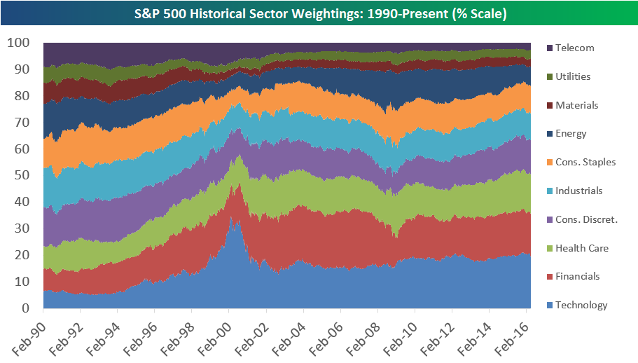
Below we provide historical weighting charts by sector going back to 1990. For each sector, the red line represents its average weighting over the entire 26-year period. This allows you to see which sectors are currently above or below their long-term averages. At the moment, Technology and Health Care are the only two sectors solidly above their long-term averages. Energy, Industrials, Materials and Telecom are the farthest below.
The Closer 8/1/16 – GDP Trading Down, Homeownership Out
Looking for deeper insight on global markets and economics? In tonight’s Closer sent to Bespoke clients, we break down the impact crude is currently having on high yield markets before analyzing three different economic releases: the Fed’s Senior Loan Officer Survey, Construction Spending, and ISM Manufacturing.

The Closer is one of our most popular reports, and you can sign up for a trial below to see it and everything else Bespoke publishes free for the next two weeks!
Click here to start your no-obligation free Bespoke research trial now!
ETF Trends: US Indices & Styles – 8/1/16
Below is our daily list of the twenty best and twenty worst performing ETFs over the last five trading days. Gold stocks continued to trend upward and remained atop our list of best performers. S&P Biotech and NASDAQ Biotech also performed strongly. The Turkish ETF was also up again as were a number of Asian stocks including South Korea. Japanese yen rallied considerably after a “disappointing” BoJ decision last week. On the flip side, oil kept falling as did related energy and commodity exposures.

Bespoke provides Bespoke Premium and Bespoke Institutional members with a daily ETF Trends report that highlights proprietary trend and timing scores for more than 200 widely followed ETFs across all asset classes. If you’re an ETF investor, this daily report is perfect. Sign up below to access today’s ETF Trends report.
See Bespoke’s full daily ETF Trends report by starting a no-obligation free trial to our premium research. Click here to sign up with just your name and email address.
Oil: Exit Bull Market, Welcome Bear
Bids have been few and far between for oil over the last two months. Since peaking in early June, the commodity has essentially been straight down. As shown below, prices have been extremely depressed over the last couple of weeks, moving lower day-by-day along the bottom of its trading range.
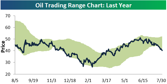
While oil saw a bounce off of its 200-day moving average last Friday, it couldn’t hold its 200-day on a re-test today. This break also marked the beginning of a new bear market for oil, which is defined as a 20%+ decline from a bull market high. At current levels, oil is down 21.7% from its high 54 days ago on June 8th.
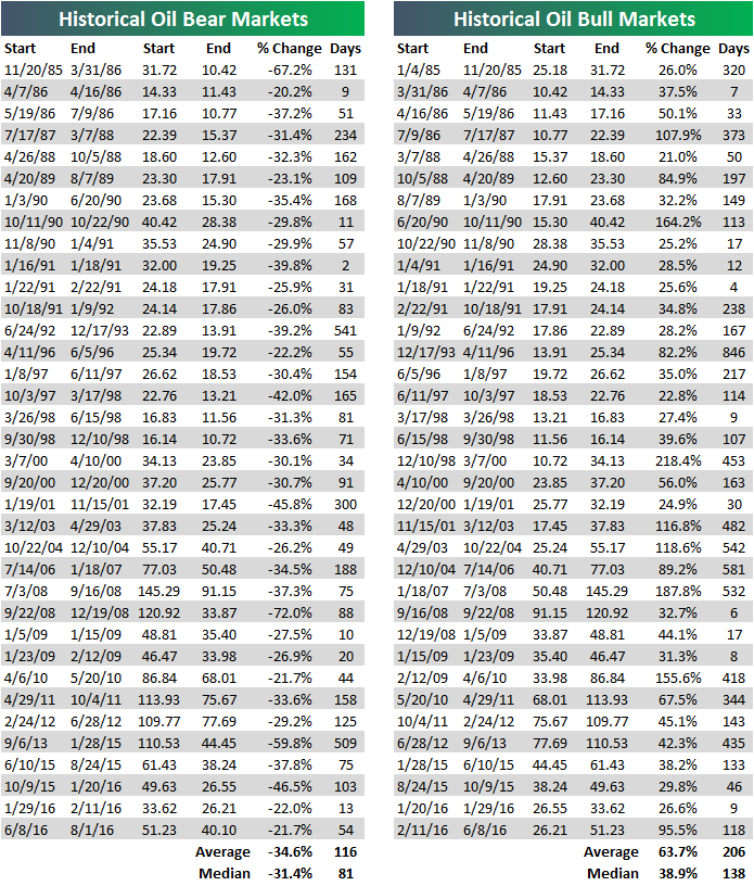
Below is a list of historical oil bull and bear markets since the early 1980s when data begins. The prior bull market that just ended for oil was a strong one at +95.5%. That’s much stronger than both the average and median gain seen for historical oil bulls. Now that the new bear market is official, how low will prices go? Well, the average bear has seen a decline of 34.6% from high to low, while the median bear has seen a decline of 31.4%.
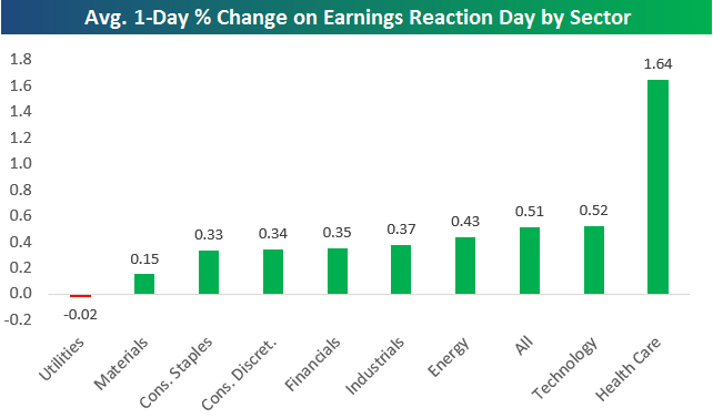
Health Care, Tech Stocks Leading on Earnings
More than 1,000 companies have reported Q2 numbers since earnings season began on July 11th when Alcoa (AA) kicked things off. Stocks have generally been reacting positively to their earnings reports this season. Thus far, the average stock that has reported has averaged a one-day gain of 0.51% on its earnings reaction day. (Remember, for companies that report before the open, its earnings reaction day is that trading day. For companies that report after the close, its earnings reaction day is the next trading day.)
Below is a look at how stocks are performing in reaction to earnings by sector. As shown, Health Care stocks have knocked it out of the park this season, averaging a one-day gain of 1.64% on their earnings reaction days. The Technology sector is far off the pace in second at +0.52%. Only one sector has seen its stocks average declines on earnings this season — Utilities. Utilities stocks that have reported have averaged a very small one-day decline of 0.02%.
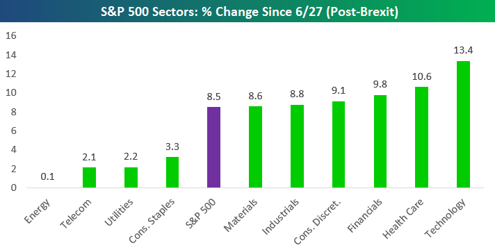
Below is a quick look at sector performance since the S&P 500 made its post-Brexit low on June 27th. Just as Technology and Health Care stocks have led the way on earnings this season, these two sectors are up the most post-Brexit as well.