the Bespoke 50 — 8/4/16
Consumer Discretionary and Technology Go Their Separate Ways
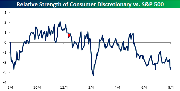
It’s been a tough year for the Consumer Discretionary sector as more conservative consumers and Amazon outweigh the positive impact of lower gas prices. The chart below shows the sector’s relative strength versus the S&P 500 over the last twelve months. In the chart, a rising line indicates that the sector is outperforming the S&P 500, while a falling line indicates underperformance. We have also included a red dot to show the last FOMC rate hike back in early December. As shown, the sector had seen a nice bounce towards the end of 2015, but in the days leading up to that hike, its relative strength peaked and has pretty much never recovered. Through today, the sector is underperforming the S&P 500 by close to its widest levels of the last year.
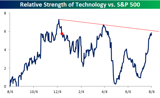
Times may be tough for the Consumer Discretionary sector, but the Technology sector is enjoying quite a revival. Since the end of April, the Technology sector has been the top performing sector, rallying 10.6% compared to a gain of just 1.8% for the S&P 500. The rally in the sector shows up in the relative strength chart below. Despite that spike higher, though, the Technology sector’s relative strength is still below the two prior peaks from early April and December just before the Fed hiked rates.
July Employment Report Preview
Heading into tomorrow’s Non Farm Payrolls (NFP) report for July, economists are expecting an increase in payrolls of 180K, which would be a big decline from last month’s huge upside surprise reading of 287K. In the private sector, economists are expecting an increase of 171K, which would be a similar decline to what economists are forecasting for the overall NFP reading. The unemployment rate is forecasted to tick back down to 4.8% after moving up to 4.9% last month. Growth in average hourly earnings is expected to accelerate back up to 0.2%, while hours worked is forecast to remain unchanged at 34.4. June’s employment report was a big positive surprise for the market and economists after the big disappointment in May, so hopefully now that those two have evened each other out, we will return back to levels more inline with the overall trend.

To see our complete preview of the July Employment report which was just sent to Bespoke Premium and Bespoke Institutional clients, please sign up for a monthly Bespoke Premium membership below!
See the full B.I.G. Tips report by signing up for a monthly Bespoke Premium membership now. Click this link for a 10% discount ($89/month).
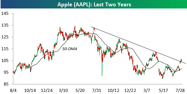
Apple (AAPL) Trying to Break Two-Year Downtrend Channel
After making a “higher low” when it bottomed at the end of June during the Brexit market sell-off, Apple (AAPL) has rallied roughly 15%. Included in this rally is the 6.5% gain it experienced on July 27th following its Q2 earnings report.
The reason we’re pointing out Apple this morning is because it’s finally testing a break above the top of its 12-month downtrend channel. This is a first-step in turning a downtrend into a new uptrend.
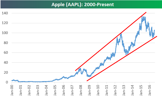
The longer-term chart for Apple (AAPL) is notable as well. As shown below, the recent pullback for the stock from peak to trough looks very similar to the one that occurred back in 2012/2013. So far, the bottom of its seven-year uptrend channel has held. As long as that’s the case, “technical” investors will find it attractive.
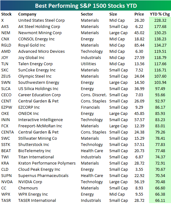
Best and Worst Performing S&P 1500 Stocks YTD
The S&P 1500 is a combination of the large-cap S&P 500, the mid-cap S&P 400, and the small-cap S&P 600. The average stock in the S&P 1500 is up 9.95% year-to-date as of this morning. Notably, though, just 55 stocks in the index are up more than 50% year-to-date, and just 11 are up more than 100% year-to-date. We expected to see more big winners than there actually are.
Below is a list of the 30 best performing stocks in the index year-to-date. As shown, US Steel (X) is currently on top with a gain of 228%. AK Steel (AKS) ranks second at +178%, followed by Newmont Mining (NEM) in third at +150%. Notice a pattern? Yes, the three best performing stocks are mining companies.
In the top ten, six are from the Materials sector, while just one stock (AMD) is from the Technology sector. The majority of names on the list of winners are small-cap stocks, and there aren’t a lot of household names on the list. Outside of Newmont or US Steel, Taser (TASR) is probably the third most widely recognized name on the list, and it’s at the very bottom in 30th place.
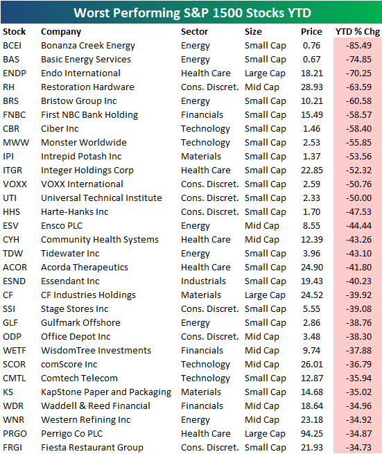
You can’t provide a list of winners without providing the losers as well. Below is a list of the 30 worst performing S&P 1500 stocks year-to-date. While 55 stocks are up more than 50% year-to-date, just 12 are down more than 50%. Bonanza Creek Energy (BCEI) is down the most at -85.5%, followed by Basic Energy Services (BAS) at -74.85%. Pharmaceuticals company Endo International (ENDP) is down the third most at -70.25%, while Restoration Hardware (RH) is fourth worst at -63.6%.
Dynamic Upgrades/Downgrades: 8/4/16
40 Sub 40
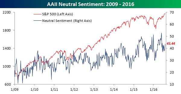
After trading sideways for the last two weeks now, bullish sentiment dropped back down below 30%, as these days it doesn’t even take a market decline to make individual investors a little more nervous. According to the weekly survey from the American Association of Individual Investors (AAII), bullish sentiment dropped from 31.25% down to 29.79%, for the third straight weekly decline and the 40th straight week where bullish sentiment has been below 40. The last time we saw bullish sentiment above 50% was during the first week of 2015!

Interestingly, while bullish sentiment declined, bearish sentiment also dropped, falling from 28.4% down to 26.8%. So rather than turning more bearish as the market consolidates, investors are taking a wait and see approach with neutral sentiment increasing to 43.44% from 40.34% last week.
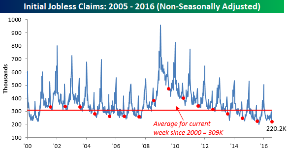
Jobless Claims Remain Near Multi-Decade Lows
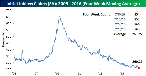
Jobless Claims rose slightly this week, moving up to 269K from last week’s reading of 266K. Economists had been expecting a level of 265K. While technically a weaker than expected report, what’s a few thousand in a labor force the size of the US? With this week’s reading, jobless claims have now been under 300K for 74 straight weeks, which is tied for the longest streak since 1973.

After getting within 1K of a new cycle low last week, the four-week moving average moved up to 260.25k from 256.5K last week. This week was our best chance to get down to a new cycle low, but now it’s going to be tough to get back down to that level.
The big standout to this week’s jobless claims report was the non-seasonally adjusted (NSA) reading. At a level of 220.2K, this week’s reading was 89K below the average reading for the current week dating back to 2000, and for the current week of the year, it was the lowest on record (going back to 1967). No matter how you look at it, jobless claims continue to show a solid foundation for employment.
The Closer 8/3/16 – Services Need Labor
Looking for deeper insight on global markets and economics? In tonight’s Closer sent to Bespoke clients, we look at some internals from today’s ISM Non-Manufacturing Report, as well as charting data on the petroleum market that was updated by the EIA today.

The Closer is one of our most popular reports, and you can sign up for a trial below to see it and everything else Bespoke publishes free for the next two weeks!
Click here to start your no-obligation free Bespoke research trial now!
Fixed Income Weekly – 8/3/16
Searching for ways to better understand the fixed income space or looking for actionable ideals in this asset class? Bespoke’s Fixed Income Weekly provides an update on rates and credit every Wednesday. We start off with a fresh piece of analysis driven by what’s in the headlines or driving the market in a given week. We then provide charts of how US Treasury futures and rates are trading, before moving on to a summary of recent fixed income ETF performance, short-term interest rates including money market funds, and a trade idea. We summarize changes and recent developments for a variety of yield curves (UST, bund, Eurodollar, US breakeven inflation and Bespoke’s Global Yield Curve) before finishing with a review of recent UST yield curve changes, spread changes for major credit products and international bonds, and 1 year return profiles for a cross section of the fixed income world.
This week, we chart the spread between US bond yields and global peers over the last decade. Below we give the example of Canada.
Our Fixed Income Weekly helps investors stay on top of fixed income markets and gain new perspective on the developments in interest rates. You can sign up for a Bespoke research trial below to see this week’s report and everything else Bespoke publishes free for the next two weeks!
Click here to start your no-obligation free Bespoke research trial now!