Chart of the Day – Nasdaq Losing Streaks Take the Summer Off
 There have been no shortage of memorable moves in the market this summer, but one that ranks up there concerns the Nasdaq. Since the two-day 6.5% decline following the Brexit vote in late June, the Nasdaq has gone 37 trading days now without posting back to back daily declines. In the Nasdaq’s history dating back to 1971, there have only been seven other periods where the Nasdaq went longer than 35 trading days without back to back declines and the current streak of 37 ranks as the longest since December 2004! If the Nasdaq can go three more trading days without a two-day losing streak, it will be the longest streak since 1978!
In today’s Chart of the Day, which was sent to paid subscribers we looked at prior periods where the Nasdaq went a similar amount of time without a two-day losing streak and calculated the index’s returns going forward. To see the report, please start a 14-day free trial to Bespoke’s paid research below.
the Bespoke 50 — 8/18/16
Bullish Sentiment Still Below 40%
As equities continue to levitate at or near all-time highs, bullish sentiment also ticked higher this week but still remains below 40% as it has for 42 straight weeks now. According to the American Association of Individual Investors (AAII), bullish sentiment increased from 31.29% up to 35.56% this week. That’s the highest level since mid-July and the biggest weekly increase in a month. Looking at the chart below, since late 2015, bullish sentiment has made a series of lower highs and lower lows, but if the current upswing holds on, that trend could break next week. The level to beat is 36.9%, and if that happens, the 40% level may just come into play. Wouldn’t that be something?
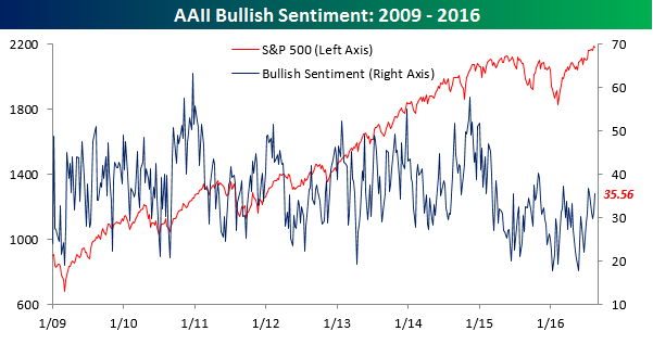
While bullish sentiment increased, bearish sentiment didn’t see much of a decline as it fell from 26.76% down to just 26.36%.

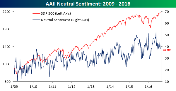
This week’s increase in bullish sentiment came almost entirely from the neutral camp. As shown in the chart below, neutral sentiment declined from 41.95% down to 38.08%. This is notable due to the fact that it has been common to see neutral sentiment increase when equities reach new highs. Therefore, with neutral sentiment starting to decline, it may signal that investors are becoming more comfortable with equities. From a contrarian perspective, that wouldn’t necessarily be such a good thing, but according to AAII data at least, we aren’t at the stage of complacency yet.
S&P 500 Correlations to Oil, Gold, Bonds, Dollar
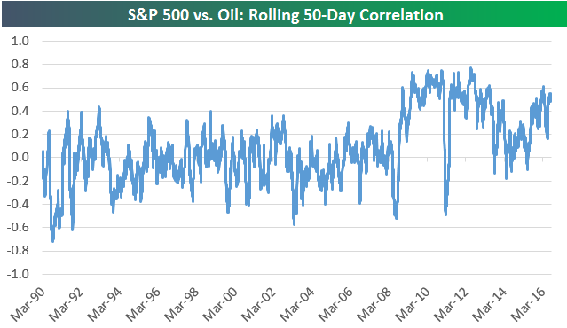
Below is an updated look at the correlation between the US stock market and oil. In the chart, we show the rolling 50-trading day correlation between daily price moves (in percentage terms) of the S&P 500 and crude oil. From 1990 through the end of the mid-2000s bull market, correlations between stocks and oil trended sideways in a range between -0.6 and +0.4 (1.0 means they’re moving exactly inline with each other while -1.0 means they’re exactly mirroring each other). During the Financial Crisis when correlations across most asset classes increased significantly, the correlation between the S&P and oil increased up towards 0.80. It trended lower and moved towards 0 in 2013 and 2014, and then started to trend higher again in 2015. Over the last 50 trading days, the correlation has been roughly 0.50.
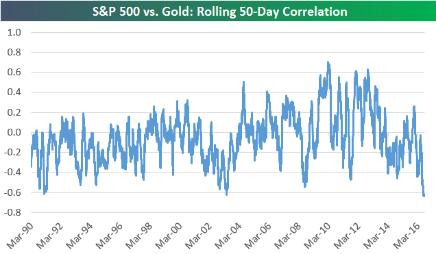
Unlike oil, where correlation with the stock market is positive, we’ve recently seen stocks and gold become negatively correlated. Over the last 50 trading days, the correlation between the S&P 500 and gold has been -0.62. As shown below, that’s the most negative correlation seen between the two since at least 1990!
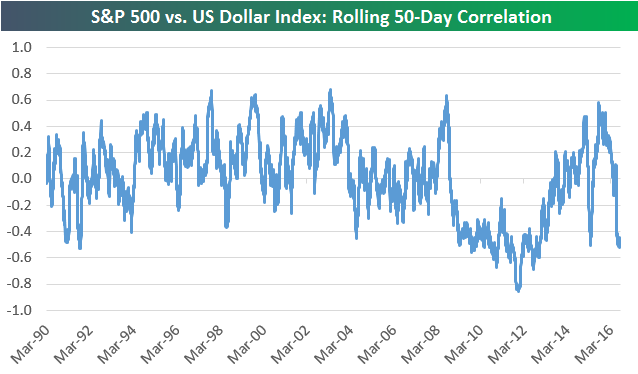
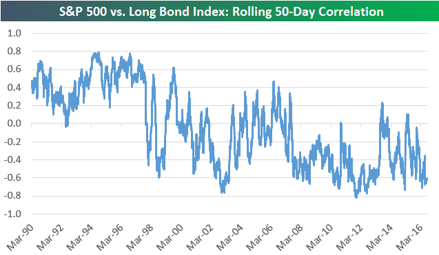
The final two charts below show the rolling 50-trading day correlation between daily prices moves of the S&P 500 and the US Dollar index as well as the S&P 500 and the long bond. The S&P 500 and the Dollar index have really seen correlations dip negative over the last couple of months, while the correlation between the S&P 500 and the long bond is at -0.60 as well.
Dynamic Upgrades/Downgrades: 8/18/16
Philly Fed Inline; Internals Weak
Today’s Philly Fed Manufacturing report for the month of August came in right inline with consensus expectations at a level of +2.0, but the internals of the report were pretty weak. Let’s start with the headline index. In June, the headline reading came out of negative territory for the first time in nine months only to fall back into negative territory in July, so this month’s rebound north of neutral is definitely welcome.
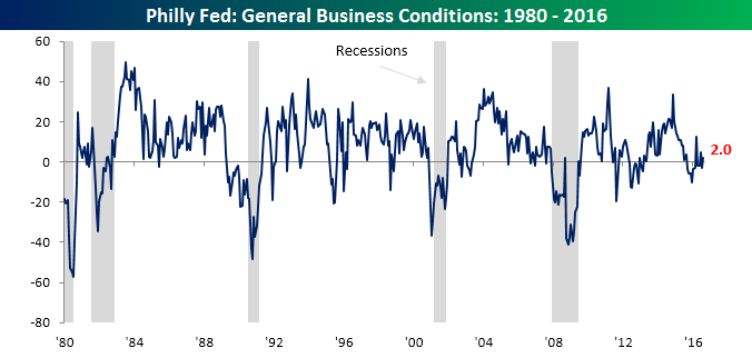
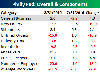 Turning to the internals of this month’s report, breadth was weak with just three sub-components showing m/m increases while six declined. On the upside, categories that increased showed just relatively modest moves, while some of the categories that showed declines saw much larger moves. New Orders, for example, dropped from +11.8 down to -7.2; that was the largest monthly decline since June 2012. Another lowlight of this month’s report was the Number of Employees index, which dropped 18.4 points to -20.0. The last time this component was lower was coming out of the recession in July 2009. It was also the eighth straight month of negative readings, which is also a streak that hasn’t been seen since the economy was coming out of the last recession. So while Jobless Claims nationally are painting a positive picture of the employment situation,manufacturing employment within the Philadelphia Fed’s district is not nearly as rosy.

Jobless Claims in the 60s
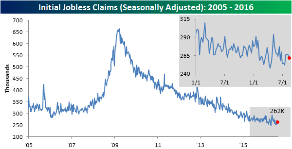
Jobless Claims for the latest week came in slightly lower than expected, dropping by 4K. While economists were expecting claims to come in at a level of 265K, the actual reading came in at 262K. Although it was pretty much an uneventful report, this week’s report marks the 76th straight week where claims have been below 300K. We haven’t seen that long of a sub-300K streak since 1970 when the US population was more than one-third smaller than it is now!
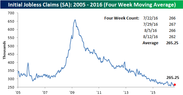
Although claims dropped, the four-week moving average ticked up slightly, rising from just under 263K to 265.25K. It has now been 17 weeks since we last made a new cycle low in this series, and it doesn’t look like we will be getting back down to that level anytime soon.
On a non-seasonally adjusted basis, jobless claims was just as, if not more impressive than the seasonally adjusted reading. As shown in the chart below, this week’s reading of 219.5K was 85K below the average level for the current week of the year, and the lowest level for the current week of the year since 1969.

The Closer 8/17/16 – A Crude Reading Of The Minutes
Looking for deeper insight on global markets and economics? In tonight’s Closer sent to Bespoke clients, we discuss today’s release of the Fed’s July meeting minutes. We also break down the weekly DoE EIA petroleum market report.

The Closer is one of our most popular reports, and you can sign up for a trial below to see it and everything else Bespoke publishes free for the next two weeks!
Click here to start your no-obligation free Bespoke research trial now!
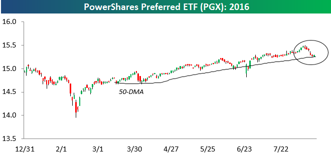
Preferred ETF Testing 50-DMA
Since a big collapse in early February as oil prices were making their 2016 lows, the preferred stock ETF — PGX — has made a nice run higher within a relatively tight uptrend channel. As shown below, the ETF has recently pulled back to its 50-day moving average, which is also the bottom of its tight uptrend channel. Technical longs will be looking for prices to hold and then bounce from here.