ETF Trends: Hedge – 8/23/16
Gold continues to underperform, while Mexico, Poland, and South Africa were among the worst performing ETFs we track this week. South Africa saw its currency, the rand, fall 3% in less than an hour this afternoon on headlines a minister had been taken into police custody. On the best performing side, Energy continues to look pretty solid on a 5 day basis. Materials also outperformed. As of this writing, ITB was up 2.6% on the day following Toll Brothers (TOL) earnings and a blow-out New Home Sales figure this morning.

Bespoke provides Bespoke Premium and Bespoke Institutional members with a daily ETF Trends report that highlights proprietary trend and timing scores for more than 200 widely followed ETFs across all asset classes. If you’re an ETF investor, this daily report is perfect. Sign up below to access today’s ETF Trends report.
See Bespoke’s full daily ETF Trends report by starting a no-obligation free trial to our premium research. Click here to sign up with just your name and email address.
Bespoke Stock Scores: 8/23/16
IPOs on Fire
As highlighted in a post earlier this week, the IPO market has been heating up recently as some new issues have seen major rallies in the short period of time since they have come out of the gate. The Bloomberg IPO index tracks the performance of stocks that have had their IPOs in the last year, and while the index is still 12% from its all-time closing high in November 2014, it did recently trade at a 52-week high for the first time in over 21 months (442 trading days). Since the index’s inception in 1994, the current drought without a new high in the index was only the fourth time that the index went more than a year without closing at a 52-week high. The prior three streaks ended in March 2002 (495 trading days), August 2009 (523 trading days), and May 2013 (551 trading days). The first chart below shows the Bloomberg IPO index since the start of 1995, and the end of each streak is noted with a red dot. The second chart shows the S&P 500 over the same time period, and here each of the red dots represent the dates in the top chart where each of the prior streaks ended.
Looking at the performance of both indices when the prior streaks came to an end shows a mixed picture. For the Bloomberg IPO index, the index traded down once (2002), sideways once (2009), and up once (2013). For the IPO market at least, the fact that subsequent performance was so mixed suggests little in the way of any sort of bullish or bearish signal. Looking at the S&P 500, its subsequent performance following an end to a long drought without a new high in the Bloomberg IPO index is a little more positive as the index continued to trade higher twice (2009 and 2013) and down once (2002). However, in the one period where the S&P 500 declined, it cratered. While the decline doesn’t look so bad in the long run chart, from March 2002 through the ultimate low in October 2002, the S&P 500 fell more than 47%!
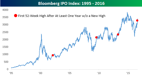
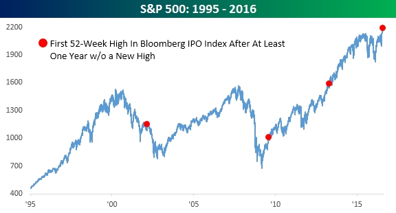
Chart of the Day: 2015’s Losers Shine
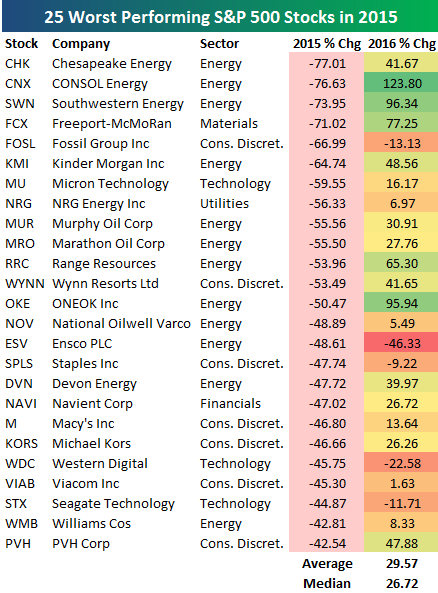 At right is a table showing the 25 worst performing S&P 500 stocks in 2015 and how they have performed so far in 2016. As shown, these stocks which fell sharply in 2015 are up an average of nearly 30% so far this year. Chesapeake Energy (CHK) was the worst performing stock in 2015, and it’s up 41.67% this year. CONSOL Energy (CNX) fell essentially the same amount as CHK in 2015, and it’s up 123.80% in 2016. Other Energy stocks like Southwestern (SWN), Kinder Morgan (KMI), Range Resources (RRC), and ONEOK (OKE) also saw big losses in 2015 only to turn it around this year.
In today’s Chart of the Day, which was sent to paid subscribers, we further analyzed stock performance in 2015 to see what impact it has had on performance in 2016. The results suggest that 2016 has signaled a new “leg” of the current bull market that we’ve been in since early 2009. To see the full report, start a two-week free trial to our premium research product below.
The Closer 8/22/16 – World Market Cap And National Activity
Looking for deeper insight on global markets and economics? In tonight’s Closer sent to Bespoke clients, we summarize the shifting global distribution of the market cap of the world’s stock markets. We also break down today’s Chicago Fed National Activity Index, which appears to be signalling an acceleration in growth for Q3.

The Closer is one of our most popular reports, and you can sign up for a trial below to see it and everything else Bespoke publishes free for the next two weeks!
Click here to start your no-obligation free Bespoke research trial now!
Chart of the Day: Herman Miller (MLHR) Breakout
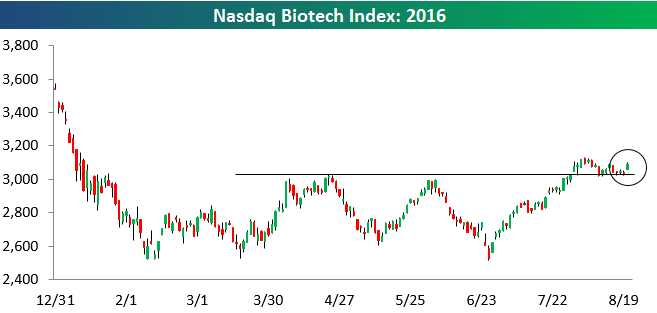
Biotech Still Holding Support
While the broad market equity indices are slightly in the red today, the Nasdaq Biotech index is rallying by nearly 2%. This bounce is certainly welcomed by Biotech bulls since the group has been trading right on top of key support over the last couple of weeks. You can see the trading action in the chart below:
ETF Trends: US Indices & Styles – 8/22/16
Oil is down sharply today but it’s still among the best performers versus a week ago. The same can’t be said for precious metals where Gold Miners and Silver have gotten hit hard. A smattering of EM is also down sharply versus last Monday, with Taiwan, Brazil, Poland, and Mexico seeing underperformance. The USD is down big versus GBP and EUR over the last week, while New Zealand has performed brilliantly among country ETFs.
Bespoke provides Bespoke Premium and Bespoke Institutional members with a daily ETF Trends report that highlights proprietary trend and timing scores for more than 200 widely followed ETFs across all asset classes. If you’re an ETF investor, this daily report is perfect. Sign up below to access today’s ETF Trends report.
See Bespoke’s full daily ETF Trends report by starting a no-obligation free trial to our premium research. Click here to sign up with just your name and email address.
Chicago Fed Exceeds Expectations For Second Straight Month
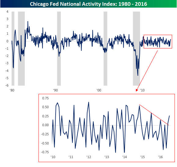
The Chicago Fed National Activity Index (CFNAI) isn’t the most widely followed economic indicator, and in more recent history has also been one of the least volatile. The index is released monthly and consists of a weighted average of 85 different monthly economic indicators that measure economic activity on a national basis. When the index is above average, it indicates that economic activity is growing above trend, while negative readings indicate below trend growth.
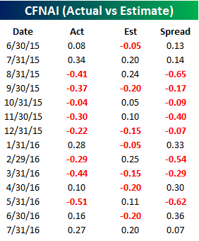 We will have a full breakdown of today’s release later on in today’s Closer report, which you can view by starting a two-week free trial to our premium research, but for now, we wanted to highlight a number of notable trends from this month’s report. As shown in the table to the right, July’s report came in at a level of +0.2687 versus consensus expectations of +0.2. This month’s better than expected report was the first time that we have seen back to back reports exceed expectations since last July. Not only that, but it was also the first time in a year that we have seen two straight positive, or above trend growth, readings. Not to get ahead of ourselves here, but if next month’s report also exceeds expectations, it would be the longest streak of better than expected reports since November 2009, and if it’s positive it would be the first ‘three-peat’ of above trend readings since the end of 2014.
The chart below is a long-term look at the CFNAI index going back to 1980. We have also included gray shading to indicate recessions. As shown in the chart, heading into prior recessions, the CFNAI was typically trending lower well ahead of the recession. In the current period, the CFNAI had been trending slightly lower since the start of 2015. With the last two reports, however, that string of lower highs appears to have been broken providing further confirmation that the ‘growth scare’ of 2015 was just that and nothing more dire.